Planning Guides, Style Guide
Invitation Examples: Design Samples & Inspiration
Apr
Design Samples That Actually Work (Not Just Pinterest Dreams)
So you need invitation examples and honestly this comes up like every single week with my clients. They’ll send me fifteen screenshots from Instagram and be like “I want THIS vibe” and I’m looking at five completely different styles wondering where to even start. Let me just show you what actually translates well from concept to real invitations because there’s a huge gap between what looks good in a photo and what works when you’re holding it.
The minimalist white-on-white invitation is having a massive moment right now. I’m talking crisp white cardstock with either letterpress or raised printing in the same white or maybe a super soft gray. You add texture through the printing method itself not through color. I did one of these for a spring 2023 wedding and the bride was OBSESSED but her mom kept asking if we forgot to print the actual text because the contrast was so subtle. That’s the thing with these – they photograph like a dream but older guests sometimes struggle to read them. If you’re gonna go this route make sure your font size is at least 11pt, preferably 12pt.
For this style you want something like a classic serif font – think Garamond or Didot. The layout should be centered and symmetrical. Keep your wording super simple:
Together with their families
Sarah Chen and Michael Roberts
request the pleasure of your company
at their wedding
Then your date, time, venue on separate lines. That’s it. The restraint IS the design.
Bold Typography Invitations
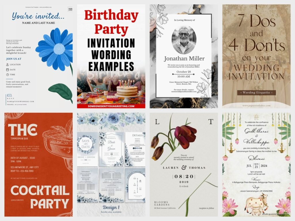
Okay so the complete opposite direction – big chunky letters that basically scream at you. These work really well for modern couples who want something that feels current and confident. I used a design like this for a Brooklyn loft wedding in summer 2021 and we did the couple’s names in this massive sans-serif font that took up like 60% of the card. Everything else was tiny underneath.
The key here is hierarchy. You pick ONE thing to be huge (usually the names or sometimes just “WEDDING“) and everything else gets small. You can play with font weights too – mix a heavy black weight with a thin light weight of the same font family. It creates contrast without needing multiple fonts which can look messy.
Color-wise these look sick in black and white but you can also do like a punchy single color. I’ve seen amazing ones in: bright coral, deep navy, forest green, or even a rich burgundy. Just keep it to one color plus black or one color plus white. Two bright colors starts looking like a kid’s birthday party real quick.
Floral Border Designs
I gotta be honest – I’m kinda tired of the generic floral border that every online template company uses. You know the one. Eucalyptus and roses in watercolor forming a perfect rectangle around text that’s in Montserrat font. It’s not that it’s bad it’s just SO overdone at this point that it doesn’t feel special anymore.
BUT if you want florals (and lots of people do because they’re pretty and romantic) here’s how to make it feel less template-y. First option: commission custom illustrations that match your actual wedding flowers. I worked with this amazing illustrator who drew the exact roses and peonies my client was using in her bouquet. The invitation felt personal because those WERE her flowers not just generic pretty flowers.
Second option: go editorial with it. Instead of a full border use like a single stem or small cluster in one corner. Maybe bottom left or top right. Asymmetrical placement automatically makes it feel more current and less… I don’t know how to describe it… less “default wedding invitation”?
Third option: vintage botanical prints. Like actual scientific illustrations from old books. These have such a different vibe from watercolor florals – they’re detailed and specific and kinda nerdy in a good way. You can find public domain ones online and incorporate them into your design.
Unexpected Shapes and Formats
Standard rectangle is 5×7 inches and there’s nothing wrong with that but if you want something that stands out in the pile of mail consider different formats. I did a square invitation (6×6) last fall and people LOVED it because it just felt different in their hands. It’s still formal enough for a wedding but the shape makes you pause.
Skinny and tall is another option – like 4×9 inches. These work really well for minimalist designs because you can do this beautiful vertical layout with lots of white space. They fit in standard envelopes if you get the 4.25×9.5 size which is sometimes called “policy size” for some reason.
Folded cards open up more possibilities literally. A bifold (folds once) gives you four panels to work with. You can put your ceremony details on the outside and then reception info inside. Or do a gatefold where both sides fold inward to meet in the middle – these feel really luxe when you open them but they’re more expensive to print and assemble.
What really annoys me is when people do weird shaped invitations without thinking about envelopes. I had a client who wanted these circular invitations which looked amazing but then we had to put them in square envelopes and it just looked awkward. The circle was floating in there weird. If you’re doing a non-standard shape make sure your envelope choice makes sense with it.
Acrylic and Alternative Materials
Okay so acrylic invitations are STUNNING but they’re definitely a splurge and you need to know what you’re getting into. These are like clear plexiglass sheets with your invitation printed or engraved on them. They look incredibly modern and expensive (because they are expensive – usually $15-25 per invitation minimum).
The effect is really cool though especially for evening weddings or modern venues. You can do white ink on clear acrylic, or black ink, or even print a full-color design. Some printers can do frosted acrylic which has this soft translucent look that’s a bit more subtle than fully clear.
Wood is another alternative I’ve seen work well for rustic or outdoor weddings. Thin wood veneer with laser-cut or engraved text. Vellum is having a moment too – you can print on translucent vellum and layer it over colored cardstock. As the vellum shifts you see different colors underneath which is a really pretty effect.
Fair warning though – alternative materials are HEAVY. Your postage costs go up significantly. An acrylic invitation might need $2+ in stamps versus the standard 60-something cents. Make sure you take a finished sample to the post office and have them weigh it before you buy stamps for 150 invitations.
Color Combinations That Work
I’m gonna give you some actual color combos that I’ve used successfully because “pick colors you like” isn’t actually that helpful when you’re staring at infinite options.
Navy and gold – classic and formal but not stuffy. Works for evening weddings. Use a dark navy cardstock with gold foil printing or gold ink.
Terracotta and sage – super popular right now for outdoor/garden weddings. Earthy and warm without being boring. Print in terracotta ink on cream cardstock and add sage green envelope liners.
Black and white with one pop color – keeps it clean but not boring. Your invitation is black and white but then your envelope is like a bright yellow or your envelope liner is a bold pattern.
Dusty blue and mauve – romantic without being too pink and girly. This works really well with silver foil accents or gray text.
Deep burgundy and blush – rich and elegant. Good for fall or winter weddings but honestly works year-round if you style it right.
The trick with colors is to have one dominant color (like 70% of your design) and one or two accent colors. If you split it 50/50 it can look indecisive or like you’re trying to match two wedding parties or… I don’t know it just doesn’t look as intentional.
Typography Pairings
This is where people get really overwhelmed but it doesn’t have to be complicated. Here’s my formula: one script or decorative font + one clean sans-serif or serif. That’s it.
For example: use a flowing script font for the couple’s names and a simple sans-serif like Futura or Gotham for all the details. Or flip it – modern geometric font for names and a traditional serif like Garamond for the details. The contrast between fancy and plain creates visual interest without looking chaotic.
What you DON’T want is two script fonts together or two decorative fonts. It competes with itself and becomes hard to read. Also don’t use more than three fonts total on one invitation. Two is better. Three is the absolute max before it starts looking like a ransom note.
My cat just knocked over my coffee while I’m writing this which feels very on-brand for my work-from-home life but anyway – let me show you some specific layout examples.
Layout Structures That Guide the Eye
Centered alignment is traditional and formal. Everything lines up down the middle of the card. This works best when you have short lines of text – long lines that are centered can look awkward and hard to follow. If your venue name is like “The Historic Riverside Estate and Gardens at Mountain View” you might want to rethink centered alignment because that’s gonna be three lines minimum and it’ll look clunky.
Left-aligned feels more modern and casual. You can do this with a clean sans-serif font and it has an almost editorial look like a magazine layout. Text blocks are easier to read when they’re left-aligned so if you have longer wording (like including parking instructions or dress code on the main invitation) this might be your better option.
Asymmetrical layouts are trickier but can be really striking. Maybe your text is aligned left but pushed to the right side of the card with a floral element on the left. Or text is bottom-aligned with lots of white space above. These require more design skill to get the balance right – it needs to look intentional not accidental.
Grid-based layouts work well when you have multiple events to include. Like if you’re doing a welcome party Friday, ceremony Saturday, and brunch Sunday you can create a structured grid that organizes all that info clearly. Each event gets its own section with consistent formatting.
Real Examples from My Files
Let me describe some actual invitations I’ve worked on because sometimes specific examples are more helpful than general principles.
The Brooklyn Loft Wedding: 5×7 horizontal orientation (landscape instead of portrait which already made it different). Black cardstock with white ink. The word “CELEBRATE” in huge letters across the top taking up a third of the card. Then in much smaller text below: “the marriage of Emma and Jordan” with date/time/venue in even smaller text at the bottom. Super bold and confident. We paired it with black envelopes and white address printing.
The Garden Wedding: This one was a 6×6 square on textured cream cardstock. We did a custom watercolor floral element – just a small cluster of garden roses and ranunculus in soft pink and peach tones in the top right corner. Text was left-aligned and positioned in the bottom two-thirds of the card in a warm gray ink. Classic serif font. The back of the card had a larger version of the floral pattern in very light gray almost like a watermark. Envelopes were lined with a coordinating floral pattern paper.
The Minimalist Beach Wedding: Okay this one was interesting because the couple wanted minimal but not cold. We did a soft blue cardstock (like a faded denim blue) with white letterpress printing. The layout was super simple and centered but we added this tiny debossed wave pattern along the bottom edge – you could only see it when light hit it at an angle. It was a subtle way to bring in the beach theme without doing like… starfish graphics or whatever.
The Vintage Library Wedding: They got married in this old library so we leaned into that. Cream cardstock with a design that mimicked an old library card catalog. We created a “card” frame with their information formatted like a library book listing. It was quirky and personal and totally matched their venue and personality. Font was an old typewriter style. We printed it in a dark brown ink to look aged.
Details That Make It Feel Expensive
Even if you’re on a budget there are small touches that elevate the whole thing. Envelope liners are a big one – you open the envelope and see this pop of color or pattern and it immediately feels more special. You can buy peel-and-stick liner paper and DIY this part to save money.
Wax seals are having a revival and honestly they’re not that expensive if you buy the wax and seal stamp yourself. Like $30-40 for supplies that’ll do 100+ seals. They look really impressive and old-world elegant. Just make sure you hand-cancel your invitations at the post office (bring them inside and ask them to hand-cancel) because wax seals can get damaged in sorting machines.
Edge painting is when the edges of your cardstock are painted in a color – usually gold or a color that matches your palette. This is more of a splurge because you usually need a professional printer to do it but the effect is really luxurious. When someone picks up the invitation they see that colored edge and it feels substantial and custom.
Belly bands are paper or ribbon bands that wrap around your invitation suite holding everything together. These can be printed with your names or monogram or just be a solid color that coordinates. They add a layer of presentation – instead of just pulling papers out of an envelope you’re unwrapping something which feels more gift-like.
Digital Design Tools vs. Hiring a Designer
Look I’m not gonna pretend everyone needs to hire a designer because plenty of people create beautiful invitations using templates or online tools. Canva has a million wedding invitation templates and if you have a good eye you can customize them enough to make them your own. Minted and Paperless Post have templates that are actually designed well.
Where I see people struggle is trying to create something from total scratch without design experience. They’ll use like five different fonts and seven colors and wonder why it looks chaotic. If you’re DIYing it start with a template and modify it rather than starting with a blank canvas. Change the colors, swap the fonts, adjust the layout, but keep the underlying structure that a designer already created.
When should you hire a designer? If you want something truly custom that reflects a specific vision, if you’re using alternative materials like acrylic or wood that need special file prep, if you have complicated wording or multiple events that need clear organization, or honestly if you just don’t want to spend hours figuring out why the text won’t center properly in whatever program you’re using.
A good designer will also know printing specs – like bleed lines and safe zones and what file format different printers need. I can’t tell you how many times I’ve had clients come to me with a design they made themselves that can’t actually be printed because the text is too close to the edge or they designed it in RGB instead of CMYK or the resolution is too low.
Wording Styles and Formality Levels
Traditional formal wording is very specific and follows rules about who’s hosting and how you phrase things. If the bride’s parents are hosting it’s “Mr. and Mrs. John Smith request the honour of your presence at the marriage of their daughter…” with honour spelled the British way with a U for some reason that I’ve never actually understood but that’s the tradition.
Modern casual wording throws out those rules and just says what you mean: “Sarah and Michael invite you to celebrate their wedding” or even “Let’s get married! Join us…” The tone matches your wedding vibe. If you’re having a backyard barbecue wedding your invitation shouldn’t sound like you’re addressing the Queen of England.
Something in between is “Together with their families, Sarah Chen and Michael Roberts invite you to share in their joy…” This acknowledges family involvement without the formal parent-naming structure. It’s probably the most common approach I see now because families are complicated – divorced parents, deceased parents, couples paying for their own wedding, blended families – the traditional wording doesn’t always fit.
You can also use your invitation wording to set expectations for your wedding. If you’re doing an adults-only wedding you might include “adult reception to follow” or if it’s black tie you put that on there. If it’s casual outdoor you might say “join us for a garden party” or “celebration under the stars” which signals the vibe without explicitly saying “don’t wear a ball gown.”
Honestly there’s no wrong answer here as long as you’re clear about the who/what/when/where. I’ve seen invitations that are basically just the essential info with zero decorative wording and they work fine. I’ve seen ones with quotes and poems and song lyrics and if that’s meaningful to you then do it. Your invitation should sound like you not like a Victorian etiquette manual unless you’re really into Victorian etiquette I guess.