Planning Guides, Style Guide
Create My Own Wedding Invitation: DIY Design Tutorial
Mar
Okay So You Wanna Design Your Own Wedding Invitations
First thing you gotta know is that designing your own invites is totally doable but it’s gonna take more time than you think. Like, way more. I had this couple back in spring 2023 who were adamant they’d have their DIY invites done in a weekend and then they texted me three weeks later basically in tears because they hadn’t even picked fonts yet. So just… pace yourself, alright?
What You Actually Need Before You Start
Don’t just open Canva and start throwing things at the screen. Trust me. You need to figure out some basics first or you’re gonna redesign this thing seventeen times.
- Your wedding date and venue (obviously but you’d be surprised)
- Guest count so you know how many you’re printing
- Your actual budget for printing and materials
- A vague idea of your wedding vibe – formal, casual, rustic, modern, whatever
- Colors you’re definitely using in the wedding
- All the wording details written out somewhere
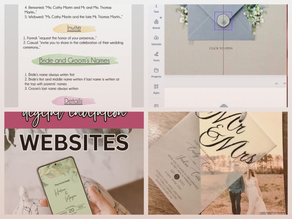
The wording thing is huge. You need to know if you’re doing “Mr. and Mrs. Smith request the honor” or “Join us as we get hitched” because that completely changes your design direction. Also figure out if you need insert cards for reception details, accommodations, RSVP cards, or if you’re doing everything on one piece.
Picking Your Design Software
So you’ve got options here and honestly what annoyed me for years was people acting like you HAVE to use Adobe InDesign or you’re not a real designer. Nah. Most couples aren’t graphic designers and that’s totally fine.
Canva is probably your best bet if you’re not design-savvy. It’s got templates, it’s intuitive, and you can actually create print-ready files if you do it right. The free version works but honestly the Pro version is like $13/month and worth it for weddings because you get way more fonts and elements.
Adobe Illustrator or InDesign if you actually know what you’re doing or you’re willing to watch a bunch of YouTube tutorials. These give you way more control but the learning curve is real.
Microsoft Word – look, I’ve seen people do this and it can work for very simple text-based invites but you’re gonna be limited and formatting for print is annoying.
PicMonkey or Adobe Express are middle ground options that are easier than Illustrator but give you more than Canva.
I usually tell people to start with Canva unless they already know another program. No point learning new software when you’re also planning a whole wedding.
Standard Invitation Sizes You Should Know
This matters more than you think because weird sizes cost more to print and mail. Standard sizes are cheaper for both.
- 5×7 inches – most common, fits in A7 envelopes
- 4×6 inches – postcard size, more casual
- 5.5×8.5 inches – a bit more vertical and elegant
- 6×9 inches – bigger statement but costs more to mail
I always recommend 5×7 because it’s the sweet spot of looking substantial without breaking the bank on postage. Plus you can find envelopes everywhere.
Actually Designing The Thing
Okay so open your software and set up your document at the right size. In Canva you can do custom dimensions. Make sure you’re working in inches not pixels if you’re gonna print these.
Margins are crucial. Keep all your text and important stuff at least 0.25 inches from the edge, preferably 0.5 inches. Printers can’t print to the very edge and you don’t want names getting cut off. Been there, seen that disaster.
Choosing Fonts
This is where people get paralyzed. You’re gonna be scrolling through fonts for hours if you let yourself. Here’s what actually works:
Use two fonts maximum. Maybe three if one is just for a small detail. One script/fancy font for names or headers, one clean readable font for the details. That’s it. When you start mixing four different fonts it looks like a ransom note.
Make sure your script font is actually readable. I know that super swirly calligraphy looks romantic but if your guests can’t tell if it says “Saturday” or “Sunday” you’ve got a problem. My cat walked across my keyboard once and honestly the random letters looked more readable than some script fonts I’ve seen people try to use.
Some reliable font pairings that don’t look basic:
- Cormorant Garamond with Montserrat
- Playfair Display with Source Sans Pro
- Great Vibes with Lato
- Italiana with Raleway
Color Schemes
Stick to your wedding colors but don’t use all of them. If you’ve got navy, blush, and gold, maybe just use navy and gold on the invite. Or blush and navy. You want it to feel cohesive not like you’re trying to showcase every color at once.
Black or dark gray text is always readable. White text only works on dark backgrounds and even then you gotta make sure it’s thick enough to read when printed. I’ve seen so many proofs where the white text basically disappeared.
Layout and Hierarchy
Your names should be the biggest thing on there. Then the date. Then the location. Then all the other details can be smaller. People need to glance at it and immediately know whose wedding it is and when.
Center-aligned is classic and easiest to make look good. Left-aligned can look modern and clean. Right-aligned usually looks weird unless you really know what you’re doing. Justified text is gonna give you weird spacing issues so maybe avoid that.
Don’t cram everything together. White space is your friend. If it feels empty that’s probably actually good design. I know it’s tempting to fill every inch but resist.
What Information Actually Goes On There
You need the essentials but you don’t need everything. Here’s the basic formula:
Host line: “Together with their families” or the parents’ names if they’re hosting
Request line: “Request the pleasure of your company” or “Invite you to celebrate”
Names: Your actual names (first and last, or first and middle and last if you’re formal)
Date: Spell it out – “Saturday, the fifteenth of June, two thousand twenty-five”
Time: “at four o’clock in the afternoon” or “4:00 PM” depending on formality
Venue name: Full proper name
City and state: “Portland, Oregon”
Reception line: “Reception to follow” or the reception location if different
RSVP details can go on a separate card or you can add a website at the bottom. Most people do wedding websites now which honestly makes everything easier because you can put all the extra info there instead of printing multiple insert cards.
The Technical Stuff That’ll Mess You Up If You Ignore It
Resolution needs to be 300 DPI minimum for print. In Canva this usually happens automatically but double-check. 72 DPI is for screens and will look blurry and pixelated when printed.
If you’re using photos or graphics, make sure they’re high resolution. Don’t just grab stuff off Google Images. Use actual stock photo sites or your own photos. Unsplash and Pexels have free high-res images if you need backgrounds or textures.
Colors look different on screen than in print. What looks like a pretty light pink on your monitor might print almost white. This is where ordering a sample proof becomes really important. Most print shops will do this and it’s worth the extra $10 or whatever.
Bleed: If your design goes to the edge of the paper, you need to extend it 0.125 inches past the trim line. This is called bleed and it prevents white edges if the cut is slightly off. Most online printers will have templates that show you where the bleed area is.
Printing Options Because This Is Where It Gets Real
You can print at home if you’ve got a good printer and want to save money, but it’s gonna take forever and you’ll probably waste some paper figuring out the settings. Home printing works best for simple designs on regular cardstock.
Online print shops like Minted, Vistaprint, Catprint, or Print Ninja are usually your best bet. Upload your file, they print it professionally, ship it to you. Prices vary wildly so get quotes from multiple places.
Paper weight matters – 110lb cardstock is standard and feels substantial. 80lb is too flimsy for invitations. Some places offer 130lb which is really thick and luxe but costs more.
Finishes: matte is classic and easy to write on if you’re doing envelope addressing by hand. Glossy can look cheap unless your design is specifically meant for it. Linen or textured finishes look expensive and hide printing imperfections.
Common Mistakes I See Literally All The Time
Using too many fonts. Already said this but seriously it’s the number one thing that makes DIY invites look amateur.
Making the text too small. If your grandma can’t read it without her glasses pressed against the paper, it’s too small. 10pt minimum for body text, 12pt is better.
Forgetting to proofread. I once had a couple print 150 invites before realizing they spelled the venue name wrong. Triple check everything. Then have someone else check it. Then check it again.
Not ordering a sample. I cannot stress this enough. Colors will look different, paper weight matters, you need to see it in person before printing 100+ copies.
Waiting until the last minute. Invites should go out 6-8 weeks before the wedding. That means you need them printed and ready to address at least 9-10 weeks before. Add design time and you’re looking at starting this process 3+ months out.
Some Design Ideas If You’re Stuck
Minimalist text-only invites are having a moment and they’re honestly the easiest to design well. Just elegant fonts on nice paper, maybe with a simple border.
Floral borders or corners – you can find tons of these as PNG files with transparent backgrounds. Just don’t go overboard.
Monogram designs with your initials can look really custom and fancy but aren’t that hard to create.
Watercolor backgrounds add color without being too busy. You can find watercolor textures and just put text over them.
Modern geometric designs with simple shapes and lines look clean and contemporary.
For a summer wedding you could do like a botanical thing with greenery or… actually I just remembered I need to call my printer about another client’s order but anyway, botanical stuff is pretty forgiving design-wise.
Envelopes and Addressing
You can print addresses directly on envelopes using your printer – most printers have envelope settings. Or you can do labels which is faster but some people think looks less formal. Hand addressing looks the nicest but takes forever unless you’ve got good handwriting or hire a calligrapher.
Inner envelopes are kinda outdated honestly. Most people just do outer envelopes now unless you’re doing a super formal wedding.
Envelope liners are that pretty paper inside the envelope flap and they’re easier to DIY than you’d think. You can buy templates or make your own, print on decorative paper, cut them out and glue them in. They make even simple invites look more expensive.
Timeline For Actually Getting This Done
Week 1: Gather all your info, pick your design direction, choose software
Week 2: Design first draft, get feedback from your partner/family
Week 3: Revisions, finalize design
Week 4: Order sample proof
Week 5: Sample arrives, make any final tweaks
Week 6: Order full print run
Week 7-8: Printing and shipping
Week 9: Addressing and assembly
Week 10: Mail them out
That’s 10 weeks minimum and that’s if everything goes smoothly which… it probably won’t. Someone will want changes or the proof will look wrong or whatever. Give yourself buffer time.
Keeping Your Sanity Through This
Save multiple versions of your file. Like, obsessively. “Invitation-draft1” “Invitation-draft2” “Invitation-FINAL” “Invitation-FINAL-actually-final” – you will want to go back to an earlier version at some point.
Take breaks. If you’ve been staring at font choices for two hours, walk away. You’re not making good decisions anymore. I learned this the hard way when I spent a whole evening convinced Comic Sans would look “fun and different” for a beach wedding. It would not have.
Ask for opinions but not from too many people. Your mom, your partner, maybe one friend with good taste. If you ask fifteen people you’ll get fifteen different opinions and you’ll never finish.
Remember that your guests will look at this for like thirty seconds total. Yes it should be nice, but you don’t need to agonize over whether that flourish should be 2mm to the left. Good enough is actually good enough.
If you get halfway through and realize you hate doing this, it’s okay to just order from a professional or use a template service. Your mental health is worth more than saving $200 or whatever. Some couples love the DIY process and some realize they absolutely do not, and both are fine.