Planning Guides, Style Guide
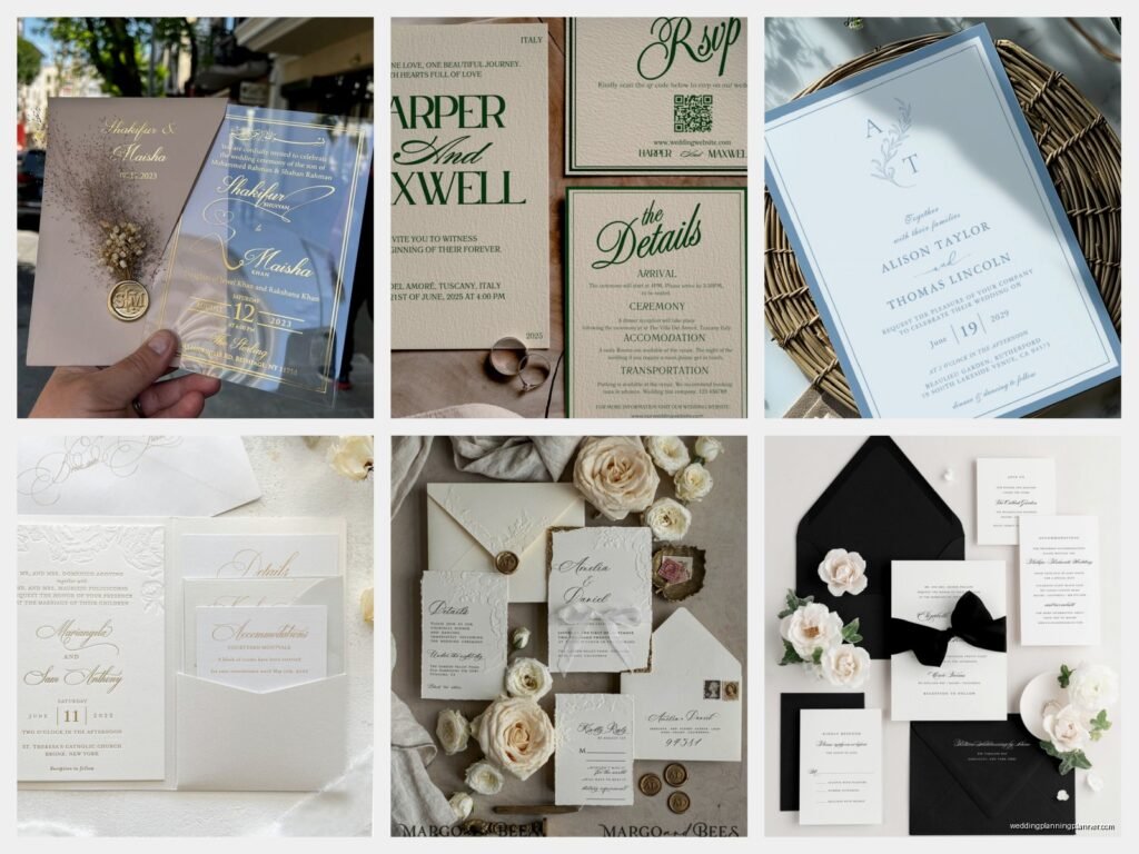
Elegant Wedding Invitations: Sophisticated Formal Designs
Mar
Okay so let’s talk about elegant wedding invitations
You know what really gets me? When couples come to me saying they want “elegant” invitations but they’re picturing something with glitter and butterflies. Like, nothing against butterflies, but that’s not what we’re talking about here. Elegant and formal wedding invitations are a whole different beast, and honestly, they’re my favorite thing to work on because there’s so much you can do while still maintaining that sophisticated vibe.
The Paper Stock Thing Everyone Gets Wrong
First thing – and I cannot stress this enough – is the paper. I had this couple in spring 2022 who insisted on buying their own paper from some craft store because they thought it would save money. The invitations looked like… I don’t even know how to describe it. Flimsy? Cheap? We had to start completely over because you could literally see through the paper when you held it up to light. That was a fun conversation.
For truly elegant invitations, you’re looking at:
- Cotton paper – minimum 110lb cardstock, but honestly 120lb feels way better
- Ecru or ivory shades work better than stark white for formal events
- Laid finish has those subtle lines that catch the light
- Smooth finish is more modern but still totally elegant
- Textured linen gives you that expensive feel without being over the top
The weight matters SO much. When someone picks up an invitation and it has that substantial feel, they immediately know this is a serious event. It’s gonna cost more, yeah, but this isn’t where you cut corners if you’re going for sophisticated.
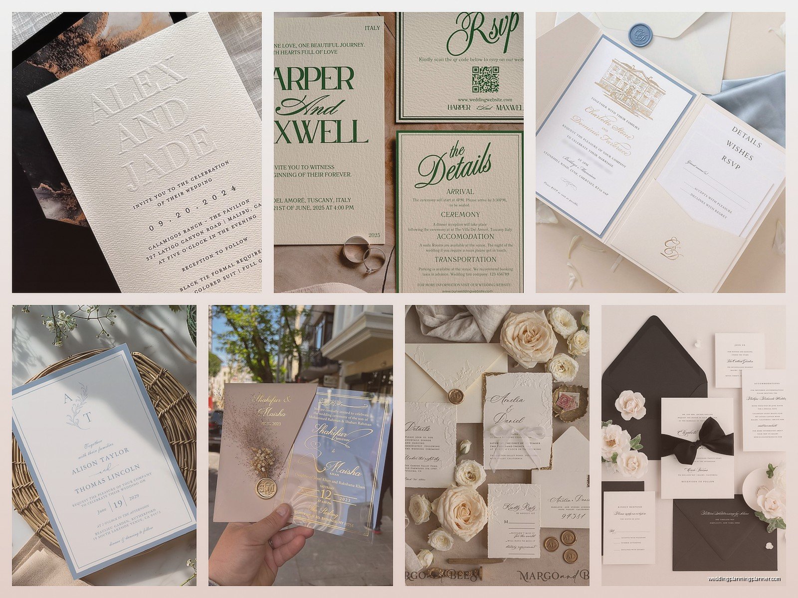
Color Palettes That Actually Look Expensive
Alright so colors. This is where people get scared and think elegant means boring, but nah. You’ve got options, they’re just more… restrained? I guess that’s the word.
Classic combinations that work:
- Black and white (never goes out of style, ever)
- Navy and gold
- Charcoal and silver
- Deep burgundy with cream
- Forest green with ivory
- Slate blue with white
What you’re avoiding here are bright colors. Not because they’re bad, but because formal elegance is about subtlety. A deep burgundy reads as sophisticated. A bright red reads as… well, not formal. There’s a place for bright reds, just not in this particular aesthetic.
Metallics are your friend but you gotta be careful. Gold foil? Gorgeous. Gold glitter? No. Silver letterpress? Beautiful. Silver glitter gel pen? Absolutely not. See the pattern here?
The Foiling Situation
Speaking of metallics, let me tell you about foiling because this is where magic happens. Real foil stamping (not digital foiling, actual hot foil stamping) elevates an invitation like nothing else. It’s that raised, shiny element that catches light and makes people go “wow.”
I remember watching The Crown while working on invitation samples one night – my cat knocked over my coffee right onto this practice sheet, completely ruined, and I just sat there thinking about how Princess Margaret would probably approve of gold foiling – anyway, foiling adds probably $3-5 per invitation but the impact is worth it for formal events.
You can foil:
- Names
- Monograms
- Border details
- Date information
- Venue names
But here’s the thing – less is more. Don’t foil everything. Pick one or two elements. The restraint is what makes it elegant.
Typography Rules You Can’t Break
Fonts are where I see the most mistakes. People think fancy script equals elegant, but that’s not… it’s more nuanced than that.
For formal invitations, you’re typically looking at a combination of:
- A serif font for body text (like Garamond, Didot, Bodoni)
- A refined script for names or headers (but readable – if your grandmother can’t read it, pick something else)
- Maybe a sans serif for modern elegant looks (like Futura, Avenir)
The biggest mistake? Using too many fonts. Two fonts maximum, maybe three if you really know what you’re doing. I had a bride in summer 2024 who sent me inspiration with FIVE different fonts on one invitation and then got annoyed when I said it wouldn’t work. Like, I’m trying to help you here.
Font Sizes Matter Too
Nobody talks about this enough but the hierarchy of information needs to be clear:
- Couple’s names: largest
- Request line (“request the honour of your presence”): medium
- Date and time: medium
- Venue: medium
- Reception details: smaller
- Dress code: smaller
And umm, the spacing between lines (leading, if you wanna get technical) should be generous. Cramped text looks cheap no matter how expensive your paper is.
Wording That Sounds Actually Formal
Okay so the wording. This trips people up because modern couples don’t always talk formally, but your invitation needs to match the vibe you’re creating.
Traditional formal wording looks like:
Mr. and Mrs. Jonathan Michael Peterson
request the honour of your presence
at the marriage of their daughter
Catherine Elizabeth
to
Mr. James Alexander Morrison
Notice “honour” is spelled the British way for formal invitations. Also “request the honour of your presence” is for religious ceremonies. For non-religious, it’s “request the pleasure of your company.”
Modern formal can be:
Together with their families
Catherine Elizabeth Peterson
and
James Alexander Morrison
request the pleasure of your company
at their wedding
Both work for elegant invitations. The key is consistency – if you’re going formal with wording, everything else needs to match.
Date and Time Formatting
For formal invitations, you spell everything out. No numbers (except for years, and even then some people spell those out too).
- Saturday, the twenty-eighth of September
- Two thousand and twenty-five
- at half after five o’clock in the evening
Not:
- Saturday, September 28th
- 2025
- 5:30 PM
I know it seems fussy, but that’s literally the point of formal invitations. The formality is in the details.
Envelope Addressing Is A Whole Thing
Nobody thinks about envelopes until the last minute and then they panic. Don’t be those people.
For elegant formal invitations, your options are:
- Hand calligraphy (most expensive but most impressive)
- Digital calligraphy (printed to look like hand calligraphy)
- Formal typeset addressing
What doesn’t work: printed labels, casual fonts, or handwriting unless your handwriting is legitimately beautiful. My handwriting looks like a doctor’s prescription note so I would never attempt this myself.
Inner and Outer Envelopes
Yes, you might need two envelopes. The outer envelope has the mailing address and gets handled by postal workers. The inner envelope has just the names and stays pristine.
Outer envelope:
Mr. and Mrs. Jonathan Peterson
428 Riverside Drive
Apartment 5B
New York, New York 10025
Inner envelope:
Mr. and Mrs. Peterson
Or if you’re including their kids:
Mr. and Mrs. Peterson
Caroline and Michael
This is how you indicate who’s actually invited without having to spell it out explicitly. If the inner envelope doesn’t include the kids’ names, the kids aren’t invited. People still get this wrong and show up with uninvited children, but at least you tried.
Printing Methods That Look Expensive Because They Are
Let’s talk about how these things actually get printed because it makes a huge difference in the final look.
Letterpress
This is my favorite. Letterpress creates an impression in the paper – you can feel the letters when you run your fingers over them. It’s old-school printing technology that’s having a moment because it looks so damn good.
Pros:
- Tactile element adds luxury
- Works beautifully with cotton paper
- Can do beautiful deep colors
- Creates shadow effects that are gorgeous
Cons:
- Expensive (usually $15-30 per invitation)
- Longer production time
- Not great for lots of colors or photos
Engraving
Traditional engraving is the most formal printing method. It’s the opposite of letterpress – instead of pressing into the paper, it raises the ink. You can feel it on the front and see the indentation on the back.
This is what you see on super formal invitations, like the kind for black-tie weddings at country clubs or embassy events. It’s pricey though – we’re talking $20-40 per invitation depending on complexity.
Thermography
Okay so thermography is like engraving’s less expensive cousin. It creates raised ink but through a heating process rather than metal plates. It looks similar to engraving but costs maybe half as much.
Most people can’t tell the difference unless they’re really looking. The giveaway is that thermography has a slightly shiny finish and you can’t see the indentation on the back like you can with engraving.
For budget-conscious couples who still want that formal look, thermography is totally acceptable.
Digital Printing
Modern digital printing has come so far. It’s flat (no texture) but you can achieve really crisp, clean designs. For a modern elegant aesthetic rather than traditional formal, digital printing works great.
It’s the most affordable option and the fastest turnaround. You’re looking at maybe $5-12 per invitation. The key is using really good paper stock so it doesn’t look cheap.
The Whole Suite Situation
An elegant formal invitation isn’t just one card. It’s a whole coordinated set, and this is where – okay my dog is literally barking at nothing right now, hold on – where people get overwhelmed because suddenly there are like seven different pieces to design.
A complete formal suite includes:
- Main invitation card
- Reception card (if ceremony and reception are different times/places)
- Response card
- Response envelope (pre-addressed and stamped)
- Accommodation card
- Direction/map card (though people just use Google Maps now so this is kinda optional)
- Weekend events card (for welcome dinner, brunch, etc.)
Each piece should be designed cohesively. Same fonts, same color palette, same level of formality.
Response Cards Done Right
Response cards are deceptively tricky. You want them to be clear but still match your formal aesthetic.
Traditional format:
M_________________
accepts with pleasure
declines with regret
Saturday, the twenty-eighth of September
Two thousand and twenty-five
The “M” is for guests to write Mr., Mrs., Ms., etc. before their name. It’s very traditional but some people find it confusing, so you could also do:
Name(s)_______________
____accepts with pleasure
____declines with regret
Include a line for number of guests attending if you’re allowing plus ones. And please, PLEASE pre-address and stamp the response envelope. Making guests hunt for stamps and look up your address is not elegant, it’s annoying.
Assembly and Presentation
How you put everything together matters. There’s an actual order to this that nobody tells you about until you’re staring at a pile of paper components wondering what goes where.
Correct assembly order (from bottom to top):
- Main invitation card (face up)
- Reception card (if separate, face up on top of invitation)
- Other enclosure cards (face up, largest to smallest)
- Response envelope (face down, flap left)
- Response card (face up, tucked under response envelope flap)
All of this goes into the inner envelope with text facing the envelope flap. Then the inner envelope goes into the outer envelope with guest names facing the envelope flap.
I know this sounds ridiculously detailed but when someone opens a perfectly assembled invitation, it creates this moment of… like, anticipation? Everything unfolds in order. It’s an experience, not just information delivery.