Planning Guides, Style Guide
Examples of Wedding Websites: Event Site Design Inspiration
Mar
Wedding Website Design Examples That Actually Work
Okay so wedding websites have completely changed since I started doing this back in the early 2000s and honestly some couples still don’t realize how important they are. Like last spring 2023 I had this couple who wanted to skip the website entirely because they thought Facebook invites would work and I literally had to show them how their 80-year-old grandparents would have zero idea what was happening. Anyway.
The best wedding websites I’ve seen follow some pretty basic patterns but people always wanna reinvent the wheel. You don’t need to reinvent the wheel. You just need something that looks nice and tells people where to show up and what time.
The Minimalist Single-Page Design
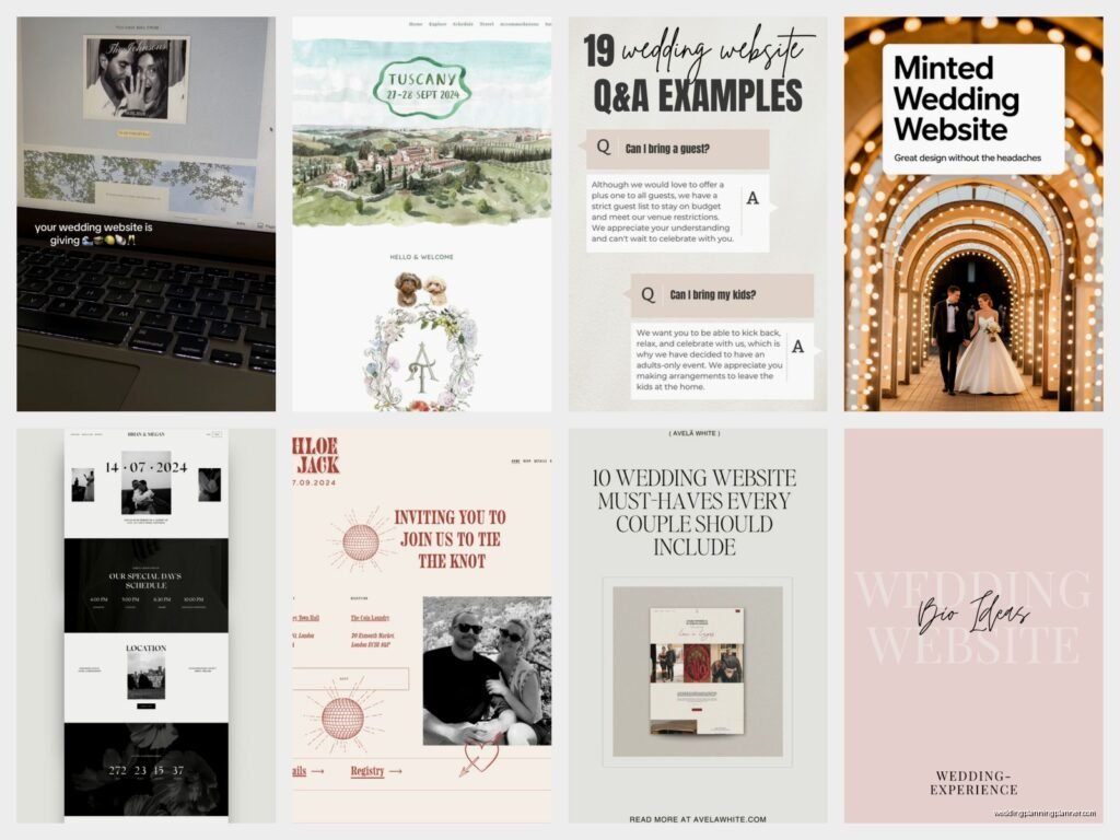
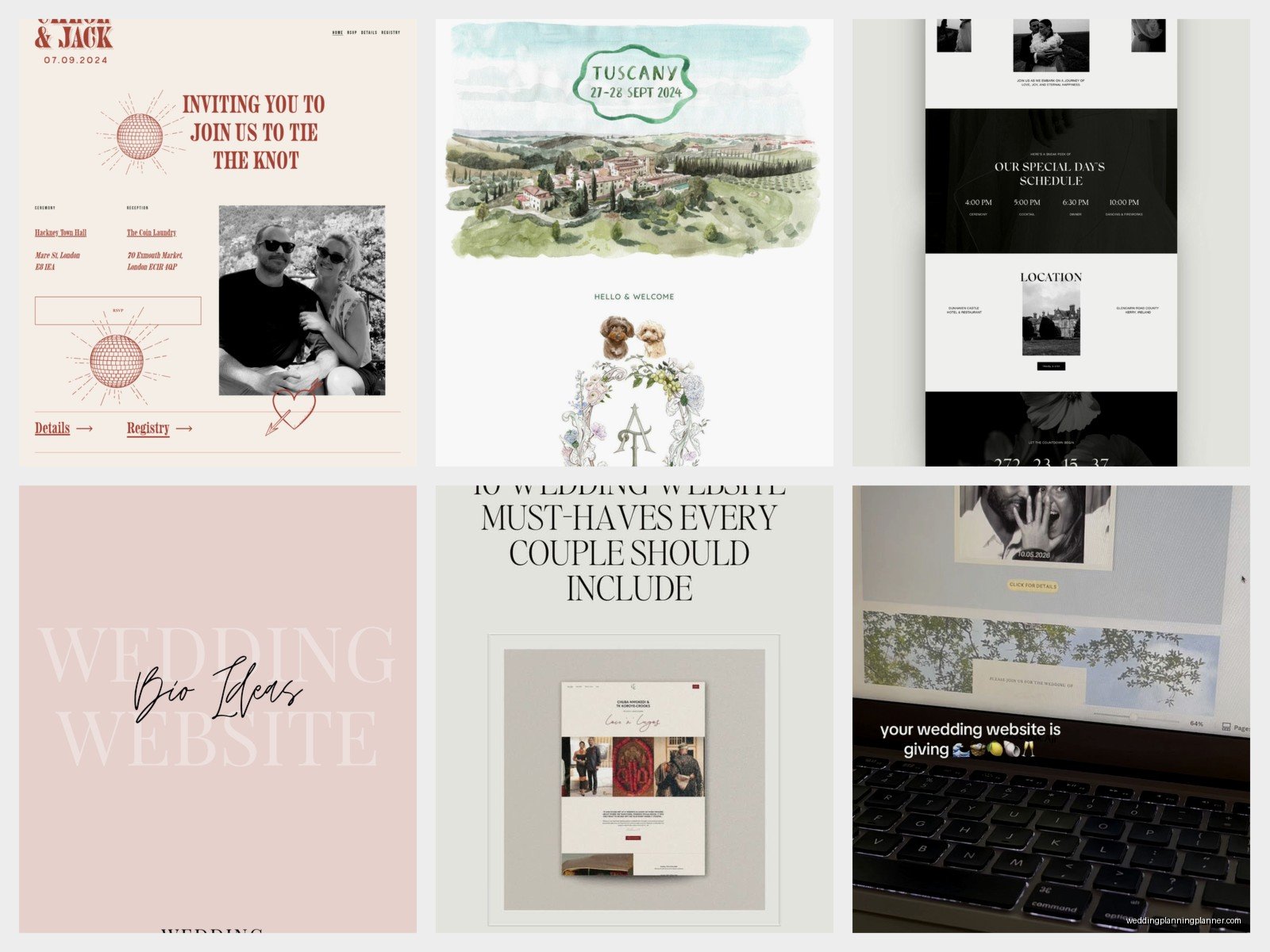
This is probably the most popular style right now and for good reason. Everything lives on one continuous scrolling page with sections for different info. You’ve got your hero image at the top—usually an engagement photo or a pretty landscape shot from the venue. Then as you scroll down you hit sections like “Our Story” then “Wedding Details” then “Travel Info” then “Registry” and finally “RSVP.”
I love these because guests can find everything without clicking around a million different pages. The navigation menu just jumps you to different sections on the same page. Super clean, super easy.
For design inspo on these, think soft neutral backgrounds—lots of ivory, blush, sage green, or that dusty blue everyone was obsessed with. Typography is usually a mix of a fancy script font for headers (but please God make it readable) and a clean sans-serif for body text. You want people to actually read your ceremony time, not squint at some curly font that looks like it was written by a calligraphy pen having a seizure.
One couple I worked with in summer 2021 did this beautifully with a vineyard wedding. Their whole site was this gorgeous cream background with deep burgundy accents and gold touches. The hero image was them walking through the vineyard rows at sunset. Each section had a thin gold divider line. Simple but it looked expensive even though they used a basic template from one of those wedding website builders.
What Actually Goes In Each Section
Your hero section needs your names obviously and the date. Some people add the city or venue name here too. I’ve seen cute countdown timers but those can look kinda cheesy depending on your vibe.
The story section is where you tell how you met but please keep it under like 300 words because nobody actually reads the whole thing if it’s longer. Hit the highlights. First date, proposal, done. I had one couple write a literal 2000-word essay about their relationship and I’m like… your guests are gonna scroll right past this.
Wedding details section is the most important and you gotta include the actual street address not just the venue name. Ceremony time, reception time, dress code. Be specific about dress code because “semi-formal” means different things to different people.
The Multi-Page Traditional Layout
Some couples prefer separate pages for everything and that’s fine too. This works better if you have a ton of information to share—like if you’re doing a destination wedding with multiple events over several days.
You’d have a home page with the basics, then separate pages for Schedule, Travel & Accommodations, Wedding Party, Registry, Photos, and RSVP. The navigation menu sits at the top or side and people click through to different pages.
This style tends to look more formal and structured. I see these more often with traditional church weddings or black-tie affairs. The design can be a bit more elaborate since you have more real estate to work with across multiple pages.
One thing that annoys me about multi-page sites though is when couples bury important information like parking details on some random sub-page that guests will never find. Put the crucial stuff front and center or link to it obviously from the homepage.
The Illustrated Custom Design
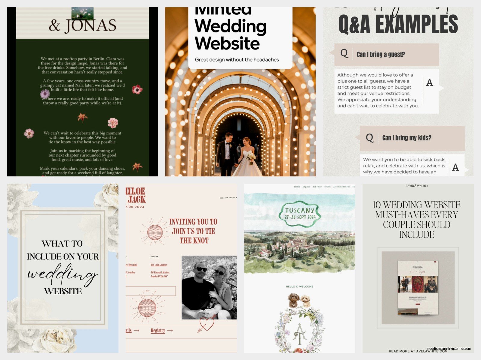
If you’ve got the budget and you want something really unique, illustrated sites are stunning. These feature custom artwork—maybe a illustrated map of your venue area, custom portraits of you as a couple, hand-drawn icons for different sections, or illustrated representations of your venue and surrounding landmarks.
I worked with a couple who hired an illustrator to create this whimsical watercolor version of their barn venue with little details like their dog running around and the mountains in the background. It became the header image and then smaller illustrations were used throughout the site. It was probably the most beautiful wedding website I’ve ever seen but it also cost them like $800 just for the illustrations.
These work really well for destination weddings because you can illustrate local landmarks and create a visual guide for guests. Think little drawings of the hotel, the beach, nearby restaurants, the ceremony site all connected by a map-style layout.
The design itself usually keeps things simple so the illustrations can shine. White or light backgrounds, minimal text, and the artwork does the heavy lifting for visual interest.
Color Palette Ideas That Don’t Look Generic
Okay so everyone does blush and gold or navy and white but there are other options. I’ve seen really gorgeous sites using:
- Terracotta and olive green with cream—very earthy and warm
- Deep emerald with gold and ivory—feels luxe without being boring
- Rust orange with dusty purple and tan—southwest vibes
- Charcoal gray with coral and white—modern and fresh
- Chocolate brown with sage and cream—sophisticated and natural
The trick is picking colors that match your actual wedding palette but also look good on screens. Sometimes your reception colors don’t translate well to web design and that’s okay. You can use complementary colors for the site.
The Photo-Heavy Gallery Style
Some couples have tons of amazing engagement photos and they wanna show them all off. These sites are basically photo galleries with text overlaid or placed between images. Think big full-width photos, maybe some in black and white, with information sections floating on top of the images or positioned between photo blocks.
This style is super visual and works great if you’ve invested in a good engagement photographer. The photos become the design element so you don’t need much else decoration-wise.
I’ve seen this done really well with parallax scrolling effects where the background images move at a different speed than the text as you scroll. It creates this depth that’s pretty cool. But don’t go too crazy with effects because it can slow down the site and some older guests might be viewing on… well my cat just knocked over my coffee mug so I’m gonna need a second… okay back.
Where was I? Right, the photo-heavy sites can get slow if you’re not careful about image file sizes. Make sure whoever builds it optimizes the photos so the site loads quickly. Nothing worse than a gorgeous website that takes 30 seconds to load.
The Timeline/Storytelling Layout
This is a fun one where the entire site is organized chronologically. You start with how you met, then dating milestones, the proposal, engagement, and finally the wedding details. It’s like scrolling through your relationship timeline.
Design-wise these often use a vertical timeline graphic down the center or side of the page with content branching off. Photos, text boxes, and details are arranged along this timeline. It’s more narrative-driven than other styles.
I think these work best for couples who really wanna share their story and have guests feel connected to their journey. It’s maybe a bit more sentimental than some other approaches but if that’s your vibe then go for it.
Mobile Design Is Not Optional
Here’s the thing—and I cannot stress this enough—more than half your guests will view your website on their phones. Maybe even like 70% honestly. So whatever design you pick, it’s gotta look good on mobile.
I’ve seen so many beautiful desktop designs that turn into an unreadable mess on phones. Text overlapping, images not resizing properly, menus that don’t work, RSVP forms that are impossible to fill out on a small screen.
Most wedding website platforms now are mobile-responsive by default but you still need to preview it on your phone before you send it out. And not just your phone—check it on different devices if you can. What looks perfect on your iPhone might be weird on someone’s Android.
The Video Background Hero
Okay this is getting more popular and it can look really cool or really tacky depending on execution. Instead of a static photo at the top, you’ve got a video clip playing—maybe from your engagement shoot, drone footage of your venue, or a montage of clips.
The video is usually muted and loops continuously. Text overlays on top of it with your names and date. When done right, it’s eye-catching and sets a cinematic tone for the whole site.
When done wrong, it’s distracting and slows down your site. The video file needs to be compressed and optimized or it’ll take forever to load. And some people find auto-playing videos annoying (I kinda do tbh) so there’s that.
I had a couple in 2022 who did this with footage from their proposal—he proposed on a beach at sunset and had a friend secretly filming. They used like a 15-second clip of the beach waves as their background and it was actually really pretty. But they had to work with a developer to get the file size right so it wouldn’t crash people’s browsers.
Interactive Elements That Actually Add Value
Some sites incorporate interactive features beyond just basic navigation. I’m talking about:
- Embedded Google Maps that guests can click for directions
- RSVP forms that let you select meal choices and add song requests
- Photo upload features where guests can share their own photos from events
- Live Instagram or social media feeds pulling in posts with your wedding hashtag
- FAQ accordions that expand when clicked to keep the page from getting too long
These features make the site more functional but you don’t need all of them. Pick one or two that make sense for your situation. Destination weddings benefit from interactive maps. Music-loving couples might want the song request feature. But don’t add stuff just because you can.
Typography Combinations That Work
Pairing fonts is weirdly hard and I see people mess this up constantly. A good rule is to use one decorative/script font for main headers and one super readable font for everything else.
Some combinations I’ve seen work well:
– A delicate script like Allura or Great Vibes with a clean sans-serif like Montserrat or Lato
– A modern serif like Playfair Display with a geometric sans-serif like Poppins
– A romantic script like Sacramento with a traditional serif like Libre Baskerville
Whatever you pick, make sure body text is at least 16px font size. I see so many sites with tiny text that older guests cannot read without zooming in. And speaking of older guests, high contrast between text and background is important for accessibility—don’t put light gray text on a white background and call it elegant.
What Information You Can Skip
Not everything needs to be on your website. You don’t need a page about your wedding party with individual bios for each person—nobody reads those except the people featured and their moms. You don’t need your entire love story going back to middle school crushes. You don’t need a detailed explanation of why you picked each vendor.
Keep it to: when, where, dress code, accommodations, registry, RSVP, and maybe a brief story section. Everything else is extra. I’ve seen couples stress themselves out trying to include every possible detail when really guests just wanna know what time to show up and whether they can bring a plus-one.
Oh and one more thing—password protection is usually unnecessary unless you’re having a very private ceremony. It just creates one more barrier for guests who are already kinda confused about technology. I had a couple insist on password-protecting their site and then half their guests couldn’t remember the password and were texting them day-of asking for ceremony times because they couldn’t access the website. Just make it public, it’s fine.
Platform-Specific Design Considerations
Different website builders have different template styles and limitations. The Knot and WeddingWire templates tend to be more traditional and structured. Withjoy has cleaner, more modern templates. Minted offers really elegant designs with their signature stationery aesthetic. Zola’s templates are user-friendly but can look a bit generic if you don’t customize them.
If you want full design control, you might need to go with a platform like Squarespace or WordPress and build it yourself or hire someone. This gives you unlimited customization options but requires more technical skill or budget for a designer.
I usually recommend couples pick a platform that matches their comfort level with technology. If you’re not tech-savvy, stick with wedding-specific builders that have templates—they’re designed to be easy and include all the features you need like RSVP management built in. If you’re comfortable with web design or have budget to hire help, then something like Squarespace gives you more creative freedom