Planning Guides, Style Guide
Indian Wedding Card Design: Traditional Layout Ideas
Apr
The Ganesh Placement Thing Nobody Tells You About
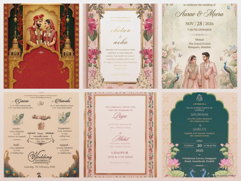
So the first thing with Indian wedding card design is that Lord Ganesh basically needs to be on there somewhere and honestly this tripped me up SO much when I first started working with Indian clients back in 2015. You can put him at the top center, which is the most traditional spot, or sometimes people do a small Ganesh symbol in the upper right corner. I had this bride in spring 2023 who wanted a super modern minimalist design but her grandmother absolutely insisted on Ganesh being prominent and we ended up doing this gorgeous compromise where we made him part of the border pattern in gold foil. It looked incredible and everyone was happy but man, those negotiations took like three weeks.
The placement matters because he’s the remover of obstacles, right? So you’re basically asking for blessings for the marriage before it even starts. Some families are super particular about the size and style of the Ganesh image. I’ve seen everything from intricate illustrations to simple line drawings to actual photos of Ganesh statues.
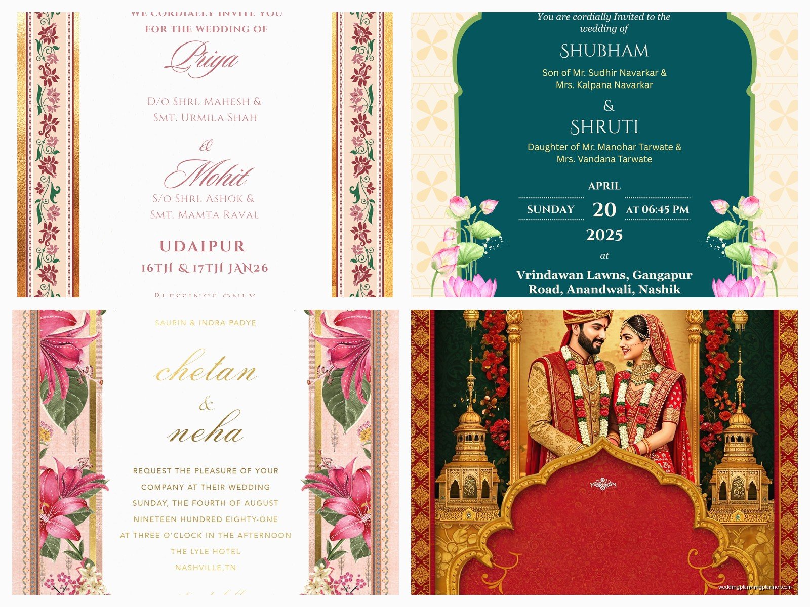
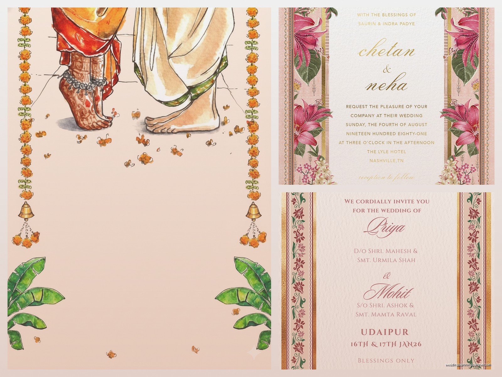
The Whole Parents’ Names First Situation
Okay so unlike Western wedding invitations where you might see “Together with their families” or whatever, Indian wedding cards traditionally list the parents’ names FIRST and prominently. Like, the parents are hosting this thing, and that’s made very clear in the layout.
You‘ll usually see it formatted something like:
- Mr. and Mrs. [Father’s name] (bride’s parents)
- Request the honor of your presence
- At the marriage of their daughter
- [Bride’s name]
- With
- [Groom’s name]
- Son of Mr. and Mrs. [Father’s name] (groom’s parents)
The hierarchy is super important here. I’ve had clients get genuinely upset when a printer accidentally made the groom’s parents’ names larger than the bride’s parents’ names. It’s not just aesthetics—it’s about respect and family structure and tradition. You gotta pay attention to these details because they matter way more than like, whether the font is pretty.
Color Schemes That Actually Work (And Why Red Isn’t Always Required)
Everyone thinks Indian wedding cards have to be red and gold, and yeah, that’s definitely the most traditional route. Red symbolizes prosperity and fertility, gold is for wealth and good fortune. But here’s what’s actually happening in 2024—people are branching out way more than they used to.
I’m seeing tons of:
- Deep maroons and burgundies with rose gold
- Royal blue with silver (especially for Sikh weddings)
- Emerald green with gold accents
- Blush pink with gold (this is getting really popular)
- Orange and fuchsia combinations for more vibrant celebrations
That said, you still wanna avoid black and white as primary colors because they’re associated with mourning in many Indian traditions. Some modern couples do use them as accent colors, but I usually advise against making them the main palette unless the family is specifically okay with it.
My cat knocked over an entire box of color samples once while I was working on a South Indian wedding invitation suite and honestly? The random combination he created was kind of gorgeous—this peacock blue mixed with coral. Didn’t use it for that client but I filed the idea away.
The Multi-Card Suite Layout
So here’s something that annoys me about online templates—they almost never account for the fact that Indian wedding invitations are usually not just ONE card. You’re looking at a whole suite situation, and the layout needs to work across multiple pieces.
Traditional Indian wedding card suites typically include:
- Main invitation card (this is the big one with all the ceremony details)
- Reception card (separate event, separate card)
- Ceremony cards for specific events like Mehndi, Sangeet, Haldi
- RSVP card or details card
- Insert cards for accommodation, directions, dress code
The layout challenge is keeping everything cohesive while making sure each card clearly indicates WHICH event it’s for. I usually recommend using the same border design across all cards but varying the interior layout or color intensity. Like, maybe the main wedding card is the most ornate, and the other cards are slightly simplified versions.
Border Designs and Paisley Patterns
The borders are honestly where you can get really creative with traditional Indian wedding card layouts. Paisley (which is called “mango” pattern in some regions) is probably the most common motif, but there’s so much more you can do.
Traditional border options include:
- Paisley/mango patterns in repeating designs
- Lotus flowers (super auspicious for Hindu weddings)
- Peacock motifs (represents beauty and grace)
- Elephant designs (strength and wisdom)
- Mandala patterns (geometric and spiritual)
- Floral vines and leaves
- Damask patterns (more fusion style but still works)
The layout usually works best when you create a frame effect—borders on all four sides with the text centered in the middle. But I’ve also done designs where the border is only on the top and bottom, or even just an asymmetrical border on one side for a more modern look.
One thing I learned the hard way: if you’re doing intricate border work, leave enough white space (or colored space, whatever your background is) around the text. During a really stressful situation in summer 2021, I had a client whose grandmother couldn’t read the invitation because I’d made the borders too busy and they encroached on the text area. We had to reprint 300 invitations. Not my finest moment, honestly.
Typography Choices for Traditional Layouts
Okay so the font situation is kinda tricky because you’re often dealing with multiple languages on one card. A lot of Indian wedding invitations include text in both English and another language—Hindi, Tamil, Telugu, Gujarati, Punjabi, whatever the family speaks.
For the English portions, I usually go with:
- Serif fonts for a classic, formal look (think Garamond, Trajan, or Cinzel)
- Script fonts for names and decorative elements (but keep them readable—no one wants to squint at your gorgeous calligraphy)
- Sans-serif for modern fusion designs
The layout gets complicated when you’re including Sanskrit shlokas (verses) or prayers at the top of the invitation, which is pretty traditional. These are usually in Devanagari script and need to be prominently placed, often right after the Ganesh symbol. You’ll want to make sure your printer can actually handle these characters properly because I’ve seen some disasters where the special characters got all messed up.
The Folding Styles and Physical Layout
Indian wedding cards come in so many different physical formats and the layout changes depending on which style you choose. Let me break down the most common ones:
Single Fold (Book Style): This is like a greeting card. Cover has decorative elements, maybe names or Ganesh symbol, inside spread has all the invitation text. Layout-wise, you’re designing for a two-page spread once it opens.
Gatefold: Two doors that open from the center. The layout here is really dramatic because you can hide information behind the “doors” and reveal it when they open. Usually the cover has minimal text (maybe just “Wedding Invitation” or a symbol) and all the details are inside.
Scroll Invitations: These are rolled up, often in a box or cylinder. The layout is vertical and continuous, like designing a long webpage. You gotta think about how information unfolds as they unroll it.
Boxed Invitations: The most elaborate option where everything comes in a decorative box. Multiple cards are stacked or arranged inside. Layout-wise, you need to think about the order people will encounter each piece.
Accordion Fold: Multiple panels that fold out. Great for when you have lots of events to list because each panel can be a different ceremony.
I personally love the gatefold for traditional designs because the reveal moment is just *chef’s kiss* but they’re also more expensive to produce and assemble.
Text Layout Hierarchy That Makes Sense
The order of information on a traditional Indian wedding card follows a pretty specific hierarchy, and messing with it too much can feel off to people who are used to the traditional format.
Here’s the typical flow from top to bottom:
- Ganesh symbol or religious symbol
- Sanskrit shloka or prayer (if including one)
- Bride’s parents’ names and hosting statement
- “Request the honor of your presence” or similar phrasing
- Bride’s name
- “With” or “&” or “to”
- Groom’s name
- Groom’s parents’ names
- Date, time, and day of the week
- Venue name and address
- Additional ceremonies or events with their timings
- RSVP information
Some families want the groom’s name first, especially in certain regional traditions, so always check with your clients about their preferences. I never assume anymore after I got it wrong once and had to explain to a very traditional Gujarati family why I’d laid it out “backwards.”
Regional Variations You Should Know About
So like, “Indian wedding card” is actually way too broad because there are SO many regional differences in layout and design traditions. Let me just touch on a few:
South Indian (Tamil, Telugu, Kannada, Malayalam): Often includes images of deities specific to the region, lots of temple-inspired architectural elements in borders, sometimes uses banana leaf motifs. The layout tends to be more symmetrical and includes more religious text.
North Indian (Punjabi, Hindi-speaking regions): Brighter colors generally, more use of floral patterns, often includes Sikh religious symbols like the Khanda for Sikh weddings. Layout can be a bit more flexible and modern.
Gujarati: Swastik symbols are really common (it’s an auspicious Hindu symbol, nothing to do with the Nazi appropriation of it), lots of folk art influences, bright and vibrant color schemes.
Bengali: Alpana (traditional art) patterns, sometimes includes images of conch shells, more likely to use red and white color schemes, layout often includes more poetic language.
I’m definitely generalizing here and every family is different, but these are patterns I’ve noticed over the years working with different communities.
Modern Fusion Layouts (When Traditional Meets Contemporary)
Alright so more and more couples want something that feels traditional but also reflects their modern sensibilities. The layout for fusion designs is where I actually have the most fun because you’re not bound by all the rules but you’re still nodding to them.
Some fusion layout ideas that work really well:
- Traditional border with modern minimalist text layout in the center
- Watercolor backgrounds with traditional motifs
- Geometric patterns inspired by traditional mandalas but rendered in contemporary style
- Photography incorporated into the design (not traditional at all, but some couples love it)
- Asymmetrical layouts that still include all the traditional elements
- Laser-cut overlay cards where the traditional pattern is cut out and reveals modern design underneath
The key with fusion is making sure you’re not accidentally disrespecting any traditions while you’re being creative. I always run fusion designs by the family, especially elders, before finalizing because what looks cool to me might be inappropriate in ways I don’t understand.
Embellishments and How They Affect Layout
Traditional Indian wedding cards are often pretty embellished, and you gotta account for this in your layout planning. When you’re adding physical elements, they take up space and affect readability.
Common embellishments include:
- Foil stamping (gold, silver, rose gold, copper)
- Embossing and debossing
- Rhinestones or crystals
- Ribbon or tassel ties
- Wax seals
- Fabric elements (silk, brocade)
- Laser cutting
Your layout needs to leave room for these elements. Like, if you’re planning to add a ribbon tie down the center of a folded card, don’t put important text right where the ribbon will go. Sounds obvious but I’ve seen it happen.
Also, embellishments add weight, which affects postage costs. This isn’t really a layout issue but it’s something to keep in mind when you’re designing because your gorgeous creation might need extra postage and your clients might not be happy about that surprise.
The Insert Cards Layout Strategy
Since Indian weddings usually have multiple events, you’re gonna need insert cards for all the different ceremonies. The layout strategy here is about creating a visual system that makes sense.
I usually recommend:
- Same size cards for all inserts so they stack neatly
- Color coding each event type (Mehndi in green, Sangeet in purple, etc.)
- Consistent header treatment across all cards
- Icons or small illustrations that indicate which event (henna cone for Mehndi, musical notes for Sangeet)
- Clear date and time prominently displayed
- Dress code mentioned on each card since it changes by event
The main invitation card should be obviously the “main” one—larger, more ornate, heavier cardstock. The inserts should feel like they belong to the same family but are clearly secondary pieces.
Wording Layout for Different Hosting Scenarios
Sometimes it’s not just the bride’s parents hosting, and the layout needs to accommodate different scenarios. Like what if both sets of parents are hosting together? Or what if the couple is hosting their own wedding? Or grandparents are involved?
The layout shifts depending on who’s listed as hosts. For joint hosting by both families, I usually center everything and list both sets of parents at the same level, sometimes with “together with” between them. When the couple is hosting, their names go at the top and you skip the whole parents’ names first thing—though some couples still include their parents’ names lower down as a sign of respect.
There was this whole thing where a client wanted to include her grandmother who raised her but also her biological parents who she wasn’t close with, and we spent hours figuring out the layout and wording that honored everyone appropriately. Layout isn’t just about what looks good—it’s about navigating family dynamics and making sure everyone feels… I don’t know, I guess seen and respected.
One more thing about paper weight—use at least 250gsm cardstock for the main invitation card because anything lighter feels cheap and doesn’t support embellishments well. The inserts can be slightly lighter, like 170-200gsm, but the main card needs to feel substantial in your hands. This is especially true for traditional layouts with lots of decorative elements because you want the card to feel as elaborate as it looks.