Planning Guides, Style Guide
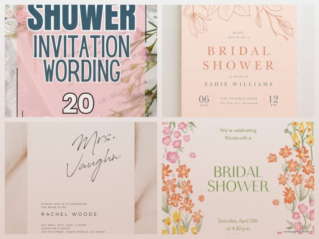
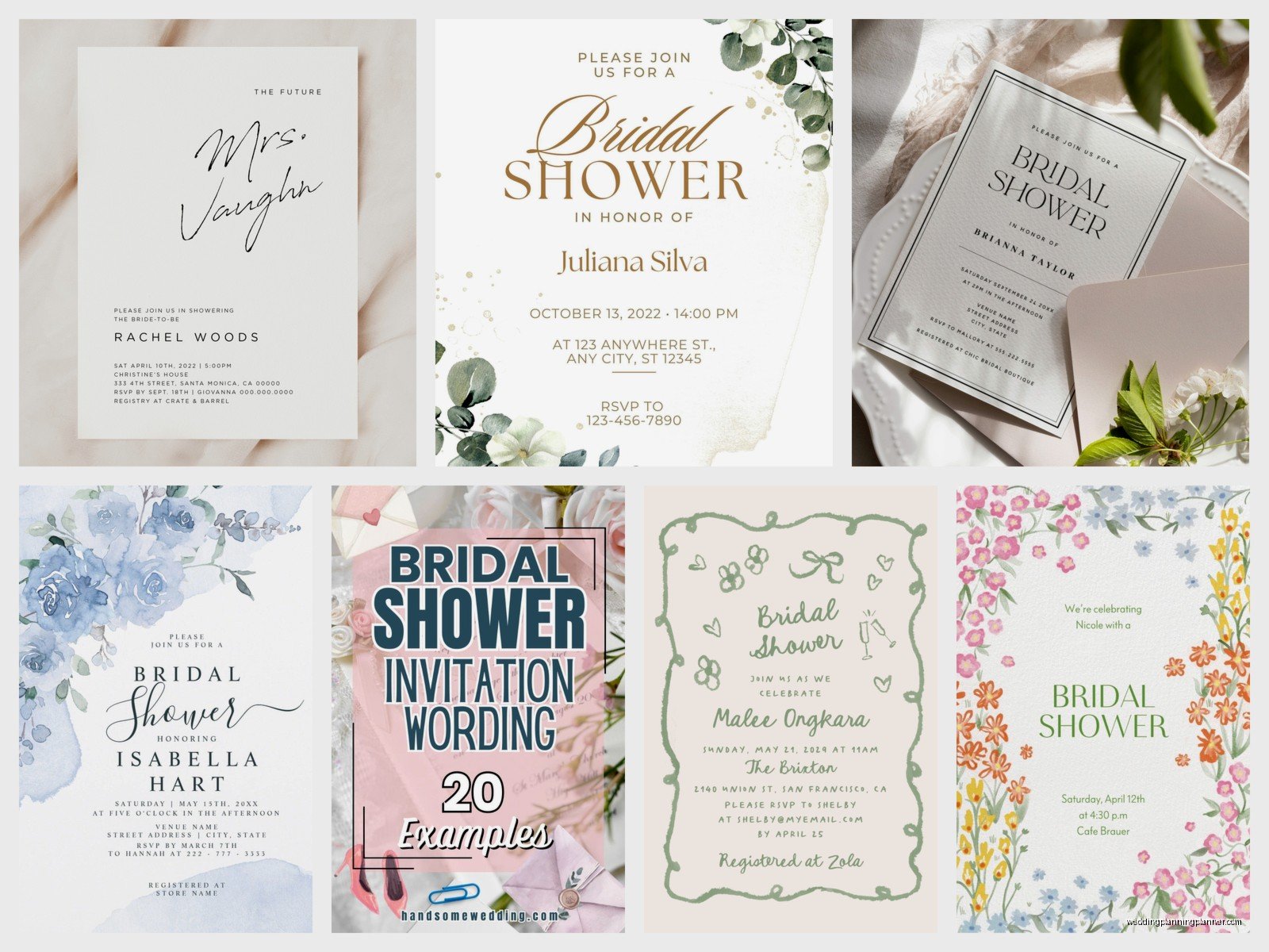
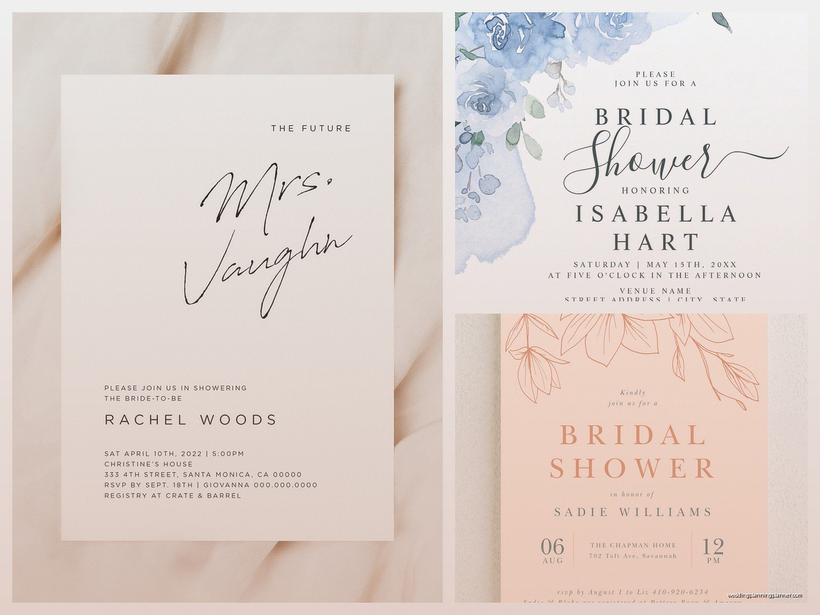
Sample Bridal Shower Invitations: Party Design Examples
Mar
Garden Party Invitations That Don’t Look Like Your Grandma’s Tea Party
Okay so garden party invites are having this whole moment right now and honestly I get why. They’re elegant but not stuffy, which is exactly what most brides want. The key here is botanical illustrations without going full-on jungle explosion.
I did this bridal shower back in spring 2023 where the bride wanted “garden vibes” and her sister ordered these invitations covered in like, every flower known to mankind. It was SO busy that you could barely read the actual shower details. We ended up having to reprint them with just eucalyptus sprigs and soft watercolor roses in the corners, and suddenly it looked expensive instead of chaotic.
For garden party designs, stick with one or two botanical elements max. Greenery along the borders works great – eucalyptus, olive branches, ferns. Add maybe one floral accent in a muted color palette. Sage green, dusty rose, cream, soft lavender. The text should be in a mix of script and serif fonts, but don’t go crazy with the script or it becomes unreadable for anyone over 50.
Sample wording that actually works: “Please join us for a Garden Bridal Shower honoring [Bride’s Name]” with the date, time, venue name and address clearly listed. RSVP info goes at the bottom with a date that’s at least two weeks before the shower. Include whether it’s gonna be outdoors so guests know to bring a cardigan or whatever.
Modern Minimalist Designs (Because Sometimes Less Really Is More)
These are my favorite to work with honestly because there’s less room for error. Clean lines, lots of white space, maybe one geometric element. The brides who choose these are usually pretty decisive and know what they want, which makes my job easier.
The design should have a simple border – think thin gold lines forming a rectangle or hexagon shape. Single color text, usually black or a deep navy. Maybe one small icon like a diamond ring or champagne glasses, positioned at the top center. That’s it. Don’t add more stuff just because there’s empty space. The empty space IS the design.
Font choices matter here more than anywhere else because there’s nothing to hide behind. You want a clean sans-serif for the main information and maybe a delicate serif for the bride’s name to make it stand out. No script fonts on minimalist invites unless you really know what you’re doing with font pairing.
One thing that annoys me SO much is when people try to do minimalist but then add like seventeen different font sizes. Pick three max – one for headers, one for body text, one for accent details. Stick with it. I’ve seen invitations that look like a ransom note because someone discovered the font dropdown menu and lost their mind.
Wording for Minimalist Invites
Keep it simple and direct. “A Bridal Shower for Emma Chen” as the header. Then date, time, location stacked neatly in the center. Registry information can go in smaller text at the bottom or honestly just put it on a separate details card. RSVP info with a phone number or email. Done.
Vintage Tea Party Aesthetics
Alright so vintage tea party invites are tricky because they can go wrong in like five different directions. Too literal and you’ve got actual teacups clipart happening (nah). Too antique-looking and it feels like you’re attending a historical reenactment instead of a bridal shower.
The sweet spot is vintage-inspired with modern touches. Think art deco borders, muted color palettes from the 1920s-1940s era – blush pink, mint green, gold accents. Delicate lace patterns as background elements, but make them subtle. The font should have that vintage feel but still be completely readable.
I worked with this bride whose mom wanted a vintage theme because she was obsessed with Downton Abbey or something, and we found these beautiful invitations with a soft cream background, thin gold art deco corner designs, and the text in this gorgeous 1920s-style font that was still totally clear. Added a tiny teacup illustration at the bottom center. Perfect.
For wording, you can get a bit more formal here since it matches the aesthetic: “You are cordially invited to a Bridal Tea celebrating the upcoming marriage of…” Sounds fancy but appropriate for the theme. Include dress code if there is one – “Garden attire suggested” or “Sundresses and fascinators welcome” gives people guidance.
Tropical and Destination Vibes
These work great for destination showers or when the wedding itself is somewhere tropical. Palm leaves, monstera prints, hibiscus flowers in bright colors. The palette here can be bold – coral, turquoise, hot pink, sunny yellow.
But here’s where people mess up – they make it look like a luau party instead of a bridal shower. You still need elegance. So instead of tiki torches and coconuts, think watercolor palm fronds in the corners, gold foil text, and maybe a subtle pineapple icon. Keep the tropical elements sophisticated.
My cat knocked over my coffee all over a sample set of these once and honestly the water damage kinda made them look more watercolor-y, but anyway… the point is that even with bold colors and tropical themes, the layout should stay clean and organized.
Tropical Invitation Wording
You can be playful here: “Let’s get this party started! Join us for a Tropical Bridal Shower” or “Aloha! You’re invited to celebrate [Bride’s Name]” – just don’t go overboard with the puns. One tropical reference is enough. Then standard info: date, time, place, RSVP details. Mention if there’s a theme dress code like “Tropical attire encouraged” so people don’t show up in winter sweaters.
Rustic Barn and Farmhouse Styles
Okay so the rustic trend has been going strong for like a decade now and I thought it would die out but nope, still going. Wood grain textures, burlap patterns, mason jar illustrations, wildflowers, twine details.
The key to making these not look cheap is the paper quality and printing method. A rustic design printed on flimsy cardstock looks sad. Same design on thick kraft paper or textured cardstock with good quality printing? Suddenly it’s charming and intentional.
Design-wise, think wood background texture with white or cream text overlay. Wildflower bouquets in the corners – daisies, baby’s breath, sunflowers depending on the vibe. Maybe a subtle banner ribbon element for the bride’s name. String lights illustrations work if you don’t overdo it.
During this one wedding planning season summer 2021 I swear every single shower was rustic themed and I started dreaming about burlap, which sounds weird but it happened. Anyway I learned that mixing rustic with one unexpected element makes it more interesting – like rustic background with modern geometric shapes, or farmhouse vibes with gold foil accents.
Wording can be casual and warm: “Let’s shower the bride-to-be! Join us for a Rustic Celebration” with all the standard details. Location is extra important here – if it’s actually at a barn or farm, great, but if it’s at someone’s suburban house the rustic theme might feel random unless the decor matches.
Elegant Formal Invitations
For the traditional bride who wants classic elegance. These invitations use formal fonts, usually black or navy text on white or cream cardstock. Maybe a subtle damask pattern as a background or border. Possibly a monogram with the bride’s initial.
The paper quality matters most here because there’s nowhere to hide – no bright colors or busy patterns to distract from cheap printing. You want heavy cardstock, maybe with a slight texture. Engraved or letterpress printing if the budget allows, otherwise high-quality digital printing that doesn’t look pixelated.
Layout should be centered and symmetrical. Every element balanced. If you have a decorative element on the left, you need one on the right. The bride’s name gets the fanciest font treatment, everything else in clean serif fonts.
Formal wording is expected: “You are cordially invited to attend a Bridal Shower in honor of Miss Sarah Elizabeth Thompson” – using full names, proper titles, complete dates spelled out (Saturday, the fifteenth of June, two thousand twenty-five). Time should say “two o’clock in the afternoon” not “2pm.” RSVP information can say “Kindly respond by” instead of just “RSVP by.”
Boho and Whimsical Designs
Boho invites have this free-spirited feel with feathers, dreamcatchers, pampas grass, macrame patterns, and earthy tones. Terracotta, cream, sage green, dusty blue. The fonts should be flowy but not overly scripted – you want that handwritten feel without being illegible.
These invitations work well with asymmetrical layouts, which is different from most other styles. Text doesn’t have to be perfectly centered. Elements can feel more organic and flowing. Watercolor washes as backgrounds, hand-drawn illustrations of feathers or arrows.
I gotta say though, boho can go wrong fast if you add too many elements. Pick your theme – is it feathers and dreamcatchers? Or is it pampas grass and desert vibes? Or is it floral and flowing? Mixing all of them makes it look confused instead of whimsical.
Boho Wording Approach
You can be more casual and personal: “Join us under the sun and stars to celebrate [Bride’s Name]” or “Let’s gather to shower our bride with love and laughter.” The language can be warmer and less formal than traditional invites. Still include all the necessary details but the tone can be relaxed.
Practical Printing and Paper Considerations
Okay so you’ve picked your design style but now you actually have to… print these things. Standard invitation size is 5×7 inches, which fits nicely in an A7 envelope. You can do 4×6 for a smaller option or go bigger with 5.5×8.5, but then you need custom envelopes which gets pricey.
Paper weight matters – at minimum you want 80lb cardstock, but 100lb or 110lb feels more substantial. Matte finish is classic and works for almost everything. Glossy can work for modern or tropical designs but feels cheap for rustic or vintage themes.
Print method options: digital printing is most affordable and totally fine for most designs. Letterpress is gorgeous and has that pressed-in texture but costs way more. Foil printing adds metallic accents and looks expensive because it kinda is. Thermography creates raised text and falls somewhere in the middle price-wise.
Order at least 10-15% more invitations than you think you need because addresses get messed up, invites get lost in the mail, or suddenly three more people need to be invited and you’ll want matching invitations instead of a random different batch.
What Actually Needs to Be On Every Invitation
Regardless of design style, every bridal shower invitation needs these elements or people will be confused and you’ll get a million questions:
- The bride’s full name (first and last at minimum)
- That it’s specifically a bridal shower – sounds obvious but I’ve seen invites that just say “celebration” and guests thought it was the actual wedding
- Date spelled out completely
- Start time (and end time if there’s a specific endpoint)
- Full venue address including city and zip code
- RSVP deadline and method (phone, email, or online)
- Host names (usually at the bottom in smaller text)
- Registry information or “no gifts please” if applicable
Optional but helpful info: parking instructions, dress code, whether it’s a surprise shower, if guests should bring recipes or advice cards, theme details if there’s a specific one.
Digital vs Physical Invitations
Look, I’m a stationery person so I love physical invitations, but digital ones have their place. For casual showers, friend groups that are all digital-native, or last-minute planning, services like Paperless Post or Greenvelope work fine. You get design templates, easy RSVP tracking, and no printing costs.
But for more formal showers, traditional brides, or when you’re inviting older relatives who aren’t super online, physical invitations show more effort and thoughtfulness. Plus they can be kept as keepsakes, which you can’t really do with an email… I mean you can but it’s not the same.
Some people do both – physical invitations for close family and wedding party, digital for extended friends or coworkers. Just make sure the designs match or at least coordinate so it doesn’t look totally random.
Coordinating Insert Cards
Sometimes you need extra cards to include with the invitation. Registry cards listing where the bride is registered (though some people find this tacky and prefer to share registry info only when asked). Details cards with directions, parking info, or hotel recommendations for out-of-town guests. Recipe cards if you’re doing a recipe shower theme where everyone brings a favorite recipe.
These should match the invitation design but can be smaller – like 4×6 or even business card sized. Same color palette, same fonts, same overall aesthetic. Nothing looks worse than a beautiful invitation with a random mismatched insert card that someone clearly made in Microsoft Word at the last minute.
Envelopes matter too actually – they’re the first thing people see. Printed return addresses look more polished than handwritten or labels. Envelope liners in coordinating colors or patterns add a nice surprise when someone opens it. Calligraphy addressing is gorgeous but expensive, so that’s a splurge item if budget allows or you know someone with nice handwriting who owes you a favor.