Planning Guides, Style Guide
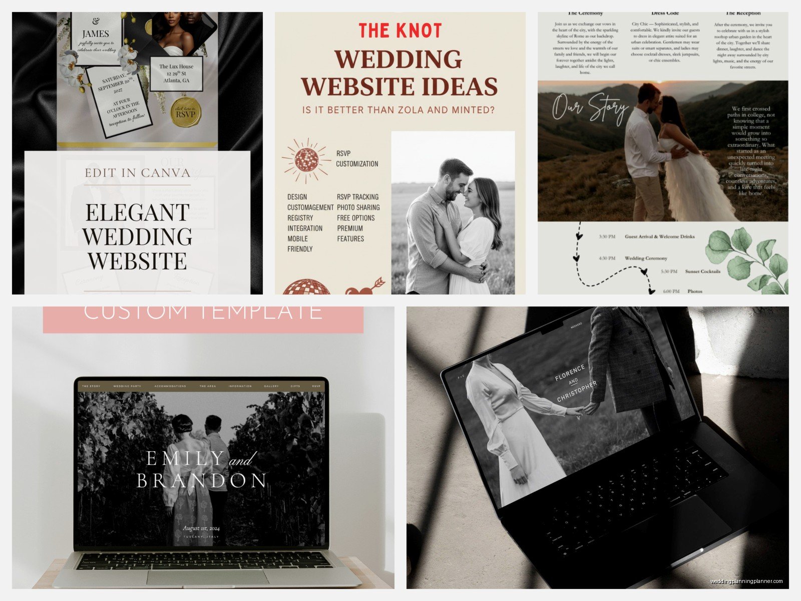
The Knot Website Themes: Brand Review & Guide
Mar
okay so The Knot website themes are basically your starting point
The Knot’s website builder comes with a bunch of pre-made themes and honestly they’re kinda hit or miss depending on what vibe you’re going for. I remember back in spring 2023 I had this couple who spent THREE HOURS just clicking through all the theme options because they couldn’t decide if they wanted “Romantic Garden” or “Modern Minimalist” and I was just sitting there thinking about my cat knocking over my coffee that morning while pretending to be super invested in their decision.
The themes are organized into categories which is helpful but also overwhelming. You’ve got like Classic, Modern, Rustic, Whimsical, and a few others. Each category has maybe 4-8 theme variations and they all come with different color palettes and layout structures.
What You Actually Get With Each Theme
So when you pick a theme on The Knot, you’re getting a pre-designed template that includes your homepage layout, your RSVP page structure, registry page, photo galleries, and all those essential wedding website pages. The thing is—and this really annoyed me when I first started recommending The Knot to clients—you can’t actually see ALL the pages in the preview. You only see the homepage preview and maybe one other page, so you’re kinda buying blind on how your travel info page is gonna look.
Each theme has:
- A header design (where your names go, sometimes with a photo background)
- Navigation menu styling
- Pre-set fonts for headings and body text
- Color scheme with usually 2-3 main colors
- Layout for your wedding details section
- RSVP form design
- Photo gallery grid or slideshow setup
The customization options are decent but not amazing. You can swap out colors, change fonts from their dropdown menu (they have maybe 20-30 font options), and upload your own photos for headers and backgrounds. But you can’t like, completely redesign the layout structure or move sections around freely.
Breaking Down the Main Theme Categories
Classic Themes
These are your safe bet themes. They usually have elegant serif fonts, soft color palettes (lots of blush, navy, ivory options), and traditional layouts. The “Elegant” theme is probably their most popular in this category and I’ve seen it used at least 40 times by now. It’s got this clean header with your names in a script font, a neutral background, and everything is centered and symmetrical.
Good for: Traditional weddings, church ceremonies, country club receptions, couples who want something that won’t look dated in photos five years from now.
The problem with Classic themes is they can look kinda boring if you don’t add your own personality through photos and custom text. I always tell clients to at least change the default color palette because the standard ivory-and-gold combo is so overdone.
Modern Themes
Modern themes on The Knot lean minimal with lots of white space, sans-serif fonts, and geometric elements. The “Urban Chic” theme is one I actually really like—it has this cool asymmetrical layout and uses a lot of negative space which makes your photos pop.
These themes usually have:
- Clean lines and geometric shapes
- Bold typography
- Black and white or monochromatic color schemes
- Full-width photo sections
- Minimal decorative elements
Good for: City weddings, loft venues, couples who have a strong visual brand already, millennials who hate anything that looks “too wedding-y”
The downside is that modern themes can feel cold if you don’t warm them up with personal touches or… wait I’m getting ahead of myself here.
Rustic Themes
Okay so rustic themes were EVERYWHERE like 2015-2020 and they’re still pretty popular but the aesthetic has evolved a bit. The Knot’s rustic themes usually feature wood textures, kraft paper backgrounds, greenery graphics, and handwritten-style fonts.
The “Woodland Romance” theme is a good example—it’s got this forest green and brown color palette with little leaf illustrations and a texture overlay that’s supposed to look like wood grain or burlap or something.
Good for: Barn weddings, outdoor ceremonies, vineyard receptions, fall weddings
What annoys me about rustic themes is they can look really busy and cluttered especially if couples add too many additional graphic elements. Like you already have the wood texture AND the leaf graphics AND the script fonts—you don’t need to also add mason jar clipart to every page.
Whimsical/Romantic Themes
These are the themes with florals, watercolor effects, soft pastels, and lots of decorative flourishes. “Garden Party” and “Watercolor Blooms” fall into this category and they’re super popular for spring and summer weddings.
You’ll see:
- Floral borders and corner decorations
- Watercolor wash backgrounds
- Delicate script fonts
- Soft color palettes (lots of lavender, peach, mint, blush)
- Romantic language in the default text
Good for: Garden weddings, romantic venues like historic estates, couples who love flowers and soft feminine aesthetics
These themes can go from beautiful to overwhelming real quick. I had a bride in summer 2021 who picked the most floral theme possible and then wanted to add even MORE flower graphics and it just became this explosion of petals that made the actual information hard to read.
The Customization Reality Check
So here’s what you actually need to know about customizing these themes because The Knot’s marketing makes it sound like you can do whatever you want but that’s not really true.
You CAN change:
- Colors (usually 2-3 main colors in the palette)
- Fonts from their preset list
- Header images and background photos
- Text content obviously
- Which pages you include or hide
- Some spacing and padding options
You CANNOT change:
- The fundamental layout structure
- Where major elements are positioned
- The navigation menu style (it’s stuck in their format)
- Font sizes beyond basic small/medium/large options
- Add custom CSS or HTML
- The RSVP form fields beyond adding optional questions
This is probably the biggest source of frustration I see with couples using The Knot. They pick a theme thinking they can customize it extensively and then realize they’re kinda locked into that design framework.
The Photo Situation
Every theme handles photos differently and this is actually super important to consider. Some themes are photo-heavy with big full-width image sections on the homepage, while others use photos more sparingly with smaller thumbnail galleries.
If you’re a couple who did an engagement shoot and has gorgeous professional photos, you definitely want a photo-forward theme. But if you’re just gonna use iPhone snapshots or don’t have many photos yet, pick a theme that doesn’t rely so heavily on imagery because empty photo placeholders or low-quality images will make even the prettiest theme look bad.
Matching Your Theme to Your Actual Wedding
This is where I get kinda passionate because I see couples make this mistake all the time—they pick a website theme based on what looks pretty in the preview without thinking about whether it matches their actual wedding aesthetic.
Your website theme should coordinate with your invitations and your overall wedding design. It doesn’t have to match perfectly but it shouldn’t clash. If you’re doing modern black-tie wedding with sleek invitations and a monochromatic palette, don’t pick the rustic theme with wood textures just because you think it looks cute.
I always recommend:
- Pick your invitations first (or at least nail down your color palette and style)
- Then choose a website theme that complements that aesthetic
- Use the same colors on your website that you’re using in your invitations
- Keep the formality level consistent (formal invite = classic theme, casual invite = modern or whimsical theme)
One thing that really helped my clients was creating a simple brand board before they started designing anything. Just a Pinterest board or even a Google doc with their colors, a few inspiration photos, and the general vibe they’re going for. Then when you’re scrolling through theme options you have something concrete to reference instead of just going with whatever catches your eye first.
Mobile Responsive Stuff You Should Check
Most of your guests are gonna view your website on their phones let’s be real. The Knot themes are all mobile-responsive which means they automatically adjust for smaller screens but some themes handle this better than others.
The themes with simpler layouts tend to look better on mobile. The really decorative themes with lots of graphic elements sometimes get weird on phones—text can overlap with graphics, images get cropped in awkward ways, or the navigation becomes clunky.
Before you finalize your theme choice, definitely preview it on your phone. The Knot has a preview option but also send the link to yourself and look at it on your actual device because the preview isn’t always 100% accurate.
Loading Speed Issues
Some of the more graphics-heavy themes load slower especially if you upload a bunch of high-res photos. This isn’t usually a huge problem but I did have one couple whose website was so slow to load that guests were complaining they couldn’t RSVP.
If you pick a theme with lots of background images or decorative elements, compress your photos before uploading them. You don’t need 5MB image files for a website—around 200-300KB per image is plenty and it’ll load way faster.
The Colors Thing Everyone Gets Wrong
Each theme comes with a default color palette but you can customize it and honestly you SHOULD customize it because the default palettes are so generic. But here’s what trips people up—The Knot’s color picker doesn’t always show you where each color is being applied until after you change it.
So like, you might change “Color 1” thinking it’s just your header text but then it also changes your button colors and link colors and suddenly nothing looks right. My advice is to change one color at a time and then scroll through your entire website to see where that color appears before you move on to the next one.
Also pick colors that have enough contrast for readability. Light gray text on a white background might look sophisticated but your guests can’t read it. The RSVP section especially needs to be super clear and readable.
Theme-Switching Mid-Planning
You can change your theme after you’ve already set up your website but it’s kinda a pain. All your content stays (your text, photos, event details, etc.) but the layout changes so you’ll need to go through and reformat everything to fit the new theme’s structure.
I had a couple switch themes like two months before their wedding and we spent an entire afternoon redoing their whole website because sections that looked good in the old theme looked terrible in the new one. So really think through your choice at the beginning or you’re gonna create extra work for yourself later.
The one situation where switching makes sense is if you picked a theme super early in your planning (like right after getting engaged) and then your whole wedding aesthetic evolved into something completely different. That happened to me with a fall 2023 wedding where they initially wanted rustic and then shifted to modern industrial once they booked their venue.
Honestly the Best Approach
Look I’m not gonna tell you there’s one perfect theme because it totally depends on your specific situation. But after helping like a hundred couples set up Knot websites, here’s what I think works best:
Start with your venue and invitations. Those usually dictate your overall aesthetic more than anything else. Then filter The Knot themes by category that matches that aesthetic. Look at 3-4 options max—more than that and you’ll get decision paralysis.
Check each theme on both desktop and mobile. Make sure the RSVP page is clean and functional because that’s the most important page honestly. Pick the one that needs the LEAST amount of customization to match your vision because extensive customization is frustrating within The Knot’s limitations.
And don’t overthink it. Your guests care way more about the information on your website than what theme you picked. They need to know where to show up, when to show up, where to park, and where you’re registered. Everything else is just decoration.