Planning Guides, Style Guide
Wedding Brochure Examples: Sample Ideas & Examples
Apr
Wedding Brochure Basics That Actually Matter
Okay so wedding brochures are one of those things vendors either overthink completely or just throw together last minute and honestly both approaches drive me a little crazy. I’ve been doing wedding planning consultations since like 2009 and the number of times I’ve seen gorgeous couples hand me a brochure that’s basically just their logo repeated twelve times with zero actual information is… look, it’s a lot.
The whole point of your wedding brochure is to give potential clients something tangible they can take home and actually reference when they’re making decisions. Not something they glance at once and toss in their car where it gets buried under Starbucks receipts for three months.
What Actually Goes In A Wedding Brochure
You need your basic contact info obviously but also your packages and pricing structure. I know some vendors get weird about putting prices in print because they wanna have that conversation first or whatever but honestly people appreciate transparency. Spring 2023 I had this venue owner who refused to put ANY pricing in her materials and she kept complaining about tire-kickers wasting her time and I’m like… you’re literally making people jump through hoops just to find out if they can afford you.
Include your services broken down clearly. If you’re a photographer don’t just say “wedding photography services” because that means nothing. List out what’s included in each package – how many hours of coverage, how many edited images, whether you include engagement sessions, if there’s an online gallery, turnaround time for photos, all that stuff.
Your brochure should have actual photos of your work. Not stock images please for the love of everything. I see this with newer planners especially and it’s just… nah. Use real weddings you’ve done even if they’re not perfect. People want to see YOUR aesthetic not some random couple from Shutterstock.
Layout Styles That Work
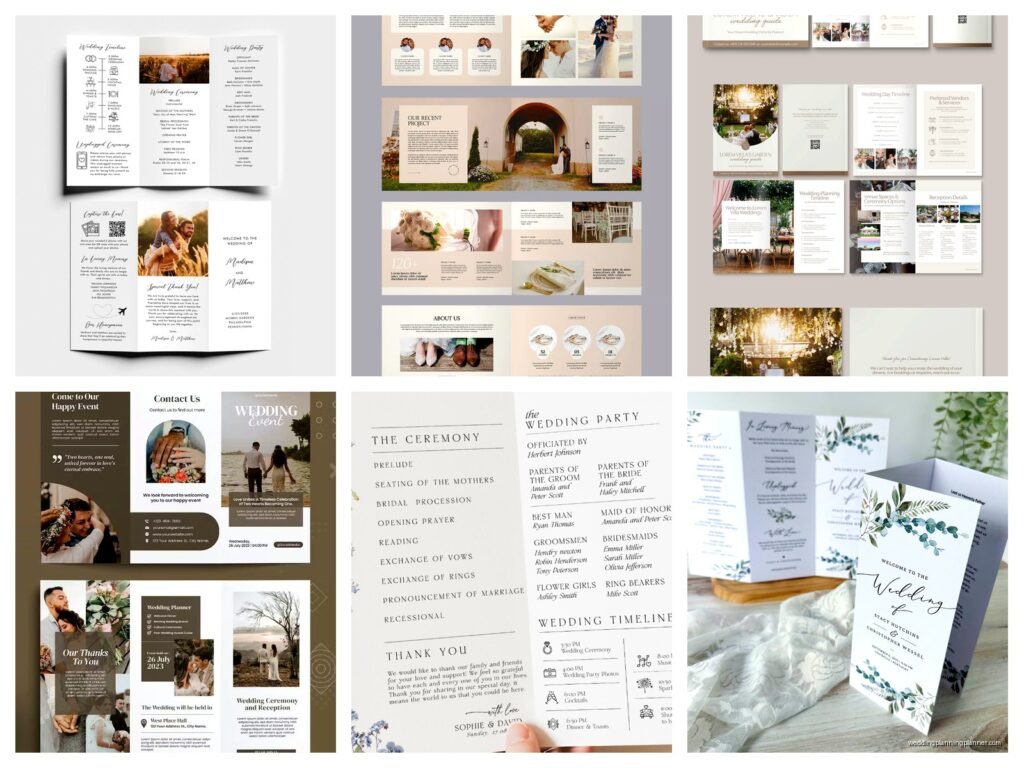
The trifold brochure is classic for a reason. You can fit a decent amount of info without overwhelming people and it fits in a standard envelope if you need to mail it. I usually recommend putting your most eye-catching work on the front panel, your introduction and philosophy on the inside left, packages in the center, and testimonials or FAQ on the right panel.
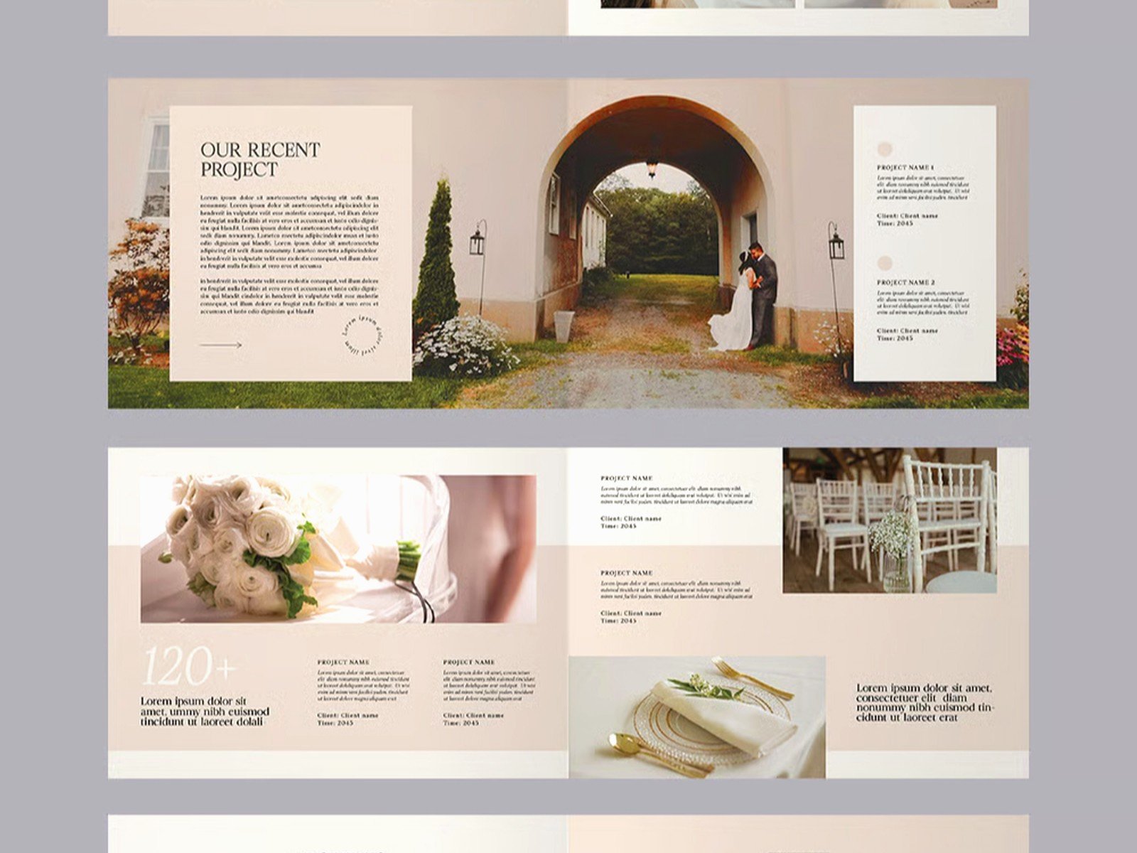
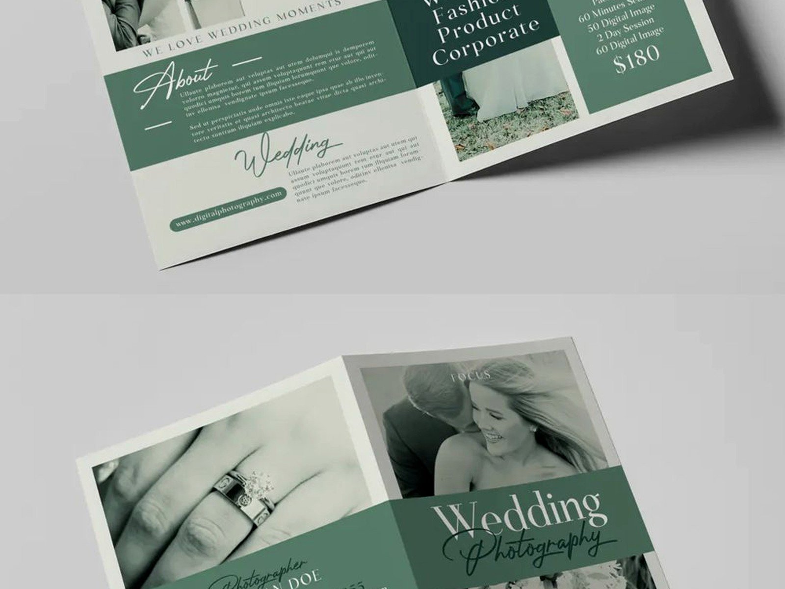
Bifold brochures give you more space for larger images which is great if you’re a photographer or florist where visuals really sell your work. The outside can be almost like a mini portfolio and then inside you get into the details.
Booklet style brochures are kinda extra but sometimes they work for full-service planning companies or venues that need to show off a lot of different spaces and options. Just don’t go overboard – I’ve seen 20-page brochures and nobody’s reading all that during the decision-making process.
Single-sheet brochures work fine too especially if you’re on a budget. You can do a nice 8.5×11 printed front and back with your key info. Not as fancy but it gets the job done.
Design Elements People Actually Notice
Color scheme should match your brand but also be readable. I cannot stress this enough – I’ve seen so many brochures with like gray text on a slightly lighter gray background and it’s impossible to read without squinting. High contrast is your friend here.
Font choices matter more than you think. Stick to two fonts maximum – one for headings and one for body text. I see vendors mixing like four different script fonts and it looks like a ransom note honestly. Keep script fonts for accents only because they’re hard to read in paragraphs.
White space is not wasted space okay. This is something I had to learn myself because I used to try cramming every possible detail into my early brochures and they just looked cluttered and desperate. Give your content room to breathe. People’s eyes need places to rest.
Your logo should appear on the front and maybe once inside but you don’t need it on every panel. Same with decorative elements – a few elegant touches are better than borders and flourishes everywhere.
Content That Converts Browsers Into Bookers
Tell people WHO you are not just what you do. I always include a short personal paragraph about my background and approach to wedding planning. Nothing too long or braggy just like “I’ve been planning weddings for over a decade and my favorite part is watching couples actually enjoy their engagement instead of stressing over centerpiece heights” or whatever feels authentic to you.
Testimonials are huge. Include 2-3 short quotes from past clients with their first names and wedding date. Full names with last initials work too like “Sarah M. & Tom K.” People trust other people’s experiences way more than they trust your marketing copy.
Your packages need clear names and pricing tiers. Don’t call them weird cutesy things that don’t mean anything – I once saw a planner with packages named after gemstones and you had to read three paragraphs to figure out which was the basic package. Just call it something straightforward like “Essential Planning Package” or “Full Service Coordination.”
Include what makes you different but be specific. “Attention to detail” and “passionate about weddings” doesn’t tell me anything because literally every wedding vendor says that. Instead say something like “I specialize in multicultural weddings and have coordinated ceremonies in seven different faith traditions” or “I maintain relationships with 50+ local vendors and can usually get my clients preferred rates.”
Real Examples From My Files
Summer 2021 I completely redesigned my planning brochure because the old one was just… it wasn’t working. I had been using this very formal, traditional design with lots of gold foil accents and script fonts because I thought that’s what wedding clients expected. But I kept attracting clients who wanted super formal ballroom weddings when I actually prefer more relaxed, personal celebrations.
So I switched to a cleaner, more modern design with real photos from backyard weddings and intimate venues I’d worked at. Changed my package names from “Platinum” and “Gold” to “Full Planning” and “Month-Of Coordination” because that’s more clear about what you’re actually getting. Added a section about my planning philosophy which is basically that weddings should feel like YOU not like a Pinterest board. And my ideal client inquiries went up like 40% within six months.
For a florist brochure I consulted on, we did a square format which is less common but really showcased her arrangements. Each page featured one signature style – romantic garden, modern minimalist, bohemian wildflower – with a brief description and starting price range. On the back we included her delivery area, consultation process, and a note about seasonal availability which saved her so many emails from people asking if they could get peonies in September.
A venue brochure I helped with used a bifold design where the outside was a stunning photo of their ceremony space at sunset and inside we created a floor plan with capacity numbers, a list of what’s included in the rental, and a simple pricing chart broken down by season and day of the week. They also added a FAQ section that answered the top 10 questions they always got asked which was smart because it qualified leads before they even reached out.
Digital vs Print Considerations
You probably need both honestly. Print brochures are great for bridal shows, in-person consultations, and leaving with venue coordinators who might refer you. But most people will first see your brochure as a PDF they download from your website or you email to them.
For print make sure you’re using high resolution images – at least 300 DPI. I learned this the hard way in like 2012 when I printed 500 brochures and all the photos looked pixelated and blurry. Expensive mistake. Also use a professional printing service not just your home printer unless you’ve got a really good one and the right paper stock.
For digital PDFs you want to optimize the file size so it doesn’t take forever to download but still looks good. Keep it under 5MB if possible. Make sure all your links are clickable if you include your website or social media. And consider making it mobile-friendly since lots of people will view it on their phones.
Some vendors do QR codes now that link to their digital brochure or portfolio which is kinda smart because you can update the online content without reprinting everything. Just make sure the QR code is big enough to actually scan because tiny ones are annoying and half the time they don’t work.
Mistakes I See All The Time
Using too many different photos that don’t match stylistically. Your brochure should feel cohesive not like a random collection of weddings. If you shoot both traditional church weddings and edgy industrial warehouse weddings maybe create separate brochures for each market or at least group similar styles together.
Forgetting to update contact information. I cannot tell you how many times I’ve gotten brochures with old phone numbers or email addresses that bounce. Check this stuff before you print 1000 copies.
Making the text too small. If people over 45 need reading glasses to see your pricing you’ve messed up. Keep body text at least 10-11 point font, preferably 12.
Not including a clear call to action. What do you want people to DO after reading your brochure? Usually it’s schedule a consultation or visit your website. Make that obvious with something like “Ready to start planning? Contact me to schedule your complimentary consultation” or whatever fits your process.
The thing that really annoys me though is when vendors put more effort into making their brochure look pretty than making it useful. I’ve seen these gorgeous brochures with stunning design and like… no actual information about services or pricing. Just vibes and aesthetics. And sure, that might get people interested but it doesn’t help them make a decision or even know if you’re in their budget range or— okay I’m getting worked up about this but you get what I mean.
Budget-Friendly Options
Look, professional design and printing can get expensive. If you’re just starting out or keeping costs low there are totally viable alternatives that still look professional.
Canva has wedding brochure templates you can customize. Some are free, some are paid, but even the paid ones are cheaper than hiring a graphic designer. Just please don’t use them exactly as-is because then your brochure looks identical to fifty other vendors. Customize the colors, fonts, and layout enough to make it yours.
Vistaprint and similar services do decent quality printing at reasonable prices especially if you’re not doing anything fancy like foil stamping or unusual shapes. Their standard brochures on good paper stock look fine for most purposes.
You can also start with just a digital PDF brochure and only print small batches as needed. This lets you update information more frequently without wasting printed materials.
My cat just knocked over my coffee while I’m writing this which is perfect timing because I was gonna wrap up anyway… no wait, there’s more stuff about examples I should cover.
Industry-Specific Brochure Tips
For wedding planners your brochure should emphasize your process and what working with you actually looks like. Include timeline examples or a step-by-step overview of how you work with couples from booking to wedding day. People hiring planners want to know you’re organized and have systems in place.
Photographers need to show range – different lighting conditions, various venues, candid moments and posed portraits. Include information about your editing style and turnaround time because those are huge concerns for couples. Maybe add a note about what happens if you’re sick on the wedding day because everyone worries about that.
Venues should include capacity numbers for different setup styles, what’s included in the rental fee versus what costs extra, and any restrictions people should know about upfront like noise ordinances or vendor requirements. Floor plans are really helpful. So are seasonal photos if your space looks different throughout the year.
Caterers gotta include menu options obviously but also service style information, whether you provide rentals or just food, staffing details, and how tastings work. Dietary accommodation information is increasingly important too.
For DJs and bands include your music style range, equipment details, whether you MC the reception, and maybe a Spotify playlist link or something so people can get a sense of your vibe. Video clips work better but those don’t go in print brochures so maybe a QR code to your demo reel.
When To Update Your Brochure
At minimum review your brochure annually. Pricing changes, your style evolves, you add new services – all reasons to update. Also if you’re handing out brochures and they’re not generating the kind of inquiries you want that’s a sign something isn’t working and needs adjustment.
If you rebrand or change your business name obviously you need new brochures immediately. Same if you move locations or change your contact information.
When you have significantly better photos than what’s currently in your brochure it’s worth updating. Your brochure should always showcase your best, most recent work.
I usually do a major refresh every 2-3 years and minor updates as needed in between. It’s one of those things where you don’t wanna be constantly reprinting but you also don’t wanna be handing out materials that feel dated or don’t reflect where your business is now.
Honestly the best wedding brochures are the ones that feel authentic to your brand and give people the information they actually need to make a decision about working with you. Everything else is just details and pretty design which matters but not as much as being clear, useful, and genuine about what you offer and how you work