Planning Guides, Style Guide
Wedding Card Design: Creative Layout Ideas & Trends
Mar
Okay so wedding card design layouts are honestly where most couples get stuck
Like they’ve picked their colors and theme but then they open a design template and just… freeze. I saw this happen with a couple last spring 2023 and they literally stared at blank mockups for twenty minutes before asking if I could just “make it look wedding-y” which is not actually helpful direction but I get it.
The layout is basically how you arrange all the text and design elements on your card. You’ve got names, dates, venue info, RSVP details, maybe a cute quote or monogram, and you need to make it all fit without looking like a ransom note. The biggest mistake I see is people trying to cram everything onto one side because they’re worried about wasting space or something.
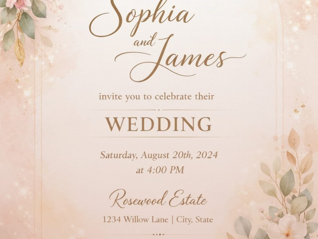
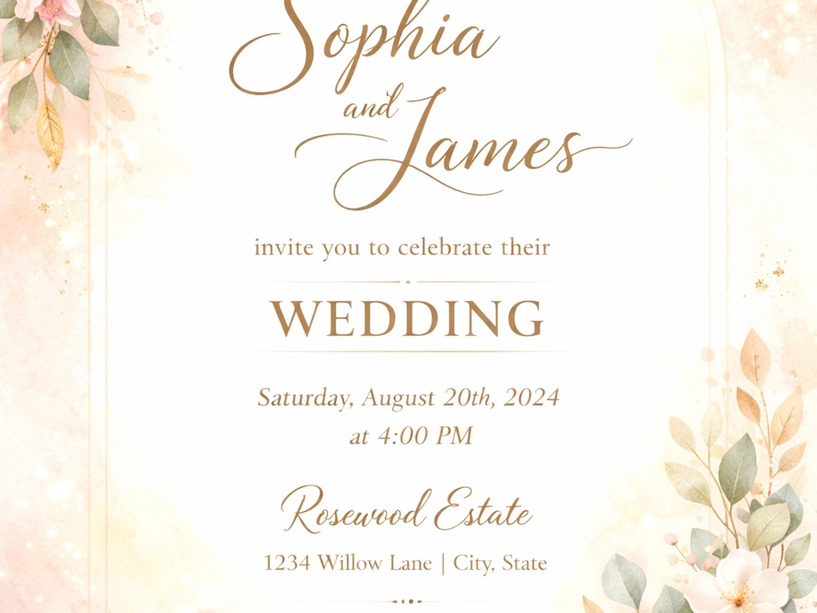
Traditional Center-Aligned Layout
This is your classic safe bet. Everything stacked down the middle, usually starts with the couple’s names at top, then the invitation wording, then details at the bottom. It’s formal, it’s clean, it works for literally any wedding style from ballroom to barn. You can dress it up with fancy fonts or keep it minimal with simple typography.
I use this layout probably 40% of the time because it just works. The key is playing with font sizes to create hierarchy – like the couple’s names should be the biggest thing on there, then the date, then everything else scales down from there. White space is your friend here, don’t be afraid of it.
Asymmetrical Layouts Are Having A Moment
Okay so asymmetrical designs are kinda everywhere right now and they look really modern when done right. Instead of centering everything, you align text to the left or right, maybe put a design element on one side that balances the text on the other. It’s more dynamic and feels less stuffy than centered layouts.
But here’s what annoys me – people think asymmetrical means random. It doesn’t. You still need balance and intention. I had a bride send me a Pinterest inspo board in summer 2021 with like fifteen different asymmetrical designs that had nothing in common except that text wasn’t centered, and she wanted “all of those vibes” in one card. That’s not how this works.
The trick with asymmetrical is creating visual weight. If your text is all pushed to the left side, you need something on the right – could be a floral illustration, a photo, a colored block, whatever. Just something to balance it out so the whole thing doesn’t feel like it’s gonna tip over.
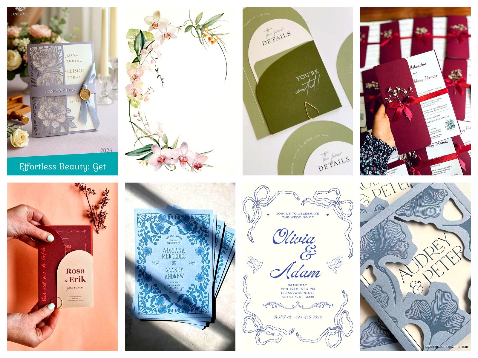
Border and Frame Layouts
Borders are classic but they’re coming back in interesting ways. Instead of just a simple rectangular frame, people are doing botanical borders, geometric frames, watercolor edges, even illustrated scenes that frame the text. I’m seeing a lot of partial borders too – like florals that only go around two or three corners instead of all four.
You gotta be careful with borders though because they can eat up a lot of space. If you’re working with a standard 5×7 card and you put a thick border around everything, you’re left with like a 3×5 area for actual text and that gets cramped real fast. Go for thinner borders or ones with negative space built in.
The Landscape vs Portrait Thing
Most wedding invitations are portrait orientation because that’s traditional and it fits in standard envelopes easily. But landscape cards are really popular right now, especially for modern or minimalist weddings. They feel more contemporary and give you more horizontal space for creative layouts.
Landscape works great for designs where you want text on one side and imagery on the other, or for panoramic venue illustrations. The downside is finding envelopes that fit properly – you might need custom sizes which adds cost. But if your whole aesthetic is modern and different, landscape orientation signals that right away.
Layered and Dimensional Designs
This is where you’re using multiple pieces of cardstock or paper layers to create depth. Like a base card with a smaller panel on top, maybe with foam adhesive between them for dimension, or a vellum overlay with printed details. It’s very elegant and makes the invitation feel more expensive and special.
I love doing layered designs for formal weddings because they photograph beautifully. You can play with different colors, textures, and finishes. But they’re definitely more work to assemble – if you’re DIYing this, set aside way more time than you think you’ll need. My cat knocked over a whole stack of layered invitations I was assembling once and I wanted to cry, they’d taken hours.
The layout consideration here is that your top layer is usually smaller than the base, so you’re designing for that visible border. Common approach is to put the main invitation wording on the top layer and let decorative elements or a colored background show through on the base layer.
Minimal Text Layouts With Big Imagery
Some couples are going really minimal with text and letting one large image or illustration do most of the talking. Like a full-bleed botanical print with just names and date overlaid, or a watercolor wash background with minimal text in one corner. It’s very Instagram-friendly which is probably why it’s trending.
The challenge is you still gotta include all the necessary info somewhere. Usually this means having a separate details card in your invitation suite with venue address, timing, website, etc. The main invitation is just the pretty announcement piece. Which is fine but make sure guests can actually find the important stuff – I’ve seen people get so caught up in the aesthetic that they forget to mention what time the ceremony starts or…
Grid-Based Layouts
Using a grid system to organize information is super helpful especially if you have a lot of details to include. You divide your card into sections – could be quadrants, thirds, whatever – and assign different info to each section. It keeps everything organized and makes it easy for guests to scan and find what they need.
This works really well for modern, graphic-style weddings. You can use actual visible lines to separate sections or just use the grid as an invisible guide for alignment. The key is consistency – if you’re aligning things to a grid, commit to it throughout the whole design.
Monogram-Focused Layouts
A custom monogram can be the centerpiece of your whole layout. Put it at the top, make it big, build everything else around it. Or use it as a background element in a light color or watermark. Monograms are having a resurgence after being kinda outdated for a while, but now they’re more modern and less traditional-stuffy.
I’m seeing a lot of minimal line-art monograms instead of ornate scripty ones. They work as a strong focal point and then you can keep the rest of the layout really simple. Just make sure your monogram is actually readable – some designers get so artistic that you can’t tell what letters it’s supposed to be.
Color Blocking and Geometric Shapes
Using solid color blocks or geometric shapes to section off your layout is very contemporary. Like putting all your text in a colored rectangle that sits on top of a photo background, or using triangular shapes to create visual interest. It’s graphic and bold and definitely makes a statement.
This style works best for modern or art deco themed weddings. You can play with opacity too – like a semi-transparent color block over an image so you can still see the photo underneath but the text is readable. The layout here is about creating strong visual zones and using color strategically to guide the eye.
Illustrated Venue or Map Layouts
Custom illustrations of your venue or a map showing the location can be integrated right into the layout. I love these for destination weddings or when the venue itself is really special and unique. The illustration becomes part of the design rather than just being decorative.
You can do this where the illustration is the background and text overlays it, or split the card so illustration is on one side and text on the other. If you’re hiring an illustrator this adds cost but it makes your invitations completely unique and guests actually keep them as keepsakes.
Trends I’m Seeing Right Now
Okay so lemme just rapid-fire some layout trends that are everywhere in 2024. Arch shapes and curved elements instead of straight lines – very popular. Negative space being used intentionally as part of the design. Mixing fonts in interesting ways, like pairing a bold sans serif with delicate script. Earthy color palettes with terracotta and sage green. Hand-lettered elements mixed with printed text.
Also seeing a lot of maximalist designs making a comeback – like after years of minimal everything, some couples want florals and patterns and details everywhere. The layout challenge with maximalism is keeping it from looking chaotic. You still need focal points and places for the eye to rest.
QR codes are being integrated into designs now too which is sorta funny but actually practical. People are putting them right on the invitation linking to their wedding website instead of printing separate details cards. The layout consideration is making the QR code feel intentional rather than just slapped on as an afterthought.
Practical Layout Tips That Actually Matter
Alright so here’s the real talk about layouts that nobody mentions. First, always design with your printer’s specs in mind. If you’re printing at home, test your layout with your actual printer because margins can be different than you expect. If you’re using a professional printer, ask about bleeds and safe zones before you finalize anything.
Second, read your text out loud in the order it appears on your layout. Does it make logical sense? Can guests easily figure out what, where, and when? I’ve seen gorgeous designs where the information flow makes no sense and guests are confused about basic details.
Third, think about your envelope when designing your layout. If you’re doing a really horizontal landscape design, make sure you can actually source envelopes that fit. If you’re doing something oversized, factor in extra postage costs.
Font size matters more than you think. Nothing smaller than 9pt for body text or older guests won’t be able to read it. I learned this the hard way when a mother of the bride called me irritated that she couldn’t read the venue address without her reading glasses. Fair point honestly.
Also consider how your layout will translate to other pieces in your suite. If you’re doing save-the-dates, invitations, RSVP cards, details cards, programs, menus, etc., you want some visual consistency. Your layout approach should be flexible enough to adapt to different sizes and formats.
What Not To Do
Don’t use more than three fonts in one layout. Just don’t. It looks messy and amateur. Two fonts is usually plenty – one for headers and one for body text.
Don’t make your background so busy that text is hard to read. I see this constantly with watercolor backgrounds or photo backgrounds where people put text right over the busiest part. Use solid overlays or pick a clear area for text placement.
Don’t forget about hierarchy. Everything can’t be the same size and weight. Some information is more important than other information and your layout should reflect that through size, weight, color, or placement.
And please don’t use templates exactly as they come. Everyone else is using those same templates. Customize them, change colors, swap fonts, adjust the layout to make it yours. Templates are starting points not finished products.
Testing Your Layout Before Printing
Always print a test at actual size before committing to a full print run. Colors look different on paper than on screen. Spacing that looked fine digitally might feel cramped in person. Text that seemed readable on your computer might be too small when printed.
Show your test print to someone who doesn’t know all your wedding details and see if they can quickly figure out the essential information. If they’re squinting or asking questions about basic details, your layout needs work. The goal is elegant but also functional – guests shouldn’t need a decoder ring to figure out when and where your wedding is happening.