Planning Guides, Style Guide
Wedding Invitation Card Samples: Design Examples
Mar
Formal Traditional Invitations
Okay so formal traditional wedding invitations are like the bread and butter of what most people think of when they picture wedding invites. These are the ones your parents probably sent out and honestly they never really go out of style which is both comforting and kinda boring at the same time.
The classic formal invitation uses third-person wording like “Mr. and Mrs. Jonathan Smith request the honour of your presence at the marriage of their daughter.” Notice I spelled honour the British way with a U – that’s actually the traditional way to do it on formal invites and it drives me slightly nuts when couples don’t know this and think it’s a typo. I had this bride in spring 2023 who kept “correcting” the proof I sent her and I had to gently explain that no, this is actually how it’s supposed to be.
For formal invites you’re looking at:
- Engraved or letterpress printing (the fancy expensive kind)
- Classic fonts like Copperplate, Garamond, or Times New Roman
- Cream, ivory, or white cardstock
- Traditionally sized at 5×7 inches
- Inner and outer envelopes (double envelope system)
The layout is super structured. Names at top, ceremony details in the middle, reception info at bottom or on a separate card. Everything centered and balanced. Think symmetry.
Semi-Formal Invitations
This is where like 60% of my clients end up honestly because formal feels too stuffy but they don’t want something totally casual either. Semi-formal gives you room to play with design while still keeping things elegant.
You can switch to first-person wording here: “Together with their families, Sarah Chen and Michael Rodriguez invite you to celebrate their wedding.” See how that feels more personal? The design elements can get more creative too – you might add a monogram, use two different fonts that complement each other, or incorporate subtle patterns.
Semi-formal samples often include:
- Digital printing or thermography (raised printing that looks like engraving but costs less)
- Mix of script and sans-serif fonts
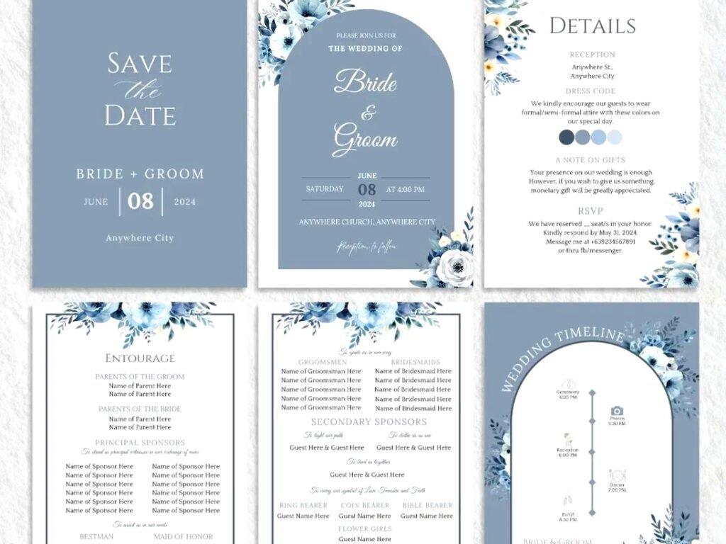
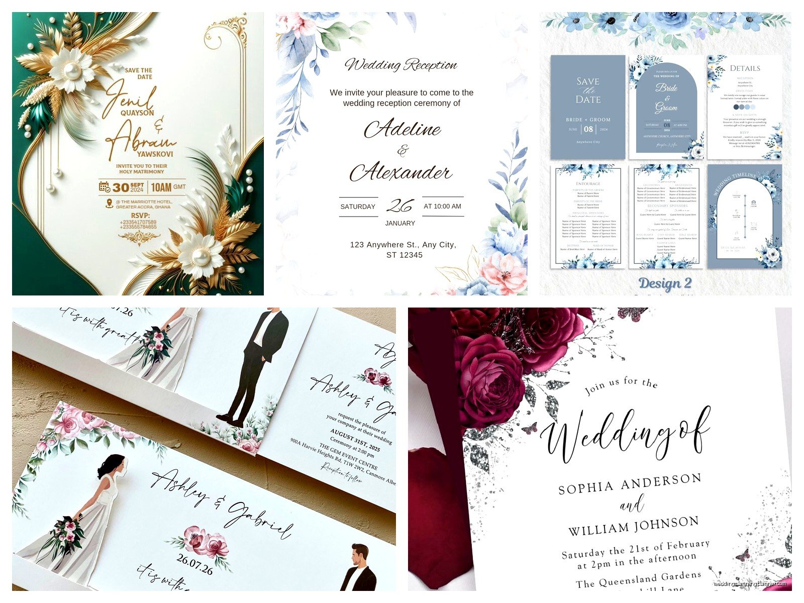
- Soft color palettes – blush, sage, dusty blue, that whole vibe
- Simple borders or geometric frames
- Single envelope system
My cat knocked over my coffee on a semi-formal proof once and the stain actually looked kinda pretty so we ended up doing a watercolor wash background for that couple which worked out weirdly well.
Rustic and Bohemian Designs
Ugh okay so rustic invitations were EVERYWHERE from like 2015-2020 and I got so tired of burlap and mason jars but honestly when done right they can be really beautiful. The key is not going overboard with the theme.
Good rustic invitation samples use natural textures and earthy elements without looking like you’re getting married in a barn (even if you are getting married in a barn). Think kraft paper, wood grain textures, greenery illustrations, and hand-drawn elements.
Bohemian invitations take this further with:
- Feather motifs or pampas grass illustrations
- Macramé-inspired borders
- Watercolor florals in muted tones
- Mixed fonts that look hand-lettered
- Vintage stamps and wax seals
For wording you can get more relaxed: “Join us for a celebration of love under the open sky” or whatever feels authentic to you. The rustic/boho style is all about that organic, slightly imperfect aesthetic so you don’t need everything perfectly centered or…
Modern Minimalist Samples
Now we’re talking. Modern minimalist invitations are my personal favorite because there’s nowhere to hide design mistakes when you strip everything down to essentials. Everything has to be intentional.
These invitations use lots of white space, clean lines, and usually one or two colors max. The typography does most of the heavy lifting. You might see all caps sans-serif fonts, asymmetrical layouts, or just the couple’s names in a gorgeous large typeface with tiny ceremony details below.
Modern minimalist characteristics:
- Sans-serif fonts (Helvetica, Futura, Montserrat)
- Monochromatic color schemes
- Geometric shapes as design elements
- High-quality paper stock (the paper quality matters MORE here)
- Sometimes unconventional sizes – square or long and narrow
The wording can be super stripped down too: “Sarah & Michael // June 15, 2024 // Brooklyn, New York” with ceremony time and location details in smaller text. That’s it. Clean. Simple. Elegant without trying too hard.
Destination Wedding Invitations
Destination wedding invites need to work harder than regular invitations because you’re asking people to travel. The design should immediately communicate the location vibe while still providing all necessary info.
For a beach wedding in Mexico you might incorporate:
- Watercolor ocean waves or palm leaves
- Sandy beige and turquoise color palette
- Casual, breezy fonts
- Passport or luggage tag design elements
For a European destination maybe elegant architecture illustrations or vintage travel poster aesthetics. The key is suggesting the location without being too literal about it – you don’t need a cartoon Eiffel Tower on your Paris wedding invitation, you know?
These invitations absolutely need to include or come with detailed information cards about travel, accommodations, itinerary, and what to expect. I usually recommend a separate details card or directing guests to a wedding website because there’s just too much info to fit on one invitation.
Garden Party and Floral Designs
Floral invitations never go out of style but the style of florals definitely changes. Right now we’re seeing a shift away from those super detailed botanical illustrations toward more abstract, artistic floral elements.
Garden party invitation samples typically feature:
- Watercolor flowers (still popular despite being everywhere)
- Pressed flower designs or actual pressed flowers (delicate but gorgeous)
- Botanical line drawings
- Floral borders or corners
- Soft romantic fonts with lots of swashes
The color palette depends on your actual wedding flowers but popular combos are blush and greenery, lavender and sage, or peachy coral with gold accents. You can go full-coverage floral where flowers cover the entire invite or just use them as accent elements.
One thing that really annoys me is when couples choose flowers for their invitation that have nothing to do with their actual wedding flowers or season. Like don’t put sunflowers on your winter wedding invitation just because you think they’re pretty. It’s confusing.
Art Deco and Vintage Gatsby Style
These are so fun to design honestly. Art Deco invitations pull from 1920s-1930s design with geometric patterns, gold foiling, and that whole glamorous Gatsby aesthetic.
Key elements include:
- Geometric borders and frames (lots of chevrons, fans, sunbursts)
- Metallic accents – gold, rose gold, or silver foiling
- Black and gold color schemes (classic)
- Elegant serif fonts with some personality
- Symmetrical layouts
The wording can be formal but with personality: “An evening of elegance and celebration” or “Join us for a night of vintage glamour.” These invitations work really well for evening weddings, ballroom receptions, or New Year’s Eve weddings.
I did an Art Deco suite in summer 2021 during that post-lockdown wedding boom and the couple wanted EVERYTHING foiled. The quote was insane but it turned out stunning and they didn’t even blink at the price which was refreshing after so many budget conversations.
Whimsical and Illustrated Invitations
Custom illustrated invitations are having a moment and they’re perfect for couples who want something totally unique. These can be professionally illustrated or done by a talented friend.
Popular illustration styles:
- Venue portraits (illustration of your actual wedding venue)
- Couple portraits in a cute illustrated style
- Whimsical scenes with florals, birds, butterflies
- Map illustrations showing ceremony and reception locations
- Pets! So many couples want their dogs or cats illustrated on their invites
The vibe is playful and personal. Wording can be creative and fun: “Let’s party! We’re getting married!” or “Plot twist: We’re getting hitched.” These work great for couples who don’t take themselves too seriously.
Just make sure if you’re going illustrated that the style matches your overall wedding vibe because a cartoon-style invitation sets certain expectations and then if your wedding is super formal it’s gonna feel disjointed.
Luxury and High-End Samples
When budget isn’t a concern you can do some really incredible things with wedding invitations. I’m talking multiple layers, laser cutting, silk ribbons, wax seals, the works.
Luxury invitation suites might include:
- Laser-cut covers or overlay cards
- Silk or velvet ribbons
- Custom wax seals with monogram stamps
- Acrylic or wood invitation cards
- Hand-painted elements
- Deckled edges on handmade paper
- Multiple envelope liners in coordinating patterns
These suites often come in custom boxes or folders and include multiple cards – the invitation itself, reception card, RSVP card, accommodations card, weekend itinerary, maybe a map. Everything is coordinated with the same design elements and color palette.
The printing techniques are top-tier: engraving, letterpress, foil stamping (sometimes multiple foil colors on one piece), or embossing. The paper stock is thick – like 120lb or higher – and often has a cotton content for that luxe feel.
Casual and Laid-Back Designs
Not every wedding needs a fancy invitation honestly. Casual weddings – backyard BBQs, brewery receptions, elopement announcements – call for more relaxed invitation designs.
These might look like:
- Postcard-style invitations (saves on postage too)
- Simple text-based designs with fun fonts
- Bright, cheerful colors
- Polaroid or photo-based layouts
- Hand-lettered or brush script fonts
The wording is conversational: “We’re tying the knot! Come celebrate with us” or “Eat, drink, and be married – join us for our wedding celebration.” You can absolutely inject humor and personality here.
Casual doesn’t mean low-quality though. The design should still be well-executed and the printing should be professional even if the vibe is relaxed.
Cultural and Religious Invitation Samples
Different cultures and religions have specific traditions for wedding invitations and it’s really important to get these right. I always ask couples about their cultural background early in the design process.
For Indian weddings you might include:
- Ganesh or other religious symbols
- Rich colors like red, gold, orange, and fuchsia
- Intricate paisley or mandala patterns
- Multiple events listed (Mehndi, Sangeet, ceremony, reception)
- Both families’ names prominently featured
Jewish invitations often include Hebrew text alongside English and might incorporate symbols like the Star of David or pomegranates. Catholic invitations might include a cross or reference to the nuptial mass.
Chinese wedding invitations traditionally use red and gold, double happiness symbols, and might include both English and Chinese characters. The format and wording follow specific conventions that honor both families.
Don’t just slap cultural symbols onto a design without understanding what they mean – do your research or work with a designer who specializes in that type of invitation.
Digital and Eco-Friendly Options
Okay so I’m a stationery consultant which means I love paper but I gotta be honest that digital invitations have come a long way and they’re not just for casual weddings anymore.
Digital invitation platforms now offer:
- Animated designs
- Video invitations
- Interactive elements (RSVP tracking, meal selection)
- Beautiful templates that rival printed designs
- Easy guest list management
For eco-conscious couples who still want physical invitations there are sustainable options like seed paper (you can plant it after), recycled paper stock, soy-based inks, and tree-free paper made from cotton or bamboo.
The design doesn’t have to scream “eco-friendly” with leaves and green everywhere – you can have a gorgeous modern or traditional design printed on sustainable materials and just mention it subtly if you want guests to know about that aspect.
Mix and Match Elements
Here’s the thing nobody tells you: you don’t have to pick one style and stick with it rigidly. Some of the best invitation suites I’ve designed mixed elements from different styles.
You could do a formal traditional layout but with modern minimalist typography. Or rustic kraft paper with elegant calligraphy. Floral elements with Art Deco geometric frames. The possibilities are actually endless once you stop thinking in rigid style categories.
The key is making sure everything feels cohesive even when mixing styles. Use a consistent color palette, repeat certain design elements, and make sure the fonts work well together. Usually I recommend picking one dominant style and then borrowing one or two elements from another style as accents.
Also consider your venue and overall wedding aesthetic – your invitations are the first impression guests get of your wedding so they should reflect the actual vibe of your event. A super formal engraved invitation followed by a food truck reception is sorta gonna confuse people.