Planning Guides, Style Guide
Wedding Certificate Design: Complete Guide
Apr
Wedding Certificates Are Kinda The Most Overlooked Thing Ever
Okay so wedding certificates – not to be confused with marriage licenses, which is like a whole legal thing – are basically these beautiful keepsakes that couples get to commemorate their wedding day. I’ve been designing stationery for weddings since like 2007 and honestly people forget about these until the last minute and then panic, which drives me absolutely nuts because they’re actually super important for the whole aesthetic if you care about that stuff.
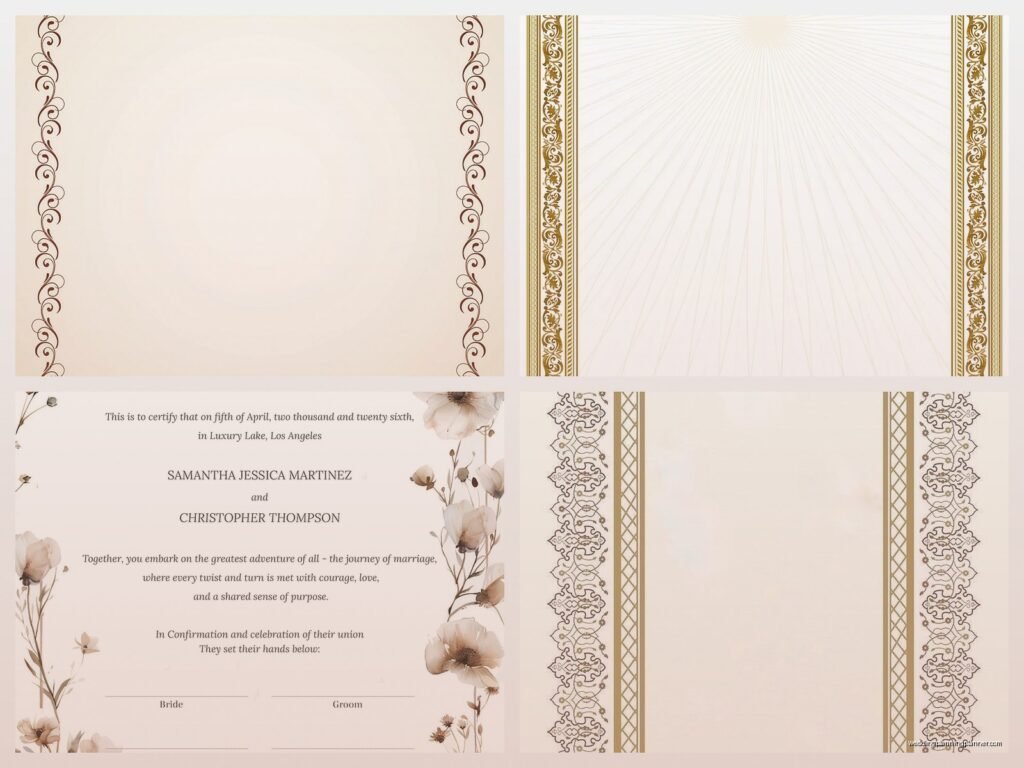
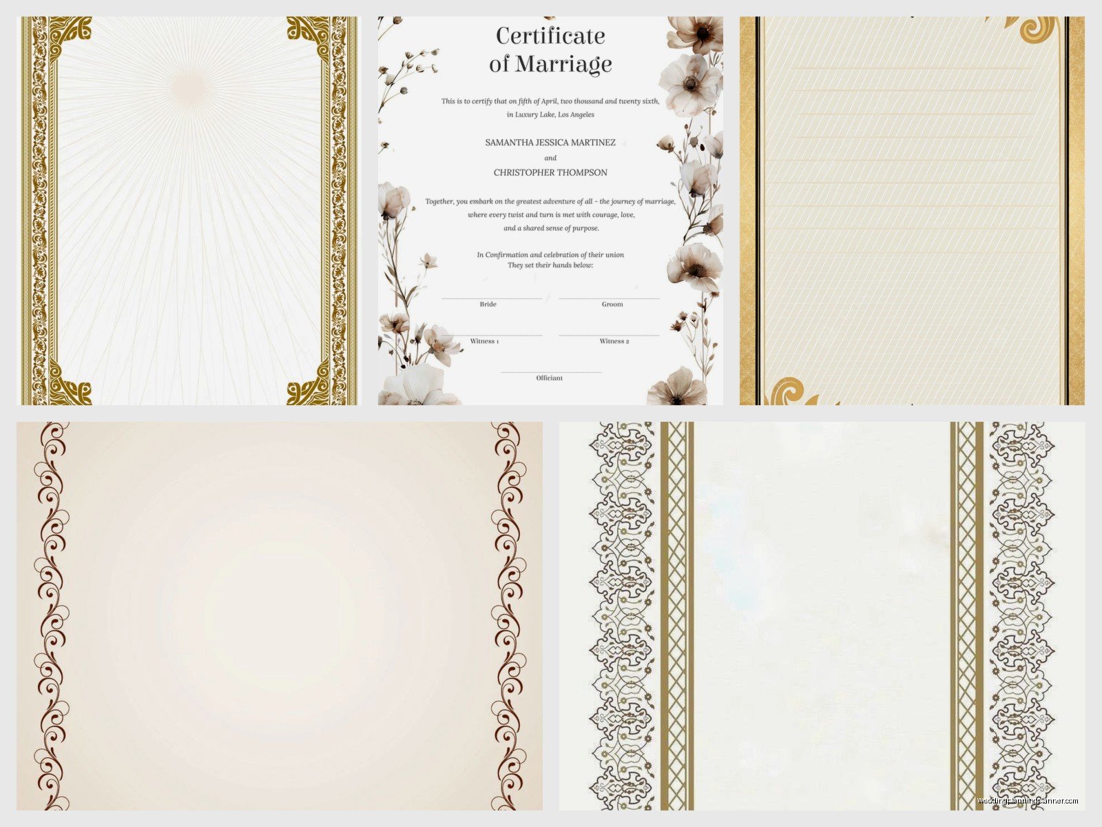
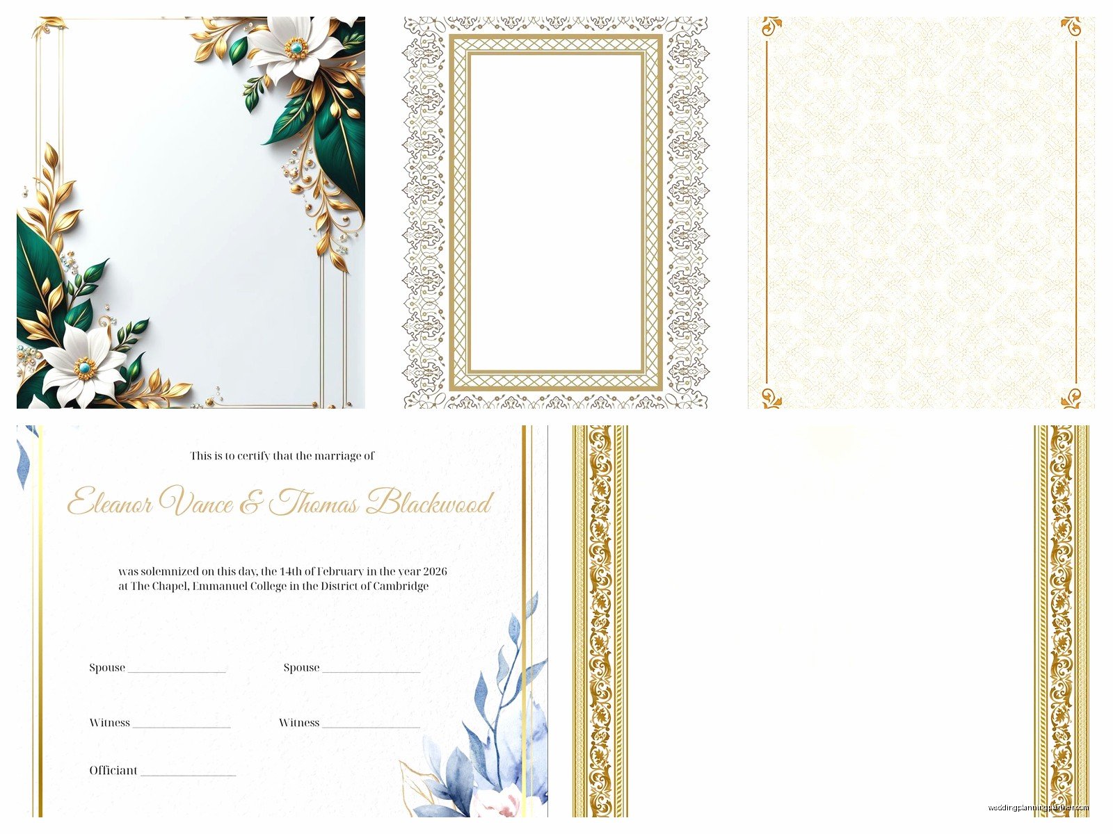
The certificate is what you frame and put on your wall. It’s the thing your grandkids will find in your attic someday. It’s got your names, your wedding date, maybe your vows or a meaningful quote, and it’s supposed to look gorgeous. Not the boring government document you sign at the courthouse – that’s your marriage license and it’s gonna look terrible no matter what you do with it.
What Actually Goes On A Wedding Certificate
You need to figure out what information you’re putting on this thing before you even think about fonts or colors or whatever. Most certificates include the couple’s full names, the wedding date, the location (venue name or city), and sometimes the officiant’s name. Some people add their parents’ names which I think is sweet but also makes the design more crowded so like… your call.
I had this bride in summer 2021 who wanted to include a full paragraph about how they met on a hiking trip and I was like okay but this is a certificate not a scrapbook page, and we compromised by putting a short meaningful quote instead. She was actually really happy with how it turned out once she saw the mockup.
Religious couples often include scripture or religious imagery. Jewish couples might have Hebrew text or a ketubah-inspired design. Catholic couples sometimes include saints or crosses. You can also go completely secular with just beautiful typography and decorative elements.
The Names Situation
This is where it gets tricky and people get weirdly emotional. Are you using both last names? Hyphenating? Keeping separate names? The certificate needs to reflect whatever you’ve decided. I always ask couples what names they want displayed because assumptions make everyone uncomfortable.
Also think about nicknames versus full legal names. Some people go by their middle name or a shortened version and you gotta decide if this is a formal document or more personal. There’s no wrong answer but you should be consistent with your other wedding stationery.
Design Styles That Actually Work
Alright so there’s basically infinite design possibilities but let me break down what I see working consistently. Traditional calligraphy-heavy designs are still super popular especially for formal weddings. Think lots of flourishes, script fonts, maybe some gold foiling if you’re feeling fancy.
Modern minimalist is huge right now – clean lines, one or two fonts max, lots of white space. These look really sophisticated when done right but can look boring if you don’t have a good eye for typography. I’m gonna be honest, I’ve seen some really bad minimalist attempts where it just looks like someone forgot to finish designing it.
Vintage and botanical styles work great if your wedding has a garden or rustic theme. Floral borders, muted colors, maybe some watercolor elements. These can get kinda busy though so you need to balance the decorative stuff with readable text.
Geometric and art deco designs are perfect for glamorous weddings. Think Great Gatsby vibes – gold and black, clean geometric shapes, elegant fonts. My cat knocked over my coffee while I was working on one of these last month and I almost cried because I had to reprint the whole thing.
Size and Format Decisions
Most wedding certificates are either 8×10 or 11×14 inches because those are standard frame sizes and you don’t want to deal with custom framing costs. Sometimes people do 16×20 for a statement piece but then you’re looking at expensive framing and it takes up a ton of wall space.
Vertical or horizontal orientation depends on your design and where you’re planning to display it. Horizontal fits better over sofas or beds. Vertical works well in hallways or narrower wall spaces. I usually design both orientations and let the couple choose.
You can do a single-page certificate or a folded presentation style. The folded version is nice if you want to include additional elements like your vows on the inside pages or photos, but it’s harder to frame and display so most people go with single-page.
Paper Quality Actually Matters Here
Don’t print this on regular printer paper please I’m begging you. You want at least 80lb cardstock, preferably something with a nice texture. Cotton paper looks and feels luxurious. Linen finish adds subtle texture. Smooth finish works better if you’re doing lots of fine details or calligraphy.
If you’re doing metallic foiling or letterpress, you need thicker stock – like 110lb or more – or it won’t hold up to the impression. I learned this the hard way in my first year when I tried to letterpress on thin paper and it just… destroyed everything. Still annoyed thinking about that.
DIY vs Professional Design
Look, you can totally DIY this with Canva or similar platforms and it might turn out great. There are templates available and if you have a good eye for design, go for it. But I’ve also seen some really tragic DIY certificates where the fonts are fighting each other and nothing is aligned properly and there’s like seven different colors happening.
If you’re not confident in your design skills, hiring someone is worth it. A graphic designer or calligrapher can create something custom that matches your wedding aesthetic perfectly. Expect to pay anywhere from $150 to $500+ depending on complexity and whether you want hand lettering or digital design.
Etsy has tons of templates you can customize yourself which is a good middle ground. You get a professionally designed template and just fill in your information. Just make sure you’re buying from someone with good reviews because quality varies wildly.
Font Choices That Won’t Make People Cry
Okay this is where people mess up constantly. Script fonts are beautiful but you need to make sure they’re actually readable. I’ve seen certificates where the names are so swirly and elaborate that you literally cannot tell what they say. Your certificate should be legible from like 3 feet away minimum.
Pair a fancy script with a simple serif or sans serif for the body text. Don’t use more than three fonts total or it looks chaotic. And please, I’m begging you, don’t use Comic Sans or Papyrus or anything that will make your certificate look like a joke.
Font size matters too. Names should be prominent – at least 24pt, often bigger. Dates and locations can be smaller but still readable. If you’re including longer text like vows or quotes, make sure there’s enough contrast and spacing that people can actually read it without squinting.
Color Schemes and What Works
Match your wedding colors or go neutral – those are your main options. Neutral designs in black, gold, silver, or navy age better and won’t clash with your decor when you move houses or redecorate. But if your wedding has a strong color theme and you love it, incorporate those colors.
Metallics are always elegant. Gold foiling looks expensive even when it’s not real gold foil. Rose gold is still popular though I think we’re starting to see it fade a bit. Silver and copper are underused and can look really sophisticated.
If you’re doing color, keep it to 2-3 colors max. More than that and it starts looking like a kindergarten art project. And think about how colors will look in photos because you’re definitely gonna photograph this thing and post it on Instagram or whatever.
Working With Calligraphers
Hand-lettered certificates are stunning but they’re pricey and time-consuming. A good calligrapher will charge $200-600+ for a custom piece depending on size and complexity. You need to book them early – like months in advance – because they can only do so many per week.
When you work with a calligrapher, be clear about your style preferences. Show them examples of lettering you love. Discuss ink colors, paper choices, and whether you want any painted or illustrated elements. Most calligraphers will do a sketch or digital mockup first so you can approve the layout before they do the final piece.
One thing that really annoyed me was this couple in spring 2023 who hired a calligrapher, approved the design, and then changed their minds about the wording after it was finished. The calligrapher had to start completely over and they acted shocked that they had to pay for it again. Like… that’s not how this works.
Digital vs Physical Certificates
Most people want a physical certificate they can frame, but digital versions are becoming more common especially for pandemic weddings or destination weddings where shipping is complicated. A high-resolution digital file can be printed later, shared with family digitally, or used in wedding albums.
If you’re going digital, make sure you get a print-ready file – usually a PDF at 300 DPI minimum. PNG files work too but PDFs maintain quality better when printing large sizes. Get the file in multiple sizes so you have options for framing later.
Some couples do both – a digital version they can share immediately and a physical version for framing. This works well if you’re having the certificate signed by guests during the reception and need a backup copy.
Signing and Display Considerations
Are you having people sign your certificate? This is a thing some couples do instead of or in addition to a guest book. If yes, you need to leave adequate space for signatures – at least a 3-4 inch border. And you need the right pens – archival quality ink that won’t fade or bleed.
Think about framing before you finalize the design. Leave at least a half-inch border on all sides so the frame doesn’t cover any important elements. Standard frame sizes are cheaper and easier to find, so design with those dimensions in mind.
Where are you gonna display this? Above your bed? In your living room? The design should complement that space. A huge ornate certificate might look weird in a minimalist modern apartment. A simple design might get lost on a large empty wall.
Printing and Production Details
For DIY printing, local print shops usually do better quality than home printers unless you have a really good printer. FedEx Office, Staples, or local specialty print shops can handle nice cardstock and have better color accuracy. Bring your file on a USB drive or email it to yourself and access it there.
Online printing services like Minted, Artifact Uprising, or specialty stationery companies offer professional printing with lots of paper options. You upload your design, choose your specifications, and they ship it to you. Turnaround is usually 1-2 weeks plus shipping.
If you want fancy finishing like foiling, letterpress, or embossing, you need a specialty printer. These techniques are expensive – starting around $300-500 for small runs – but they look incredible. The texture and dimension make your certificate feel really special and heirloom-quality.
Timing and When To Order
Don’t wait until the last minute because everything takes longer than you think. If you’re hiring a designer or calligrapher, start conversations at least 3-4 months before your wedding. Custom work needs time for revisions and production.
For DIY or template-based designs, you still want to start at least 6-8 weeks out. You need time to design, get feedback, make changes, order printing, receive it, check for errors, and potentially reorder if something’s wrong. I’ve had couples contact me two weeks before their wedding wanting a custom certificate and I’m like… nah, that’s not happening unless you want to pay rush fees.
Order a proof first if possible. Print it at home or get a cheap version printed to check sizing, colors, and layout before committing to expensive fancy printing. Colors look different on screen versus paper and you might catch spacing issues you didn’t notice digitally.
Common Mistakes That Drive Me Crazy
Misspellings are the worst because once it’s printed you’re stuck with it. Triple-check all names, dates, and locations. Have multiple people proofread it. I once had to reprint an entire order because the couple’s last name was spelled wrong and nobody caught it until after – they were hyphenating and we had one letter off and ugh.
Poor contrast makes certificates hard to read and photograph badly. Light text on light backgrounds or dark text on dark backgrounds without enough differentiation just doesn’t work. Your certificate should be readable in various lighting conditions.
Overcrowding the design is super common with DIY projects. People want to include everything and the certificate ends up looking cluttered and overwhelming. White space is your friend. Less is usually more with these things or maybe not less but like… balanced? You know what I mean.
Wrong file formats cause printing problems. If you’re designing digitally, save as a high-resolution PDF for printing. JPEGs can work but they compress and lose quality. Never use Word documents for final printing because formatting gets messed up between computers.
Alternative Ideas and Variations
Some couples skip the traditional certificate entirely and do something more creative. I’ve seen illustrated portraits of the couple, maps of meaningful locations, timelines of their relationship, or artistic interpretations of their vows.
Quaker wedding certificates are beautiful if you’re into that style – they typically include signatures from all wedding guests surrounding the couple’s information. These work as both certificate and guest book and create a really meaningful keepsake.
Multi-language certificates are great for multicultural weddings. Include text in both languages or have the same information translated. This honors both families and looks really sophisticated when designed well.
I’ve been watching a lot of home renovation shows lately and I keep thinking about how wedding certificates are kinda like the finishing touch on a room – not technically necessary but it makes everything feel complete and intentional. That’s probably a weird comparison but whatever.
Some people do a series of smaller prints instead of one large certificate – like the couple’s names on one, the date on another, their vows on a third. These can be grouped together on a wall gallery-style which looks really modern and interesting.