Planning Guides, Style Guide
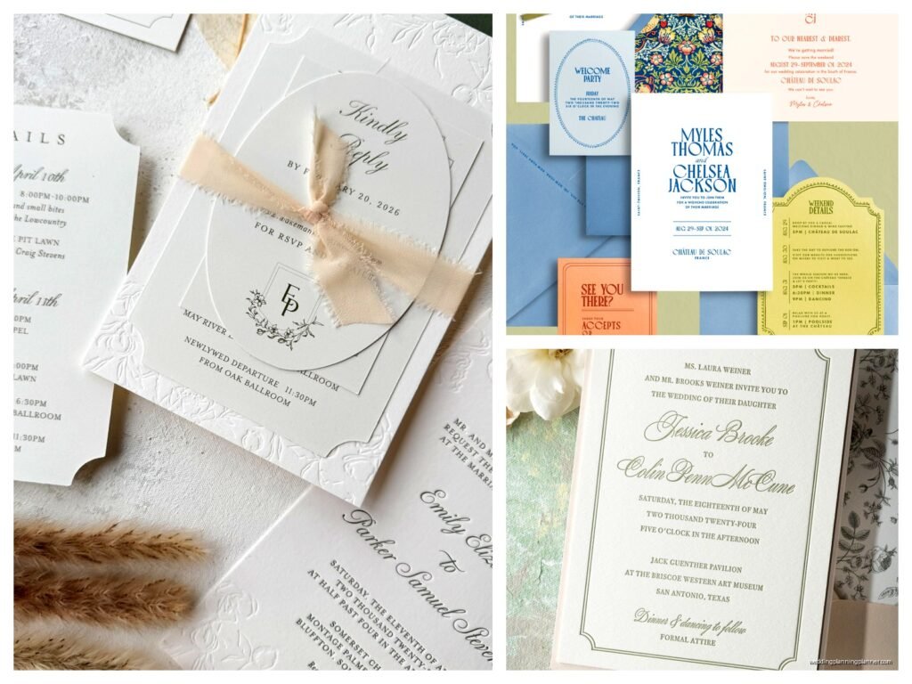
Letterpress Invitations: Classic Pressed Printing Technique
May
What Letterpress Actually Is
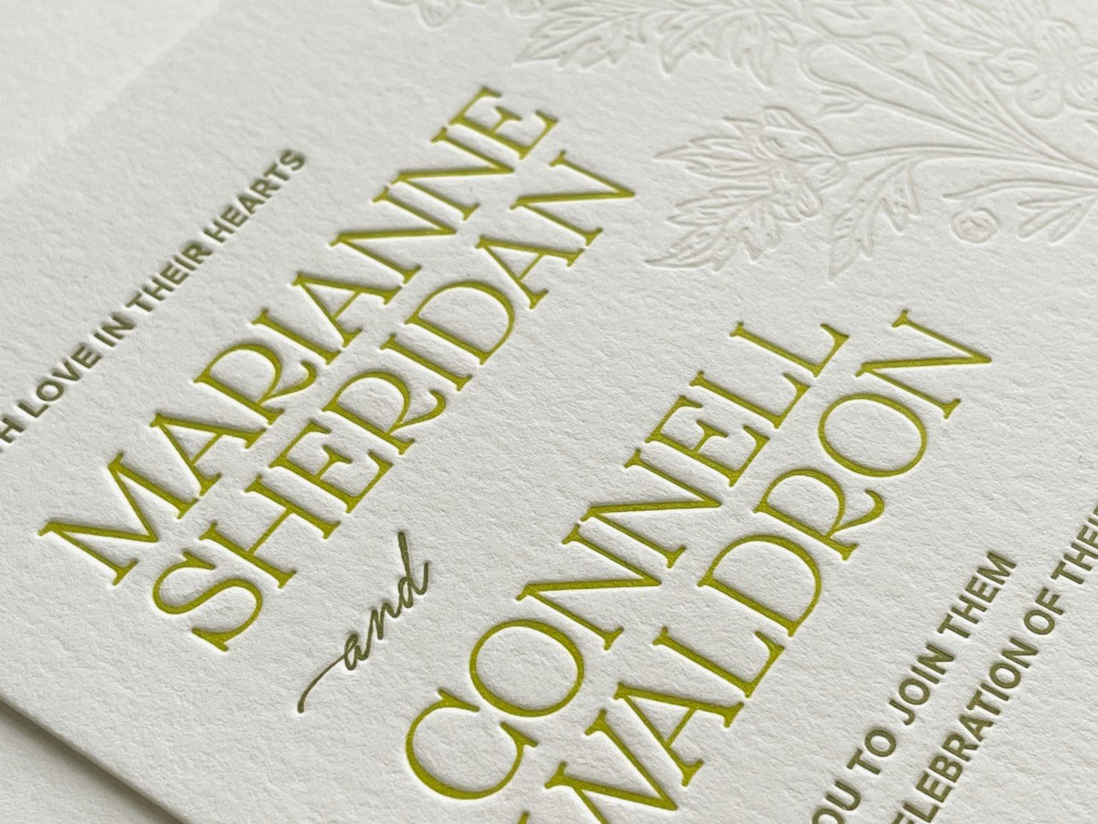
Okay so letterpress is basically this old-school printing method where they press metal or polymer plates into paper so hard that it leaves an actual impression. Like, you can run your fingers over it and feel the indentation. That’s the whole point and what makes it different from regular flat printing that just sits on top of the paper.
The plates have your design on them (backwards obviously) and they get inked up, then pressed into the paper with serious pressure. You end up with this dimensional quality that’s kinda impossible to replicate with digital printing. Some couples want the debossed look where it pushes into the paper, others want it inked so you see color AND feel the impression.
I had this bride in summer 2021 who was absolutely obsessed with letterpress after seeing her cousin’s invitations, but she didn’t understand why they cost so much more than her friend’s printed ones. That’s when I realized most people don’t actually know what goes into this process and why it’s expensive.
Why People Choose Letterpress (And Why They Don’t)
The texture is the main thing. You’re paying for that tactile experience where guests can literally feel the printing. It screams quality and effort in a way that digital printing just doesn’t. Plus it photographs beautifully because of the shadows created by the impression.
But here’s what bugs me – people see letterpress on Pinterest and think they can get it for like $3 per invitation. Nah. That’s not happening unless you’re doing something super simple with one color. Real letterpress with custom designs and multiple colors? You’re looking at $15-30+ per invitation easily, sometimes way more.
The reasons you might skip letterpress: budget obviously, timeline (it takes longer), and if you want full-color photos or really detailed designs. Letterpress works best with clean designs, typography, simple borders, and limited colors.
Design Considerations That Actually Matter
So when you’re designing for letterpress, you gotta think differently than regular printing. Fine lines can be tricky – anything too thin might not hold up under the pressure or might not print consistently. I usually tell clients to keep line weights at least 0.5pt, preferably thicker.
Colors are charged per pass through the press, so every color adds cost AND time. A one-color invitation is way cheaper than a three-color one because the printer has to run the paper through three separate times. Sometimes you can get creative with color combinations… like using a colored paper stock with one ink color can give you a two-tone look without paying for two colors.
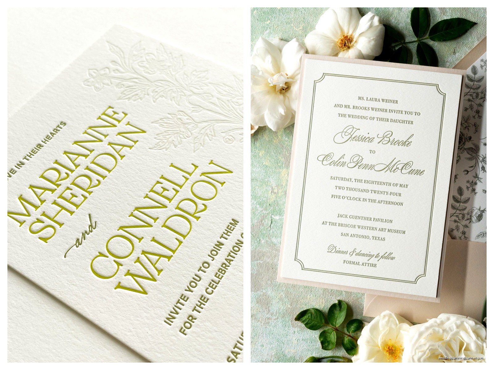
Typography looks amazing with letterpress. Serif fonts especially. There’s something about the way the thick and thin strokes get pressed into the paper that just works. Script fonts can be beautiful too but make sure they’re not too delicate or the thin parts might disappear.
Paper Stock
This is huge. You need thick paper for letterpress – I’m talking 220lb cotton paper minimum, though 300lb or even 600lb looks incredible. Regular thin paper will basically just get crushed or might tear under the pressure. Cotton paper is standard because it’s soft enough to receive the impression but sturdy enough to handle it.
Crane Lettra is like the gold standard that every letterpress printer knows. It comes in different weights and a bunch of colors. There’s also Bella Cotton, Somerset, and other specialty papers. Each one takes ink and impression slightly differently, so ask your printer what they recommend.
Colored papers can be gorgeous – you can do dark ink on light paper (classic), light ink on dark paper (dramatic), or tone-on-tone where the ink is similar to the paper color so you mostly see the impression. That last option is super elegant but doesn’t photograph as well if you care about that.
Finding A Letterpress Printer
Not every print shop does letterpress. You need to find an actual letterpress studio or a printer that specializes in it. I keep a running list of printers I trust in different price ranges because this comes up constantly with clients.
Ask to see physical samples, not just photos. The whole point is the tactile quality so you need to feel examples of their work. Look at how deep the impression is, whether the ink coverage is even, if the registration is clean (that means when multiple colors are used, they line up properly).
Questions to ask: Do they use metal plates or polymer? Metal is traditional and lasts longer but polymer is fine for most jobs and cheaper. What’s their turnaround time? Letterpress usually takes 4-6 weeks minimum, sometimes longer during wedding season. What’s their minimum order? Some printers won’t take jobs under 100 pieces.
Local vs. Online Printers
Local printers are great if you want to be involved in the process – some will even let you come see your job run which is actually really cool to watch. The old presses are like these massive mechanical beasts and there’s something satisfying about seeing your invitations come to life.
Online letterpress companies like Bella Figura, Dauphine Press, and others offer semi-custom options where you pick a design from their collection and customize the wording and colors. This is cheaper than fully custom but you’re working within their existing templates. Still looks beautiful though and they have good quality control since they’re doing this all day every day.
I had a client who went with a local printer she found on Instagram without checking their experience level first and… yeah that was a mistake. The impression was so deep it almost punched through the paper in some spots, and the ink was uneven. We had to scramble to get them reprinted elsewhere with only three weeks before the wedding. So stressful.
The Cost Breakdown Nobody Tells You About
Okay so here’s what you’re actually paying for with letterpress. First, there’s the plate-making – each color needs its own plate and this can be $50-150 per plate depending on size and whether it’s polymer or metal.
Then there’s the paper, which is more expensive than regular cardstock because you need that thick cotton stock. Setup fees for the press itself. Labor because letterpress is hands-on and takes time – someone is literally feeding each sheet through the press, checking quality, making adjustments. The more colors you have, the more passes through the press, the more time it takes.
If you want edge painting (colored edges on your paper) or envelope liners or other fancy additions, those are separate costs. Envelopes themselves can be letterpress printed too but that adds up fast. A lot of people do letterpress for the main invitation and then use digital printing for the enclosure cards to save money, which is totally fine.
One thing that annoys me? When couples don’t factor in addressing. You’ve spent all this money on gorgeous letterpress invitations and then you’re gonna print addresses on your home printer with basic labels? Come on. At least do digital calligraphy or hire a calligrapher. Or get the envelopes letterpress printed with addresses if budget allows, though that’s pricey.
Timeline For Getting This Done
You need more time than you think. Here’s a realistic timeline: Start looking at letterpress options 6-8 months before your wedding. Finalize your design and place your order at least 4 months out, maybe 5-6 months to be safe.
The printer needs time to create plates, order paper, schedule press time, run your job, and deal with any issues that come up. Rush fees exist but they’re expensive and sometimes a printer literally cannot rush letterpress because they’re booked solid.
Build in time for you to receive them, address envelopes, and mail them out 8 weeks before the wedding (or 6 weeks minimum). So working backwards from your wedding date, you’re ordering invitations like 5-6 months in advance at least.
Design Elements That Work Best
Simple geometric borders look amazing with letterpress. Monograms are perfect for it. Typography-focused designs where the font itself is the star. Minimalist layouts with lots of white space. Traditional formal wording with classic fonts.
You can do illustrations but keep them fairly simple with clear lines. Super detailed watercolor-style art or photographs don’t work well with letterpress – you’d need to do digital printing for that instead or a combination where some elements are letterpress and photos are printed separately then attached.
Blind debossing is when there’s no ink at all, just the impression. This looks incredibly elegant and modern, especially for something like a monogram or border. Some couples do blind deboss on the back of the invitation or on the envelope flap.
Color Combinations To Consider
Navy ink on white paper is classic and always looks good. Black on cream is traditional and formal. Gray on white is softer and modern. Metallics like gold, silver, or copper are gorgeous but more expensive because metallic inks cost more and can be trickier to print.
Two-color combos: navy and gold, blush and gray, sage green and cream, burgundy and gold. Just remember each color = another pass = more money. Sometimes it’s worth it though for that perfect look you’re going for.
My cat knocked over my coffee on a sample set once and the cotton paper actually held up pretty well after it dried, which I guess speaks to the quality? Not that I recommend coffee-testing your invitations but it happened and I thought it was kinda funny in a “of course this would happen right before a client meeting” way.
Envelope Options And Addressing
Your envelopes matter more than you think because that’s the first thing guests see. A5 envelopes are standard for 5×7 invitations. You can get them in colors to match your paper, or do a contrasting color for visual interest.
Envelope liners add a pop of color or pattern when someone opens the envelope. You can order custom printed liners or use solid colors. They’re not necessary but they’re a nice touch if budget allows.
For addressing, options include: professional calligraphy (most expensive but gorgeous), digital calligraphy printing (cheaper but still pretty), letterpress printing addresses directly on envelopes (pricy but cohesive), or nice computer printing with a good font (most affordable).
Return addresses can go on the back flap, either letterpress printed or with a stamp. Custom stamps are like $30-50 and reusable so that’s an economical option that still looks nice.
What Can Go Wrong And How To Prevent It
Impression depth can be inconsistent if the printer doesn’t have the pressure calibrated right. This is why you want to see samples of their actual work, not just their portfolio photos which might be their absolute best pieces.
Ink can be patchy if it’s not applied evenly or if the plate isn’t properly locked in. Colors might not match exactly what you expected – always ask for a physical color proof if color accuracy is critical to you.
Paper can tear or crease if it’s not fed through the press correctly or if the impression is too deep. Registration issues happen when multiple colors don’t line up properly – there should be some tolerance for slight misalignment with handmade processes but it shouldn’t be obvious or sloppy.
The best prevention is hiring an experienced printer with good reviews and seeing their samples in person. Also build buffer time into your timeline so if something does need to be reprinted, you’re not completely screwed.
Putting It All Together
So here’s what a typical letterpress invitation suite might include: the main invitation (letterpress), RSVP card (could be letterpress or digital), details card about accommodations and directions (usually digital to save money), and maybe a reception card if ceremony and reception are separate… or you can combine everything onto one card if your wording isn’t too long.
Assembly matters. Stack everything in order with the main invitation on bottom, then other cards, then tuck it all into the envelope with the text facing up so when someone opens it they see your beautiful design immediately. If you have a belly band or ribbon, wrap it around the stack before inserting.
Some people get stressed about the order of enclosure cards but honestly as long as the invitation is on bottom (or in back) and guests can easily figure out what each piece is for, you’re fine. Don’t overthink it.
Weight is another thing – letterpress invitations with thick cotton paper are heavy, so you might need extra postage. Take a fully assembled invitation to the post office and have them weigh it before you buy stamps. Square envelopes also cost more to mail because they can’t go through automated sorting machines.
Alternatives If Letterpress Doesn’t Fit
If letterpress is outside your budget but you still want that dimensional quality, look into thermography. It’s raised printing that you can feel but it’s created through a heat process rather than pressing, and it’s cheaper. Doesn’t look quite the same but it’s still nice.
Engraving is another pressed technique but it’s actually more expensive than letterpress usually. The image is recessed into a metal plate and paper is pressed into it from behind, creating a raised image on the front. Very formal and traditional.
Digital printing has come a long way and can look really good, especially on nice paper. You won’t get the impression but you can do full color, photos, gradients, and complex designs that letterpress can’t handle. And it’s way more affordable.
Some couples do a combination – letterpress for just the names or a monogram on an otherwise digitally printed invitation. Or letterpress for the invitation itself and digital for all the enclosure cards. That gives you the letterpress element without the full cost of doing everything that way.