Planning Guides, Style Guide
Photo Wedding Invitations: Custom Picture Card Designs
May
Getting Started With Photo Invitations
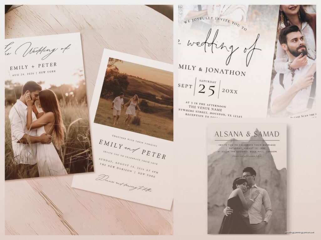
So photo wedding invitations are having this huge moment right now and honestly they’re not going anywhere. The basic idea is you take your engagement photos or really any photo of you two and turn it into the actual invitation instead of just having text with maybe a tiny monogram or whatever. I had this couple back in summer 2021 who wanted to use like seven different photos and I had to literally sit them down and explain that more isn’t always better because their guests were gonna be so confused about which card was the actual invitation.
Types of Photo Card Designs You Should Know About
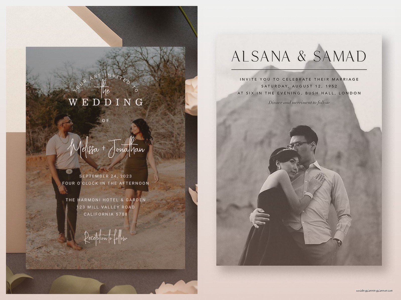
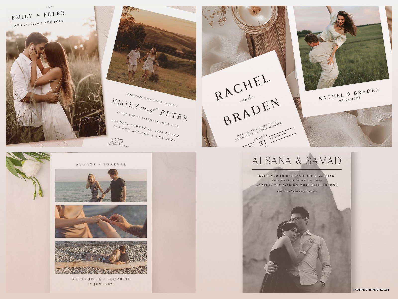
There’s basically a few main categories here. Full bleed photos where the image goes edge to edge and the text sits on top of the photo itself – these look super modern and magazine-like. Then you’ve got framed photos where there’s a border around your picture and the text goes below or beside it, which feels more traditional I guess. Collage style is when you use multiple photos in a grid or artistic layout, and those work great if you can’t pick just one shot or if you wanna tell more of your story.
Oh and there’s also the postcard style which is kinda having a resurgence? Like the photo is on one side and all your wedding info is on the back. Super clean, saves on printing costs because it’s one piece instead of a card with an insert, but some older guests might not immediately realize it’s a wedding invitation because it looks so casual.
Choosing The Right Photo
This is where people mess up the most honestly. You need high resolution images – I’m talking at least 300 DPI at the size you’re printing. Your photographer should give you high res files but double check because some send you like web-sized previews first. I’ve seen couples try to use photos they pulled from Instagram and then get shocked when the printed version looks pixelated and terrible.
The composition matters so much more than you think. If you’re doing text overlay, you need negative space – that’s photographer speak for empty areas where the text can breathe. A photo where you’re smack in the center with busy stuff happening all around makes it nearly impossible to read your wedding details. Look for images with a clear sky, a blank wall, an open field, something like that where words can sit comfortably.
What Actually Photographs Well For Invitations
Lighting is everything and I mean everything. Soft natural light photographs way better than harsh shadows or that golden hour thing where half your face is in shadow. It might look artistic in your photo album but on an invitation you want guests to actually see your faces clearly. Backlit photos can work if there’s enough fill light on you, but a lot of times you end up as silhouettes which… I mean unless that’s specifically what you’re going for, nah.
Close-ups of your faces work better than full body shots for most invitation sizes because invitations are like 5×7 or 6×8 typically. If you use a photo where you’re tiny figures in a landscape, guests are gonna need a magnifying glass to see you. Save those epic wide shots for the save the dates maybe where they can be bigger.
Text Placement and Readability
This is the thing that drives me absolutely crazy – couples pick the most gorgeous photo and then slap white text over a white dress or black text over a dark suit and wonder why nobody can read it. You gotta think about contrast. If your photo has light areas, use dark text. Dark areas, light text. Seems obvious but you’d be surprised.
Text boxes with semi-transparent backgrounds are your friend. Like a white box with 70% opacity behind your text means the photo shows through a bit but your words are still totally readable. Some designers hate this look and say it’s not elegant enough but you know what’s really not elegant? Your guests having no idea what time your ceremony starts.
Font choices matter more on photo invitations than regular ones because you’re competing with the image for attention. Script fonts can get lost really easily especially in small sizes. I usually tell people to use a clean serif or sans serif for the important details (date, time, location) and maybe a fancier font for just your names if you really want that romantic vibe.
Layout Options That Actually Work
Horizontal layouts give you more room for landscape-oriented photos and they feel more modern and casual. Vertical layouts are more traditional and formal. I did this wedding in spring 2023 where the bride was absolutely set on using a horizontal photo in a vertical invitation and we had to crop out the groom’s brother who was standing on the side and it became this whole drama.
Split designs are really popular right now – half the card is your photo and half is a solid color block with text. These are great because you don’t have to worry as much about text overlay issues. The photo does its thing on one side, the information is crystal clear on the other side.
Bleed vs border is another choice you gotta make. Full bleed (where the photo prints to the edge) looks more modern and expensive honestly. Bordered designs with white space around the photo feel more classic. There’s no wrong answer but just know that full bleed costs slightly more usually because of how the printing process works.
Working With Your Printer
Okay so here’s something nobody tells you – screens and paper show color differently. That gorgeous warm sunset photo on your laptop might print way more orange than you expected. Good printers will send you a proof, and you should absolutely pay for a physical printed proof not just a PDF. I cannot stress this enough. Digital proofs don’t show you the actual paper texture, color accuracy, or how the finish affects the image.
Speaking of finishes, you’ve got matte, glossy, and pearl/shimmer options usually. Matte is sophisticated and reduces glare which makes it easier to see the photo in different lighting. Glossy makes colors pop more and feels more vibrant but can be harder to read if light hits it wrong. Pearl is kinda in between with a subtle sheen.
Paper weight matters for photo cards – you want at least 120lb cover stock so it feels substantial. Flimsy invitations with your beautiful engagement photos on them just feel cheap no matter how good the printing is.
Color Correction and Editing
Don’t assume your photographer’s editing is gonna translate perfectly to print. Sometimes you need to adjust brightness, contrast, or saturation specifically for printing. Most professional printers can help with this but you might need to pay extra for color correction services.
If you’re printing at home (which I don’t usually recommend for actual invitations but whatever), you need to calibrate your monitor and do test prints. The photo paper you use at home matters a ton – cheap stuff from the drugstore is not gonna give you professional results.
What To Include With Your Photo Invitation
Just because the invitation itself has a photo doesn’t mean you need photos on every single insert. Actually it’s better if you don’t – let the invitation be the star and keep your details card, RSVP card, and other inserts simple. Too many competing photos make the whole suite look chaotic.
Your envelope is another opportunity though. Photo envelope liners are gorgeous if your budget allows. They’re like a sneak peek of your invitation when someone opens it. Or you could do a photo on the back flap of the envelope as a seal design.
Return address printing – you can incorporate a tiny version of your photo into your return address design or keep it simple with just text. I lean toward simple because the mail sorting machines sometimes have trouble with too much visual noise in the address areas.
Digital Versions
You’re probably gonna want a digital version for your wedding website or to text to people who need the info quickly. Make sure you get both print files and web-optimized files from your designer. They’re different specs – print is high res and CMYK color mode, web is lower res and RGB color mode. If you try to use a print file on your website it’ll load super slowly and if you try to print a web file it’ll look blurry.
Budget Stuff Nobody Talks About
Photo invitations typically cost more than text-only designs because of the printing quality needed. You’re looking at anywhere from like $3 to $12 per invitation depending on all your choices. That adds up fast when you’re inviting 150 people.
Ways to save money: use the photo on just the invitation itself and not the whole suite, choose standard sizes that don’t require custom cutting, skip fancy finishes like foil or letterpress, and order slightly more than you need the first time because reorders of small quantities cost way more per unit.
One thing that annoyed me so much last year was this couple who wanted to completely change their photo after I’d already placed the print order and they couldn’t understand why that wasn’t just a quick fix. Like we had to cancel, pay a cancellation fee, start over with a new proof, and they ended up spending an extra $400 because they didn’t make a final decision when I asked them to.
Timeline For Ordering
You need your engagement photos back from your photographer first obviously, so factor that in. Most photographers take 4-6 weeks to edit and deliver a full gallery. Then you need time to pick your favorite shot, work with a designer or stationery company on the layout, review proofs, approve everything, and have them printed.
The actual printing takes 2-3 weeks usually, sometimes longer during busy wedding season. Then you gotta assemble everything, address envelopes, and mail them. Invitations should go out 8 weeks before your wedding, or 12 weeks if it’s a destination wedding. So work backwards from there – you really need to book your engagement session like 5-6 months before your wedding if you wanna use those photos on your invitations.
Common Mistakes I Keep Seeing
Using photos where you’re not looking at the camera can work but it’s tricky. Candid shots are beautiful for save the dates or thank you cards but invitations feel more… I dunno, official I guess? Guests want to see your faces clearly.
Overediting the photo so you don’t even look like yourselves anymore. I get it, everyone wants to look their best, but if you smooth and filter so much that your own mother wouldn’t recognize you, maybe dial it back a bit.
Forgetting about the envelope – you spent all this money on a gorgeous photo invitation and then you stuff it in a plain white envelope? At least get envelopes that coordinate with your color scheme or upgrade to a colored envelope that complements your photo.
Not considering how the photo works with your wedding style. If you’re having a black tie ballroom wedding, maybe that casual photo of you two in jeans and baseball caps sends mixed messages. Your invitation sets the tone for the whole event so make sure everything aligns.
Working With Different Photography Styles
If your photographer shoots really moody and dark, those photos might need extra work to translate to invitations where you want things readable and clear. Super artistic photos with weird crops or experimental angles are cool for your album but can be difficult for invitation layouts where you need room for text and a balanced composition.
Black and white photos are making a comeback for invitations and they’re actually easier to work with in some ways because you don’t have to worry about color accuracy issues. They also tend to look more timeless and elegant. My cat knocked over my coffee onto a sample set last month and the black and white ones showed the stains way less obviously than the color ones if that tells you anything about durability.
Etiquette Things To Consider
Some older or more traditional guests might think photo invitations are too casual for a formal wedding. That’s just something to be aware of – you can do it anyway if you love the look, but know that your grandmother might have opinions.
If you have divorced parents or complicated family situations, think carefully about which photos you use. A photo with just one side of the family might cause hurt feelings. Sometimes a photo of just the two of you is the safest choice.
Religious considerations – if you’re having a religious ceremony, check if there are any guidelines about imagery on invitations. Some faiths have specific traditions about wedding stationery.
Alternatives If You’re Not Sold On Full Photo Invitations
You could do a small photo as an accent instead of the main event – like a tiny circular photo at the top of an otherwise text-based invitation. Or use a photo just on the save the date and go more traditional for the actual invitation. There’s also illustrated versions of your photo which some artists offer, where they turn your engagement photo into a custom drawing or watercolor painting, and that’s like a middle ground between photo and traditional.
Honestly photo wedding invitations are gonna continue evolving with printing technology and design trends, but the basics I’ve covered here should help you figure out if they’re right for your wedding and how to actually make them happen without losing your mind or all your money