Planning Guides, Style Guide
Maroon Wedding Invitation: Design & Ordering Guide
Jun
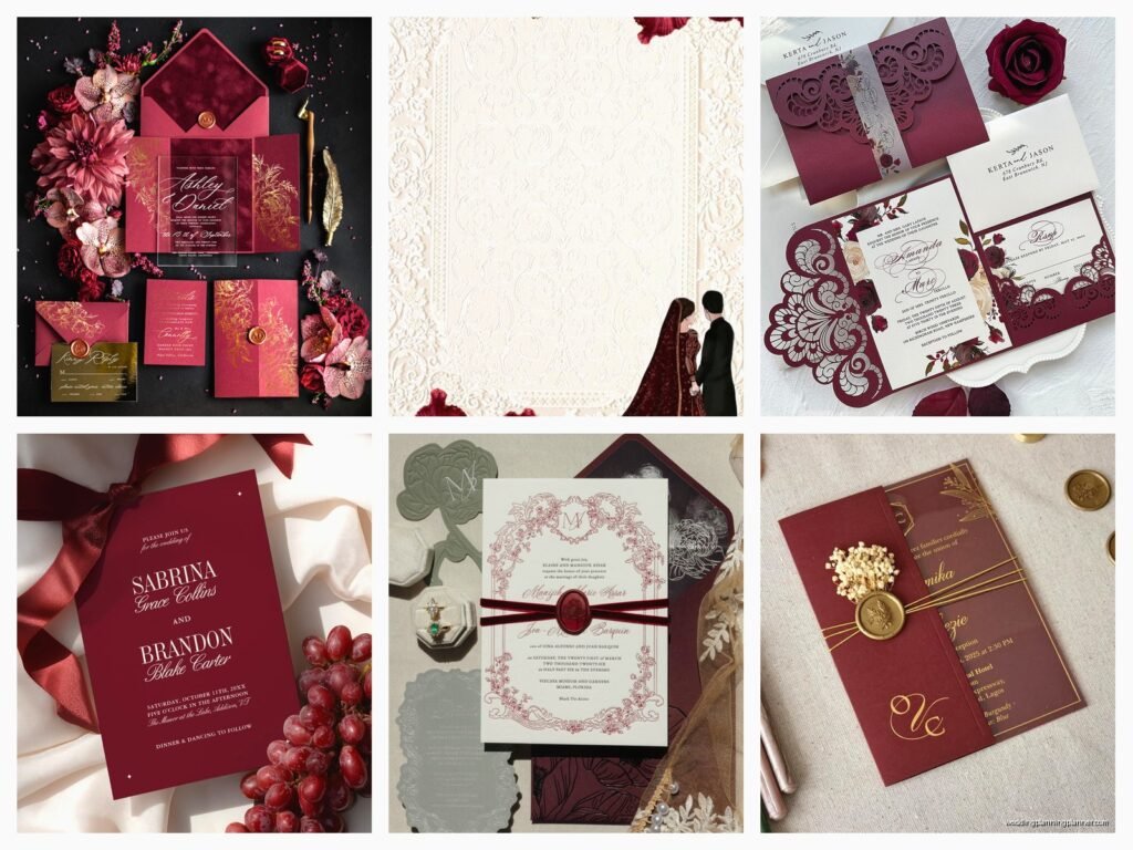
Okay So Maroon Invitations Are Having a Moment
I’ve been designing wedding invites for like fifteen years now and maroon has absolutely exploded in the past two years. It’s not just burgundy anymore—people want that deep, rich maroon that looks expensive without being too… I don’t know, wine-drunk? If that makes sense.
First thing you gotta figure out is what shade of maroon you’re actually going for because there’s like a million versions. There’s the brick-red maroon that leans orange, the plum maroon that’s almost purple, and then the classic deep maroon that’s kinda brown-ish. I had this bride in spring 2023 who kept saying she wanted “maroon” but what she actually wanted was marsala, and we went through three proof rounds before I literally made her a color chart. So yeah, get specific from the start.
Picking Your Maroon Palette
You can use maroon as your primary color or as an accent. Most people do it one of these ways:
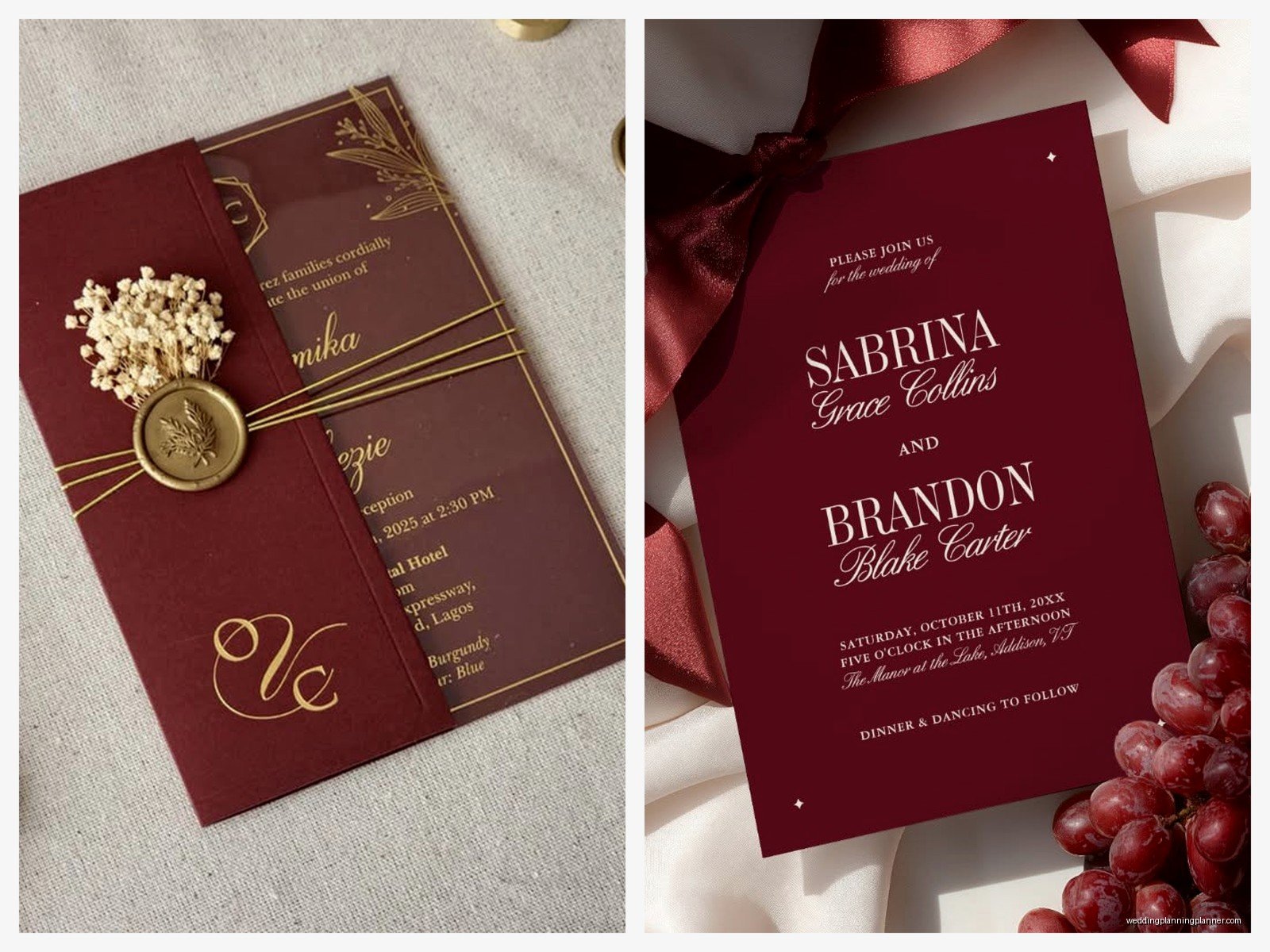
- Full maroon cardstock with gold or cream text
- Cream or white base with maroon text and borders
- Maroon envelope with coordinating lighter insert
- Maroon watercolor wash as background
- Maroon wax seal on neutral invitation
The full maroon cardstock looks super dramatic but here’s what annoys me—printers never get it exactly right on the first try. The color shifts depending on the paper stock, the printer calibration, and apparently the mood of the printing gods. I always tell clients to order a sample first, but do they listen? Sometimes.
Design Elements That Actually Work
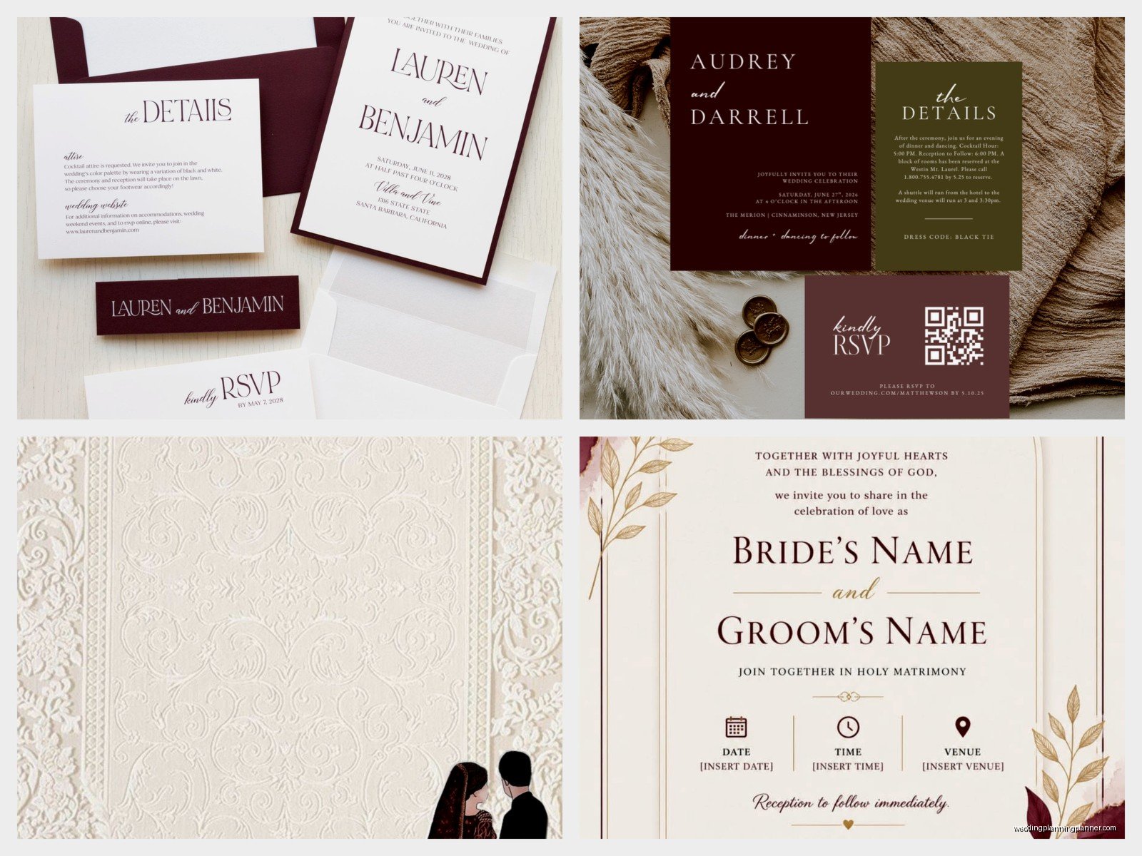
Maroon pairs best with gold foil, and I mean that’s just facts. Rose gold works too if you’re going for softer vibes. Cream, ivory, blush pink, and sage green are your friend colors. Navy can work but it gets muddy fast so be careful with that combo.
For fonts, you want contrast. If you’re doing a formal wedding, pair a romantic script with a clean serif. For modern weddings, go geometric sans-serif with maybe one script element for names. I did this invitation set last fall where the couple wanted everything in calligraphy and it was just… a blob of curlicues that nobody could read, so we had to scale back.
Paper Stock Matters More Than You Think
Okay this is where people try to cut corners and then regret it. Your paper weight should be at minimum 110lb cardstock. For maroon specifically, I recommend 120lb or higher because the darker color can make thinner paper feel flimsy.
Paper finishes:
- Matte: Classic, sophisticated, doesn’t show fingerprints
- Linen: Has texture, feels expensive, great for traditional weddings
- Smooth: Best for intricate designs and foil stamping
- Cotton: Luxury option, has that deckled edge vibe
I personally love linen texture for maroon invites because it adds dimension without trying too hard. My cat knocked over my coffee onto a linen sample once and it actually absorbed it better than the smooth stock, so there’s that.
Layout and Information Hierarchy
People overthink this but it’s actually pretty straightforward. Your invitation should answer: who, what, when, where, and how to RSVP. In that order, usually.
Standard components you’re gonna need:
- Main invitation card (the big one)
- RSVP card with envelope
- Details card (accommodations, website, dress code)
- Envelope (outer and maybe inner)
- Envelope liner (optional but makes it fancy)
For maroon invites specifically, I like doing a cream main invitation with maroon text, then a maroon RSVP card with cream text. It creates this nice visual balance when people open the envelope. Or flip it—maroon main invite with a cream details card.
Typography Tips I Learned the Hard Way
If you’re printing maroon text on light paper, you need to make sure your font isn’t too thin or it’ll look spotty. Script fonts under 18pt tend to fill in when printed in dark colors. Go for medium-weight fonts at minimum.
Also, letter spacing matters. Maroon is a heavy color visually, so if your text is too cramped it becomes this dark rectangle that’s hard to read. I usually increase letter spacing by like 50-100 for dark text on light backgrounds.
Where to Actually Order These Things
Alright so you’ve got options at every price point. I’m gonna be real with you about what you’re getting at each level.
Budget-Friendly Options ($1.50-$3 per invite)
Minted, Zazzle, Shutterfly: These are fine for simple designs. They have templates you can customize. The maroon might not be exactly what you see on screen, and the paper quality is decent but not luxury. Turnaround is usually 2-3 weeks. Good for casual weddings or if you have 200+ guests and need to save money.
Vistaprint: Even cheaper but the quality shows it. I’d only recommend for save-the-dates, not the actual invitation.
Mid-Range Options ($3-$6 per invite)
Minted Premium, Wedding Paper Divas, Artifact Uprising: Better paper stocks, more customization. You can usually request samples. The maroon colors are more consistent. They often have designers who can tweak templates for you. This is where most of my clients land honestly.
Etsy designers: This is kinda wild because quality varies SO much. But if you find a good designer (read reviews, look at actual photos not just mockups), you can get semi-custom work in this price range. Just make sure they provide print-ready files if you’re printing elsewhere.
Luxury Options ($6-$15+ per invite)
Bella Figura, Crane & Co, William Arthur: This is the fancy stuff. Letterpress, foil stamping, custom die cuts. The maroon will be Pantone-matched and gorgeous. Longer lead times though—sometimes 6-8 weeks.
Custom stationery designers (like me): We’ll design exactly what you want from scratch. You’re paying for the design time, revisions, and usually we have relationships with quality printers. This is the option if you want something truly unique or if you have a complicated vision.
Printing Methods You Should Know About
Because this affects both cost and look dramatically:
Digital printing: Most affordable, good color reproduction, flat finish. Works great for maroon designs with lots of color variation or photos. No setup costs.
Offset printing: Better for large quantities (100+), more color-accurate, can do Pantone matching. There’s a setup fee but per-unit cost drops.
Letterpress: Creates an impression in the paper, super tactile and gorgeous. Maroon letterpress on cream paper is *chef’s kiss*. Expensive though, and you need thick paper stock.
Foil stamping: Gold foil on maroon paper? Yes. This is a separate process, adds cost, totally worth it for formal weddings. Rose gold foil is also stunning with maroon.
Thermography: Raised printing that mimics engraving but cheaper. Gives nice texture. The maroon will be shiny/glossy where it’s raised.
Timing Your Order
You need your invites mailed 8 weeks before the wedding, bare minimum 6 weeks. Work backwards from there:
- Design phase: 2-4 weeks (faster if using templates)
- Proofing and revisions: 1-2 weeks
- Printing: 2-4 weeks depending on method
- Assembly: 1 week (or one very long weekend)
- Addressing: 1-2 weeks
So you’re looking at starting the process 4-5 months before your wedding. I know that seems early but summer 2021 I had a bride who waited until 8 weeks before her wedding to start and we had to rush everything, pay express fees, and she still had to hand-deliver some invites because timing was so tight.
Proofing Is Where Mistakes Happen
Check everything three times. Then check again. Common mistakes I see:
- Wrong date (seriously, this happens more than you’d think)
- Misspelled venue name
- Wrong time or time zone
- Typos in parents’ names
- Incorrect RSVP date
- Wrong website URL
Have someone else read it. Your mom, your friend, your accountant, I don’t care who—just get fresh eyes on it because you’ll miss stuff after staring at it for hours.
Assembly and Extra Touches
If you’re doing a multi-piece suite, you’ll need to assemble everything. It’s actually kinda therapeutic if you put on a good show—I binged all of Succession while assembling my last big order.
For maroon invites, consider these extras:
- Maroon envelope liner (you can DIY these with template paper)
- Maroon wax seal (easier than you think, just get a seal stamp and wax sticks)
- Gold or cream ribbon belly band
- Vellum overlay with printed details
- Dried flowers or greenery tucked in
Wax seals look amazing but they add postage weight and sometimes get damaged in mail sorting. If you’re gonna do them, I recommend hand-delivering to your VIPs or using them only on inner envelopes.
Addressing and Postage
Maroon envelopes look gorgeous with white or gold ink. You can do calligraphy (hire someone or DIY if your handwriting doesn’t look like a drunk spider), print directly on envelopes, or use printed labels.
For formal weddings, I suggest white ink calligraphy on maroon envelopes. It’s striking and elegant. Gold ink is beautiful too but can be harder to read depending on the maroon shade.
Postage is boring but necessary—get your invites weighed at the post office before you buy stamps. Square envelopes, thick invites, and wax seals all add cost. Also, please don’t use the forever stamps with like cartoon characters on formal wedding invites. Get the pretty ones or custom stamps.
Digital RSVP vs. Physical Cards
I’m seeing more couples skip physical RSVP cards and just direct people to their wedding website. It’s cheaper and easier to track, but older guests sometimes struggle with it. I usually recommend including both—a details card with your website for online RSVPs, but mention they can email or call if needed.
If you’re doing physical RSVP cards, the maroon ones need pre-stamped return envelopes. People are lazy and won’t RSVP if they have to find a stamp, that’s just reality.
Sample Ordering Is Non-Negotiable
I cannot stress this enough—order samples before committing to 150 invitations. The maroon you see on your screen will NOT be the maroon that arrives. Monitors display colors differently, printers interpret files differently, and paper type changes how color appears.
Most companies charge $5-15 for samples, which seems annoying but it’s way better than receiving 150 invitations in a maroon that looks like… I don’t know, ketchup? When you wanted wine?
Order samples from 2-3 vendors if you’re undecided. Compare them in natural light, in indoor light, take photos of them to see how they photograph (because your guests will post these on Instagram).
Budget Real Talk
For a guest list of 100, you’ll probably send 60-75 invitations (couples and families share). Here’s rough math:
- Budget route: $100-200 total
- Mid-range: $300-500 total
- Luxury: $600-1200+ total
This includes all inserts, envelopes, printing, and postage. It doesn’t include addressing services (add $1-3 per envelope) or design fees if you’re hiring someone.
You can save money by: doing single-panel instead of folded invites, skipping envelope liners, printing your own envelopes, using digital RSVPs, and buying paper goods during sales (Minted has sales constantly).
Common Design Mistakes With Maroon
Using too many dark colors together—maroon, navy, and black looks muddy. Stick with maroon plus light neutrals and one metallic.
Overcrowding the design because you’re worried about empty space. White space is your friend, especially with a heavy color like maroon.
Choosing a maroon that clashes with your actual wedding colors. Bring your invitation sample to your florist and venue to make sure it coordinates.
Using low-resolution graphics or photos—they’ll look pixelated when printed, especially obvious on dark backgrounds.