Planning Guides, Style Guide
Marriage Card Photo: Design & Ordering Guide
Jun
Getting Your Photo Right for Marriage Cards
Okay so the photo on your marriage card is probably gonna be one of the most scrutinized images of your entire wedding planning process and I learned this the hard way back in spring 2023 when a bride called me crying because her printer had already run 200 cards with a photo that made her fiancé look like he had three chins. The lighting was terrible, the angle was worse, and we had to eat the cost and start over.
First thing – you need to decide if you even want a photo on your card. I know that sounds obvious but hear me out. Traditional formal invitations often skip the photo entirely, and honestly sometimes that’s the classiest move. But if you’re going for something more personal or modern or you just really love how you two photograph together, then yeah, go for it. Just know what you’re committing to because changing your mind after approving a proof is expensive.
Choosing the Right Photo
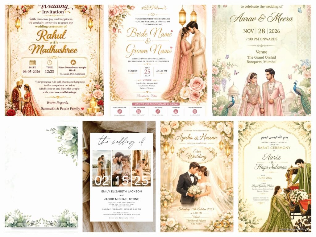
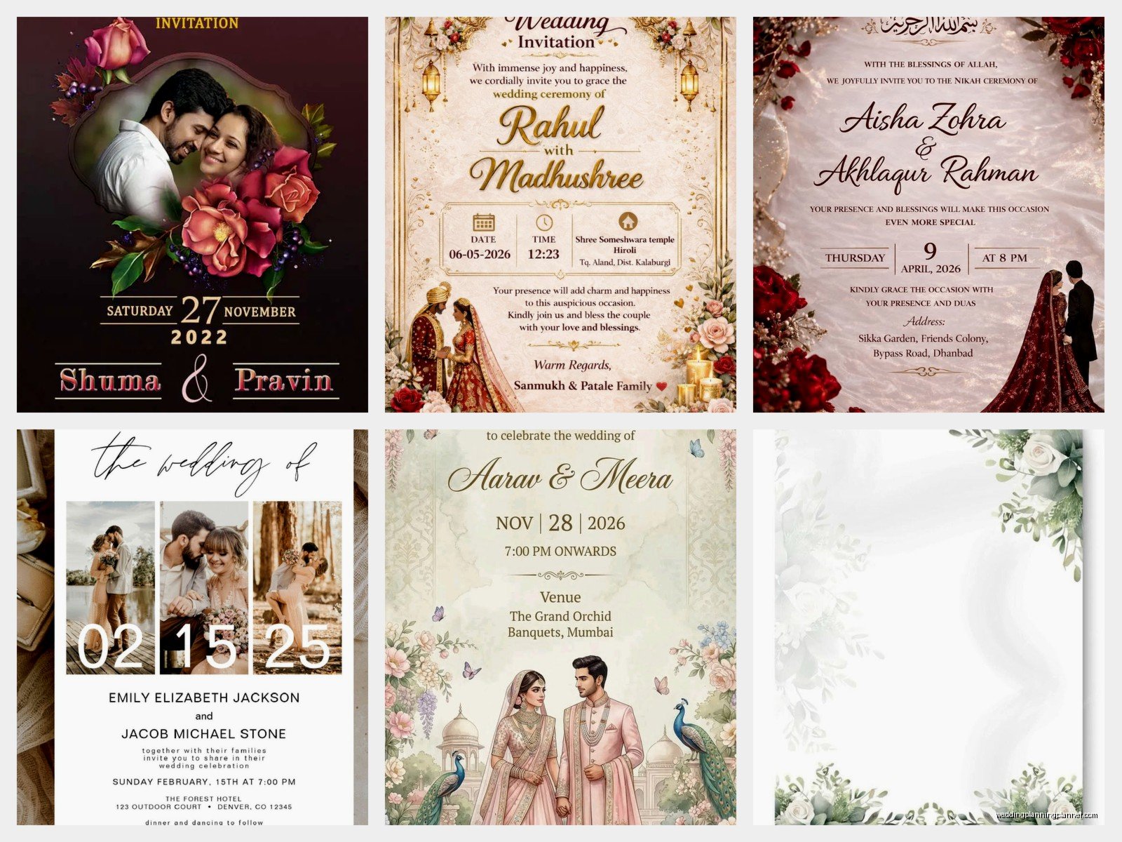
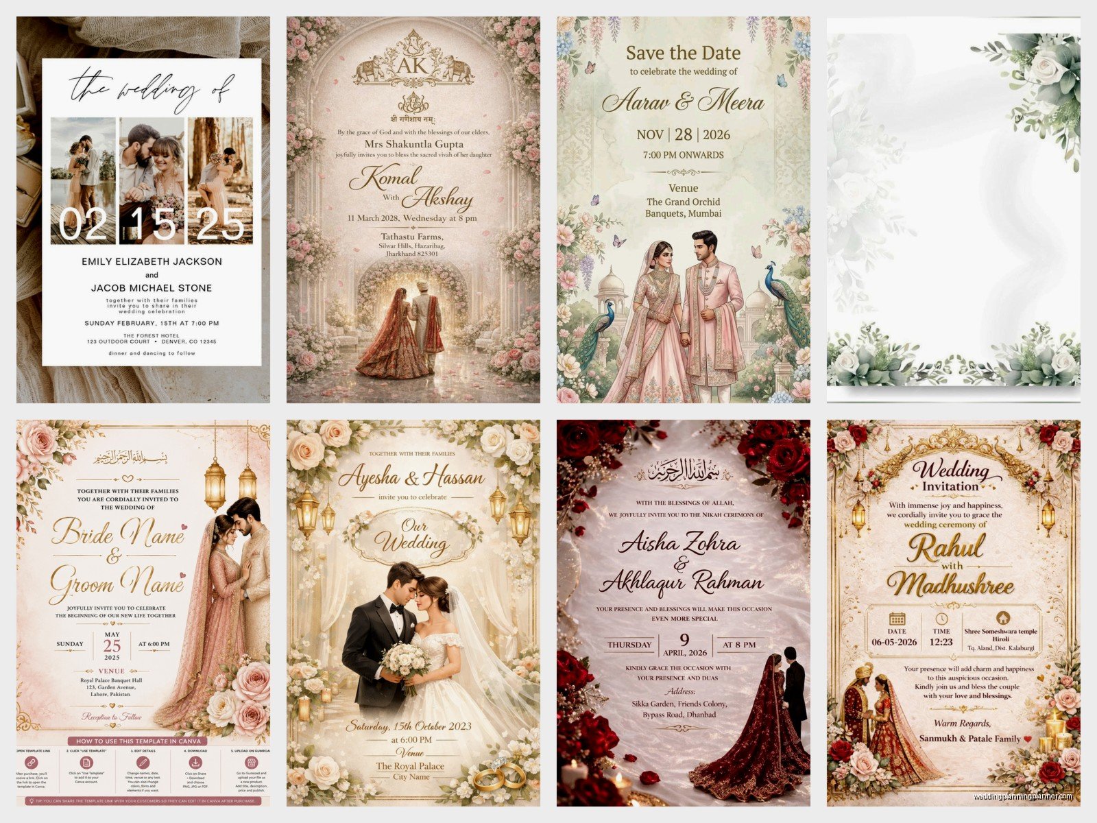
This is where people mess up constantly. You want a photo that’s recent – like within the last year recent. Not your engagement photos from 2019 when you both had different haircuts and he weighed 20 pounds less. Your guests will see you at the wedding and if there’s a massive disconnect between card-you and real-you, it’s gonna be weird.
The photo needs good resolution. I’m talking at least 300 DPI at the size it’ll print. If you’re pulling something off Instagram that you screenshot, nah, that’s not gonna work. It’ll look pixelated and grainy and cheap. Get the original high-res file from your photographer. If you don’t have professional photos, take new ones with a decent camera – even iPhone portrait mode can work if you have good natural light.
Speaking of light, this is critical. Outdoor photos in natural light during golden hour (that’s like an hour before sunset) are your best friend. Harsh overhead sun at noon? Your enemy. Indoor photos with yellow tungsten lighting? Also not great unless your printer can color-correct really well. I once had a couple insist on using a photo taken at a dimly lit restaurant and even after corrections it looked muddy and… actually you know what, my cat does this thing where she sits on whatever paper I’m working on and that couple’s proof sheet was her favorite napping spot for like a week, which felt appropriate given how many rounds of corrections we did.
Composition Matters More Than You Think
The way you’re positioned in the photo affects how it’ll work on the card layout. If your faces are way off to one side, you’re gonna have awkward empty space or you’ll have to crop weirdly. Centered or slightly off-center works best for most card designs.
Also think about whether you want a close-up of just faces or a full-body shot or something in between. Close-ups are more intimate and work better for smaller card sizes, but they also show every little detail so make sure you’re happy with skin texture, makeup, any facial hair situation, everything. Full-body shots give you more flexibility with cropping and can show off your outfits or a pretty location, but faces can get lost if the card is standard size.
Vertical photos versus horizontal photos – this depends entirely on your card layout. Most traditional invitation formats work better with vertical images or square crops. Horizontal photos can work for postcard-style save-the-dates or more modern landscape-oriented designs. Just make sure you know your card dimensions before you finalize the photo selection because trying to force a horizontal photo into a vertical space means you’re either cropping out one person’s head or leaving tons of blank space.
Working With Your Designer or Template
If you’re hiring a stationery designer (hi, that’s literally what I do), they’ll usually guide you through this but you still need to come prepared. Send them 3-5 photo options and let them show you mockups with each one. What looks good on your phone screen might not work once it’s integrated with text and design elements.
For DIY templates from places like Minted or Zazzle or whatever, you’ll be dragging and dropping the photo yourself. This is where people get frustrated because the template has a fixed photo box and their image doesn’t quite fit right. You can usually adjust the zoom and position within the box, but if your photo is the wrong orientation or aspect ratio, you’re gonna struggle. Pro tip: download the template specs before you even pick your photo so you know exactly what dimensions you need.
Backgrounds and Busy-ness
Simple backgrounds work better than complicated ones. If you’re standing in front of a gorgeous mountain vista, that’s beautiful, but if there are also seventeen random tourists and some trash cans and a parking lot in the frame, it’s distracting. Your printer can sometimes blur backgrounds or do other edits, but that costs extra and doesn’t always look natural.
Solid-colored backgrounds or very soft blurred bokeh backgrounds make the text on your card easier to read. Because here’s the thing – you’re putting words on top of or around this image, and if the background is too visually busy, your guest information or wedding details get lost. I’ve seen cards where I literally could not read the venue address because it was printed over a section of photo that had too much contrast and pattern.
One thing that really annoys me is when couples pick a photo they love as a standalone image but refuse to see it as part of a design composition. Like yes, that shot of you two laughing with confetti everywhere is adorable, but when we add text it becomes a chaotic mess. Sometimes you gotta choose between your favorite photo and the photo that works best for the card design, and those aren’t always the same thing.
Editing and Filters
Light editing is fine – brightness adjustments, contrast, maybe removing a stray hair or a small blemish. But heavy filters or black-and-white conversions or those vintage effects… just think carefully. What looks cool on social media might look dated or overly stylized on a printed card that people keep on their fridge for months.
Black and white photos can be super elegant though, especially for formal weddings. They also print more consistently than color photos because you don’t have to worry as much about color calibration between your screen and the final printed product. But make sure it’s a true black and white conversion, not just a desaturated color photo, because those can look flat.
If you’re editing the photo yourself, work from the original RAW or highest quality file, make your edits, and export at maximum quality. Don’t edit a JPEG and then save it again as a JPEG because you lose quality with each save. Export as PNG or TIFF if your printer accepts those formats.
Ordering Process and Printer Considerations
Different printers have different capabilities and this matters more than you’d think. Digital printing is most common and works great for photo cards – it handles color gradients and photo details really well. Offset printing is better for large quantities but can be pricier for small runs. Letterpress doesn’t really work with photos unless you’re doing something very specialized and expensive.
When you upload your photo to an online printer, pay attention to the preview they show you. I know it’s tempting to just click through quickly but actually zoom in and check the details. Is the cropping how you want it? Are the colors looking right? Online previews aren’t perfect but they’ll catch obvious problems.
Order a sample or proof before you print 150 cards. This is not optional. I don’t care how perfect it looks on screen. Paper quality, ink saturation, color accuracy – all of this can only be evaluated with a physical sample in your hands. Most good printers offer digital proofs or single printed samples for reasonable prices. In summer 2021 I had a client who skipped this step despite my warnings and her “ivory” cardstock printed as straight-up beige and her skin tones looked orange and it was a whole disaster that could’ve been prevented with one $15 sample.
File Formats and Upload Specs
Your printer will specify what file format they need. Usually JPEG is fine for photos, but some want TIFF or PNG. Whatever they ask for, give them that exact format. Don’t try to be creative here.
Color mode matters – most photo prints should be in RGB color mode, but some professional printers prefer CMYK. Check their specs. If they need CMYK and you send RGB, the colors might shift when they convert it on their end.
Resolution again – 300 DPI minimum at the actual print size. If your card is 5×7 inches and the photo takes up most of that space, you need an image that’s at least 1500×2100 pixels at 300 DPI. Anything less and you risk it looking fuzzy or pixelated. I’ve had to reject so many photos because people send me something that’s 800 pixels wide and expect it to print crisply on a 5-inch wide card and that’s just… the math doesn’t work, you know?
Timing Your Order
Don’t wait until the last minute. Quality photo printing takes time, especially if you’re doing custom designs or working with a smaller stationery studio. Most online printers quote 3-5 business days for production plus shipping, but add buffer time for reviewing proofs, potential reprints if something’s wrong, and addressing your envelopes.
I usually tell couples to have their cards ready to mail 8 weeks before the wedding for local guests, 12 weeks for destination weddings. Work backwards from there – if you need them ready 8 weeks out, order 10 weeks before the wedding to allow for production and any issues. If you’re getting a sample first, add another week or two.
Cost Considerations
Photo cards typically cost more than text-only designs because of the printing complexity. Expect to pay anywhere from $1.50 to $5+ per card depending on the printer, paper quality, size, and any special finishes.
Fancy finishes like foil accents or raised text can look gorgeous with photos but they add significant cost. A simple flat-printed photo card might be $2 each, but add gold foil borders and you’re looking at $4-6 each. For 100 invitations that difference adds up fast.
Quantity discounts are real – ordering 150 cards is usually way more cost-effective per unit than ordering 75. But don’t over-order just to get a better price if you don’t need that many. I’d rather you order exactly what you need than have 50 leftover cards sitting in a drawer forever.
Paper Stock Options
The paper you print on affects how your photo looks. Matte cardstock is popular for photos because it doesn’t show fingerprints and has a soft, elegant feel. Glossy or semi-gloss makes photos look more vibrant and saturated but can feel less formal – it kinda reminds people of drugstore photo prints which might not be the vibe you want.
Textured papers like linen or felt are beautiful but they can make photo details less sharp. The texture interferes with the image crispness. If you love textured paper, consider using it for the backing or envelope and keeping the photo panel smooth.
Weight matters too – 110lb cardstock is standard and sturdy enough for mailing, but 130lb feels more substantial and luxurious. Just make sure it doesn’t get so thick that it costs extra postage. Cards over a certain thickness or rigidity require hand-canceling at the post office and additional postage.
Coordinating Your Suite
If your invitation has a photo, think about whether your other pieces should too or if that’s overkill. Some couples use a photo on the save-the-date and then go text-only for the formal invitation. Others use the same photo across everything for consistency. There’s no wrong answer but just think about the overall look.
Your RSVP cards, details cards, and thank-you notes can coordinate with the photo invitation through color scheme and fonts without necessarily repeating the image. Sometimes a subtle background pattern that pulls a color from your photo is enough to tie everything together.
Common Problems and How to Avoid Them
Bleed and trim issues – if your photo goes all the way to the edge of the card (called a full-bleed design), you need to extend the image past the actual card edge in your file. Usually 1/8 inch on all sides. Otherwise you might get white slivers along the edges after cutting. Your printer should specify their bleed requirements.
Color matching between screen and print is never going to be 100% perfect because screens emit light and paper reflects it. But you can get close by making sure your screen is reasonably color-calibrated and by ordering that sample proof I keep mentioning. If the colors are way off on your proof, you can request adjustments before the full print run.
Text readability – light text on a light photo background or dark text on dark background just doesn’t work. You need contrast. Sometimes adding a semi-transparent overlay box behind the text helps, or choosing a photo with a naturally light or dark area where text can sit comfortably. Your designer can help with this or if you’re DIYing it, most templates have these features built in.
I had a couple once who wanted their ceremony time printed in white text over a photo section that was mostly white sky and I tried to explain why this was a problem but they insisted it looked fine on their laptop and then the printed version came and surprise, you literally could not read the time without squinting in perfect light and tilting the card at an angle and…
Anyway. Contrast. It’s important.
File naming – this sounds silly but name your files clearly. “Wedding_Photo_HighRes_Final.jpg” is way better than “IMG_2847.jpg” when you’re uploading to a printer or sending to a designer. And please don’t send something labeled “Final” and then send three more versions. Label them v1, v2, v3 or use dates.