Planning Guides, Style Guide
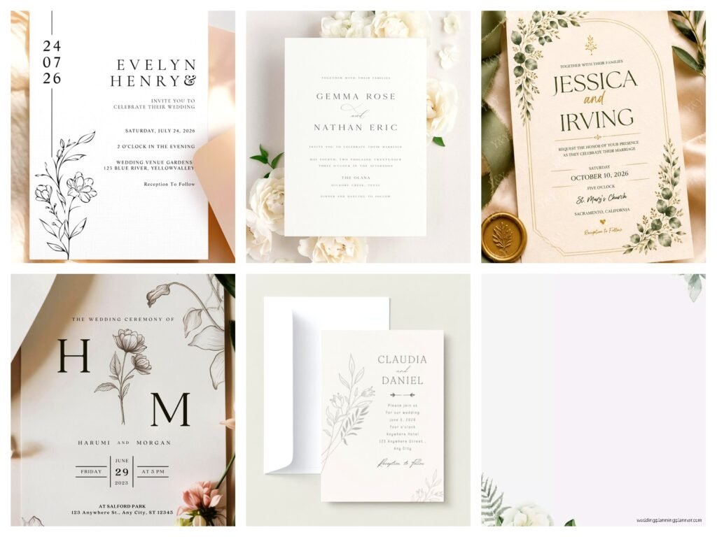
Simple Wedding Invitation Template: Minimalist Downloads
Jul
Okay So Minimalist Wedding Invitations Are Actually Way Harder Than You Think
Look, I’m gonna be straight with you – minimalist wedding invitation templates sound like the easiest thing in the world until you actually sit down to make one. Everyone thinks “oh I’ll just slap some text on a white background and call it a day” but then you end up with something that looks like a doctor’s appointment reminder instead of a wedding invite.
I learned this the hard way in spring 2023 when a bride came to me with a Pinterest board full of “simple” invitations and I thought it’d take me like two hours max. Four days later I was still tweaking kerning at 2am because minimalist design means every single tiny detail shows. There’s nowhere to hide when you strip everything down to basics.
What Actually Makes a Minimalist Template Work
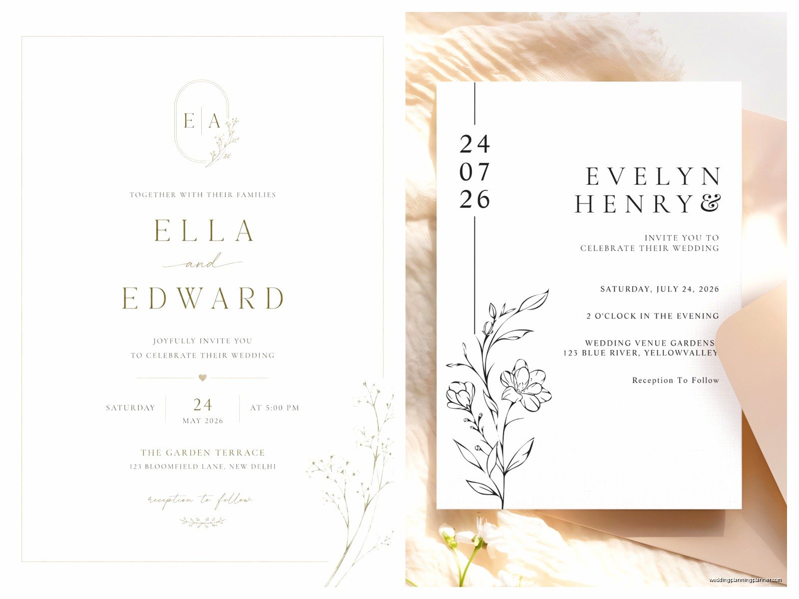
The whole point of minimalist invites is that they’re clean and uncluttered, but you still need hierarchy. Like, people need to know what they’re looking at within two seconds. Your names should be the biggest thing, then the date, then the location. I usually do:
- Couple names at like 24-36pt depending on the template size
- Date at 18-24pt
- Location and time at 12-14pt
- RSVP details at 10-12pt
But honestly those numbers change depending on your font choice and… okay we’ll get to fonts in a second because that’s where people really mess up.
Font Choices That Don’t Make Me Want To Scream
This is the thing that annoys me SO MUCH about downloadable templates – people pair like five different fonts together and call it “minimalist” when really it just looks chaotic. Minimalist means restrained. You need two fonts maximum, and honestly? One font in different weights works perfectly fine.
For minimalist wedding invites, I always recommend:
- A clean serif for elegance (think Cormorant, Lora, or even good old Garamond)
- A sans-serif for modern vibes (Montserrat, Raleway, or Futura if you can get it)
- Or just use one font family with regular, italic, and bold weights
My cat knocked over my coffee onto a template proof once and honestly the coffee stain looked more interesting than the original design, which tells you something about how boring “simple” can get if you’re not careful with your typography.
Mixing Fonts Without Looking Like A Ransom Note
If you’re using two fonts, pair a serif with a sans-serif. Don’t pair two serifs or two sans-serifs unless you really know what you’re doing. And for the love of everything, don’t use script fonts for minimalist invites. I know they’re pretty but they defeat the entire purpose.
The rule I follow: use the fancier font for names, the simpler font for details. Or flip it if you want a more modern look. Just stay consistent across all your pieces – invite, RSVP card, details card, whatever else you’re including.
Layout Stuff That Actually Matters
Alright so layout is where minimalist templates either look expensive or look like you forgot to finish designing them. White space is your friend but it needs to be intentional white space, not just… empty areas because you didn’t know what to put there.
Center-aligned text is the easiest and most classic for minimalist invites. But left-aligned can look really modern and editorial if you do it right. I rarely recommend right-aligned for wedding invites because it reads weird and makes people’s eyes work too hard.
The Actual Template Sizes You Need
Most people download templates without thinking about printing and then get confused when their local print shop looks at them like they’re crazy. Standard sizes that won’t cost you extra:
- 5×7 inches – the most common, fits in A7 envelopes
- 4×6 inches – postcard size, cheaper to mail
- 5.5×8.5 inches – half of a letter sheet, easy to print at home
Always design at 300 DPI if you’re printing. 150 DPI looks fine on screen but will print blurry and you’ll be mad about it. Also add a bleed if you’re printing with a professional printer – that’s usually 0.125 inches on all sides, which means your design area is actually smaller than your final size.
Where To Actually Download These Templates
I’m not gonna lie, there’s a ton of garbage out there. Etsy has some good ones but you gotta wade through like fifty terrible options to find them. Creative Market is better for quality but more expensive. Canva has free templates but they all kinda look the same after a while.
What I tell my clients: look for templates that come with multiple file formats. You want at least PDF and either PSD (Photoshop) or AI (Illustrator) files so you can actually edit things properly. If a template only comes as a JPG, nah, keep scrolling. You can’t edit those well.
Free vs Paid Templates
Free templates are fine for super casual weddings or if you’re really broke, but they usually have limited customization. You get what you get. Paid templates ($15-40 range usually) give you way more flexibility – you can change colors, move elements around, swap fonts.
During summer 2021 when everyone was doing micro-weddings after the whole pandemic thing, I had so many clients wanting cheap templates and I get it, budgets were tight. But the free ones often had licensing restrictions that meant you couldn’t use them for printed invites, only digital. Always read the fine print on licensing.
Customizing Your Downloaded Template Without Breaking It
Okay so you downloaded a template, now what. First thing – duplicate the file before you change ANYTHING. I cannot stress this enough. You’re gonna mess something up and you’ll want that original to go back to.
When you’re customizing, change text first, then colors, then layout if you really need to. Don’t start moving design elements around before you’ve put in your actual wedding info because you might realize the layout works better than you thought.
Color Choices For Minimalist Vibes
Minimalist doesn’t mean colorless, but it does mean restrained. Pick one or two accent colors max. My go-to minimalist color schemes:
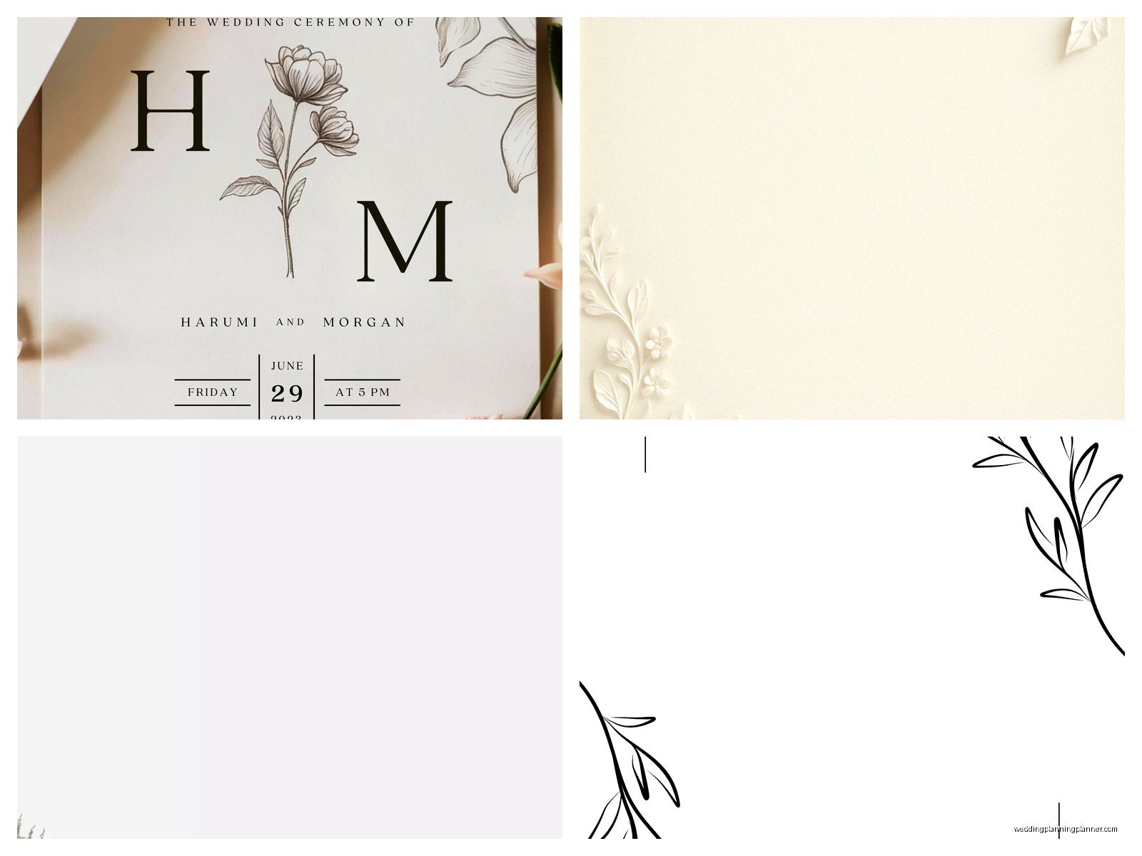
- Black text on white with one muted color accent (sage green, dusty blue, terracotta)
- Charcoal gray instead of black for a softer look
- Navy and white – classic and elegant
- All black text with just your names in a metallic gold or rose gold
What doesn’t work: rainbow colors, neon anything, or trying to match seventeen different colors from your wedding palette. Pick the main one or two and stick with those.
Actually Editing The Files You Downloaded
Most templates come in formats that need specific software. PSD files need Photoshop, AI files need Illustrator, and… okay if you don’t have Adobe Creative Cloud this gets tricky. You can use free alternatives like GIMP or Inkscape but there’s a learning curve.
Canva templates are honestly the easiest for people who aren’t designers. You just click and type. But they’re also the most limiting if you want to do anything custom. The templates I create for clients usually come in both Canva and Adobe formats so people have options.
Common Mistakes People Make When Editing
Don’t stretch text to make it fit – it’ll look distorted. Change the font size instead or rewrite your wording to be shorter. Also don’t use too many different text sizes. Three sizes max for the whole invite.
And please, for the love of all that is holy, don’t use default drop shadows or bevels or any of those effects that were cool in 2004. Minimalist means flat design. No shadows, no gradients, no 3D effects. Just clean shapes and text.
Printing Your Minimalist Invites
You’ve got options here. Home printing on nice cardstock can work for small weddings (under 50 invites). Get a paper that’s at least 100lb cover weight or it’ll feel flimsy. I like Neenah or French Paper for home printing.
For bigger weddings, use a print shop. Upload your file as a PDF with crop marks and bleed. Most online printers like Minted or Vistaprint have okay quality, but local print shops usually do better work if you can find one. Just expect to pay more.
Digital printing is fine for minimalist designs since you’re not usually doing foil stamping or letterpress. That stuff’s gorgeous but not really minimalist anyway and costs like three times as much.
Paper Stock Matters More Than You Think
With minimalist designs, the paper quality shows through more because there’s nothing distracting from it. Matte cardstock looks modern and sophisticated. Glossy looks… cheap honestly, unless you’re going for a very specific photo-heavy design which isn’t really minimalist.
Textured paper like linen or cotton can add interest without adding visual clutter. I’m obsessed with this one paper called Lettra that has a really subtle texture – it’s technically for letterpress but works great for digital printing too.
What To Include In Your Minimalist Invite Suite
Just because the design is minimal doesn’t mean you skip important info. At minimum (see what I did there) you need:
- Full names of whoever’s getting married
- Date and time
- Venue name and city/state
- RSVP deadline and method
Optional but recommended stuff:
- Dress code if it’s not obvious
- Website URL for additional details
- Registry info (though some people put this only on the website)
- Hotel blocks or travel info
You can put extra details on a separate details card or direct people to your website. That’s actually more minimalist anyway – keeping the main invite super clean and putting the logistics elsewhere.
Digital Minimalist Invites Are A Whole Different Thing
If you’re doing digital invites only, the rules change a bit. You need to think about how it displays on phones since that’s where most people will see it first. Vertical orientation works better than horizontal for phone screens.
Keep file sizes small – under 2MB ideally – so it doesn’t take forever to load or download. Save as JPG or PNG, not a massive PDF. And make sure your text is big enough to read on a small screen without zooming.
I watched this show the other night where they planned a whole wedding in like three days and I kept thinking about how stressed the planner must’ve been… anyway, digital invites can be sent through email, text, or wedding websites. Just make sure you have everyone’s correct contact info because there’s nothing worse than finding out someone didn’t get the invite because you had an old email address.
Troubleshooting When Things Look Wrong
Text looks blurry when you zoom in? Your DPI is too low. Start over with a 300 DPI file. Colors look different on screen vs printed? That’s normal – screens use RGB color and printers use CMYK. You can convert your file to CMYK before printing to get closer, but it’ll never be exact.
Layout looks weird when you changed the text? You probably need to adjust the spacing or line height. In most design programs this is called “leading” and you want it to be about 120-150% of your font size.
The margins got cut off when printing? You forgot to account for the print margin – most printers can’t print all the way to the edge. Keep important stuff at least 0.25 inches from any edge, or 0.375 inches to be safe.
Timeline For Getting This Done
Download and customize your template: 2-4 hours if you know what you’re doing, 8-10 hours if you’re figuring it out as you go. Order printed samples: do this like 6 months before the wedding so you have time to fix anything. Final printing and assembly: allow 3-4 weeks for professional printing, or one weekend if you’re DIY-ing it.
Mail invites 8 weeks before the wedding, or 12 weeks if lots of people are traveling. That’s not minimalist-specific advice, just… you know, general timing stuff that people always ask about.
Honestly the hardest part isn’t the design, it’s making decisions. You’ll second-guess every font choice and wonder if you should add just one more design element and then suddenly your minimalist invite isn’t minimalist anymore. Trust your first instinct, keep it simple, and remember that people are gonna look at it for like thirty seconds before they stick it on their fridge. It doesn’t have to be perfect, just clear and nice-looking