Planning Guides, Style Guide
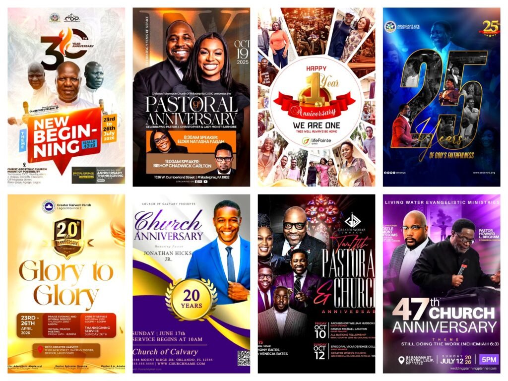
Church Anniversary Flyer: Religious Celebration Template
Jul
Getting Your Church Anniversary Flyer Actually Done
Okay so church anniversary flyers are one of those things that seem simple until you’re staring at a blank template at 11pm and the committee needs it by tomorrow morning. I’ve been there, trust me. Back in spring 2023 I had this client who was planning their church’s 75th anniversary and she called me literally panicking because their “tech-savvy nephew” had disappeared with the flyer design three days before print deadline. We had to start from scratch.
The biggest thing people mess up is trying to cram every single detail about the celebration onto one flyer. Like, you don’t need the entire church history, the complete schedule down to bathroom break times, and every committee member’s name on there. It’s a flyer, not a novella.
What Actually Needs to Be on There
Your church anniversary flyer needs like five core things and everything else is optional. You need the anniversary year or milestone (50th, 100th, whatever), the date and time, the location (even though people know where the church is, you still gotta put it), and how to RSVP or get more info. Oh and obviously the church name but I’ve seen people forget that when they get too creative with designs.
The theme or tagline is where you can get a bit fancy. Something like “Celebrating 50 Years of Faith” or “A Century of Service” or whatever resonates with your congregation. I usually tell people to keep it under seven words because nobody’s gonna read a paragraph-long theme statement.
Design Stuff That Actually Matters
Colors are weirdly important for church flyers and it kinda annoyed me how long it took me to figure this out. You can’t just slap random bright colors on there because different congregations have different vibes. Traditional churches usually want deep blues, golds, burgundy, maybe some cream. More contemporary churches can handle brighter palettes. I learned this the hard way when I designed this gorgeous teal and coral flyer for a very traditional Baptist church and… yeah they politely asked me to redo it in navy and gold.
Your font choices matter way more than you think. I see people using like four or five different fonts on one flyer and it looks like a ransom note. Pick two fonts max – one for headers and one for body text. And please, for the love of everything, make sure they’re readable. That fancy calligraphy font you found might look elegant on your computer screen but when it’s printed on a flyer someone’s holding at arm’s length, it’s gonna be illegible.
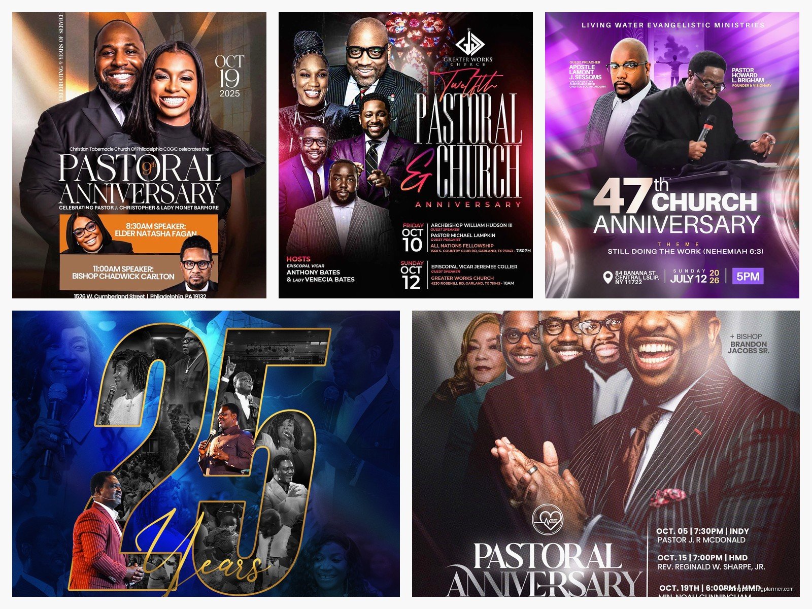
Here’s what I typically do for font sizing: Your main headline (the “50th Anniversary” part) should be your biggest text, obviously. Then the church name can be slightly smaller or the same size depending on your layout. Date, time, and location details should be easily readable but don’t need to compete with the headline. And any additional info can be smaller but never go below 10pt font because that’s just mean to anyone over 40.
Images and Graphics That Don’t Look Cheesy
Stock photos of churches with light beams streaming through windows are everywhere and they’re fine I guess but they’re also kinda boring at this point. If you have actual photos of YOUR church, use those. People connect with real images. That photo from the church’s founding, or a shot of the current congregation, or even the building itself – those work better than generic stock images.
Religious symbols are tricky because you don’t want it to look like a Sunday school craft project but you also want it to feel appropriately spiritual. Crosses, doves, open Bibles – these are classic for a reason. Just don’t go overboard. One or two well-placed symbols are better than decorating every corner with clipart.
I had this moment where my cat knocked over my coffee directly onto a flyer proof I was reviewing and honestly the coffee stain looked better than the original design because it covered up this awful border the client had insisted on. Sometimes less really is more.
Layout Options That Work
You’ve got a few standard layouts that work well for church anniversary flyers. There’s the centered approach where everything’s stacked in the middle – this is very traditional and works great for formal celebrations. Then there’s the split layout where you have an image on one side and text on the other, which gives you more room to work with and looks more modern.
Another option is the top-heavy design where you put a big image or graphic at the top and stack all your info below it. This works really well if you have a great photo of your church building or a historical image you want to feature prominently.
Whatever layout you pick, you need white space. I cannot stress this enough. White space (or negative space or whatever you wanna call it) makes everything more readable and less overwhelming. If every inch of your flyer is covered with text or images, people’s eyes don’t know where to look first and they’ll probably just… not look at all.
The Information Hierarchy Thing
Okay so this sounds fancy but it just means organizing your info so people see the most important stuff first. Their eyes should go: anniversary milestone, then church name, then date/time, then location, then additional details. You control this with size, color, and placement.
What drives me absolutely crazy is when people bury the date and time in tiny text at the bottom. Like that’s literally the most important practical information someone needs! I’ve seen flyers where the theme is in huge letters and then you have to search for when the event actually is. Don’t do that.
Special Event Details You Might Need
If your anniversary celebration includes special elements like guest speakers, reunion activities, special music, or a meal, you need to figure out how much detail to include. My rule is: if it affects whether someone will attend, put it on the flyer. If it’s just nice-to-know info, save it for the website or a separate program.
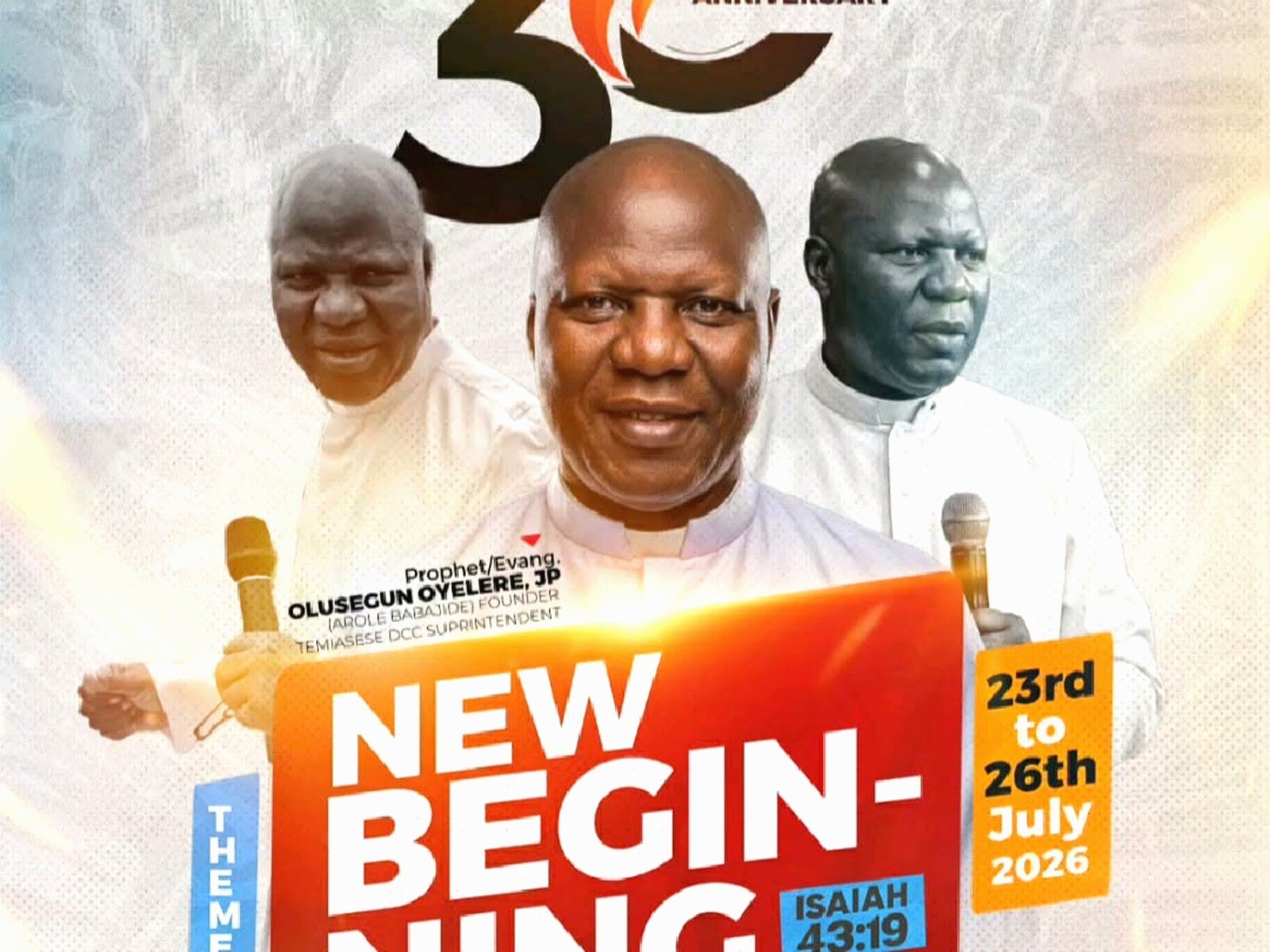
For example, “Featuring Special Guest Pastor John Smith” – that goes on the flyer because people might specifically want to hear him. But “Coffee will be served in Fellowship Hall afterward” – that’s not crucial for the flyer unless the whole point of the event is the fellowship meal.
Print vs Digital Versions
You’re probably gonna need both and they’re not exactly the same. Print flyers need to be higher resolution (300 DPI minimum) and you need to think about how they’ll actually be distributed. Are these gonna be bulletin inserts? Then you need a specific size. Handed out after service? Maybe go with a postcard size that fits in a purse or pocket.
Digital versions for social media or email need different dimensions. Instagram posts are square, Facebook events have their own size requirements, and if you’re emailing it, you want it to be viewable without downloading. I usually create one main design and then adapt it for different platforms rather than trying to make one size work everywhere.
Getting Feedback Without Losing Your Mind
Church committees are… well they’re groups of people with opinions. Lots of opinions. You’re gonna get feedback and some of it will be contradictory and some of it will be “can you make the logo bigger” (every designer’s favorite request, said with maximum sarcasm).
Here’s what I learned: show your design to a small group first, like maybe the pastor and one or two committee leaders. Get their feedback and make changes. THEN show it to the larger group. If you show a first draft to fifteen people, you’ll get fifteen different redesign suggestions and you’ll want to scream.
Also set a deadline for feedback. “I need all comments by Friday” is your friend. Otherwise you’ll get suggestions trickling in for weeks and you’ll never actually finish the thing.
Template Resources That Don’t Suck
If you’re starting from scratch, Canva has a bunch of church flyer templates and they’re honestly pretty decent. You can customize them without needing design software. Some are free, some are paid, but even the paid ones are cheap. Just search for “church anniversary” and you’ll find options.
Adobe Spark is another option if you want something a bit more polished. Microsoft Publisher has templates too if you’re working with people who are more comfortable with Microsoft products. And honestly even PowerPoint can work in a pinch – I know a church secretary who designs all their flyers in PowerPoint and they look fine.
The key is picking a template that’s close to what you want and then customizing it rather than trying to force a template into something it’s not meant to be. Like don’t take a modern minimalist template and try to make it traditional – just find a traditional template.
Historical Elements and Nostalgia Stuff
Anniversary celebrations are naturally nostalgic so incorporating historical elements usually works really well. If you can get a photo from the church’s founding or early years, that’s gold. Even if it’s black and white and kinda grainy, it tells a story.
You could do a “then and now” layout with an old photo and a current photo. Or create a timeline element showing key moments in the church’s history. Just remember this is still a flyer not a museum exhibit so don’t overdo it… or actually you know what, I’ve seen timeline flyers that were really effective so maybe do whatever feels right for your congregation.
Practical Printing Considerations
Printing is where your beautiful design can either come to life or completely fall apart. If you’re printing at home on a regular printer, test print one first. Colors look different on screen versus paper and you don’t wanna print 200 copies only to realize the purple you picked looks brown in print.
For professional printing, talk to the print shop about paper weight and finish. A heavier cardstock (like 80lb or 100lb) feels more substantial and special for an anniversary. Matte finish is easier to read, glossy finish makes colors pop more but can have glare. I usually go with matte for church stuff because it feels more… I dunno, appropriate?
Bleed and margins are technical things you gotta think about. Bleed means your background or images extend past the cut line so you don’t get white edges. Most printers want at least 0.125 inches of bleed. Keep important text at least 0.25 inches from the edge so it doesn’t get cut off.
Common Mistakes I Keep Seeing
People keep making the same mistakes and it’s gonna drive me to start a whole separate blog just about what NOT to do. Using too many fonts, cramming too much text, forgetting to proofread (I’ve seen “Anniversery” spelled wrong on actual printed flyers), and my personal pet peeve – using low resolution images that look pixelated and terrible.
Another big one is not considering your audience. If your congregation skews older, you need larger text and high contrast. If you’re trying to attract younger families back for the anniversary, your design should reflect that without alienating your current members. It’s a balance.
Oh and please make sure all your information is actually correct before you print. Double check the date, time, address, and any names. I had a client once who printed 500 flyers with the wrong date and it was… expensive to fix.
Adding RSVP and Contact Info
You need to make it easy for people to respond or get more information. A phone number is essential – usually the church office number. An email address is good too. If you have a website, include that. QR codes are becoming more common and they work great if your congregation is tech-comfortable, but don’t make that the ONLY way to get info.
If you need RSVPs for catering purposes, be really clear about the deadline and method. “RSVP by October 15th” is better than just “RSVP.” And give them multiple ways to respond – phone, email, maybe a signup sheet at church – because people have preferences.
I’m watching this show about event planners and they always have these dramatic moments about guest counts and it’s actually pretty accurate, like knowing how many people are coming matters a lot for planning but getting people to actually RSVP is like pulling teeth sometimes but anyway that’s why you need to make it super easy and obvious on your flyer