Planning Guides, Style Guide
Canva Wedding Program: Brand Review & Guide
Mar
Okay So Canva Wedding Programs Are Everywhere Right Now
I’m gonna be honest, back in spring 2023 I had this bride who insisted on DIYing literally everything for her wedding and she came to me with a Canva program template that was… well, it existed. That’s about the nicest thing I could say. But here’s the thing—Canva wedding programs can actually look really professional if you know what you’re doing, and I’ve since helped dozens of couples navigate this platform without making their programs look like a middle school project.
The brand itself, Canva, has basically democratized design which is amazing but also kinda terrifying because now everyone thinks they’re a graphic designer. For wedding programs specifically, they have thousands of templates and honestly about 40% of them are actually usable for a real wedding. The rest? Skip them.
What Makes Canva Different From Other Design Platforms
You’ve probably heard of Canva by now but if you haven’t—it’s a drag-and-drop design tool that works in your browser. No software to download, which my less tech-savvy clients absolutely love. I remember this one groom in summer 2022 who couldn’t even figure out how to update his iPhone and he managed to create a decent program in Canva, so that tells you something about the user interface.
The free version gives you access to tons of templates but the paid version (Canva Pro) unlocks way more fonts, photos, and the brand kit feature which is actually super helpful if you’re trying to maintain consistent colors across all your wedding stationery. It’s like $13/month or something, and honestly if you’re designing programs, menus, place cards, and signage, it pays for itself.
The Template Situation
When you search “wedding program” in Canva you’ll get overwhelmed immediately. There are literally thousands. Here’s what I tell my clients—filter by style first. Are you doing modern minimalist? Rustic? Classic elegant? Bohemian? Because Canva templates run the full spectrum and you can waste hours scrolling through stuff that doesn’t match your vibe at all.
The templates are organized pretty well but some of them are… look, some of them were clearly designed by someone who’s never been to an actual wedding. I once saw a template that had the ceremony order listed as “Vows, Then Cake, Then Kiss” and I’m still confused about that sequencing.
Setting Up Your Program The Right Way
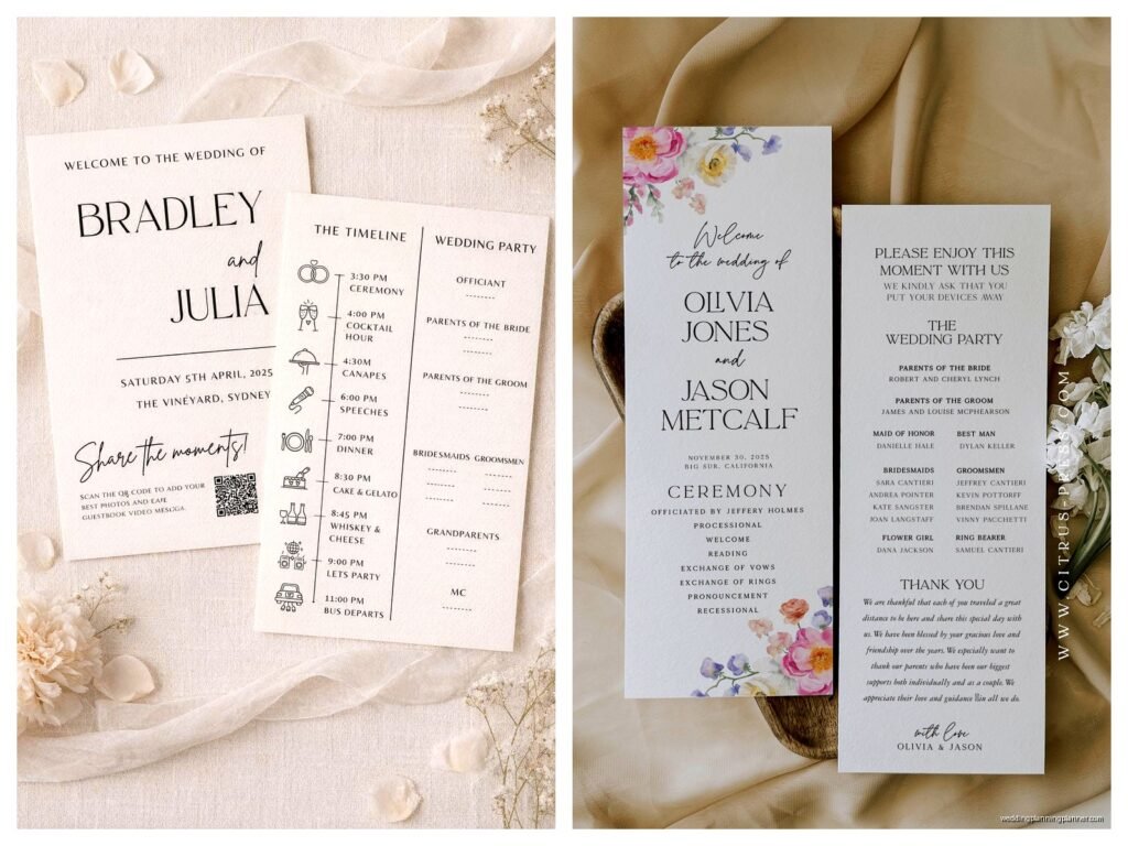
Okay so first thing—you need to decide on your dimensions. Most wedding programs are either 5×7 inches (bifold) or 8.5×11 inches folded in half. Canva has preset dimensions for both but double-check because I’ve seen people accidentally design at screen dimensions and then wonder why their printed programs look weird.
When you open a template, the first thing you should do is replace all the placeholder text with your actual information. Sounds obvious but you’d be surprised how many people forget to change “Bride’s Name” to their actual name before sending it to print. That bride from spring 2023 I mentioned? Yeah, she almost did that.
Typography Things You Gotta Know
Canva has hundreds of fonts and this is where people get into trouble. Your wedding program should use maximum two fonts—maybe three if you’re really confident but I wouldn’t push it. One for headers, one for body text. That’s it.
The free fonts are honestly pretty limited if you want something elegant. You’ll see a lot of the same ones at every wedding—like Montserrat, Raleway, that kind of thing. Canva Pro unlocks fonts like Cormorant Garamond and Bodoni which look way more sophisticated for formal weddings. For rustic or boho weddings, there’s tons of script fonts but be careful because some of them are basically illegible at small sizes.
One thing that annoys me SO much is when people use script fonts for the entire program. Your 80-year-old grandmother should be able to read the ceremony order without her reading glasses, you know? Script for names and headers, clean serif or sans-serif for everything else.
Color Management Because This Gets Tricky
If you have wedding colors, you need to input them exactly into Canva. The brand kit feature lets you save your specific color codes (hex codes) so everything matches. This is crucial because if you’re just eyeballing colors and selecting “dusty rose” from Canva’s color picker, it’s not gonna match the dusty rose on your invitations or your bridesmaid dresses.
Get the hex codes from your invitation designer or your wedding planner (if you have one) and plug them in. Otherwise you’ll end up with seventeen different shades of blush across all your materials and it looks sloppy.
Also—and this is important—what you see on screen won’t be exactly what prints. Screens use RGB color and printers use CMYK. Canva works in RGB which means colors can shift slightly when printed, especially blues and purples. I always tell clients to order a test print before doing a full print run. Just one program, see how it looks in real life, make adjustments if needed.
What Actually Goes In A Wedding Program
Okay so content-wise, here’s the standard structure and you can adjust based on your ceremony type:
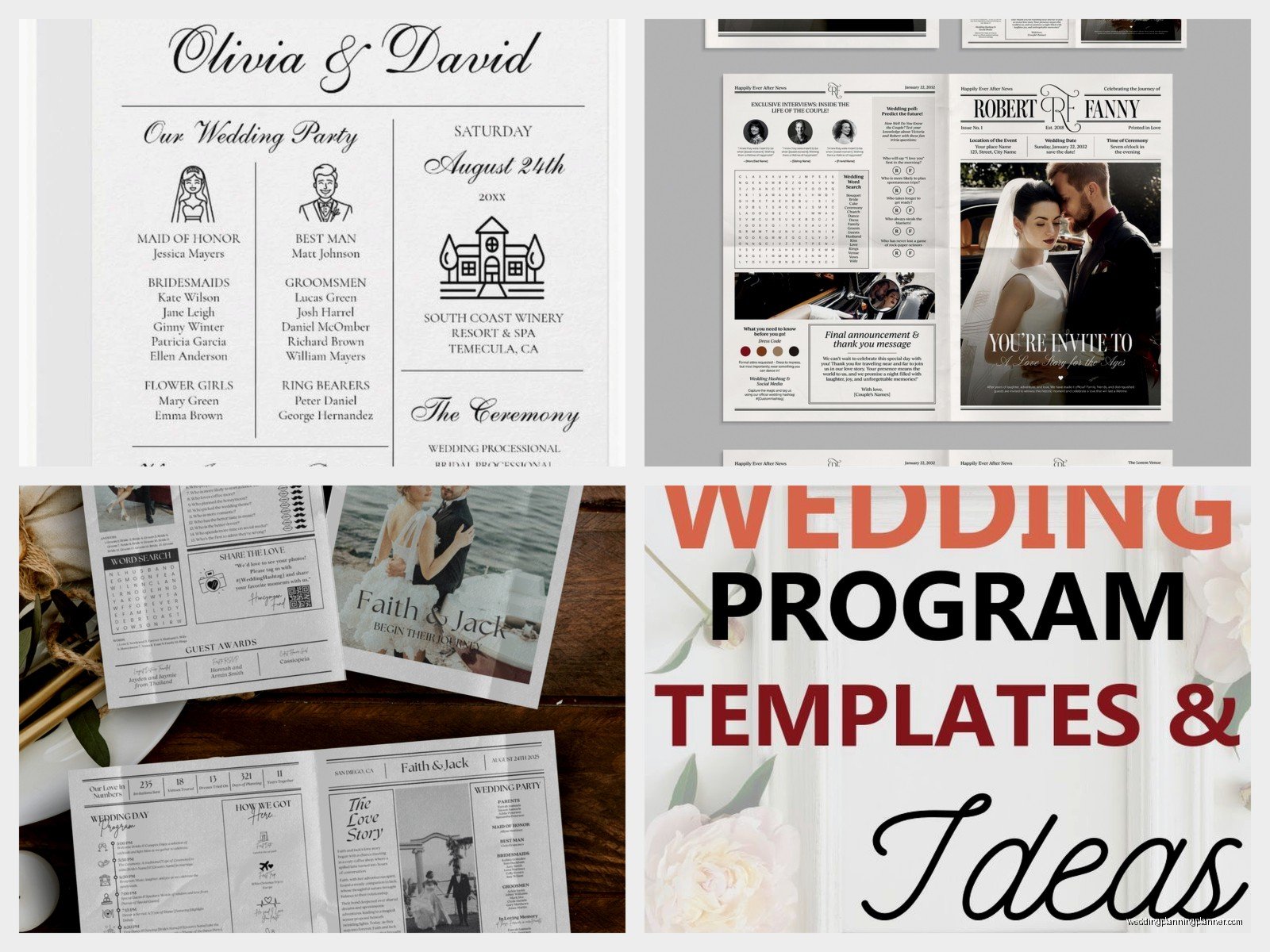
- Cover: Your names, wedding date, ceremony location
- Welcome message or quote (optional but nice)
- Wedding party names and roles
- Ceremony order/sequence of events
- Special recognitions (deceased family members, readers, musicians)
- Thank you message to guests
- Reception information if it’s at a different location
For religious ceremonies you might also include readings, prayers, or explanations of specific traditions. For cultural ceremonies, it’s really helpful to include brief explanations of rituals that not all guests will be familiar with—like a tea ceremony or jumping the broom or whatever’s specific to your tradition.
I had a client doing a Hindu wedding and we added a whole page explaining each part of the ceremony because most of her guests had never been to one before and it was actually really appreciated. People weren’t confused, they could follow along, it made the whole experience more meaningful.
The Spacing Thing Nobody Talks About
In Canva you can adjust spacing between lines and it makes a huge difference in readability. If your text looks cramped, increase the line spacing (they call it “line height” in the editor). If it looks too spread out and disconnected, decrease it slightly. This is one of those small details that separates amateur designs from professional-looking ones.
Also leave margins. Don’t put text right up to the edge because printers have a bleed area and you might lose text or it’ll look cut off. Most printers recommend at least 0.25 inches from the edge, some want 0.5 inches. Check with wherever you’re printing.
Images And Graphics Without Making It Look Cheesy
Canva has a huge library of graphics—florals, borders, geometric shapes, all that stuff. The temptation is to use ALL of them and then your program looks like a scrapbook page from 2005. Less is more, I promise.
If you’re using photos (like an engagement photo on the cover), make sure it’s high resolution. Canva will warn you if an image is low quality but sometimes people ignore that warning and then wonder why their printed program looks blurry. Don’t ignore the warning.
For graphics, stick to your wedding style. If you’re doing modern minimalist, maybe just a simple geometric border. Rustic wedding? Some subtle greenery or wildflowers. The pre-made templates usually have graphics already placed in a balanced way, so if you’re not confident in your design skills, just swap out the colors and text but keep the graphic placement as-is.
Printing Options Because This Is Where Money Happens
You can print directly through Canva which is convenient but not always the cheapest option. They use professional printers and the quality is good, but you’re paying for that convenience. I’ve had clients use Canva printing and be really happy with the results—colors were accurate, paper quality was nice, shipping was fast.
But you can also download your design as a PDF and print elsewhere. If you do this, make sure you download as “PDF Print” not “PDF Standard” because the print version has the proper bleed and crop marks. Then you can take it to a local print shop, upload it to an online printer like Minted or Vistaprint, or even print at home if you have a good printer and the right paper.
For at-home printing you’ll want cardstock, not regular printer paper. At least 80lb weight, preferably 100lb or 110lb. You can get this at any office supply store. My cat knocked over a whole stack of programs once right before a wedding and I had to reprint like 50 of them at midnight, so maybe keep your pets away from your printing area… just a thought.
Quantity Math That’s Easy To Mess Up
How many programs do you actually need? Not as many as you think. A lot of couples share programs—one per couple or one per family. So if you have 150 guests, you probably need 75-100 programs max. Some people don’t take them, some get left on chairs, whatever.
I usually recommend ordering about 60-70% of your guest count for programs. They’re not like invitations where everyone needs their own. And honestly with the rise of unplugged ceremonies and digital programs, some couples are skipping physical programs altogether but that’s a whole different conversation.
Common Mistakes I See All The Time
Using too many fonts—already covered this but seriously, it’s the number one issue. Your program shouldn’t look like a ransom note with twelve different typefaces.
Forgetting to proofread. Read it three times. Have someone else read it. Check the spelling of everyone’s names especially. I once saw a program where the officiant’s name was spelled wrong and it was awkward because he was RIGHT THERE reading it during the ceremony.
Making text too small. If people older than 50 are attending your wedding (and they probably are), make sure your body text is at least 11pt, preferably 12pt. Your wedding isn’t the time to show off your ability to fit tiny text into spaces.
Not considering the fold. If you’re doing a bifold program, make sure important information isn’t getting lost in the crease. Canva’s templates usually account for this but if you’re moving elements around, keep the fold line in mind.
Overcrowding the design. White space is your friend, not your enemy. You don’t need to fill every single inch with text or graphics or… anything really. Let it breathe.
The Actual Canva Editor Features You’ll Use
The toolbar on the left is where everything lives. Templates, elements (graphics), uploads (your own photos), text, and more. It’s pretty intuitive but here’s what you’ll actually use most:
Elements section has graphics, lines, shapes, and frames. Frames are useful if you want to crop a photo into a specific shape like a circle or rounded rectangle. Just drag your photo into the frame and it auto-crops.
Text section has preset text combinations that are already styled. These are helpful if you’re not sure about hierarchy or sizing—just replace the dummy text with yours. You can also add plain text boxes and style them yourself.
The position tool (top toolbar) helps you align elements perfectly. If things look slightly off-center it drives me crazy and this tool fixes that. You can also distribute elements evenly which is super helpful for lists or wedding party names.
Transparency control is in the top right when you select an element. This is great for background graphics that you want subtle, not overpowering. Like if you have a watercolor wash or floral pattern, you can dial it back to 30-40% opacity so it doesn’t compete with your text.
Collaboration Features If You’re Designing Together
Canva lets you share designs with other people which is helpful if you and your partner want to work on the program together. Or if you have a bridesmaid who’s good at design and offered to help (take them up on it, seriously). Just click the share button and send them the link.
You can both edit at the same time and see changes in real-time, though honestly this can get chaotic if you’re both moving things around simultaneously. Maybe take turns or divide tasks—like one person handles text while the other picks graphics or whatever works for you.
Timeline For Getting This Done
Don’t wait until the week before your wedding to design your programs. You need time to design, proof, order test prints, make revisions, do the final print run, and then actually fold them if needed. I’d say start at least 6-8 weeks before your wedding, minimum.
The design itself might only take a few hours if you’re using a template and just customizing it. But then you gotta wait for test prints, review them, make changes, wait for final prints, and shipping times can vary especially if there’s a holiday or if you’re getting married during peak wedding season when printers are backed up.
One thing I learned the hard way during that stressful spring 2023 situation—always always build in buffer time. That bride wanted to design her own programs which was fine, but she didn’t start until two weeks before and then the first print run had a color issue and we had to rush reorder and pay for expedited shipping and it was a whole mess that could’ve been avoided with better timing.
Some couples design their programs at the same time as their other stationery—like right after invitations go out. That way everything matches and you’re already in design mode. The colors are fresh in your mind, you remember which fonts you used, it’s just more efficient that way rather than coming back to it months later and trying to remember what your vision was.