Planning Guides, Style Guide
Fall Wedding Invitations: Autumn Seasonal Designs
Nov
Okay so fall wedding invitations
The thing about autumn invites is that everyone immediately thinks orange and brown and leaves everywhere, which like, fine, but there’s so much more you can do. I had this bride in October 2022 who was OBSESSED with getting burgundy velvet invitations and honestly they turned out gorgeous but the velvet texture made addressing them an absolute nightmare because certain pens just wouldn’t work on the surface and we had to order special ones and… anyway, that’s a whole thing.
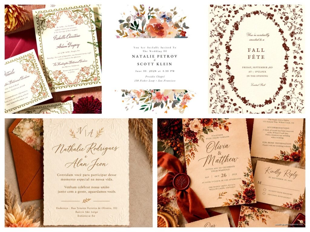
Fall gives you this massive color palette that people don’t always think about. Yeah you’ve got your classic burnt orange, deep red, golden yellow situation. But you also have sage green, dusty blue, plum, terracotta, cream, charcoal, even black works really well for autumn. The rich jewel tones are huge right now – emerald, sapphire, ruby. You can go moody and dramatic or soft and romantic depending on what vibe you’re going for.
Color combos that actually work
Some combinations I’ve used that clients loved: burgundy and gold (classic but never fails), rust and sage green (very trendy right now), navy and copper, plum and blush, terracotta and cream, forest green and ivory. You gotta be careful with orange though because it can read very Halloween if you’re not thoughtful about it. I usually suggest more of a burnt orange or rust rather than that bright pumpkin orange unless your wedding is literally on Halloween, then go wild I guess.
One thing that really annoys me is when people use that generic “fall leaves border” clipart. You know the one. It’s on like every template site and it just screams 2005 Microsoft Word document. There are so many more interesting ways to incorporate autumn elements without making your invitation look like a church newsletter.
Design elements beyond the obvious leaves
Okay so yes, leaves are the go-to. But think about HOW you use them. A single pressed leaf illustration in the corner is way more elegant than leaves scattered all over the place. Wheat stalks are really pretty and give that harvest feel without being too on-the-nose. Acorns, pinecones, berries – these all work. Wood grain textures as backgrounds. Watercolor washes in autumn colors.
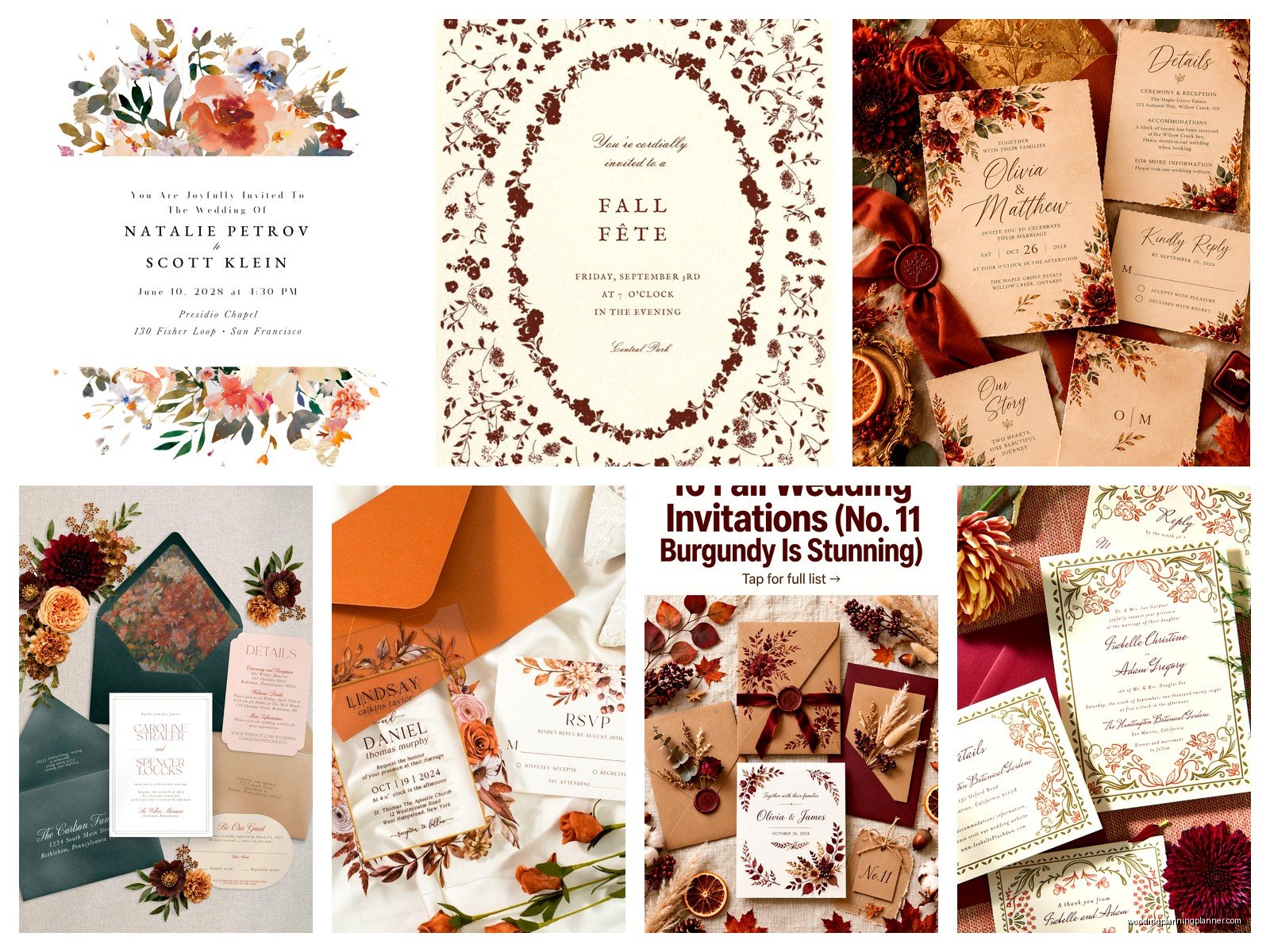
I love using geometric frames with fall colors – like a hexagonal border in gold foil with burgundy text inside. Or art deco style designs in copper. You can do mountain silhouettes if you’re having a destination wedding somewhere scenic. Vineyard illustrations if you’re doing a winery wedding. The season doesn’t have to be the ONLY theme, it can just influence the color scheme while the design itself reflects your venue or personal style or…
Oh and textures. This is where fall invitations can really shine. Kraft paper, vellum overlays, wood veneer (yes this exists and it’s so cool), handmade paper with actual pressed flowers or leaves embedded in it, linen textures, burlap elements if you’re doing rustic. My cat knocked over an entire box of vellum overlays once and they went everywhere and I’m still finding them in random corners of my office.
Paper and printing methods
The paper stock you choose matters SO much for fall invites. I usually steer people toward heavier weight papers – like 120lb or higher – because it feels more substantial and luxurious. Matte finishes work better than glossy for autumn vibes in my opinion. Cotton paper has this beautiful texture that photographs really well.
For printing, letterpress is gorgeous for fall weddings. You get that deep impression in the paper and it just feels expensive and intentional. Foil stamping in copper, bronze, or gold is another favorite – it catches the light and adds dimension. Digital printing has come a long way and is definitely the most budget-friendly option, but if you can splurge on at least foil for names or one design element, it makes a difference.
Thermography is kinda the middle ground – it’s that raised printing that looks similar to engraving but costs less. Works well for traditional formal invitations.
Wording and font choices
For fonts, I typically recommend mixing a script with a serif or sans-serif. Like a romantic script for names paired with a clean serif for the details. Don’t use more than three fonts total or it starts looking chaotic. And please make sure the font is actually readable – I’ve seen some scripts that are so swirly you literally cannot tell what letter it is.
Fall weddings sometimes have more casual vibes than like, a formal summer ballroom situation, so your wording can reflect that. You don’t have to do the super traditional “Mr. and Mrs. John Smith request the honour of your presence” thing if that’s not your style. You can be more relaxed while still being clear about the important details.
What you definitely need to include: who’s getting married, date, time, location, dress code if there is one, and where to RSVP. I had a couple in fall 2023 who forgot to put the actual TIME on their invitation and didn’t realize until after they’d mailed 150 of them and that was… a stressful phone call to receive.
Seasonal details people forget about
If your wedding is in late October or November, it’s gonna get dark earlier. Make sure your invitation clearly states if the ceremony is during daylight or evening because that affects what guests wear and plan for. Also if you’re doing an outdoor ceremony, mention that and suggest layers or wraps because fall weather is unpredictable.
I always tell clients to include accommodations info and maybe a note about weather considerations. Like “The ceremony will be outdoors, please dress accordingly” or whatever. You’d be surprised how many people show up in thin dresses to a November outdoor wedding and then complain about being cold.
The whole suite situation
Your invitation suite can include: the main invitation, RSVP card with envelope, details card (with accommodations, website, dress code), reception card if ceremony and reception are different locations, weekend events card if you’re doing welcome drinks or day-after brunch. You don’t need ALL of these, but think about what info guests actually need.
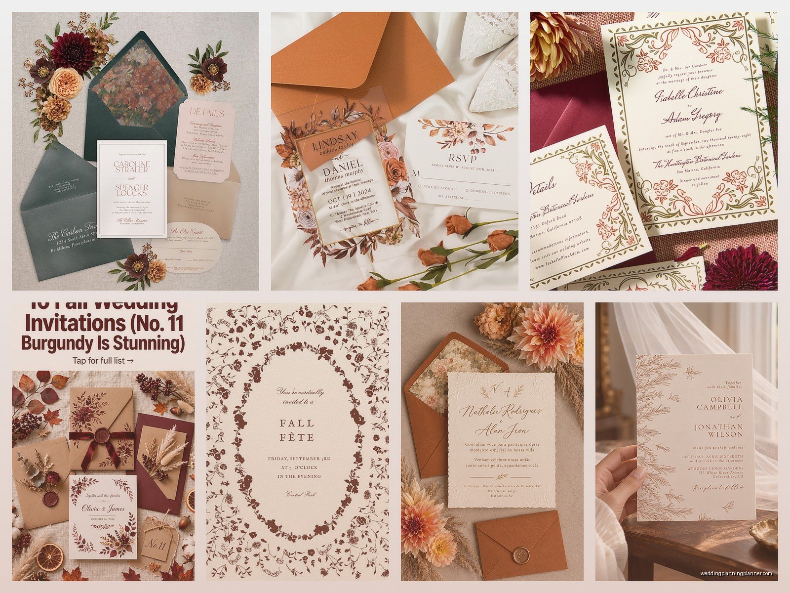
For fall specifically, I love when people carry the theme through the whole suite. So like, if you have a leaf motif on the invitation, echo it smaller on the RSVP card. Use the same color palette throughout. It looks cohesive and intentional in photos.
Envelope addressing and extras
This is where you can have fun. Colored envelopes in your fall palette instead of basic white. Envelope liners in a complementary pattern or color – these are those printed paper pieces that go inside the envelope flap and they look SO fancy. Wax seals on the back in burgundy or copper or gold. Vintage stamps if you can find them (USPS has some pretty ones sometimes).
For addressing, you can do calligraphy which is beautiful but expensive. Digital calligraphy (printed directly on envelopes) looks similar and costs way less. Or just use a nice font and print them yourself if you’re on a tight budget – totally fine, people care less about this than you think.
Timing for fall weddings
Send save-the-dates like 6-8 months before, especially if you’re doing a holiday weekend (Thanksgiving weekend weddings need even MORE notice). Invitations should go out 8-10 weeks before the wedding. Fall is a busy season with holidays and school stuff and football games apparently (I don’t get the football thing but people are serious about it), so give people time to plan.
Budget considerations because let’s be real
Invitations can range from like $2 per suite to $20+ depending on what you want. Digital printing on standard paper stock is cheapest. Adding foil, letterpress, custom illustrations, fancy paper, envelope liners, wax seals – each thing increases cost. You gotta decide what matters to you. Honestly most guests look at the invitation for like 30 seconds, stick it on their fridge, and then recycle it after the wedding, so don’t go into debt over invitations.
That said, they DO set the tone for your event. A formal black-tie wedding needs a different invitation than a casual barn wedding. Your invitation is basically the first impression of your wedding, so it should match the vibe of what people can expect.
DIY vs professional
You can definitely DIY fall invitations if you’re crafty and have time. Sites like Minted, Zazzle, Etsy have tons of templates. You can customize them and order them printed or print them yourself. Just make sure you order samples first before committing to 150 invitations.
Going with a stationer or designer means you get something custom and they handle all the details and timing, but it costs more. I’m obviously biased here but there’s value in not having to worry about it, especially when you’re planning a whole wedding and possibly working full-time and trying to maintain your sanity.
Some specific design ideas I’ve done
A vineyard wedding with watercolor grape leaves and vines in burgundy and green. Mountain wedding with a minimalist line drawing of the peak where they were getting married, in navy and copper. Rustic barn wedding with kraft paper, twine belly band, and a sprig of dried lavender tucked in. Elegant hotel ballroom wedding with deep plum and gold foil art deco design. Garden wedding with pressed botanical illustrations in autumn colors on handmade paper.
One couple did a library theme because they met in a bookstore, so we designed invitations that looked like vintage book pages with fall colors and it was so unique and perfect for them. The theme doesn’t have to be JUST “fall” – it can be fall plus your personal story or interests or venue.
Common mistakes I see
Using too many design elements at once. Like leaves AND acorns AND pumpkins AND wheat AND plaid AND… it’s too much. Pick one or two elements and stick with them. Not ordering enough invitations – always order like 15-20 extra because you WILL mess up addresses or need more for last-minute additions. Forgetting to weigh the invitation suite before buying stamps – if it’s heavy or has a wax seal, it needs extra postage. Not proofreading – I cannot stress this enough, have like three people check for typos because once they’re printed, they’re printed.
Choosing a font that’s too small for older guests to read. Not considering how the colors will show up when printed versus on screen – colors can look different. Ordering too close to your mail date and then panicking when there’s a printing delay.
Digital invitations for fall
Okay so some people are doing fully digital invitations now which is fine, it’s eco-friendly and cheap, but I still think for most weddings people appreciate a physical invitation. That might be my age showing though. If you do go digital, you can still incorporate all the same fall design elements – animated leaves falling, rich color schemes, beautiful typography. Sites like Paperless Post, Greenvelope, and Evite have gotten way more sophisticated.
You could also do a hybrid where you send digital save-the-dates but physical invitations, or vice versa. Whatever works for your budget and style. Just make sure older relatives can actually access and understand digital invites – my mom still prints out every email so…
Little details that elevate everything
A custom wax seal with your initials or wedding date. Hand-torn edges on deckle-edge paper. A small watercolor illustration of your venue. A quote or poem that’s meaningful to you printed on the back. Envelope liners that coordinate with bridesmaid dresses. Vintage stamps that match your color scheme. A vellum overlay with just your monogram in gold foil.
These little touches don’t always cost a lot more but they make the invitation feel special and considered. People notice the details even if they don’t consciously realize what makes it look good.
The main thing with fall wedding invitations is to not feel like you HAVE to do leaves and orange just because it’s autumn. Use the season as inspiration for colors and mood, but make it personal to you. Your invitation should feel like it’s actually from you and represents your wedding, not just a generic fall template that could be anyone’s wedding. Think about what fall means to you specifically – is it cozy sweaters and hot cider? Crisp air and mountain hikes? Harvest and abundance? Football and tailgates? Let that inform your design choices and you’ll end up with something way more interesting than generic fall clipart everywhere