Planning Guides, Style Guide
Modern Wedding Invitations: Contemporary Clean Designs
Nov
The Whole Modern Minimal Thing Actually Works
Okay so modern wedding invitations are having this massive moment right now and honestly it’s about time because I was getting SO tired of the overly ornate stuff that looked like it belonged in a Victorian museum. Like, I had this bride last spring 2023 who came in with a Pinterest board full of calligraphy and florals and after we talked for like twenty minutes she admitted she actually hated all of it but thought that’s what wedding invitations were “supposed” to look like. We switched everything to clean lines and sans-serif fonts and she literally cried.
Modern wedding invitations are all about stripping away the unnecessary stuff. Think clean typography, lots of white space, geometric shapes, and a color palette that doesn’t try to do everything at once. You’re going for that “less is more” vibe but in a way that still feels special and intentional, not just lazy or cheap.
What Makes It Actually Modern
The typography is gonna be your main player here. Forget the swirly calligraphy fonts for a second—modern invites use sans-serif fonts or really clean serif fonts. Think Futura, Helvetica, Montserrat, or maybe a refined serif like Didot if you want something with a bit more personality. The key is readability and impact. I usually pair two fonts max, sometimes just one in different weights.
White space is your friend, like your BEST friend. This is what people get wrong all the time and it drives me absolutely crazy—they get a 5×7 card and feel like they need to fill every single millimeter with information or design elements. Nah. The empty space is doing work too. It’s giving your eyes a place to rest and making the important information stand out. I learned this the hard way back in summer 2021 when I designed invites for my cousin and crammed too much onto the details card and it just looked… messy? Even though it was “modern” fonts and colors, the lack of breathing room killed it.
Color palettes for modern invites tend to be pretty restrained. You’re looking at:
- Black and white (classic, always works, never goes out of style)
- One bold color plus neutrals (like a deep navy with cream and grey)
- Monochromatic schemes (different shades of the same color)
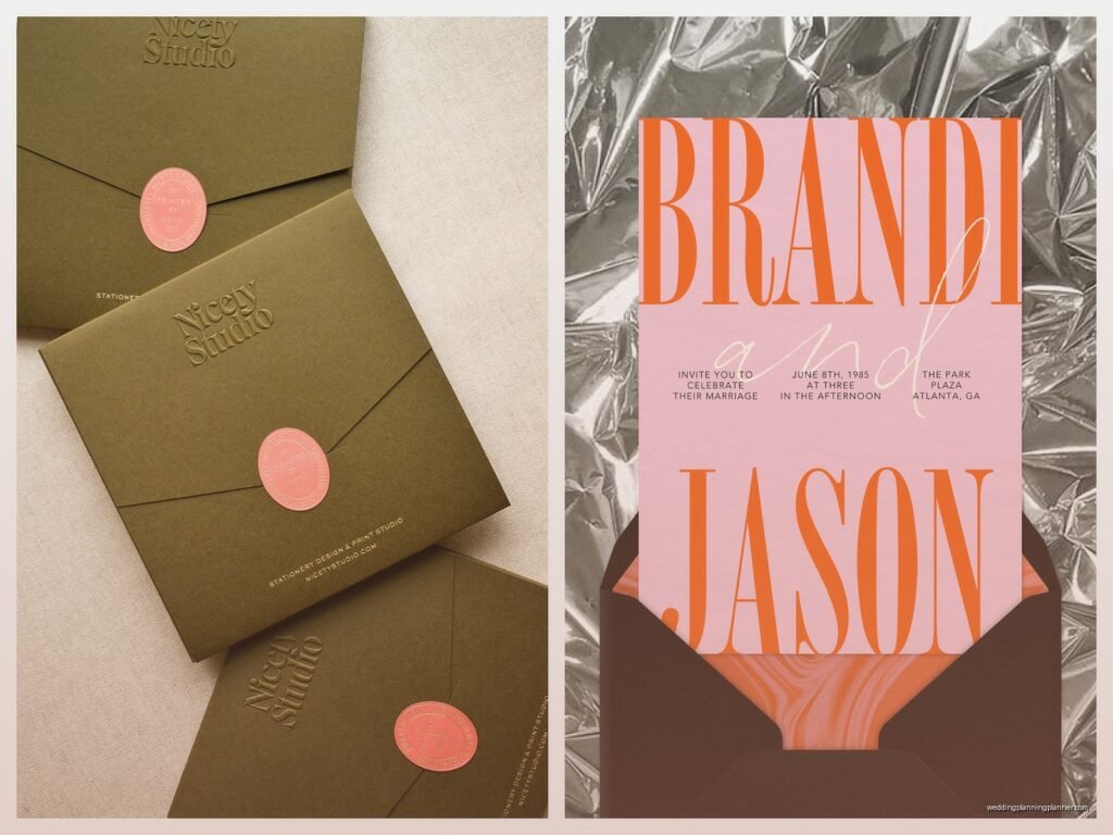
- Unexpected neutrals like terracotta, sage, or dusty blue with white
- Metallic accent with one main color (but just one metallic, not gold AND silver AND rose gold)
Layout and Composition Stuff
Modern layouts are usually asymmetrical or have this really intentional balance to them. You might have all your text aligned left with tons of space on the right side. Or everything centered but with varying line lengths that create visual interest. Sometimes I’ll do a horizontal layout instead of vertical because it immediately feels different and contemporary.
Geometric shapes work really well—think thin line rectangles as borders, circles, triangles as accent elements. But here’s the thing: use them sparingly. One geometric element is cool and modern. Five geometric elements is a geometry textbook. I saw someone on Instagram once use like seven different geometric shapes on one invite and I wanted to… anyway.
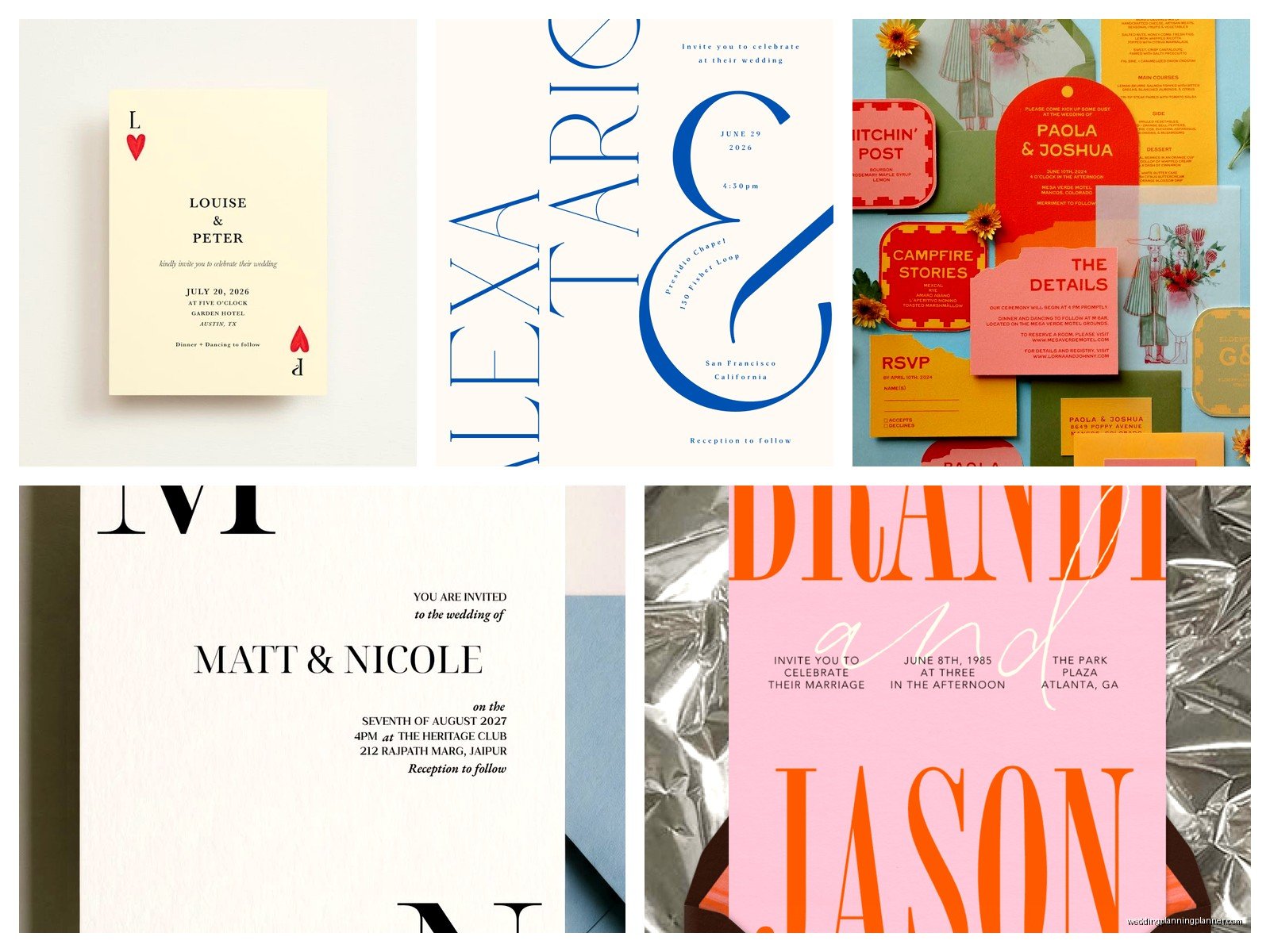
The hierarchy of information matters so much. Your names should be the most prominent thing, obviously. Then the date, then location, then all the other details get smaller. With modern design, you can play with this hierarchy using font size, font weight, and spacing rather than decorative elements.
Paper and Printing Techniques
The paper stock you choose can make or break a modern invitation. I usually go with:
- Smooth matte cardstock (no texture, very clean)
- Ultra-white or bright white paper (cream can work but it gives a different vibe)
- Heavier weight stock, like 120lb or higher, because thin paper feels cheap no matter how good the design is
- Sometimes a really subtle linen texture if the bride wants some tactile interest
For printing, digital printing works great for modern designs because you can get super crisp text and solid colors. Letterpress can be beautiful too but it gives more of a… I don’t know, it adds a handmade quality that sometimes works and sometimes doesn’t depending on how minimal you’re going. Foil stamping in a single metallic can look incredible on modern invites, especially if it’s just used for names or one design element.
I had this client who insisted on thermography printing because her mom said that’s what you do for wedding invites, and it just didn’t work with the flat, minimal design we’d created. The raised text looked wrong. Sometimes you gotta push back on the traditional “rules” to make the design actually work.
The Suite Components
A modern invitation suite doesn’t need seventeen pieces of paper. Seriously, this annoys me so much when people think more pieces equals more formal or fancy. You probably need:
- The main invitation
- Details card (or put details on the back of the invitation if it’s not letterpress)
- RSVP card or direct people to your website
- Envelope (maybe two if you’re doing an inner envelope but honestly that’s kinda old-school)
That’s it. You don’t need a separate accommodations card, travel card, weekend events card, registry card… just put that stuff on your website. The invitation should introduce the vibe and give essential information. Everything else is digital.
Design Elements That Work
Okay so here’s what I actually use in modern invitation designs:
Line art: Simple line drawings or illustrations, not detailed sketches. Like a single-line drawing of your venue or a geometric representation of something meaningful to you.
Monograms: But modern ones—overlapping initials in a clean font, or initials in a simple geometric shape. Not the traditional circular ornate ones your grandmother had.
Borders: Thin line borders, maybe 0.5pt to 1pt thickness. Or a thick border on just one side of the card for asymmetry.
Color blocking: Like half the card is a solid color and half is white. Or a colored band across the top or bottom.
Negative space text: Where the text is actually the white space cut out of a colored background, though this can be tricky to print well so…
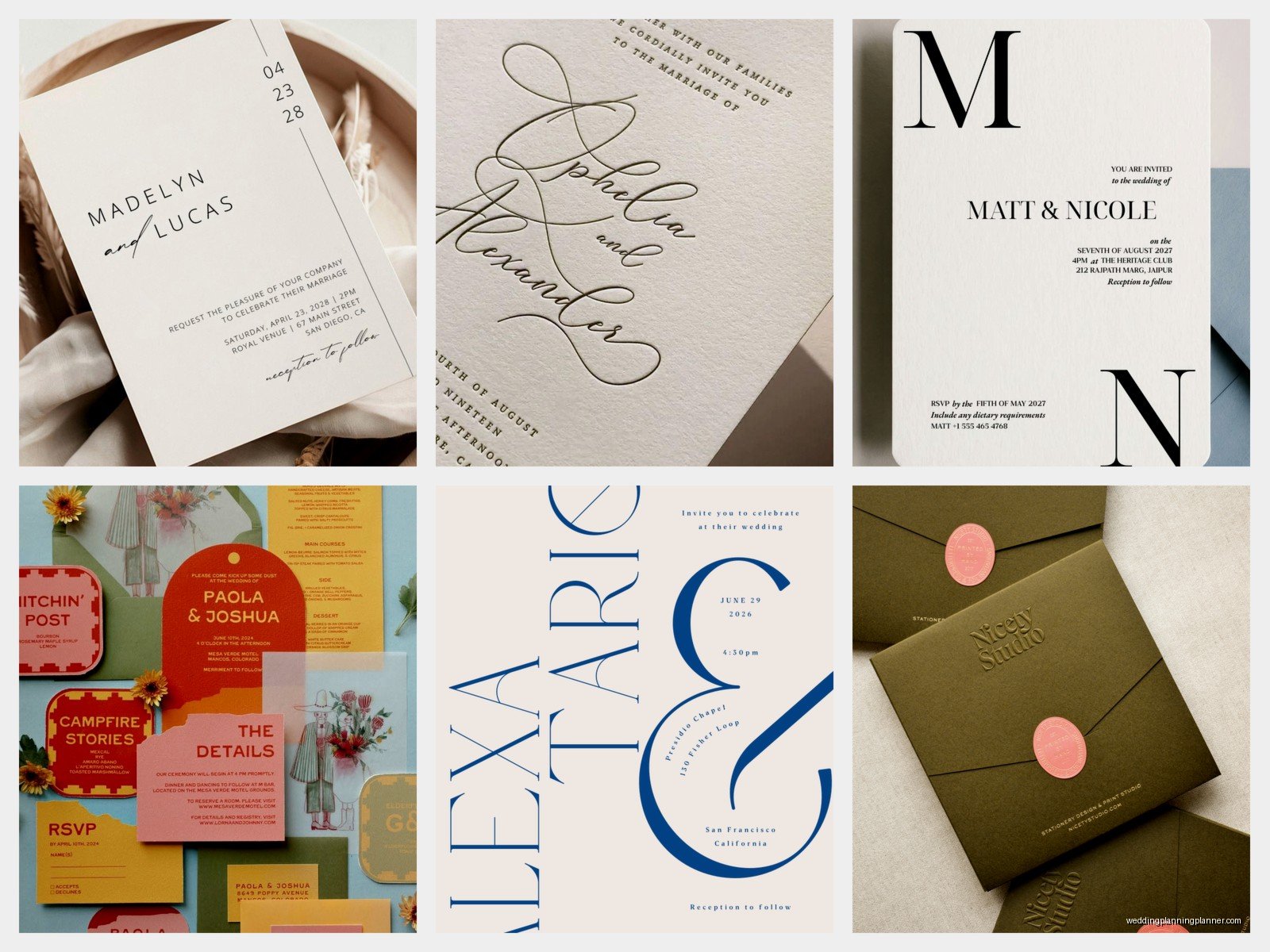
What doesn’t work: clip art, multiple fonts (I mean more than 2-3), busy patterns, anything that feels “rustic” or “vintage” because that’s a different aesthetic entirely, random decorative elements that don’t mean anything.
Wording for Modern Invites
You can be less formal with the wording too. Traditional invitation wording is super stuffy—”Mr. and Mrs. John Smith request the honour of your presence” or whatever. Modern couples are doing stuff like:
“Join us for our wedding”
“We’re getting married!”
“Let’s celebrate”
“Together with our families, we invite you to our wedding”
You can drop the “request the honour” language entirely. You can use first names only. You can acknowledge both sets of parents or neither. The rules are basically gone, which is great because those rules were kinda arbitrary anyway.
My cat literally just knocked over my coffee while I’m writing this, so if there are typos blame her.
Digital vs. Physical Modern Invites
Here’s something people ask me all the time—can you do a modern invitation digitally? Yes, absolutely. Digital invitations are becoming more accepted even for formal weddings, especially after 2020 when everything went virtual anyway. The same design principles apply: clean fonts, white space, minimal color palette, clear hierarchy.
The advantage of digital is you can do subtle animations, like text that fades in or geometric shapes that rotate. Just keep it subtle—this isn’t a rave flyer. I usually design digital invites to work both on phones and computers since people will view them everywhere.
But honestly, there’s still something about a physical invitation that feels more special for a wedding. The weight of it, the paper quality, the fact that it arrives in someone’s mailbox among all the bills and junk mail. If your budget allows for printed invites, I’d do it.
Color Combinations I Keep Coming Back To
These work really well for modern wedding invitations:
- Black text on white with one accent color like emerald green or burgundy
- Navy and blush (I know it’s everywhere but it works)
- All black and white with gold foil accents
- Terracotta and cream
- Sage green and ivory
- Charcoal grey and white
- Dusty blue and white
- All black (bold but really striking)
Working With a Designer or DIY
If you’re hiring a stationery designer for modern invites, look at their portfolio and make sure they actually do minimal work. Some designers are amazing at ornate vintage stuff but can’t do clean modern design to save their life—it’s a different skill set. Ask to see examples of modern work specifically.
For DIY, templates can work but you gotta be careful. A lot of templates on Etsy or Canva say they’re “modern” but they’re actually just… simple? There’s a difference between modern intentional design and just plain. Real modern design has thoughtful spacing, perfect alignment, intentional font choices. It looks effortless but there’s actually a lot of decision-making behind it.
If you’re DIYing, spend time on the layout. Move things around. Try different alignments. Print test versions. What looks good on screen doesn’t always translate to paper. And please, please check your margins—I’ve seen so many DIY invites where the text is like 1/8 inch from the edge and it looks like a printing error.
Envelope Addressing
For modern invites, I usually do envelope addressing in one of these ways:
- Digital printing directly on the envelope in a clean sans-serif font
- Simple calligraphy that’s more modern and legible (not super swirly)
- Printed labels that match the invite design
- Hand-written in neat print (not cursive)
Skip the inner envelope if you can. It’s wasteful and kinda unnecessary unless you’re doing a really formal wedding. Just use one envelope with a clean address layout.
The Details That Matter
Little things that elevate a modern invitation: a colored envelope liner (but in a solid color, not a pattern), a wax seal in a modern shape like a hexagon or square, a belly band instead of a traditional ribbon, a vellum overlay with minimal text.
Things that don’t work: mixing metals (gold and silver together looks confused), too many design elements (pick one or two and commit), centered text that’s not actually centered (please use guides or rulers), uneven margins.
The timing for sending these out is the same as traditional invites—mail them 6-8 weeks before the wedding, or 8-10 weeks if it’s a destination wedding. Modern design doesn’t change the logistics.
I think the reason modern wedding invitations have gotten so popular is because they photograph well, they feel current and fresh, and they let the information be the star instead of hiding it behind a bunch of decorative stuff. Plus they tend to be more affordable to produce since you’re not paying for elaborate printing techniques or tons of layers and embellishments. But they still feel special and elevated when done right, which is the whole point anyway.