Planning Guides, Style Guide
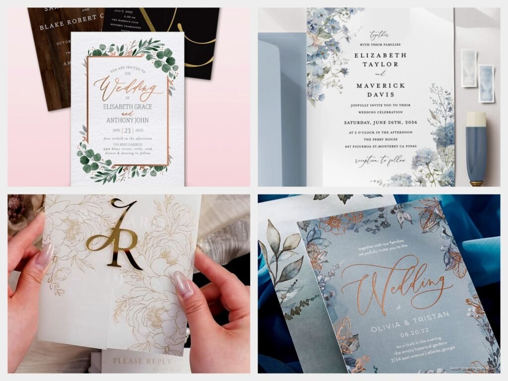
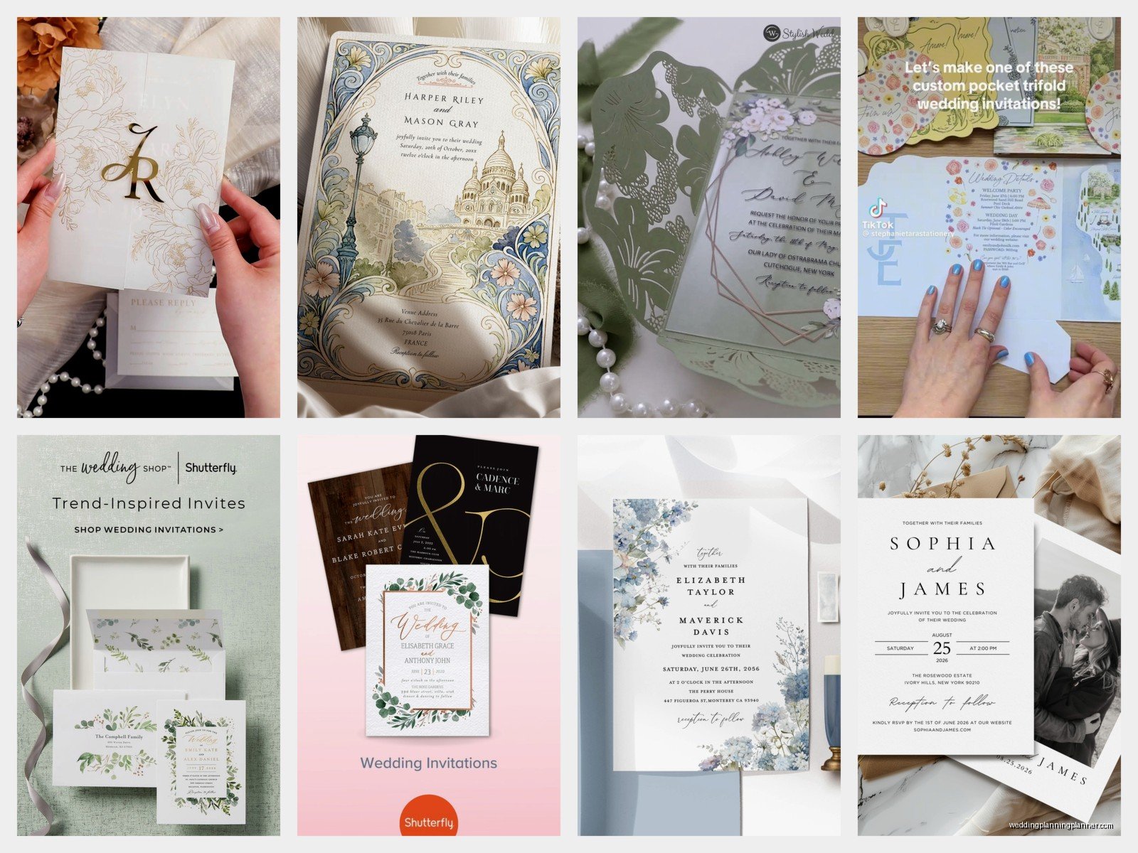
Shutterfly Wedding Invitations: Photo Card Collection
Mar
So You’re Looking at Shutterfly Photo Wedding Invitations
Okay so here’s the thing about Shutterfly’s photo card collection for wedding invitations – I’ve been dealing with these for like seven years now and they’re honestly one of those options that clients either immediately love or they don’t even consider because they’re thinking traditional letterpress or foil stamping. But let me tell you what actually happens in real weddings with real budgets.
First off, the photo card thing isn’t what it used to be. Back when I started planning weddings around 2011 or so, photo invitations were kinda considered tacky? Like something you’d do for a graduation announcement but not a formal wedding. That’s completely changed. Last spring 2022 I had this couple, Emma and Jordan, who were adamant about wanting their engagement photos incorporated and they didn’t want to spend $1200 on letterpress just to have a separate photo card tucked in. They went full photo invitation through Shutterfly and honestly it was gorgeous and guests actually mentioned it specifically at the wedding.
The Actual Selection Process Which Is Overwhelming
When you land on Shutterfly’s wedding section you’re gonna see like hundreds of options. They categorize them but it’s still a lot. Here’s how I tell clients to narrow it down without spending four hours clicking through templates:
- Filter by whether you want one photo or multiple photos on the front
- Decide if you want landscape or portrait orientation before you even start looking
- Know your wedding vibe keyword – rustic, modern, classic, bohemian, garden, beach, formal
- Check if you want the photo as background or as a framed element
The thing that really annoyed me about their interface – and this was as of summer 2024 when I was ordering for a client’s daughter – is that you can’t save more than like 20 favorites at a time. So if you’re the indecisive type which honestly most brides are and that’s completely fine, you gotta screenshot the ones you like or write down the product names because they’ll disappear from your favorites and then you’re scrolling forever trying to find that one design with the gold geometric border.
Photo Quality Requirements That Nobody Tells You Upfront
Alright so this is critical. Shutterfly will let you upload basically any photo but that doesn’t mean it’s gonna look good printed. I learned this the hard way with a client in fall 2019 who used an iPhone photo that looked fine on screen but printed grainy and dark. Here’s what you actually need:
Your photo should be at minimum 1000 pixels on the shortest side. Higher is better. If you’re doing a 5×7 invitation which is standard, you want around 1500×2100 pixels at least. For a 7×5 landscape you want 2100×1500 pixels. They have an upload tool that tells you if your resolution is too low but sometimes it says “acceptable” when really it’s just barely okay.
Get the high-resolution files from your engagement photographer. Don’t use the social media versions they posted on Instagram or Facebook because those are compressed like crazy. Email or text yourself the photos? Nah, those get compressed too. Ask your photographer for the full resolution exports or download from the gallery they provided.
Picking Which Photo Actually Works
Not every gorgeous engagement photo makes a good invitation photo. I see this mistake constantly. Someone has this beautiful shot where they’re tiny figures on a beach at sunset with amazing pink sky and they want to use it on their invitation. But then all the text goes on top and you can’t read anything or they have to put a semi-transparent white box behind the text and it covers the couple entirely.
Look for photos with:
- Clear space where text can go – usually sky, a blank wall, soft-focus background
- Good lighting on your faces – backlit photos look artistic in a frame but are hard to print well
- You’re not super tiny in the frame unless the design puts the photo in a small spot
- The important parts of the image aren’t right at the edges because of bleed zones
That bleed thing – okay so when they print, they cut slightly into the image on all sides to make sure there’s no white border. Usually about 1/8 inch. So if your heads are right at the top edge or someone’s hand is at the side edge, it might get trimmed off. The Shutterfly design tool shows you the safe zone but people ignore it and then get mad when the printed version is cropped weird.
The Design Editor Interface
Once you pick a template you get into their editor and honestly it’s pretty user-friendly compared to some other sites I’ve dealt with. Minted’s editor is prettier but Shutterfly’s is more intuitive for people who aren’t design-savvy.
Customizing Your Text
Every template comes with placeholder text that you replace with your actual info. The main things you’re putting on a wedding invitation:
- The hosts line – traditionally who’s hosting/paying but nowadays often just the couple or both sets of parents
- Request line – “invite you to celebrate their marriage” or “request the honor of your presence” etc
- Couple’s names – and yes the order matters to some people but do whatever you want honestly
- Date and time – spell out the date formally or go casual depending on your vibe
- Venue name and location – city and state, sometimes full address depending on formality
- Reception info if it’s the same location or separate
The wording is where people freeze up. I have a whole document of wording templates I send clients because everyone thinks they need to come up with something unique. You don’t. Traditional wording exists because it works and clearly communicates information. That said, Shutterfly’s templates usually have more casual modern wording built in which is fine for most weddings now.
One thing – watch your font sizes. The editor lets you make text bigger or smaller and people tend to make their names HUGE and then the actual important info like the date gets lost. Your guests need to know when and where more than they need to see your names in 48pt font.
Font Choices Within Templates
Most Shutterfly templates let you change the fonts. They have probably 50+ font options which sounds great but is actually kinda paralyzing. Here’s my rule: use maximum two fonts, maybe three if you really know what you’re doing. One script/decorative font for names or headers, one clean readable font for details.
Popular combinations that work:
- Script font like Ballantines or Beloved Script for names + simple sans serif like Montserrat for details
- Elegant serif like Playfair Display for names + lighter serif like Garamond for info
- Modern all-caps font like GOTHAM for headers + regular text font for everything else
Don’t use Comic Sans. I’m kidding nobody actually does that but I did have a groom in 2016 who wanted to as a “joke” and… it wasn’t funny enough to justify confusing elderly relatives about whether the wedding was serious.
Color Customization Options
This is where Shutterfly really shines compared to print-at-home options. You can usually change the color scheme of templates. Most designs have 2-4 color variations built in but then you can also customize individual elements.
If you have specific wedding colors you’re trying to match, use the custom color picker. But here’s the thing nobody tells you – colors on screen don’t always match colors in print. Screens emit light, paper reflects light. So that perfect coral you picked might print more peachy-pink. Shutterfly does pretty well with color accuracy but I always tell clients to order one printed sample before ordering 150 invitations.
Navy blue and gold? Prints beautifully. Bright coral and mint? Can look washed out or too neon depending on the shades. Deep burgundy and sage? Gorgeous in print. Pastels in general need to be on the slightly more saturated side on-screen to look good printed.
The Different Photo Layout Styles They Offer
Okay so Shutterfly categorizes their photo invitations in ways that aren’t always clear so let me break down what you’re actually looking at:
Full Photo Background
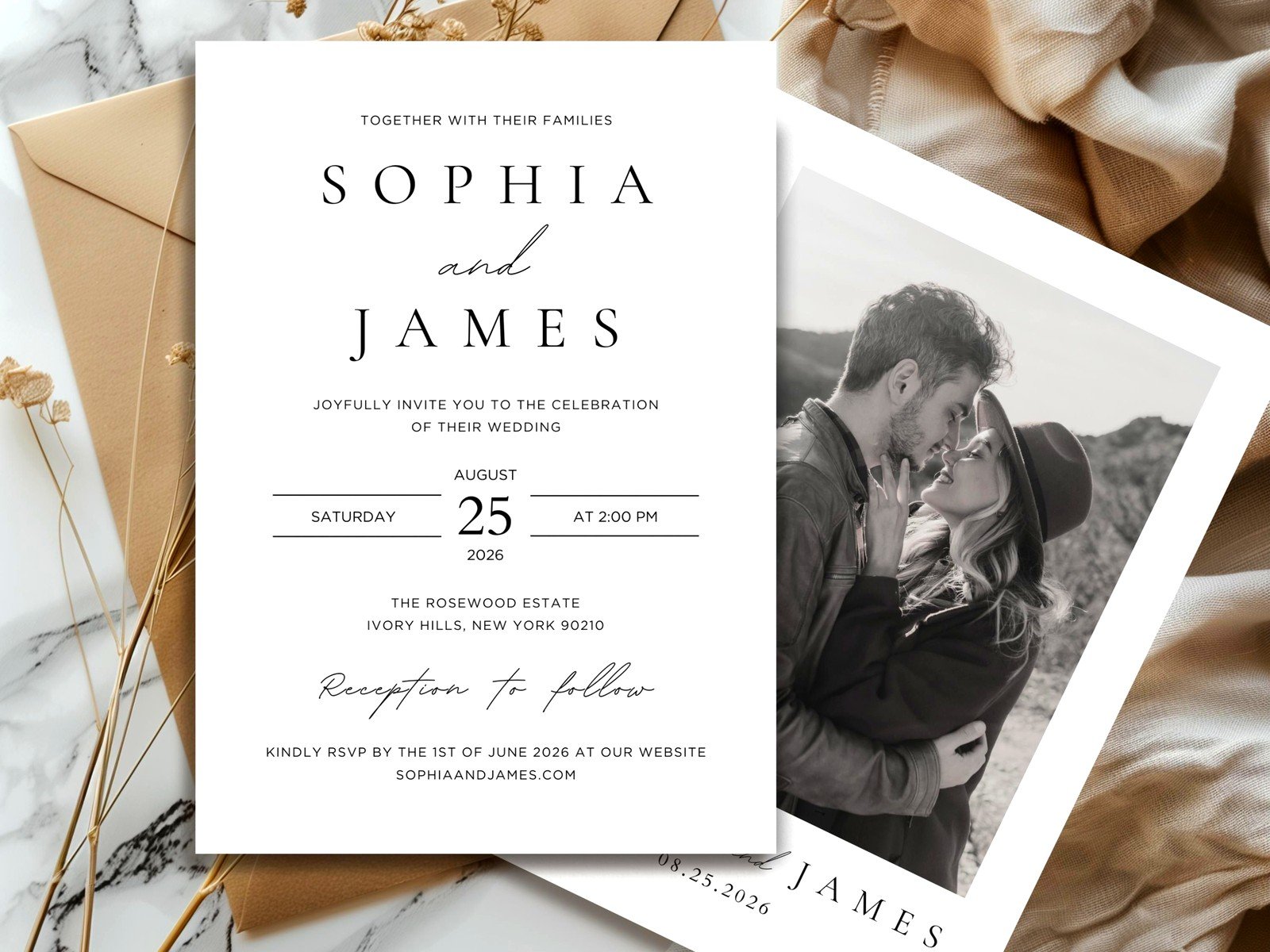
This is where your photo takes up the entire front of the invitation and text is overlaid on top. These look super modern and striking but you need the right photo. The photo needs areas of relatively solid color or soft focus where text can sit without being hard to read.
They usually add a semi-transparent overlay behind the text – white overlay with black text or dark overlay with white text. You can often adjust the opacity of that overlay. More opacity means easier to read but covers more of your photo. Less opacity keeps your photo visible but text might be harder to read.
I had this situation in summer 2024 with a client who had the most gorgeous mountain engagement photo but it was SO busy with trees and rocks and peaks that nowhere was calm enough for text. We ended up choosing a different layout style because fighting with that photo just wasn’t working. Sometimes you gotta pivot.
Bordered Photo Layouts
These have your photo in a defined space – might be a square or circle or rectangle – with a border around it and text in the remaining space. These are more versatile because your photo doesn’t have to have specific blank areas. The photo is its own element and text goes in designated text areas.
The borders can be simple lines, geometric shapes, floral illustrations, watercolor effects, whatever matches your theme. These tend to look more traditional-wedding while still incorporating your photo prominently.
Multi-Photo Designs
Some templates let you add 2-4 photos. These are really popular for couples who can’t choose just one engagement photo or who want to show different aspects of their relationship. You might have one photo from the engagement shoot, one candid from your relationship, one of you as kids, whatever tells your story.
The layout might be a grid, a collage, a series… the main thing is making sure the photos work together visually. Similar editing style, similar lighting, not like one super formal and one in sweatpants at home unless that contrast is intentional and works with your vibe.
Photo On Back Options
Some couples do a simple front without photos and put a photo on the back of the invitation. This is nice if you want a classic formal front but still want to personalize it. The back photo doesn’t need text space so you can use any photo you love.
Just remember that when invitations are mailed in envelopes, guests might not immediately look at the back. It’s more of a nice surprise detail than the main event.
Paper Stock and Finish Options
This is where you’re making decisions that affect how the invitation feels in hand and how much you’re spending.
Standard Cardstock
This is their basic option and honestly it’s fine for most weddings. It’s a heavier weight paper, not flimsy, prints clearly. If your budget is tight and you’re already spending on other wedding elements, standard cardstock is totally acceptable. Nobody’s gonna judge your marriage based on your invitation paper weight like… it’s cardstock, it does the job.
I’d say 60% of my clients who go with Shutterfly choose standard cardstock and zero guests have ever commented negatively about it.
Premium Cardstock
Thicker, more substantial feel. Costs a bit more per invitation but gives that luxury weight in hand. If you’re having a more formal wedding or if tactile quality matters to you, this is worth the upgrade. The price difference is usually like $0.30-$0.50 per invitation so for 100 invitations maybe $30-$50 more total.
Premium cardstock also tends to make colors look richer and photos print with slightly better clarity. Not a massive difference but noticeable if you’re comparing them side by side.
Glossy vs Matte Finish
Glossy makes photos really pop with vibrant colors and shine. It photographs well if people are posting their invitations on social media. But it shows fingerprints and can have glare in certain lighting. Some people think glossy looks less formal or too much like a photo print.
Matte is more sophisticated and elegant feeling. Doesn’t show fingerprints, no glare, easier to write on if you’re addressing envelopes directly. Photos look slightly less vibrant but more refined. I personally prefer matte for wedding invitations but that’s just me.
There’s also sometimes a pearl or shimmer finish option which adds subtle shimmer to the paper. It’s pretty but definitely more casual/fun vibe than formal elegant.
Rounded Corners vs Square
This seems like a tiny detail but it does change the look. Rounded corners give a softer, more modern or casual feel. Square corners are traditional and formal. Shutterfly usually charges a small fee for rounded corners, maybe $10-15 for the whole order.
I was watching The Great British Baking Show while working on a client’s invitation order last November and they were talking about clean edges versus rustic edges and I thought huh, same thing with invitation corners. Anyway that’s not helpful information but it’s what I was thinking about.
Sizing Options That Actually Matter
Shutterfly offers invitations in different sizes and this affects postage cost, envelope options, and how impressive the invitation looks when someone opens it.
5×7 Inch Invitations
This is the most standard size. Fits normal invitation envelopes, doesn’t require extra postage as long as the total weight is under one ounce. Most formal, most traditional, what people expect to receive for a wedding.
A 5×7 invitation on standard or premium cardstock with a standard envelope usually mails with a regular forever stamp which is currently $0.73 (as of when I’m writing this, prices change). If you add RSVP cards, details cards, reception cards, and other inserts you might push over one ounce and need additional postage.
7×5 Inch Horizontal
Same size as 5×7 but horizontal orientation. Good for landscape photos obviously. Slightly more modern looking because most traditional invitations are vertical. Same postage situation as 5×7.
Some photos just work better horizontal – like if you’re both standing side by side, or a wide landscape shot, or certain poses. Don’t force a horizontal photo into a vertical invitation or vice versa just because one orientation seems more “wedding-y”.
5×5 Inch Square
Square invitations are really popular for modern weddings. They look different, they feel special, they work well for certain design styles especially geometric or contemporary.
BUT – and this is important – square envelopes require additional postage because they can’t go through standard postal sorting machines. You need to add $0.24 for the non-machinable surcharge on top of the regular stamp. So you’re looking at about $0.97 per invitation minimum. For 150 invitations that’s an extra $36 just in postage compared to rectangular.
Also square invitations are sometimes harder to display – like if someone has one of those mail organizer things or puts cards on a fridge, the square doesn’t fit as naturally. This is a tiny detail that nobody thinks about but I’ve literally had guests mention it.
Larger Sizes Like 7×9
Occasionally Shutterfly offers larger statement sizes. These are gorgeous and impressive but definitely require extra postage. A 7×9 invitation is oversized and depending on weight might need $1.00+ in postage per piece.
These make sense for very formal weddings or if you want the invitation itself to be a showstopper moment. But factor in that cost.
Matching Envelope Options and Addressing
Your invitation comes with envelopes included but you have choices about style and how you address them.
White vs Colored Envelopes
Standard is usually white or ivory envelopes. Shutterfly often lets you upgrade to colored envelopes that coordinate with your invitation colors – maybe navy envelopes or blush pink or sage green or whatever.
Colored envelopes cost extra, usually around $20-40 depending on the quantity. They do make a great first impression when people get your invitation in the mail. Like you open your mailbox and there’s a dusty blue envelope between boring white bills? That’s exciting.
Dark colored envelopes need light colored addressing – white or gold or silver ink/labels. Light colored envelopes can be addressed with dark ink. This matters for readability obviously.
Envelope Liners
These are optional decorative inserts that line the inside of the envelope. When someone opens the envelope they see this pretty pattern – maybe floral or geometric or watercolor or photos even.
Envelope liners are pure decoration, they don’t serve a functional purpose, but they do make the invitation feel more luxurious and put-together. Shutterfly charges for these, I think around $30-60 for a set depending on design and quantity.
You can also DIY envelope liners if you’re crafty and have time. Buy sheets of decorative paper, cut them to size using a template, glue them in. I had a bride do this in spring 2022 during like peak DIY Pinterest wedding phase and she spent three weekends on it and said never again but they did look beautiful.
Guest Addressing Services
Shutterfly offers a service where they’ll print your guests’ addresses directly on the envelopes. You upload a spreadsheet with names and addresses, they print them in a font that matches your invitation design.
This costs extra – I think it’s around $0.50 per envelope so for 100 invitations that’s $50. But it saves you hours of hand-addressing or printing labels yourself. The printing looks professional and clean.
If you have good handwriting and like calligraphy, hand-addressing is beautiful and personal. If you have terrible handwriting like me (I can plan a wedding but my handwriting looks like a caffeinated chicken), printed addressing is the way to go.
Return addresses can be printed on the back flap which looks really polished. This is usually included in the addressing service or is a small additional fee.
The Whole Suite Concept – What Else You Need
An invitation by itself isn’t the complete package. Most wedding invitations are sent with several pieces of coordinating stationery. Shutterfly makes it pretty easy to order matching pieces.
RSVP Cards
You need a way for guests to respond about whether they’re attending. Traditional is a separate RSVP card with a pre-addressed stamped envelope. Guests fill out the card, put it in the envelope, mail it back to you.
Shutterfly sells RSVP card sets that match your invitation design. Usually smaller size like 4×5 or 4×6. The cards have a place for guests to write their names and check attending/not attending, maybe select meal choices if you’re doing plated dinner.
You buy envelopes for the RSVP cards separately but they’re included in RSVP sets usually. You need to put a stamp on each RSVP envelope before you mail the invitations – yes you’re paying postage both ways which adds up. For 100 invitations that’s $73 in stamps just for return postage. But this makes it easy for guests to respond so you get better response rates.