Planning Guides, Style Guide
Marriage Certificate Design: Complete Guide
Apr
So You Need to Design a Marriage Certificate
Okay so marriage certificates are one of those things couples don’t think about until like two weeks before the wedding and then suddenly it’s urgent. I had this bride in spring 2023 who called me literally panicking because she realized the generic certificate the officiant was gonna use looked like something from a 1987 office supply catalog and it didn’t match her $15,000 stationery suite at all.
First thing you gotta know is there’s a difference between the legal marriage license (the official government document) and the decorative marriage certificate (the pretty one you frame). The legal one has to meet your state or country requirements and honestly those are usually pretty ugly. You can’t really do much about that design-wise because it’s a standardized form. What we’re talking about here is the keepsake certificate that gets signed during or after the ceremony.
The Basic Elements You Need
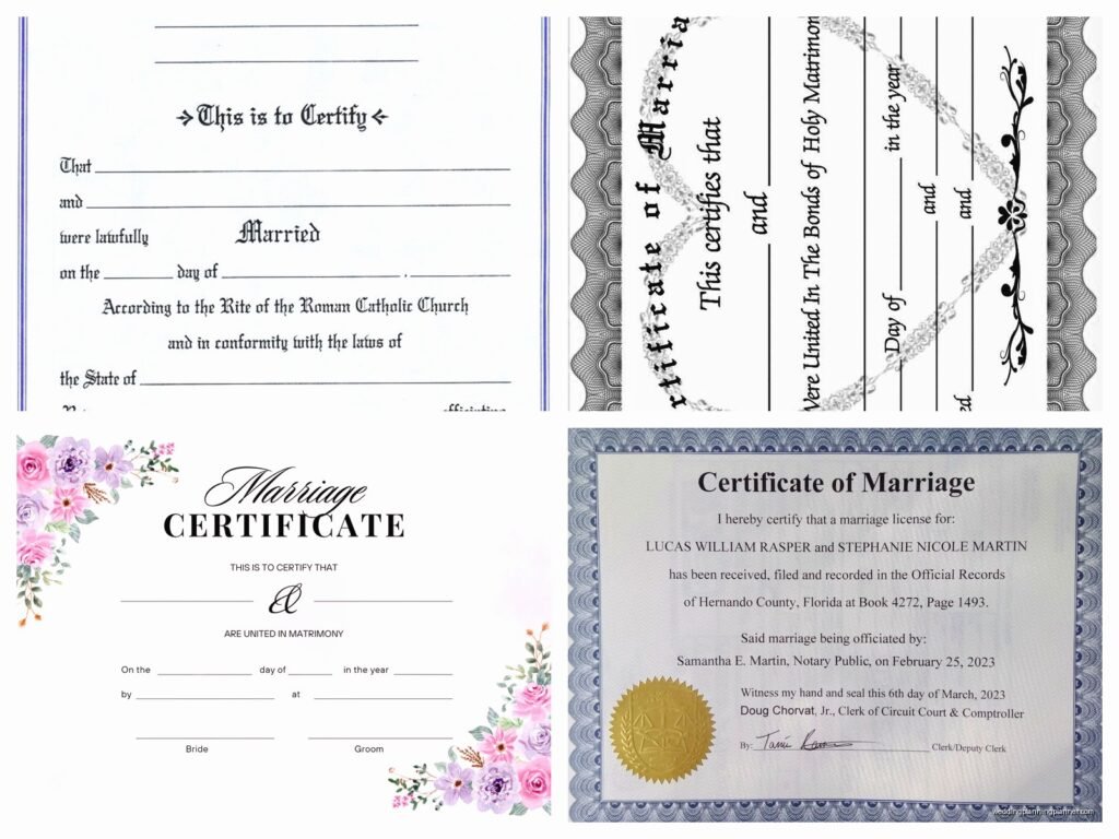
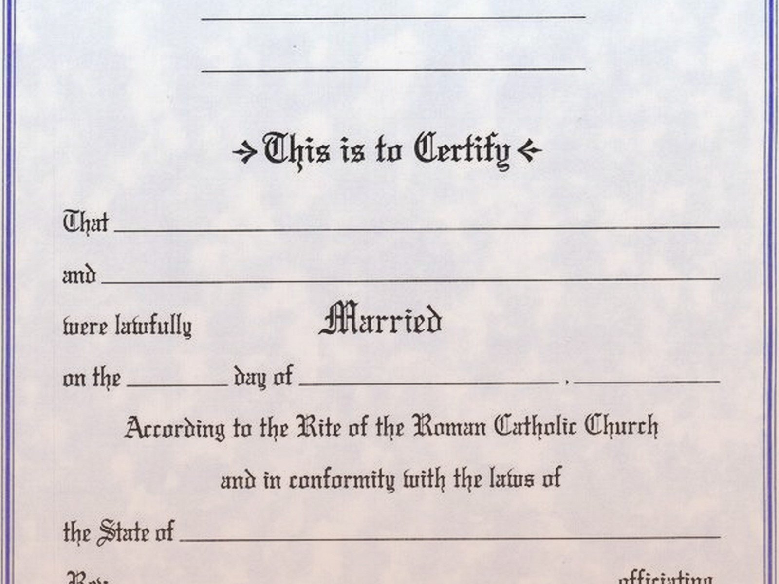
Every marriage certificate needs certain info or it just looks incomplete. You want the couple’s full names, the wedding date, the location (city and state usually), and signature lines for the couple, officiant, and witnesses. Some people add the time of ceremony but I think that’s kinda unnecessary unless you’re really into details.
The wording is where people get weird about it. Traditional certificates say stuff like “This certifies that [Name] and [Name] were united in holy matrimony” but you can make it whatever you want. I’ve done certificates that say “On this day, these two weirdos made it official” for a super casual couple. Just make sure the core info is clear – who got married, when, and where.
Design Styles That Actually Work
The style should match your wedding stationery suite or at least the overall vibe of your wedding. If you had modern minimalist invitations with clean lines and sans-serif fonts, don’t suddenly go full Victorian elaborate script on the certificate. It’ll look like it belongs to a different wedding.
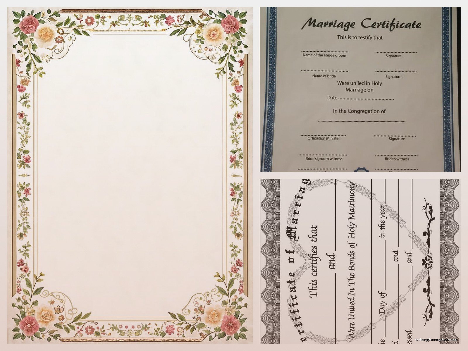
Classic formal designs use calligraphy fonts, borders with flourishes, and traditional language. These work great for church weddings, ballroom receptions, black-tie events. Think cream or white paper with gold or black ink. Maybe a subtle border design. Nothing too crazy.
Modern certificates can be really striking with bold typography, geometric shapes, minimal decoration. I love using a statement font for the couple’s names and keeping everything else super simple. Sometimes just their names in a beautiful typeface with basic info below is enough.
Rustic or bohemian weddings look good with certificates that have botanical illustrations, watercolor elements, or hand-drawn details. Kraft paper can work if it’s done right but honestly I’m kinda over the whole kraft paper trend at this point… it was everywhere in like 2019 and now it feels dated.
Paper and Printing Quality
This is where people cheap out and then regret it. You’re gonna frame this thing and look at it for years (hopefully), so don’t print it on regular printer paper. Just don’t.
Go with at least 80lb cardstock, but I usually recommend 100lb or 110lb. It should feel substantial in your hands. Cotton paper is gorgeous if you can afford it – it has this beautiful texture and weight that regular cardstock doesn’t have. Crane’s Lettra is my go-to for high-end certificates.
For printing, you’ve got options. Digital printing is fine for most designs and it’s affordable. Letterpress looks absolutely stunning but it’s expensive and you need to plan ahead because the setup time is significant. Foil stamping can add a really luxe touch – gold foil, rose gold, silver, even colored foils. I did a certificate with navy foil once and it was gorgeous.
One thing that really annoys me is when couples spend thousands on their wedding but then try to print their certificate at home on their inkjet printer. The ink smudges, the colors look off, it jams halfway through… I’ve seen it happen so many times. Just pay the $50 to get it professionally printed.
Size and Format Considerations
Most marriage certificates are 8×10 inches because that’s a standard frame size and it’s easy to display. You can also do 11×14 if you want something more substantial, but then you’re looking at custom framing which gets pricey. I’ve done 8.5×11 before which works fine and you can use standard frames from Target or wherever.
Horizontal (landscape) orientation is traditional and gives you more space for decorative elements on the sides. Vertical (portrait) can work too, especially for minimalist designs. I personally think horizontal looks better for certificates but that’s just me.
If you’re doing a Quaker wedding or a wedding where lots of guests sign the certificate, you might need a larger format to accommodate all those signatures. I did one that was 16×20 for a couple who had 75 guests signing and even that was tight.
Typography Choices
Font selection can make or break your certificate design. You want something readable but also beautiful. Script fonts are popular for names and main headings, but make sure they’re actually legible. I’ve seen certificates where I literally cannot read the couple’s names because the font is so ornate.
Pair a decorative font with a simple, clean font for the body text. Like maybe a romantic script for “Marriage Certificate” and the couple’s names, then a classic serif like Garamond or a clean sans-serif like Montserrat for the date, location, and other details.
Don’t use more than two or three fonts total. It gets messy fast. And please, please don’t use Papyrus or Comic Sans. I shouldn’t have to say this but you’d be surprised.
Color Schemes
Traditional certificates stick to black ink on white or cream paper, maybe with gold accents. This is timeless and elegant and you can’t really go wrong with it.
But you can absolutely use color if it fits your wedding. Navy and gold is gorgeous. Burgundy and blush. Emerald green with gold. Dusty blue. Whatever your wedding colors are, you can incorporate them subtly into the certificate design.
Just don’t go too crazy with it. A certificate with ten different colors is gonna look like a kindergarten art project. Stick to two or three colors max, and use them intentionally. Maybe your main text is in your wedding color and the rest is neutral, or you have a colored border with neutral text.
Decorative Elements
Borders are classic – you can do simple line borders, ornate vintage borders, floral borders, geometric borders. Just make sure they don’t overwhelm the text. The words should still be the focus.
Illustrations can be beautiful if they’re done well. Botanical drawings, venue illustrations, monograms, symbolic elements that mean something to you as a couple. I had a couple who were both marine biologists and we incorporated subtle ocean elements into their certificate design.
Watercolor washes as backgrounds can be really pretty but they need to be light enough that the text is still readable. I’ve seen designs where the watercolor is so saturated you can barely see the words and that defeats the whole purpose.
Monograms are a nice touch, especially if you already have one from your wedding stationery. Put it at the top center or bottom center of the certificate.
The Signature Section
This is actually really important and people don’t think about it enough. You need clear, obvious lines for signatures with labels underneath. Don’t make people guess where to sign or whose line is whose.
Typically you have lines for: the couple (two lines), the officiant (one line), and witnesses (usually two lines but some couples have more). Space them out enough that signatures don’t look cramped. I usually leave about 2-3 inches of horizontal space per signature line.
Under each line, put a small label in a lighter font: “Bride” and “Groom” or “Partner” and “Partner” or just their names, then “Officiant” and “Witness.” Make it obvious.
Some couples want space for the date next to the officiant’s signature, especially if the certificate is being prepared before the wedding day. That’s fine, just make sure it’s clearly labeled.
Religious vs. Secular Wording
If you’re having a religious ceremony, you might want language that reflects that – “united in holy matrimony,” “in the presence of God,” “according to the ordinance of God,” that kind of thing. Check with your officiant about what’s appropriate for your tradition.
For secular ceremonies, you have way more flexibility. “Joined in marriage,” “celebrated their union,” “made their commitment official,” whatever feels right to you. You can even write your own custom wording that reflects your relationship or values.
I had a couple who were both English teachers and they wrote the most beautiful, poetic wording for their certificate that referenced their favorite books. It was so personal and perfect for them.
DIY vs. Professional Design
Look, you can definitely DIY your marriage certificate if you’re comfortable with design software. Canva has templates, Etsy has downloadable templates you can customize, or you can start from scratch in Photoshop or Illustrator if you know what you’re doing.
The benefit of DIY is cost – you can make something beautiful for very little money. The downside is it takes time and if you don’t have a good design eye, it might not turn out great. I’ve seen some rough DIY certificates that would’ve been so much better if they’d just hired someone or bought a good template.
Professional designers (hi, that’s me) can create something custom that perfectly matches your vision and coordinates with all your other wedding stationery. It costs more but you get expertise and a polished final product. Most wedding stationery designers offer certificate design as an add-on service.
There’s also a middle ground where you buy a template from Etsy or another marketplace and just customize it with your info. This works great if you find a template you love and you’re comfortable editing it. Just make sure you’re buying from a seller with good reviews and high-quality designs.
Timing and Logistics
Don’t wait until the last minute to think about this. Ideally you’d have your certificate designed and printed at least a month before the wedding, maybe ordered at the same time as your other stationery.
If you’re doing custom design work, give your designer at least 6-8 weeks. Rush fees are expensive and stressful and avoidable.
For printing, factor in at least 2-3 weeks, more if you’re doing letterpress or foil stamping. And always order a backup copy in case something happens to the original – someone spills wine on it, the dog eats it (my cat once knocked over a full glass of water onto a certificate the day before a wedding and I wanted to die), whatever.
Bring the certificate to your rehearsal if you’re having one, or give it to your wedding planner or day-of coordinator ahead of time. Make sure your officiant knows where it’ll be and when to bring it out for signing. I usually recommend having it on a table near where the ceremony happens with nice pens ready to go.
Framing and Display
After the wedding, you’re gonna want to frame this thing. Get a frame that complements the certificate design – if you have a gold foil certificate, maybe a gold or brass frame. Classic black frames work with almost anything.
Use UV-protective glass if you’re displaying it somewhere that gets sunlight. Regular glass will let the ink fade over time and that would be sad after all the effort you put into designing it.
Some couples frame their certificate with their wedding photo in a double frame, or they create a gallery wall with the certificate, photos, and other wedding keepsakes. That can look really nice if you do it thoughtfully and not just randomly.
Digital Certificates
Okay so this is becoming more of a thing – couples who want a digital version of their certificate for sharing on social media or including in thank-you emails or whatever. If you’re designing a certificate, you might want to create both a print version and a digital version.
The digital version can be formatted for Instagram (square), Facebook (horizontal), or just as a high-resolution PDF. Make sure it’s high enough resolution that it doesn’t look pixelated but not so huge that it’s difficult to share.
Some couples skip the physical certificate entirely and just do digital, which seems kinda sad to me but it’s their choice. I’m old-fashioned I guess – I think having something physical and tangible that you signed on your wedding day is special.
Common Mistakes to Avoid
Spelling errors are the worst and they happen more than you’d think. Triple-check all names, dates, locations. Have someone else proofread it. Print a test copy before the final version if possible.
Making the text too small is another common problem. Remember that people need to be able to read this, and if you’re taking photos of the signing, tiny text won’t be legible in pictures. Keep body text at least 10-12 point, larger for names and headings.
Overcrowding the design with too many elements. White space is your friend. Let the design breathe. Not every inch of the certificate needs to have something on it.
Choosing trendy design elements that’ll look dated in five years. I mean, do what you want, but maybe think about whether you’ll still love that rose gold geometric pattern in 2030 or if it’ll scream “2024 wedding” in a bad way.
Using low-resolution images or graphics. If you’re including illustrations or photos, make sure they’re high enough resolution for printing. 300 DPI minimum for print work.
International Considerations
If you or your partner are from different countries, you might want to include both languages on the certificate or create two versions. I’ve done bilingual certificates that have English on one side and Spanish, French, Italian, or other languages on the other side. It’s a nice way to honor both cultures.
Date formats vary by country too – make sure you’re using a format that makes sense for your audience. In the US it’s typically month/day/year, but most other places do day/month/year. Or just write it out fully like “June 15, 2024” to avoid confusion.
Some cultures have specific traditions or requirements for marriage documents. If you’re incorporating cultural elements, do your research or work with someone who knows what they’re doing so you get it right and it’s respectful.