Planning Guides, Style Guide
Simple Wedding Invitation Design: Design & Ordering Guide
Apr
Okay so here’s what you actually need to know about designing simple wedding invitations
The biggest mistake I see couples make is overthinking the whole thing. Like, you’re gonna stress yourself out looking at Pinterest boards for six hours when honestly? Simple works better 90% of the time. I had this couple back in spring 2023 who showed me this elaborate invitation suite with seven insert cards and I was like… your guests are just gonna be confused about which card tells them where to actually show up.
Start with your information hierarchy
Before you even think about fonts or colors, write down what actually needs to be on the invitation. The main card should have: your names, the date, the time, the venue name and city. That’s it. Everything else can go on insert cards or your wedding website. I learned this the hard way when a client insisted on cramming the entire reception timeline onto the main invite and it looked like a ransom note.
You need to decide who’s hosting too because that affects the wording. If parents are hosting, their names go first. If you’re hosting yourselves, you can skip that whole “Mr. and Mrs. So-and-So request the honor of your presence” thing and just go with something like “Together with their families” or jump straight to your names.
Picking a design style that won’t make you cringe in five years
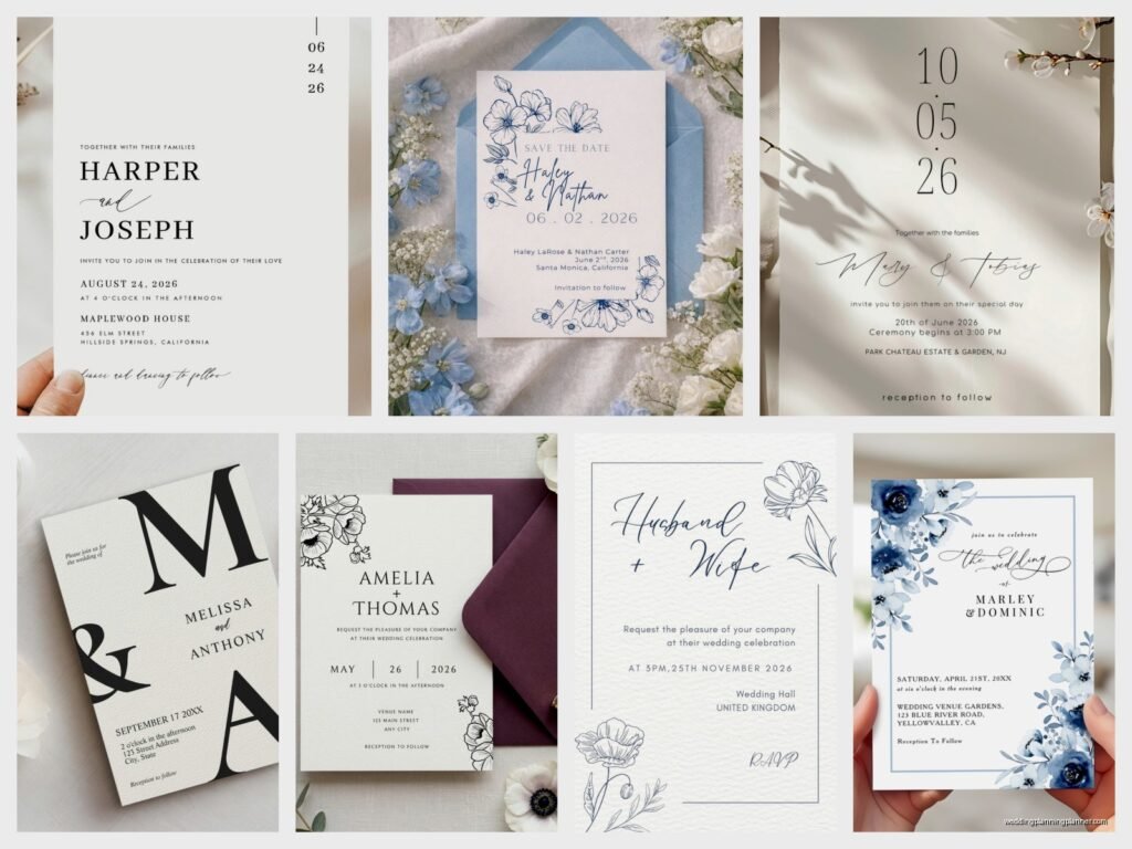
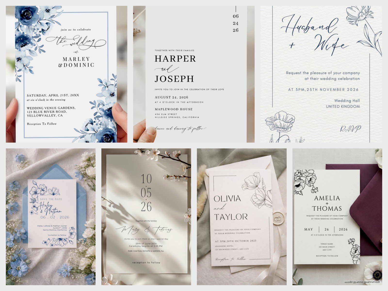
Simple doesn’t mean boring, it means intentional. You’re choosing to focus on a few elements instead of throwing everything at it. Here’s what actually works:
- Classic typography with one decorative font maximum
- Lots of white space (I know it feels wasteful but trust me)
- One or two colors plus black
- Minimal graphics or borders
- Quality paper over fancy printing techniques
The thing that annoyed me most last year was this trend where everyone wanted their invitations to look like they were designed in Canva with those geometric shapes everywhere? Like gold triangles and marble textures and… it’s already dating itself. If you want simple and timeless, think about invitations you could’ve received in 2015 or could receive in 2030 and they’d still look appropriate.
Fonts are where people get weird
You don’t need four different fonts. You need two, maybe three if you’re feeling fancy. Here’s my standard setup: one serif font for names and important info, one sans-serif for details. If you want a script font, use it ONLY for names or a single line. Reading an entire invitation in script font is like… why do you hate your guests?
Some fonts that won’t steer you wrong: Garamond, Cormorant, Libre Baskerville for serifs. Montserrat, Futura, Avenir for sans-serif. For script, Allura or Great Vibes if you must, but seriously go easy.
Make sure your font size is readable. Minimum 10pt for details, 12pt or larger for important stuff. I once had a bride insist on 8pt font for the venue address and I’m pretty sure half their guests needed reading glasses they didn’t bring.
Color choices that won’t overwhelm
Pick one main color, maybe an accent color, and use black for most of your text. That’s the formula. Your main color can show up in a border, your names, or a small graphic element. The accent color might appear in just one place, like on the envelope liner or in a tiny detail.
Neutrals are your friend here—navy, forest green, burgundy, dusty blue, sage green, terracotta. These work for almost any season and venue type. If you’re doing a summer wedding, you can go brighter, but even then… a simple design in bright coral looks better than a complicated design in “safe” colors.
And honestly? Black and white is completely acceptable and often looks the most elegant. My cat knocked over my coffee onto a black and white invitation sample once and even with the stain it looked kinda chic, which tells you something about the staying power of that combo.
Paper and printing methods
This is where you can splurge if you want to, because paper quality is something people actually notice when they’re holding the invitation. Standard cardstock is fine, but if you bump up to cotton paper (110lb or higher), it feels substantial and expensive without looking overdone.
For simple designs, digital printing is totally fine and way cheaper than letterpress or foil stamping. Digital printing technology has gotten so good that most people can’t tell the difference unless they’re really examining it. I mean, letterpress is gorgeous, don’t get me wrong, but if you’re going for simple you don’t need it.
Matte finish usually looks more sophisticated than glossy for wedding invitations. Glossy can read as… I dunno, more like a birthday party invite? That’s just my opinion but I’ve designed over 300 invitation suites at this point so.
What to include in your invitation suite
Main invitation card, obviously. Then you’ll probably need:
- RSVP card with a pre-addressed, stamped envelope (yes, you gotta stamp them)
- Details card with your wedding website, hotel info, and transportation if relevant
- Reception card if it’s at a different location or significantly later
That’s it. You don’t need a separate card for directions (put it on your website), you don’t need a card explaining your hashtag, you don’t need—okay I’m getting worked up but you see what I mean. Keep it minimal.
One envelope is fine for simple suites. Double envelopes are traditional but unless you’re doing a formal wedding or your outer envelopes are getting addressed with calligraphy, skip the inner envelope.
Sizing and layout basics
Standard invitation size is 5×7 inches, which is perfect because envelopes are easy to find and postage is straightforward. You can do 5.5×8.5 or 4×6, but 5×7 is the sweet spot for simple designs. It gives you enough room without feeling like you need to fill every inch with… stuff.
For layout, think about balance. If your text is centered, everything should be centered. If you’re doing left-aligned, commit to it. Mixing alignments in a simple design just looks like you didn’t know what you were doing, not like you were being creative.
Margins matter more than you’d think. Leave at least 0.5 inches on all sides, preferably more like 0.75 inches. White space is not your enemy, it’s actually doing the work of making your design look intentional and high-end.
DIY vs professional printing
Look, I’ve seen successful DIY invitations and I’ve seen disasters. If you’re designing them yourself in Canva or Microsoft Word or whatever, that’s fine, but please please please get them professionally printed. Printing at home on your inkjet printer is gonna look homemade, and not in a charming way.
Services like Minted, Zazzle, Artifact Uprising, or even Vistaprint for basic designs will give you way better results than home printing. They’re not even that expensive—you can get 100 simple invitations printed for like $150-300 depending on the paper quality you choose.
If you want something really custom, find a local print shop or stationer. We can help you avoid common design mistakes and the paper quality is usually better than online services. Plus you can see samples in person before committing.
Wording that doesn’t sound stuffy or too casual
For a simple invitation, the wording should match—not overly formal unless you’re having a black-tie wedding, but not so casual that your grandma will be confused. Here’s a basic template that works:
[Names or hosting line]
invite you to celebrate their marriage
[Your names]
[Date]
[Time]
[Venue name]
[City, State]
Reception to follow
You can adjust the formality level by changing “invite you to celebrate” to “request the honor of your presence” (more formal) or “can’t wait to celebrate with you” (less formal). Just pick one vibe and stick with it across all your stationery.
Ordering timeline and quantities
Order your invitations at least 4 months before your wedding date. That gives you time for design, proofing, printing, and mailing. You want invitations in the mail 6-8 weeks before the wedding, so work backward from there.
For quantities, order your guest count plus 15-20 extras. You’ll want some for keepsakes, last-minute additions, and mistakes in addressing. It’s cheaper to order extras upfront than to do a second print run. Trust me on this one, I had a client who needed to add 10 people after she’d already mailed invitations and the reorder cost almost as much as the original order because of setup fees.
Get a printed proof before you order the full quantity if you’re working with a professional printer. Most places charge like $10-20 for a proof but it’s worth it to catch errors or see if the colors look how you expected.
Envelope addressing options
You’ve got a few choices here and they all work fine for simple invitations:
- Hand-address them yourself in your regular handwriting (totally acceptable)
- Print labels or directly on envelopes (efficient, looks clean)
- Hire a calligrapher for outer envelopes (adds elegance without complicating the invite itself)
- Use a digital calligraphy service that prints directly on envelopes
Whatever you choose, make sure you’ve got accurate addresses well in advance. Send out a quick email or text asking people to confirm their mailing address like 5 months before the wedding. Returned mail is such a pain.
What actually matters vs what doesn’t
After doing this for so long, I can tell you what guests actually notice: whether the invitation clearly tells them where and when to show up, whether it feels like “you” as a couple, and whether it’s easy to RSVP. They don’t notice if you used Garamond or Baskerville. They don’t care if your envelopes have a liner or not. They probably won’t remember the color scheme six months later.
So when you’re designing, focus on clarity and readability first, personality second, and trendy details last. A simple invitation with perfect information and nice paper beats an elaborate invitation with confusing wording every single time.
Common mistakes to avoid
Don’t make your text too small to read. Don’t use light gray text on white paper—it needs contrast. Don’t forget to include the year in your date (I know it seems obvious but people forget). Don’t use all caps for everything because it’s harder to read and looks like you’re yelling.
Also maybe this is just me but don’t put your registry information on the invitation itself? That goes on the details card or your website. The invitation is for inviting people to witness your marriage, not for telling them where to buy you stuff.
Postage considerations
Weigh your full invitation suite at the post office before you buy stamps. If it’s over 1 ounce or if your envelopes are square, you’ll need extra postage. Square envelopes cost more because they can’t go through the automatic sorting machines, which is annoying but it is what it is.
You can get custom stamps from the USPS website or use vintage stamps if you’re into that aesthetic. For simple invitations, regular Love stamps or Forever stamps work perfectly fine and you don’t have to overthink it. I spent like two hours once looking at vintage stamps for my own wedding invitations and then just… used regular ones because I ran out of time and honestly no one noticed.
Hand-canceling is when the post office manually stamps your envelopes instead of running them through the machine, which can prevent damage. You have to ask for it specifically and not all post offices will do it, but it’s worth trying if you’re worried about your invitations getting mangled. Though with simple flat invitations, it’s usually not necessary.
Matching your other stationery
If you want everything to match, focus on carrying through your fonts and colors to your programs, menus, place cards, and thank you notes. You don’t need to recreate the exact invitation design on every piece—that’s actually overkill. Just use the same color palette and one of the same fonts and it’ll feel cohesive.
Your wedding website should also echo the invitation style. Same colors, similar fonts, same general vibe. Most website platforms let you customize pretty easily.
Save-the-dates can be simpler than your invitations, actually—like a postcard with just the key info and maybe one design element that hints at what’s coming. They don’t need to be a perfect preview of your invitations.
Working with designers or doing it yourself
If you’re hiring someone, look for designers whose existing work already matches what you want. Don’t hire someone who does elaborate floral designs and then ask them to create something minimal—find someone whose portfolio shows simple, clean work. It’ll be easier for everyone and you’ll get better results.
Give your designer all the information upfront: exact wording, color preferences, any design elements you definitely want or definitely don’t want, your timeline, and your budget. The more specific you are at the beginning, the fewer revision rounds you’ll need.
If you’re DIYing, use templates as a starting point and customize from there. Don’t try to design something completely from scratch in Canva unless you actually have design experience, because you’ll spend hours on something that could’ve taken 20 minutes with a template. There’s no shame in using templates—they exist for a reason and honestly some of them are really well-designed.
Either way, proofread everything multiple times and have at least two other people proofread it too. I once caught a typo in a client’s invitation literally the day before it was supposed to go to print—they’d spelled the venue name wrong the entire time and nobody had noticed through three revision rounds because our brains just… autocorrect stuff when we’re reading.