Planning Guides, Style Guide
Flower Wedding Invitation: Design & Ordering Guide
Jun
Okay so flower wedding invitations are having a MOMENT right now
Like literally every third bride I work with wants florals on their invites and I totally get it because they’re gorgeous and versatile and honestly work with almost any wedding vibe. But here’s the thing – there’s SO much that goes into getting them right and I’ve seen people mess this up in ways that could’ve been totally avoided.
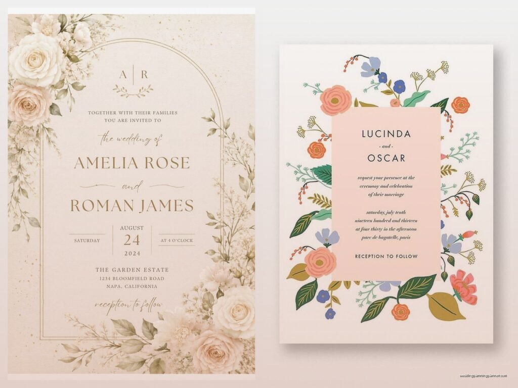
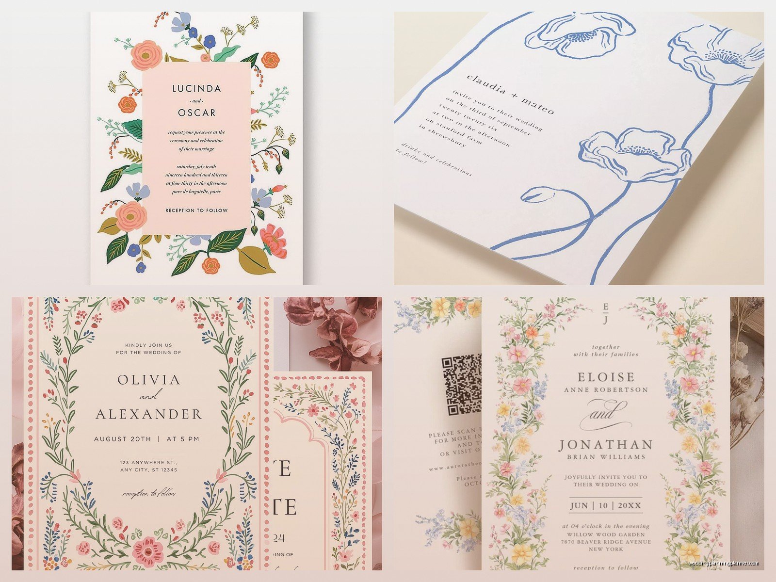
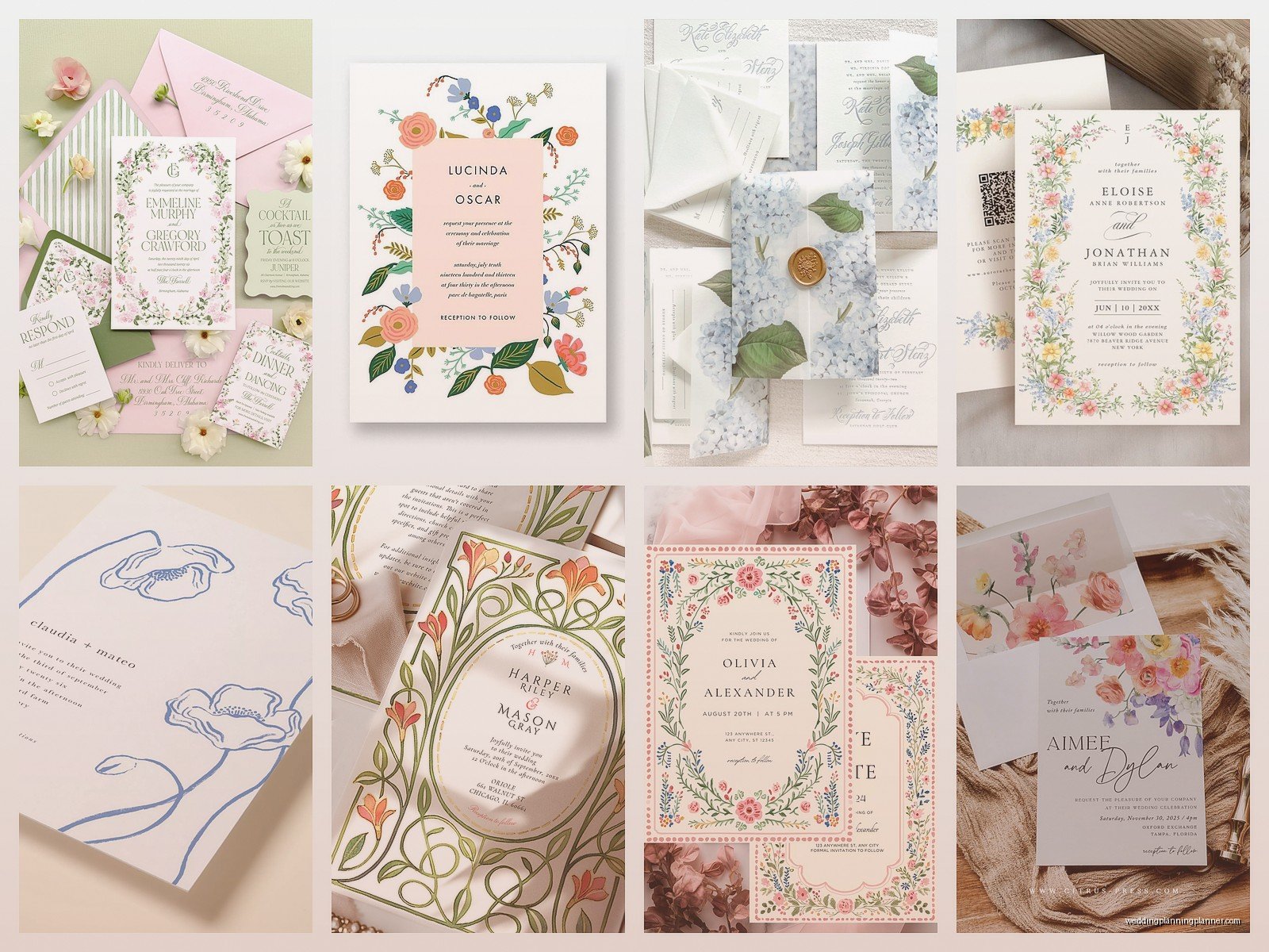
First thing you gotta figure out is what KIND of floral look you’re even going for because “flower invitation” is like saying “I want food at my wedding” – it’s way too broad. Are we talking watercolor botanicals? Pressed flowers? Illustrated line drawings? Photo-realistic roses? Wildflower meadow vibes? Each one gives off a completely different energy and some are gonna work better with your actual wedding flowers than others.
Matching Your Invite Florals to Your Actual Wedding Flowers
This is where I see brides get tripped up ALL the time. You fall in love with these gorgeous peony invitations in like January, order 150 of them, and then in March your florist tells you peonies are out of season for your September wedding and you’re stuck with dahlias instead. Now your invites don’t match your actual flowers and it’s… fine? But also kinda annoying if you’re the type who notices that stuff.
I had this bride in spring 2023 who ordered the most beautiful cherry blossom invitations because she was obsessed with that delicate pink vibe. Her wedding was in November. In Chicago. There were zero cherry blossoms anywhere near her wedding and the whole thing just felt disconnected. She didn’t care ultimately but her mom kept mentioning it and I could tell it bugged her more than she let on.
So here’s what I tell people: if you’re set on specific flowers for your wedding, make sure those are featured on your invites OR go with a more generic “garden flower” look that won’t clash with whatever you end up choosing. Roses, eucalyptus, and generic greenery are your friends here because they work year-round and with basically everything.
Design Styles and What They Actually Mean
Watercolor florals are still super popular and they give this romantic, soft, kinda dreamy feel. They work great for garden weddings, outdoor ceremonies, anything that’s leaning romantic or whimsical. The colors usually bleed into each other a bit which I think is pretty but some people find it too… I dunno, loose? Not structured enough?
Botanical illustrations are more precise – think detailed line drawings with maybe some color or maybe just black ink. These skew a bit more modern or even vintage depending on the style. I’m really into these lately because they photograph SO well and they don’t compete with your text the way some busy watercolor designs do.
Pressed flower invitations are actual dried flowers embedded in the paper or attached to it and okay, they’re stunning but also a PAIN to mail. You need extra postage, they can get damaged super easily, and honestly some postal workers hate them because they’re thick and weird-shaped. Worth it if you love the look but just know what you’re signing up for.
The Design Process (Or: Why This Takes Longer Than You Think)
Most people think you just pick a template, add your info, done. Nah. Even with a template there’s like seventeen decisions to make and they all matter more than you’d expect.
Your text hierarchy is huge. The flowers should frame or complement your words, not compete with them. I’ve seen invitations where the florals are so bold and colorful that you literally can’t read the venue address without squinting. Your names, date, time, and location need to be immediately readable – everything else is secondary.
Font pairing with florals is its own whole thing and honestly this is where having a designer helps because fonts have personalities just like flowers do. Delicate script fonts work with soft watercolor florals. Bold serif fonts can handle more dramatic roses or dark moody florals. Mixing fonts is fine but don’t go crazy – two fonts max, maybe three if one is just for tiny details.
Color Decisions That’ll Make or Break Your Design
Okay so this is where I get kinda annoyed with some of the advice out there because everyone says “just match your wedding colors!” but that’s not always the right move. Sometimes your wedding colors are like… burnt orange and deep purple (fall wedding, very pretty) but those colors on an invitation can look muddy or too dark or just weird on white paper.
I usually recommend pulling 2-3 colors from your wedding palette for the invitation florals rather than using ALL of them. It keeps things cleaner and more elegant. And consider the paper color too – florals on ivory or cream paper look totally different than on bright white.
Also think about the mood colors create. Blush and sage is soft and romantic. Deep burgundy and navy is dramatic and formal. Bright coral and yellow is fun and energetic. Lavender and white is… I dunno, very spring garden party? You get the idea.
Paper Quality Actually Matters (Unfortunately for Your Budget)
I wish I could tell you that cheap paper looks just as good but it doesn’t and you’ll be able to tell. Floral designs especially need decent paper quality because the colors print differently on cheap cardstock – they look flat and dull instead of rich and vibrant.
Minimum you want is like 110lb cardstock. Better is 130lb. Luxury territory is cotton paper or stuff with texture like linen or felt finish. Cotton paper is *chef’s kiss* for florals because it has this substantial feel and the ink sits on it differently, makes colors pop.
Matte vs glossy is personal preference but I lean matte for florals because glossy can look kinda… cheap? Unless you’re going for very modern and bold. Matte feels more sophisticated and elegant to me.
Where to Actually Order These Things
You’ve got basically three routes: online template sites, semi-custom designers, or fully custom designers. Each has pros and cons and very different price points.
Online template sites like Minted, Zazzle, Shutterfly – these are gonna be your most affordable option. You pick a design, customize the text, maybe adjust colors slightly, and order. Prices usually run $1.50-$4 per invitation depending on paper quality and extras. The downside is you’re working within their system and sometimes the customization options are limited. Also like half the weddings you go to that year might have similar invitations because everyone’s shopping from the same templates.
Semi-custom is the middle ground – you work with a designer who has existing floral designs but they’ll customize them more specifically for you. Maybe they adjust the flower arrangement, change colors completely, modify the layout. This usually runs $3-$7 per invitation. I work with several designers in this category and they’re great for brides who want something more unique but don’t have custom-design budgets.
Fully custom means a designer creates something from scratch just for you. They might paint watercolor florals specifically in your wedding flowers, or illustrate botanical drawings based on your venue’s garden, or whatever. Sky’s the limit but you’re paying for it – anywhere from $8-$20+ per invitation plus a design fee that could be $500-$2000 depending on the designer. Worth it if you want something truly one-of-a-kind and have the budget.
The Ordering Timeline (Don’t Screw This Up)
Order your invitations 4-6 months before your wedding date. Mail them 8-10 weeks before the wedding. This gives you time for the design process, proofing, printing, and addressing without having a panic attack.
If you’re doing custom design, start even earlier – like 6-8 months out – because the design process alone can take 4-6 weeks with revisions and everything.
Always always ALWAYS order samples first if you can. Most companies will send you a printed sample for like $5-15 and it’s so worth it because colors on screen look different than colors printed, and you need to feel the paper quality in your hands.
Order 10-15 extra invitations beyond your guest count. You’ll want them for keepsakes, last-minute additions, mistakes in addressing, your mom will want extras, whatever. Just trust me on this.
The Actual Practical Stuff Nobody Tells You
Envelope liners with floral patterns are gorgeous but they add like $1-2 per invitation and honestly most people don’t notice them? I mean they’re pretty when you open the envelope but it’s not where I’d spend money if budget is tight. Better to put that money toward better paper quality for the actual invitation.
Addressing options: you can hand-write them (time-consuming but personal), print directly on envelopes (clean and modern but some people think it’s impersonal), use printed labels (kinda dated looking unless they’re clear labels), or hire a calligrapher (beautiful but expensive – usually $2-5 per envelope). I usually recommend printed addresses in a nice font if you’re DIYing it because it looks clean and saves so much time.
Postage is more than you think, especially if your invitations are thick or square or have any embellishments. Take a fully assembled invitation to the post office and have them weigh it before you buy stamps. Square envelopes cost more to mail which is annoying but that’s the postal service for you. Also please use pretty stamps – it’s a small detail but floral or love-themed stamps look so much better than random flag stamps.
Digital vs Printed (Yeah This Is a Debate Now)
Some people are doing digital invitations even for formal weddings now and honestly for like a casual outdoor wedding or destination wedding, fine. They’re eco-friendly and cost-effective and you can do animated florals which is kinda cool I guess?
But for a traditional wedding there’s still something about receiving a physical invitation that feels special. It sets the tone for your event. A beautifully designed floral invitation tells guests this is an elegant, thoughtful celebration. An email… doesn’t quite do that.
My cat just knocked over my coffee cup while I’m writing this and it’s all over my notes from last week’s consultation but anyway—
You can do a hybrid approach: printed invitations for older relatives and close family, digital for everyone else. Saves money and trees while still giving that special touch to the people who care most about traditional etiquette.
Proofreading Is Not Optional
I cannot stress this enough: have like five people proofread your invitation before you order 150 of them. Check the date, day of the week, venue address, website URL, everything. I’ve seen invitations printed with the wrong year, wrong venue, misspelled names… it happens more than you’d think and reprinting is expensive and stressful.
Make sure your wedding date actually falls on the day of the week you listed. “Saturday, June 14th” sounds right until you check a calendar and realize June 14th is a Sunday. Little stuff like that.
Also double-check that your floral design doesn’t accidentally cover up any important text. I’ve seen designs where a flower is positioned right over part of the venue address or the RSVP deadline is hidden behind a leaf. Easy to miss when you’re looking at it on a computer screen.
Extras and Add-Ons (The Stuff That Adds Up Fast)
Most invitation suites include the main invitation, but then there’s the RSVP card, details card, directions card, accommodations card, weekend events card… it adds up. With floral designs you want these to coordinate but they don’t all need the same level of detail. Maybe your main invite has the full floral design and the other cards just have a small floral accent or a simple border.
Belly bands, vellum overlays, wax seals, ribbon – these are all pretty but they add cost and assembly time. If you’re DIYing assembly, think about whether you really wanna sit there for hours tying ribbons around 150 invitations. Sometimes simple is better and lets the floral design shine without all the fussy extras.
That said, wax seals with floral designs are really having a moment and they do photograph beautifully. Just know they add postage costs because they make the envelope thicker and sometimes they crack or fall off in the mail which is… well it’s whatever but slightly disappointing.
Working with Your Designer or Template
If you’re working with a designer, give them as much info as possible upfront: your wedding flowers if you know them, your venue aesthetic, your color palette, formality level, any flowers that have special meaning to you. The more context they have, the better they can create something that actually fits your wedding.
Be specific about what you don’t like too. Don’t just say “I want florals” – say “I love roses and eucalyptus but I don’t like carnations or baby’s breath” or “I want something botanical but not too busy” or whatever your preferences are.
Expect 2-3 rounds of revisions with a custom or semi-custom designer. First round they show you initial concepts, second round you refine colors and layout, third round is final tweaks. If you need more than that you might get charged extra so try to give clear feedback each time rather than changing your mind back and forth.
With templates you usually can’t revise much beyond text and maybe colors, so make sure you really love the base design before you commit. Don’t try to force a template to be something it’s not – like if the florals are all soft and watercolor-y, you can’t really make that work for a dramatic black-tie wedding no matter how you customize it.
The whole process is honestly kinda fun once you get into it, even though it feels overwhelming at first. Summer 2021 I had a bride who was SO stressed about her floral invitations matching her bouquet exactly and we spent weeks going back and forth on shades of pink, and then on her wedding day she told me she barely even remembered what her invitations looked like because there were so many other beautiful details to focus on. So yes, get them right, but also don’t let perfect be the enemy of good enough because your guests aren’t gonna remember the exact shade of your invitation roses anyway.
Just make sure they’re readable, pretty, and mailed on time. That’s like 90% of it right there.