Planning Guides, Style Guide
Wedding Mood Board Template: Design Vision Board
Jul
Wedding Mood Board Template Basics
Okay so mood boards are literally one of those things that sounds super artsy and intimidating but they’re actually the most practical planning tool you’re gonna use. I started using them with clients back in like 2018 and honestly wish I’d done it sooner because the number of miscommunications they prevent is wild.
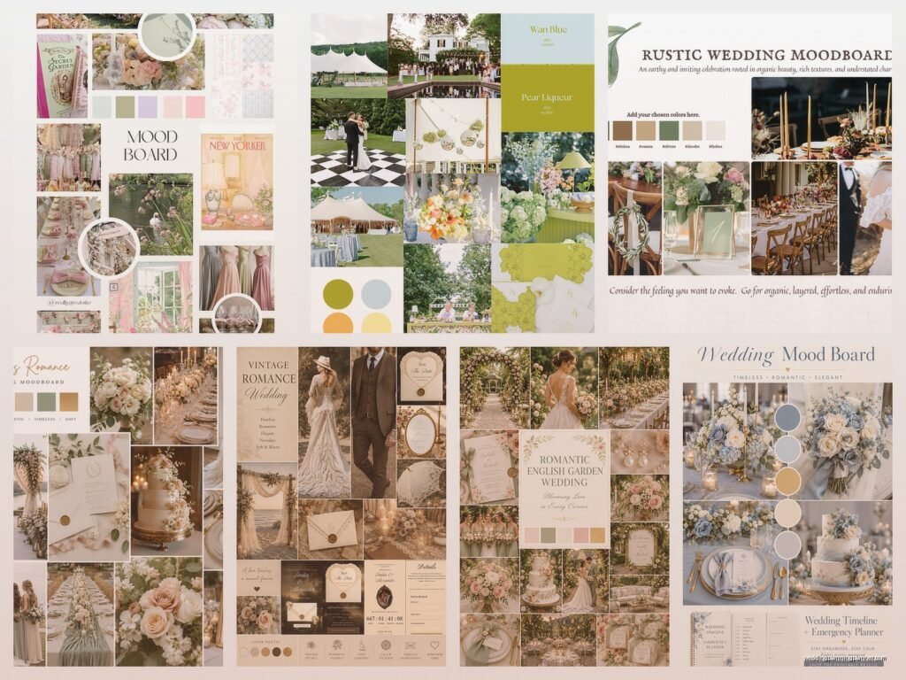
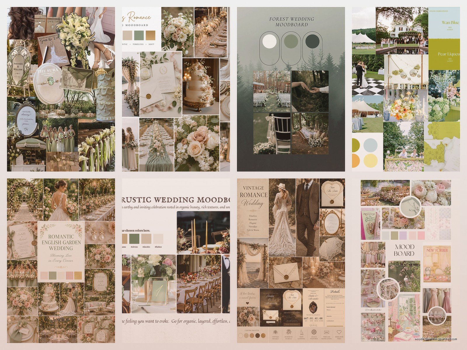
A wedding mood board is basically a visual collection of everything that represents your wedding vibe. Colors, textures, flowers, fonts, fabrics, photos of venues or decor you like, literally anything that captures the feeling you want. Think of it as your wedding’s personality in picture form.
Why You Actually Need This Thing
Here’s what happens without a mood board: you tell your florist you want “romantic” flowers and they’re thinking garden roses in blush pink, but you were actually thinking deep burgundy dahlias because your version of romantic is moody and dramatic. Then you get the proposal and you’re like wait what is this and everyone’s confused and… yeah. Been there, watched that disaster unfold in spring 2023 with a couple who insisted they didn’t need to do the visual homework.
With a mood board, your florist, your stationer (hi that’s also me), your rental company, your baker—everyone’s literally looking at the same pictures. There’s no room for interpretation when you can point and say “this exact vibe.”
Setting Up Your Template
You’ve got a few options for where to actually create this thing. I’m gonna walk through the main ones because they each have pros and cons and it kinda depends on how your brain works.
Digital Options
Pinterest is the obvious choice and honestly it works great for most people. Create a secret board (trust me, make it secret unless you want everyone and their mom commenting on your choices). Start pinning anything that catches your eye—don’t overthink it at first. I usually tell clients to spend like two weeks just pinning randomly, then go back and start organizing into sections.
Your sections should be something like: Overall Vibe, Color Palette, Florals, Table Settings, Ceremony Space, Stationery Styles, Bridal Fashion, Lighting/Ambiance. You can get more specific but don’t create so many categories that it becomes overwhelming.
Canva is another option I’ve been using more lately. They have actual mood board templates which is nice because you can arrange everything on one page or a few pages max. The free version works fine but the pro version gives you more layout options. What I like about Canva is you can add text notes directly onto the board, so if you pin a photo but only like specific elements, you can literally write “JUST THE CHAIR STYLE NOT THE FLOWERS” right there.
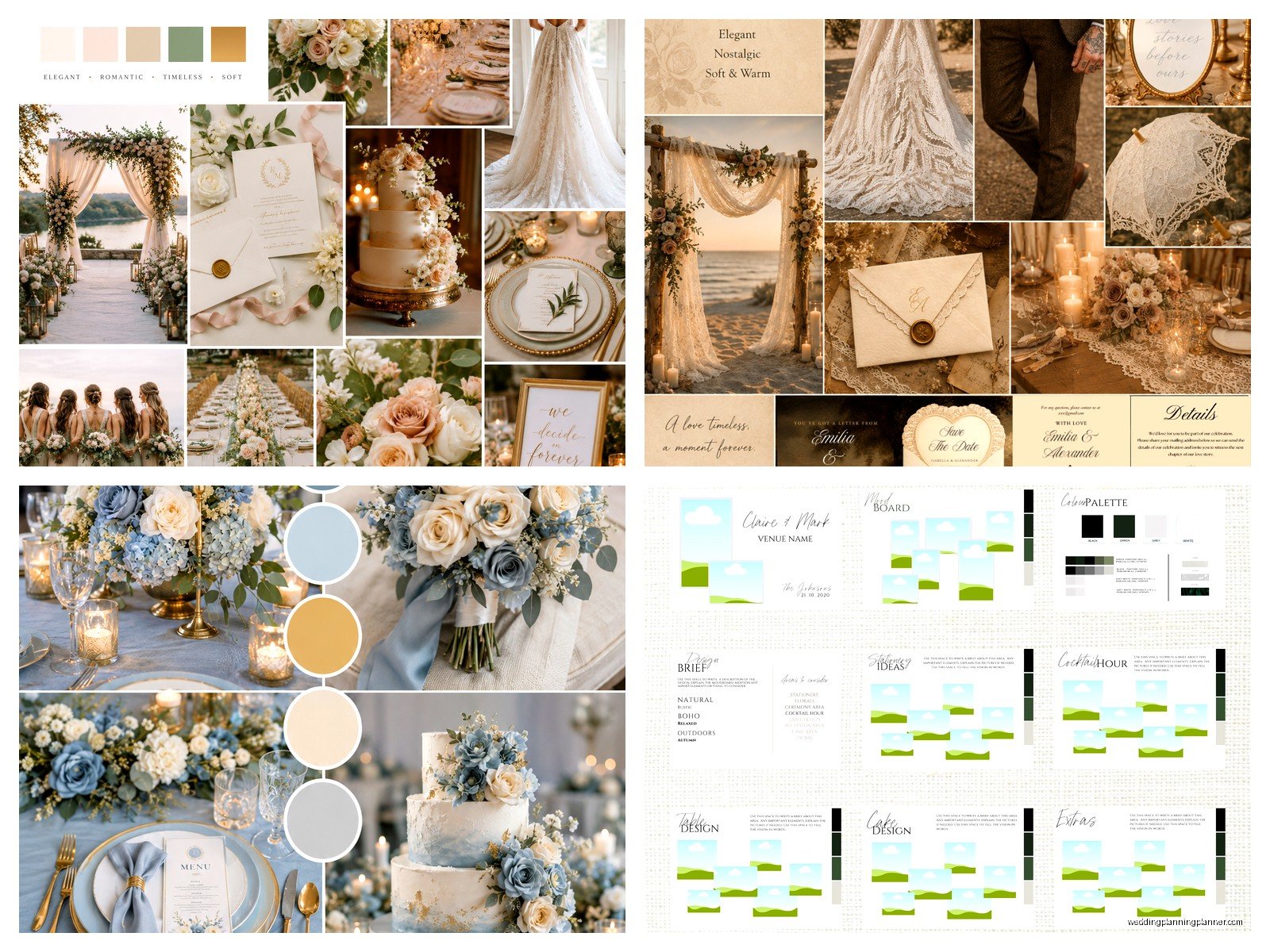
There’s also Milanote which is… it’s very aesthetic and designers love it but honestly I think it’s overkill for most couples? But if you’re really visual and want something more flexible than Pinterest, check it out.
Physical Boards
Nah I’m not gonna tell you physical poster boards are outdated because honestly sometimes they work better. If you’re someone who needs to see everything printed and tangible, do it. Get a foam core board from the craft store, print your images, and use pins or tape. My cat knocked over a client’s physical board once during a consultation at my home office and we just… laughed and repinned everything but yeah maybe keep it somewhere safe.
The downside is you can’t easily share it with vendors unless you photograph it, which defeats the purpose of having it physical in the first place.
What Actually Goes On Your Board
This is where people get stuck because they think it needs to be perfect from the start or something. It doesn’t. You’re literally just collecting visuals that speak to you.
Color Palette Section
Start here because color influences everything else. Don’t just think “blue and gold”—get specific. Navy or dusty blue? Rose gold or antique gold? Pin actual photos that show the exact shades. I like when couples include photos of things that aren’t even weddings—like a photo of a sunset, a painting, a room interior, whatever. Sometimes a random image captures the exact color combination better than any wedding photo could.
Pro tip: include at least one neutral. Everyone forgets the neutrals and then wonders why their colorful vision looks chaotic. You need something to ground everything—cream, taupe, gray, whatever works with your palette.
Textures and Materials
This is the part that separates okay mood boards from really useful ones. Don’t just show what things look like, show what they feel like. Velvet ribbons, raw wood tables, handmade paper, silk napkins, metal finishes. I had a bride in summer 2021 who was really into this organic modern vibe and she included photos of pottery and linen fabrics and honestly that communicated her vision better than any of the actual wedding photos she pinned.
If you’re doing a physical board, you can literally attach fabric swatches and ribbon samples which is actually pretty helpful.
Floral Inspiration
Pin specific flowers if you know them, but also pin arrangements and styles. Are you into structured, compact bouquets or wild, loose, garden-style? Big dramatic installations or simple bud vases? Your florist needs to understand the style just as much as the actual flowers.
What annoys me is when people pin like 47 different floral styles that have nothing in common and then get frustrated when the florist asks clarifying questions. Pick a lane or at least narrow it down to 2-3 styles max.
Table Settings and Reception Decor
This should include place settings, centerpieces, linens, chairs, lighting—basically what guests will see and experience. Think about layers here. What’s on the table? What’s the table itself? What’s around the table? I always tell people to find at least 3-5 images of complete tablescapes because those show how everything works together.
Getting More Specific With Different Elements
Stationery Vibes
Okay obviously I’m biased here but your invitation suite should match your mood board perfectly. Pin fonts you like, paper textures, envelope styles, wax seals if that’s your thing, printing methods. Are you into modern minimalism or ornate traditional or something in between?
I need to see if you’re drawn to script fonts or block letters, lots of text or clean and simple, color or neutral. Also pin any little details like belly bands or vellum overlays or whatever catches your eye.
Ceremony Space
Even if your ceremony venue is set and you can’t change the architecture, you can still create a vibe with an arch or backdrop, aisle decor, seating arrangements, signage. Pin what you want the space to feel like. Intimate? Grand? Natural? Romantic but not stuffy?
Fashion and Attire
Your dress, accessories, partner’s outfit, bridesmaid dresses—these all contribute to the visual story. You don’t need to find your exact dress on Pinterest but pin silhouettes and details you’re drawn to. Same with hair and makeup looks.
How to Actually Use This Thing
So you’ve created this beautiful collection of images and now what? This is where the mood board actually becomes useful instead of just pretty.
Sharing With Vendors
Send your mood board (or the link to your Pinterest board) to every single vendor. I’m serious. Your photographer needs to see it. Your venue coordinator needs to see it. Your makeup artist needs to see it. Everyone should be working from the same visual reference.
When you have vendor meetings, pull it up on your phone or laptop. Point to specific images when explaining what you want. “See this photo? I love the way the candlelight creates ambiance but I don’t want it to feel too dark” is so much clearer than just saying you want candlelight.
Making Decisions
Anytime you’re stuck on a choice, go back to your mood board. Does option A or option B fit better with the overall vibe? I watched a couple spend 45 minutes debating chair styles until I pulled up their mood board and it was immediately obvious which chairs matched. The board is your north star or whatever, it keeps you from getting distracted by things that are pretty but don’t actually fit your vision.
Editing and Refining
Your mood board isn’t set in stone. As you make decisions and your vision gets clearer, you’ll probably remove some images and add others. That’s normal. I usually tell clients to do a major edit around the 6-month mark when most big vendors are booked and you have a clearer picture of what’s actually happening.
But also don’t change it every week because then it’s not actually guiding you, you’re just collecting random inspiration indefinitely.
Common Mistakes I See
Too many different styles mixed together. Like you can’t have rustic barn wedding vibes AND ballroom glamour AND boho desert vibes all on one board. Pick one main style with maybe one complementary style at most. I’ve seen boards that are basically “everything beautiful I’ve ever seen on Instagram” and they’re useless for actual planning.
Not enough images. If your mood board has like 8 pins, that’s not enough to establish a clear vision. You need repetition of colors, textures, styles so patterns emerge. Aim for at least 30-50 images minimum.
Only pinning full wedding photos. Those are helpful but also include close-ups, details, non-wedding images that capture the mood. Sometimes a photo of a forest or a painting or a fashion editorial captures the vibe better than another wedding photo.
Forgetting about lighting. This is huge and people always forget it. How do you want your space lit? Bright and airy? Moody and dramatic? Candlelit? String lights? Pin lighting examples because it completely changes the atmosphere.
Organizing Your Board Strategically
If you’re using Pinterest, you can create sub-boards under your main wedding board. So like “Wedding Planning” is the main board, then underneath you have “Color Palette,” “Florals,” “Reception Decor,” etc. This keeps everything organized without having 15 separate boards cluttering your profile.
For Canva, I usually recommend creating multiple pages—one for overall vibe and colors, one for ceremony, one for reception, one for stationery and paper goods, one for fashion. You can also create a single summary page that pulls your favorite image from each category as like a quick reference sheet.
Label everything. If you save an image because you like the napkin fold but not the plates, add a note. Future you will forget what specifically you liked about that pin.
Color Coding Can Help
Some people find it helpful to organize by color within each section. So all your floral pins might be arranged from light to dark, or grouped by color family. This isn’t necessary but if you’re very visual it might help you see patterns and gaps in your palette.
When to Start and When to Stop
Start your mood board as soon as you’re engaged, honestly. Even before you book vendors, start collecting images. This will actually help you choose the right vendors because you can show them your vision during initial consultations and see if they get it.
But there’s a point where you need to stop adding and start executing. Once you’ve booked your major vendors and made your big decisions (around 4-6 months before), your mood board should be mostly locked. You can still reference it but stop adding new ideas because that’s how you end up changing directions last minute and stressing everyone out.
I had a client who kept pinning new ideas literally two weeks before her wedding and wanted to change her entire color palette and… no. Just no. We had a gentle conversation about how the mood board is for planning, not for endless inspiration collecting.
Digital vs Physical Reality Check
One thing to remember is that Pinterest and Instagram photos are often heavily edited. Colors might look different in real life, lighting is usually enhanced, angles are optimized. Use your mood board as inspiration and direction, not as an exact blueprint you’re trying to recreate pixel by pixel.
Bring your mood board to venue visits and hold your phone up in the actual space. Does this vibe work here? Can you imagine these colors in this room with this lighting? Sometimes what works on a screen doesn’t translate to your specific venue and that’s okay, you just adjust.
Getting Your Partner Involved
Look, not everyone is into the visual planning stuff and that’s fine, but your partner should at least look at the mood board and confirm they don’t hate it. I’ve seen situations where one person plans everything alone and then the other person sees it all coming together and is like “wait this is not what I pictured at all” and that’s… awkward.
Even if they’re not Pinterest people, you can show them the board on your laptop or create a simple one-page summary in Canva with the key images. Just get their buy-in on the general vibe so there are no surprises.
Mood Boards for Specific Wedding Styles
Depending on your style, certain elements matter more. For a garden wedding, you’ll want lots of floral inspiration and outdoor lighting examples. For a modern city wedding, focus on clean lines, architectural details, and sophisticated color palettes. For a beach wedding, think about how wind affects decor and what colors look good in bright sunlight versus sunset.
Your mood board should reflect the reality of your venue and setting, not just abstract pretty things. If you’re getting married in a barn, pin barn weddings. If you’re in a ballroom, pin ballroom setups. You can absolutely make any space work for your vision but you need to be realistic about the starting point.
Anyway I think I’ve covered most of the practical stuff about actually creating and using a mood board template. The main thing is just to start collecting images and don’t overthink it at first—you can always organize and refine later but you gotta have the raw material first