Planning Guides, Style Guide
Canva Wedding Menu: Brand Review & Guide
Mar
Canva Wedding Menus Actually Work Pretty Well If You Know What You’re Doing
Okay so Canva for wedding menus is honestly one of those things I recommend to like 70% of my clients now and the other 30% are either working with a designer already or have super specific branding that needs custom work. But for most couples? Yeah it’s gonna work just fine and save you probably $200-500 depending on what a stationer would charge in your area.
The biggest thing you need to know upfront is that Canva has like two different worlds of templates – the free ones and the Pro ones. The free templates for wedding menus are… okay they’re kinda rough honestly. Very 2015 vibes with those scripty fonts everywhere and clipart-looking florals. But if you have Canva Pro (which is like $13/month or something) you get access to way better stuff that actually looks professional.
The Templates Situation and What Actually Looks Good
I had this bride back in spring 2023 who was absolutely convinced she could just grab any template and swap out the text and be done in 20 minutes. She sent me her first draft and I had to be like… okay we need to talk about font pairing because she had four different script fonts happening at once and none of them were talking to each other if that makes sense.
When you search “wedding menu” in Canva you’re gonna get literally hundreds of options. Here’s what I tell people to filter for:
- Look for templates that have mostly TWO fonts maximum, maybe three if one is just for small details
- Skip anything with those rainbow watercolor backgrounds unless your whole wedding is boho-garden-festival vibes
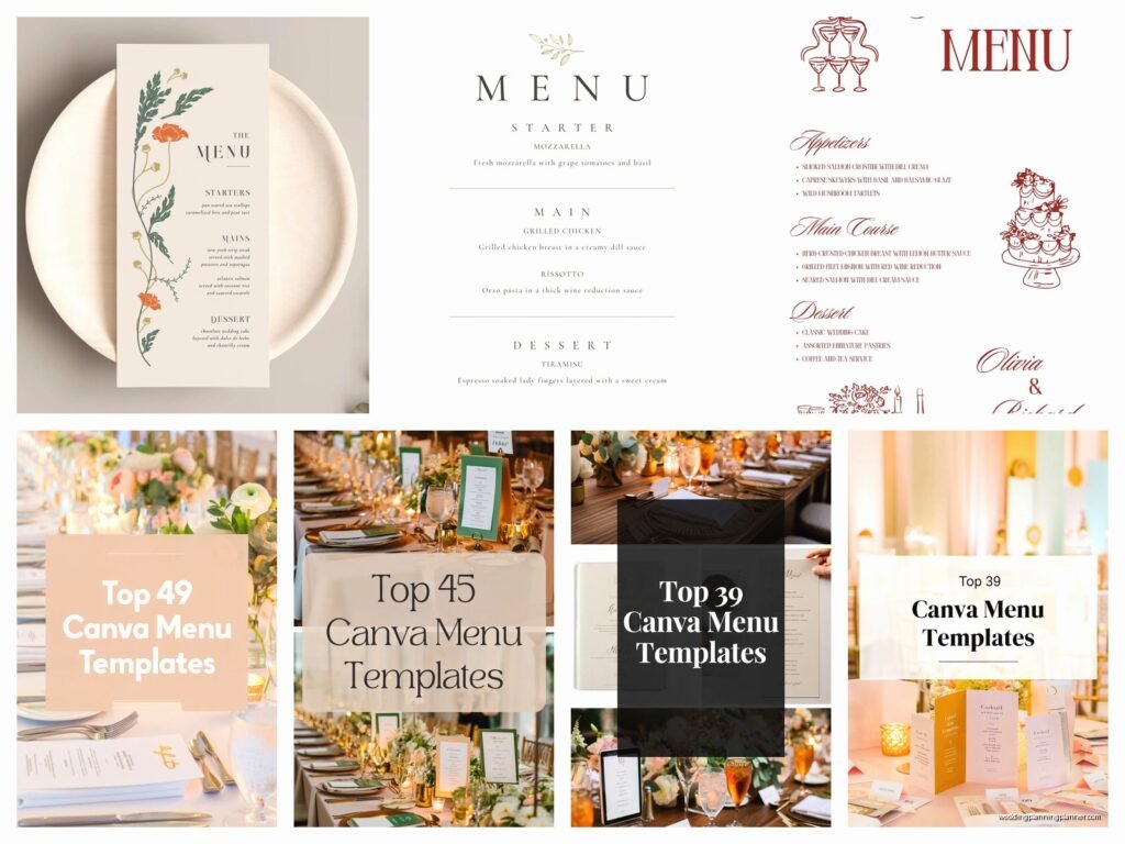
- Check if the template is sized correctly – you want either 4×9 inches (tall and skinny), 5×7 inches (classic), or 4×6 inches (compact)
- Make sure there’s enough white space or negative space because menus get cluttered SO fast
The templates I actually recommend clients start with are the ones that have a simple border or frame, clean serif or sans-serif fonts, and maybe one decorative element like a small botanical illustration or a simple geometric shape. Those age way better than the super trendy stuff.
Customizing Without Making It Look Homemade
This is where people mess up the most and honestly it’s the thing that annoys me because it’s so avoidable – they over-customize. Like you don’t need to change every single element just because you CAN. I’ve seen menus where someone added their own photos, changed all the colors to match their exact Pantone swatches, added texture overlays, put in custom illustrations… and it ends up looking like a ransom note.
Here’s what you actually need to customize:
Text content obviously – your appetizers, entrees, desserts whatever. But keep the text hierarchy that’s already in the template. If the template has the course names in 18pt bold and the descriptions in 12pt regular, keep that relationship even if you change the actual sizes.
Colors but carefully – I usually tell people to pick 2-3 colors max for the whole menu. Your primary color (usually the darkest one for text), an accent color (for headers or decorative elements), and maybe a subtle background color. Canva makes it really easy to save your brand colors which is actually super helpful if you’re doing multiple print items.
Maybe swap the decorative elements – if the template has eucalyptus leaves but you’re doing a rose-heavy wedding, sure swap those out. Canva has a huge elements library. Just search “rose line art” or “rose illustration” and you’ll find tons. Stick with one style though – all line art OR all watercolor OR all photos, not mixed.
The Font Thing That Everyone Gets Wrong
Okay I’m gonna sound like a broken record but fonts are where 80% of DIY menus fall apart. Canva has hundreds of fonts and most of them should not be on your wedding menu I’m just saying.
Safe font combinations that actually work:
- A simple script or italic serif for headers + a clean sans-serif for body text (like Allura with Montserrat)
- An elegant serif for everything but different weights (like Playfair Display in bold for headers and regular for descriptions)
- A modern sans-serif for the whole thing if you want contemporary vibes (like Futura or Raleway)
What doesn’t work: mixing multiple scripts, using all caps for paragraphs of text (so hard to read), using fonts that are too thin (they disappear when printed), or using “fun” fonts like Comic Sans or Papyrus which I really hope nobody is using but you never know.
The other thing with fonts is size – if your descriptions are under 10pt they’re gonna be hard to read in dim reception lighting. I learned this the hard way at a venue in summer 2021 where the couple had these gorgeous menus but the font was like 8pt and everyone over 50 was squinting. Not cute.
Actually Getting Them Printed Without Disasters
So you’ve designed your menu in Canva and it looks good on your screen. Cool. Now comes the part where you need to actually… print them and this is where things can go sideways fast.
Canva has their own printing service which is honestly pretty decent? I’ve used it for clients maybe a dozen times and the quality is consistent. The cardstock options are good, the colors come out accurate, and it arrives in like 5-7 business days usually. But it’s not the cheapest option.
If you wanna save money you can download the PDF and take it to a local print shop or use an online service like Catprint or GotPrint. Just make sure you download it as a PDF Print (not PDF Standard) because that maintains the quality better. And check the color mode – you want CMYK for printing not RGB which is what shows on screens.
Here’s what I tell people about paper stock: go for at least 80lb cover weight, preferably 100lb. Anything lighter feels flimsy and cheap. Matte finish usually looks more elegant than glossy for wedding menus unless you’re going for like a modern editorial vibe or something. Oh and if you’re printing yourself on a home printer… nah. Just don’t. The color matching is gonna be off and you’ll waste so much time and ink.
Sizing and Layout Decisions That Matter
The size thing is actually kinda important and depends on your table setup. If you’re doing individual menus at each place setting, 4×9 or 5×7 works great. If you’re doing one menu per table in a stand or frame, you might want to go bigger like 8×10.
Single-sided vs double-sided is another decision. Most wedding menus are single-sided because honestly there’s not that much content usually – apps, entrees, dessert, maybe drinks. But if you have a really elaborate multi-course meal or you want to include the couple’s story or something on the back, double-sided works. Just costs a bit more to print.
Layout-wise keep your margins at least 0.25 inches from the edge, preferably 0.5 inches. Canva templates usually have this built in but if you’re moving elements around make sure nothing important gets too close to the trim line.
The Canva Pro Features That Actually Help
Okay so I mentioned Canva Pro earlier and honestly for wedding stuff it’s worth it even if you only use it for like two months while you’re planning. Here’s what you get that matters for menus:
Background remover – super useful if you want to use a photo element or your venue photo but need to remove the background. Works pretty well most of the time.
Brand kit – you can save your exact colors, fonts, and logos so everything stays consistent across your menus, programs, signage, whatever. This is huge for keeping your wedding looking cohesive.
Better templates – yeah I already said this but seriously the Pro templates are so much better it’s not even close.
Magic resize – if you design a 5×7 menu and then decide you actually want 4×9, this feature resizes everything automatically. It’s not perfect and you’ll need to adjust some things but it saves so much time.
More elements and photos – way more graphics, illustrations, and stock photos to choose from. The free version is pretty limited.
Common Mistakes I See All The Time
Not proofreading enough – I cannot stress this enough get like three people to read your menu before you print 150 of them. Typos on printed materials are permanent and expensive to fix. One couple I worked with printed “Chile-Rubbed Stake” instead of “Steak” and didn’t notice until the menus were delivered. They laughed it off but still.
Using photos of food on the menu – this almost never looks good unless you have professional food photography. And even then it’s kinda… restaurant-menu vibes not wedding-elegant vibes? Just describe the food well instead.
Not considering dietary restrictions clearly – if you’re noting vegetarian or gluten-free options, make sure those indicators are clear and consistent. Use a small (V) or (GF) after the dish name in a different color maybe.
Forgetting about the bleed – if your design has a colored background or images that go to the edge, you need to extend them past the trim line. Most print shops need 0.125 inch bleed. Canva templates usually handle this but if you’re designing from scratch watch out for it.
Design Styles That Work Well In Canva
Some wedding styles translate better to Canva than others honestly. Modern minimalist? Perfect, super easy. Classic elegant? Yep, lots of good templates. Rustic or boho? Sure, just don’t go overboard with the elements. Where it gets tricky is if you’re trying to do something really ornate or traditional with lots of custom calligraphy and gold foil effects – that stuff is harder to make look authentic in Canva.
For modern menus I usually point people toward templates with geometric shapes, clean lines, lots of white space, and sans-serif fonts. Think black and white with maybe one accent color.
For romantic or garden weddings those templates with soft florals, script fonts, and maybe a subtle colored background work well. Just keep it to one floral element repeated, not like a whole botanical garden happening on one menu.
For formal traditional weddings look for templates with classic serif fonts, maybe a simple border or frame, traditional color combos like navy and gold or burgundy and cream.
Timing and Quantity Stuff
Order your menus like 3-4 weeks before the wedding if you’re using Canva’s print service, maybe 2-3 weeks if you’re using a faster local printer. This gives you buffer time if something’s wrong or if you need to reorder. Rush shipping exists but why pay extra if you don’t have to.
Quantity-wise I usually say order 75% of your guest count. Not everyone looks at the menu closely, some tables will share, and you don’t need one for every single person including kids who are eating chicken fingers anyway. So if you have 150 guests, order like 110-115 menus. Better to have a few extra than to run short though.
Oh and speaking of timing, design your menu AFTER you’ve finalized your actual food with your caterer. I know that sounds obvious but I’ve had couples design beautiful menus and then the caterer changes the entree options and they have to start over. Get the final menu from your caterer in writing then design.
Matching Your Menu To Your Other Paper Goods
If you’re doing invitations, programs, table numbers, place cards whatever – try to keep some consistent elements. It doesn’t have to match exactly but like… same color palette, similar fonts, similar level of formality. Your menu shouldn’t be ultra-modern minimal if your invitation was covered in vintage lace and script fonts you know?
The easiest way to do this in Canva is use that brand kit I mentioned. Set up your wedding colors and fonts at the beginning and use them across all your designs. Even if the templates are different styles, having consistent colors and fonts ties everything together.
My cat just knocked over my coffee while I’m writing this which is honestly on-brand for her… anyway where was I.
Working With Dietary Restrictions and Options
Most weddings now have multiple entree options or dietary accommodations and you gotta figure out how to handle that on the menu. Some couples do a general menu that lists all the options. Some do individual menus with the guest’s specific choice highlighted or indicated somehow.
If you’re doing individual customized menus (like “Sarah’s menu has her chicken entree highlighted”) that’s gonna be more work in Canva but it’s doable. You’d basically create versions of the menu and then print different quantities of each. This is where that Magic Resize and duplicate page features come in handy.
Most couples just do one standard menu that shows all options and then the catering staff knows who gets what from the RSVPs. Way simpler.
For dietary restriction indicators, keep them subtle but clear. A small icon or letter code works – (V) for vegetarian, (GF) for gluten-free, (VG) for vegan, whatever applies. Put a little key at the bottom of the menu explaining the codes.
Real Talk About When To Skip Canva
Look, Canva isn’t always the answer and I gotta be honest about that. If your wedding is black-tie formal at a super high-end venue and everything else is custom designed by a stationer, your Canva menu is probably gonna look out of place. If you want letterpress, foil stamping, unusual die-cuts, or really specific custom illustrations, you need an actual designer and printer.
Also if you’re not comfortable with design stuff at all and you find yourself getting frustrated after an hour of trying to change colors in Canva… maybe just hire someone. Your time and stress levels are worth something and sometimes paying a professional $150-300 for menu design is the right call.
But for most couples especially those with tighter budgets or those who like having creative control, Canva totally works and nobody at your wedding is gonna know or care that you didn’t hire a fancy stationer. They’re gonna be looking at the menu for like 30 seconds to see what they’re eating and that’s it.
The other situation where I’d skip Canva is if you have absolutely zero design sense and none of your friends do either. Like if you can’t tell when fonts clash or when something looks off, you might make something that technically works but doesn’t look great. In that case either hire someone or at least get a designer friend to review it before you print.