Planning Guides, Style Guide
Simple Wedding Invitations: Minimalist Clean Designs
Nov
So You Want Simple Wedding Invitations
Okay so minimalist wedding invitations are having this massive moment and honestly it’s about time because I was so tired of scrolling through Pinterest seeing invitations with like seventeen layers of vellum and calligraphy that nobody could read. Simple doesn’t mean boring though and that’s what people don’t get at first.
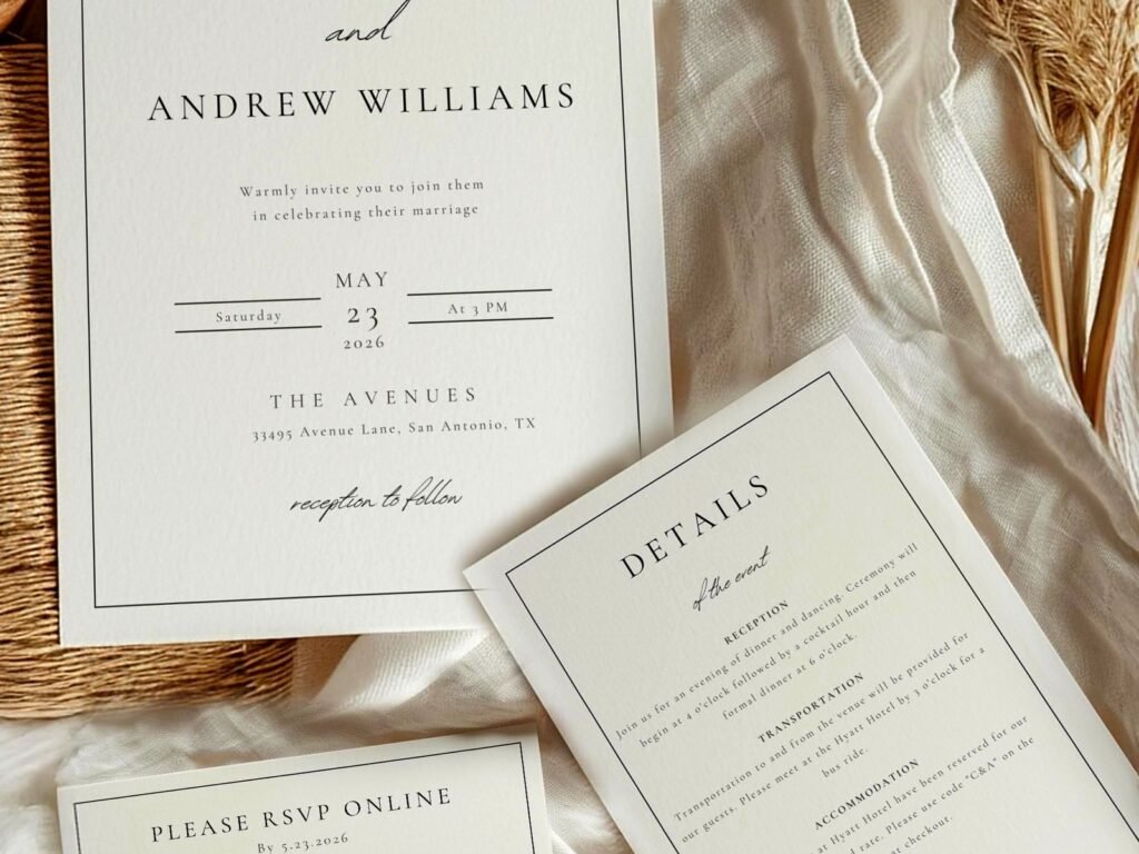
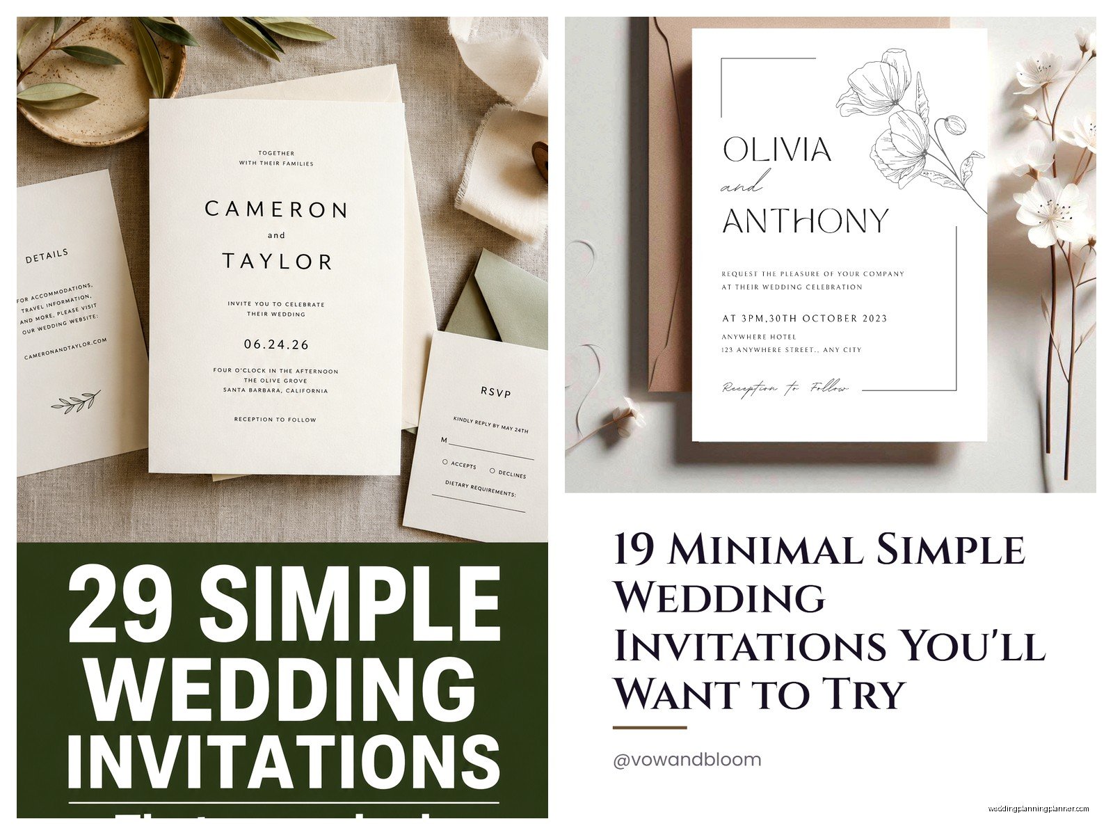
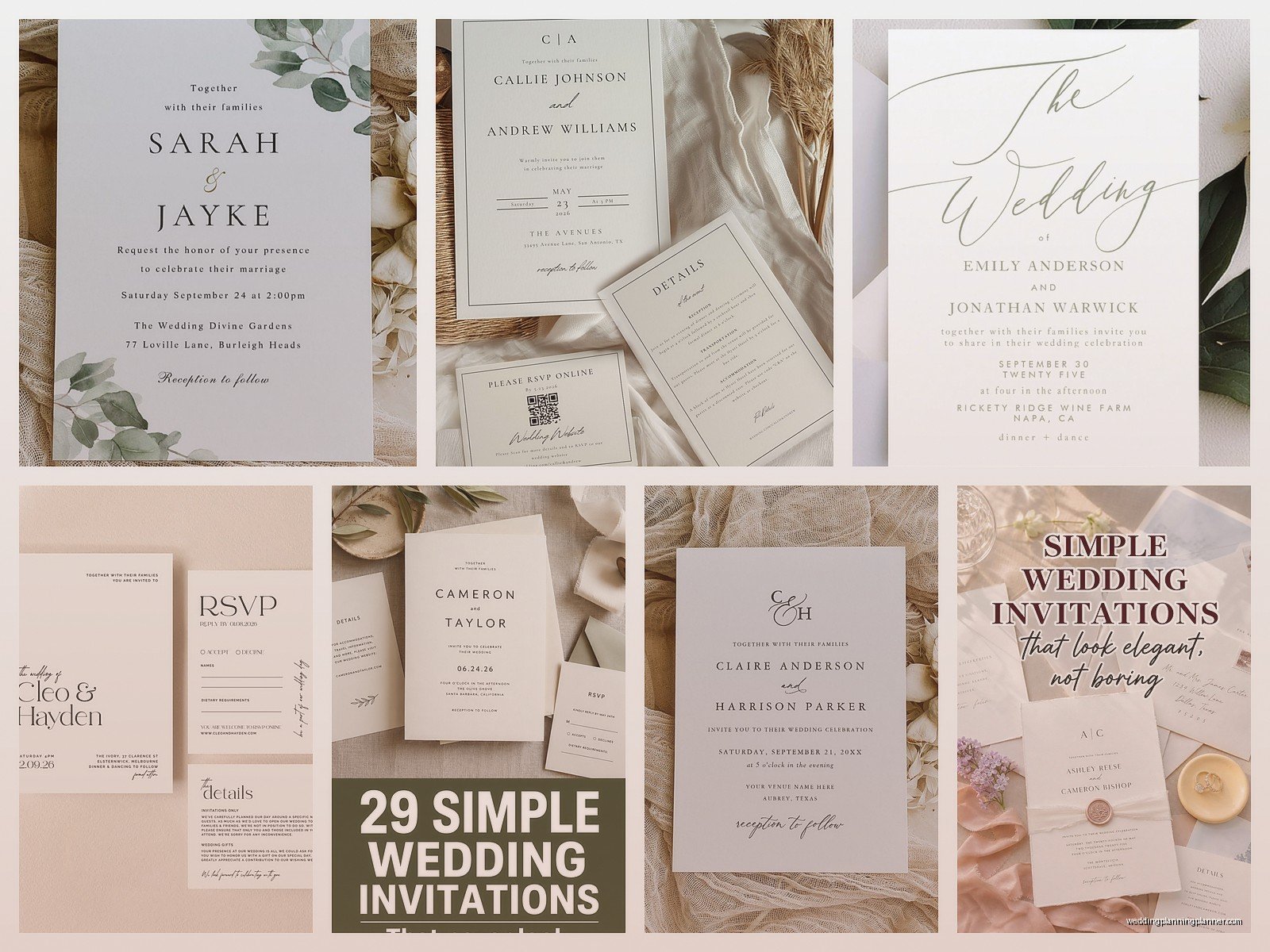
The whole minimalist approach is about stripping away everything that doesn’t serve a purpose. You’re basically looking at three core elements: typography, white space, and maybe one design element if you’re feeling fancy. That’s it. I had this bride in spring 2023 who came to me with a folder of inspiration photos and every single one was minimal and she kept apologizing like “I know these are so plain” and I had to stop her because they were stunning. Clean lines, beautiful paper stock, perfect spacing.
Typography Is Doing All The Heavy Lifting
When you strip away florals and borders and metallic foils and whatever else, your font choices become everything. You’re gonna want to pick maybe two fonts maximum. I usually do one serif and one sans serif, or sometimes just one really strong serif for everything if the weight variations are good enough.
For the couple’s names, go with something that has presence. I love Garamond, Cormorant, or Orpheus Pro for that classic minimal feel. For the details (date, time, venue), a clean sans serif like Futura, Montserrat, or even just Helvetica works perfectly. People sleep on Helvetica but it’s classic for a reason.
Size matters here more than in busier designs. Your names should be significantly larger than everything else. I’m talking like 24-36pt for names, 10-12pt for details. The hierarchy needs to be obvious because there’s nothing else competing for attention.
One thing that really annoys me is when people think minimal means they should make everything tiny and cramped. Nah. You need generous spacing between lines, between sections. Let that paper breathe.
White Space Is Actually Your Design Element
This is where people mess up constantly. They get a 5×7 invitation and feel like they need to fill it edge to edge because otherwise they’re “wasting” the paper. But white space (or negative space or whatever you wanna call it) is what makes minimalist design work.
Think about luxury brands and how their ads look. There’s usually like one product image and tons of empty space. That’s the vibe. The emptiness makes what IS there feel more important and intentional.
I usually center everything on the invitation and leave at least a 1-inch margin on all sides, sometimes more. The text block itself might only take up the middle third of the invitation. It feels wrong at first but trust me, it looks expensive and intentional when it’s printed.
You can play with asymmetry too if centered feels too formal. Left-aligned text with all that space on the right side can look really modern and… okay I’m gonna be honest my cat just knocked over my coffee and I’m trying to type while cleaning it up but anyway, asymmetry works great for less formal weddings.
Paper Stock Makes Or Breaks This
With minimal designs, you can’t hide behind embellishments, which means your paper quality needs to be on point. This is where you should spend money if you’re gonna spend it anywhere.
I always recommend at least 120lb cardstock for flat invitations. Cotton paper like Crane Lettra or Neenah Environment is beautiful and has this subtle texture that photographs well. The thickness matters because when someone picks up a thin invitation, it feels cheap no matter how pretty the design is.
Matte finishes work better than glossy for this aesthetic. You want something that feels substantial and natural, not slick. Eggshell or soft white looks more sophisticated than bright white, which can feel kinda… I don’t know, copy-paper-ish?
If you really wanna go minimal luxe, look into handmade paper or paper with deckled edges. The rough, uneven edge is a design detail in itself and you don’t need to add anything else.
Color Palettes For Minimal Invitations
Black on white is the obvious choice and it works. Classic, readable, timeless. But you’ve got options if you want something slightly different without getting too colorful.
Navy or charcoal gray instead of black gives you that same contrast but feels a tiny bit softer. I did a set in summer 2021 with dark forest green text on cream paper and it was gorgeous. Earthy tones like terracotta or rust can work too if your wedding has that desert or autumn vibe.
You can also flip it and do white text on a dark background. Dark gray or black invitations with white ink look insanely elegant. Just make sure your printer can handle it because you need solid ink coverage or it looks splotchy.
Monochromatic is your friend here. If you’re using color, keep it to one color plus maybe a shade lighter or darker of that same color. The second you add multiple colors you’re moving out of minimal territory.
The One Design Element You Might Add
Sometimes you want just a little something extra without going overboard. Here’s what works:
- A single thin border or line – could be a rectangle frame or just a horizontal line separating sections
- A small monogram or custom crest – keep it simple, line art only
- Subtle letterpress – the impression itself becomes the design element
- One tiny illustration – like a simple line drawing of your venue or a botanical element
- A single stripe of color as an accent
But honestly you don’t need any of this. I’ve designed invitations that are literally just text, well-spaced and well-typeset, and they’re some of my favorites.
Printing Methods That Work Best
Digital printing is fine for minimal designs and it’s the most affordable. Since you’re not doing gradients or complex colors, digital handles it well. Just use a good printer who understands color matching.
Letterpress is incredible for this aesthetic though. The physical impression in the paper adds dimension without adding visual clutter. It’s pricey but if you’re keeping everything else simple, it might fit your budget. The texture catches light differently and you can feel it with your fingers which is such a nice tactile experience.
Foil stamping can work but be careful. It needs to be subtle – think matte gold or silver, not shiny metallic. Or even blind foil stamping where there’s no color, just a subtle shine. I had this client who insisted on rose gold foil and then complained it looked too “Pinterest wedding” which like… yes, that’s what I told you would happen but did you listen? No.
Thermography (the raised printing) doesn’t really fit the minimal aesthetic to me. It’s trying too hard. Minimal should feel effortless.
Layout Options That Actually Work
Centered and stacked is the most traditional layout. Names at top, largest. Then date and time. Then venue address. Then reception details if on the same card. Each element centered, clear hierarchy in sizing.
Left-aligned modern is what I use for couples who want minimal but not traditional. Everything lines up on the left, generous right margin. Feels contemporary and clean.
Split layout can be interesting – key info on left side, secondary details on right side. But you need a bigger invitation size for this to work, like 6×8 or 7×9.
Horizontal orientation is underused and I love it for minimal designs. A 7×5 horizontal card feels different and modern. You can spread your text across the width with lots of breathing room.
What Information To Actually Include
Minimal design means minimal text too. You need the essentials: your names, wedding date, time, venue name and city, and some indication of what’s happening after (reception to follow, or dinner and dancing, or whatever).
Skip the “together with their families” and “request the honor of your presence” unless that formal language is important to you. You can just say “invite you to their wedding” or even just list the facts without a preamble.
Dress code can go on a details card rather than the main invitation. Same with registry info (which should never be on the invitation anyway but that’s a whole other rant), hotel blocks, and wedding website.
Actually, details cards are perfect for minimal suites because your main invitation stays super clean and all the practical info goes on a separate, smaller card. That card can match the aesthetic – same fonts, same spacing principles, just smaller format.
Envelope Considerations
Your envelope is part of the design and people forget this. For minimal invitations, a simple envelope with clean addressing is all you need.
I prefer printed addresses over calligraphy for this style. You can use the same sans serif font from your invitation. Left-aligned, no return address on the front, just clean and simple.
Envelope color should match or complement your invitation. White, cream, gray, black all work. Or you could do a colored envelope with a white invitation inside which creates a nice reveal moment.
Envelope liners are optional but they’re a way to add a tiny pop of something without cluttering your actual invitation. A solid color liner in your wedding color, or maybe a subtle pattern. Keep it understated though.
Common Mistakes People Make
Using too many fonts because they panic that it’s boring. Two fonts maximum, seriously. Three if you absolutely must have a script for something but even then I’d probably talk you out of it.
Not leaving enough margin space. Your text should not be close to the edges. It needs room to exist on the paper.
Choosing trendy fonts that’ll look dated in five years. Stick with classics. Your wedding photos will be around forever and you don’t want to look back and cringe at your font choices like we all do with papyrus and comic sans now.
Forgetting about readability. Minimal doesn’t mean light gray text on white paper. You still need contrast. Your grandmother needs to be able to read the venue address without her reading glasses.
Over-explaining in the text. You don’t need full sentences for everything. “Saturday, June 14, 2025 | 4:00 PM | The Foundry, Brooklyn” is clearer than a paragraph about how they’d be honored if you’d join them on this special day for a celebration of love and blah blah blah.
DIY vs Professional Design
You can totally DIY minimal invitations because the design isn’t technically complex. Canva or even just Microsoft Word can handle it if you’ve got a good eye for spacing and typography.
But here’s the thing – minimal design looks easy and that’s the point, but getting the proportions and spacing exactly right takes practice. It’s like when something looks effortless but actually requires a ton of skill. I’ve seen so many DIY minimal invitations where the spacing is just slightly off or the font pairing doesn’t quite work and it bothers me even though I know the couple saved money and that’s valid.
If you’re gonna DIY, print test copies on your actual paper stock before you print 150 invitations. What looks good on screen doesn’t always translate to paper, especially with spacing and margins.
A middle ground is using a template from a good stationer but customizing it yourself. Minted, Artifact Uprising, and Paperless Post (for digital) have solid minimal templates. You’re working within a framework that’s already designed well.
Timing And Practical Stuff
Order samples before you commit to anything. You need to see the paper quality, the printing method, and how the colors look in person. Screens lie about color constantly.
For printing timeline, give yourself at least 3-4 weeks for professional printing, longer if you’re doing letterpress. Then you need time for addressing and mailing. Send invitations 8 weeks before the wedding, 12 weeks if you’ve got a lot of out-of-town guests.
Proofread everything seventeen times. Then have someone else proofread. Then proofread again. There’s nowhere to hide a typo in a minimal design – it’s right there in the center of all that white space, mocking you forever. I once had an invitation go to print with the wrong year and we didn’t catch it until they arrived and… yeah that was an expensive mistake that still keeps me up at night sometimes.
Budget-wise, minimal invitations can actually save you money because you’re not paying for foils and layers and belly bands and all that stuff. Put your money into paper quality and printing method instead. A simple design on amazing paper beats a complicated design on cheap paper every single time.