
Planning Guides, Style Guide
Classic Wedding Invitations: Timeless Traditional Designs
Nov
Classic Wedding Invitations Are Never Actually Out of Style
So you’re thinking about going classic with your wedding invitations and honestly? Smart move. I’ve been doing this for nearly two decades now and the number of brides who come back to traditional designs after scrolling through Pinterest for three months is… it’s a lot. Like, a LOT.
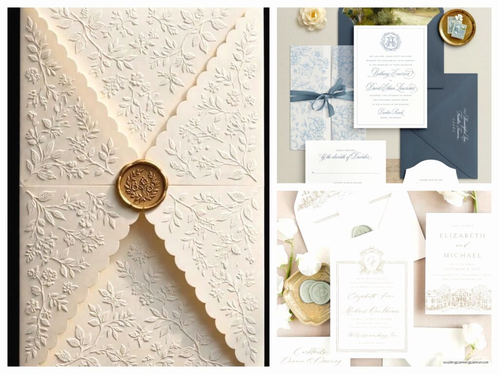
Classic wedding invitations are basically your engraved or letterpress designs with formal wording, traditional fonts, and usually cream or white cardstock. Think the invitations your parents probably had, but with better paper quality because printing technology has gotten so much better since the 80s.
What Actually Makes an Invitation “Classic”
The thing about classic invites is they follow pretty specific rules. You’ve got your formal wording structure where you write out everything in full – no abbreviations, no casual language. So it’s “Saturday, the fifteenth of June” not “Saturday, June 15th” and definitely not “Sat 6/15.” I had this bride in summer 2021 who absolutely INSISTED we could make classic invitations work with “Join us for a party!” as the opening line and I just… we had to have a conversation about what classic actually means.
Traditional fonts are usually something like Copperplate, Garamond, or a nice script like Edwardian Script. Nothing too modern or geometric. You want something that could’ve been used 50 years ago and will still look appropriate 50 years from now. That’s kinda the whole point – timelessness.
Paper Weight and Quality Matter More Than You Think
Okay so this is where people try to cut corners and it shows immediately. Classic invitations need substantial paper – I’m talking 110lb cardstock minimum. When someone picks up a classic invitation, it should feel important in their hand. Flimsy paper ruins the whole effect no matter how gorgeous your design is.
Crane & Co. makes incredible paper if you’ve got the budget for it. Their 100% cotton stock is just *chef’s kiss* but yeah, it’s pricey. For more budget-friendly options that still look legit, Neenah and Mohawk both have excellent cotton blends that most guests won’t be able to distinguish from the expensive stuff.
Color Schemes That Actually Work
Classic doesn’t mean boring, but it does mean restrained. Your safest bets are:
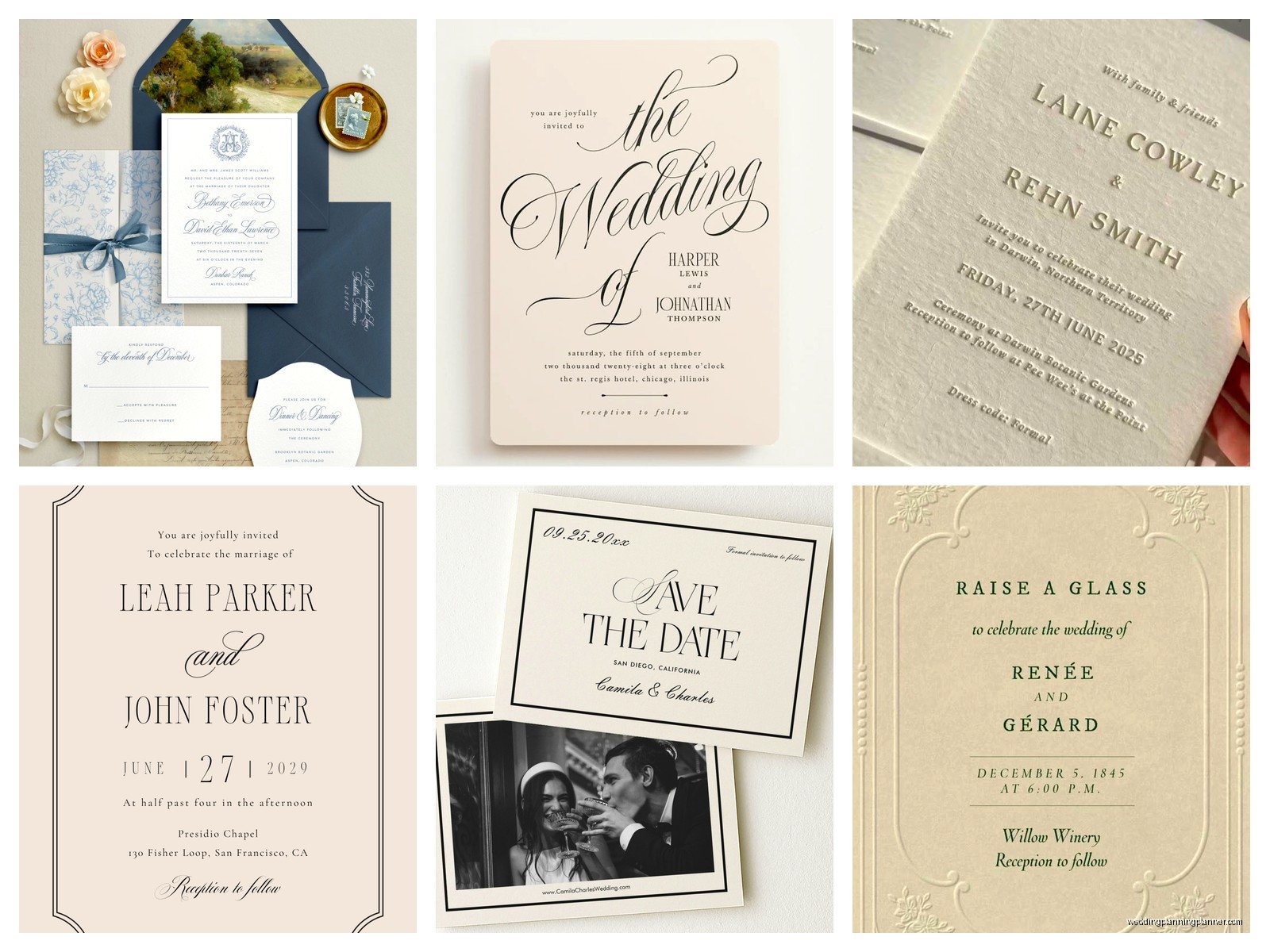
- Cream or ecru cardstock with black or navy ink
- Bright white with charcoal gray ink
- Ivory with deep burgundy or hunter green (if you’re doing a fall or winter wedding)
- White with gold or silver foil (this adds elegance without going trendy)
What annoys me is when people think classic means it has to be boring beige and black. You can do classic with a deep navy envelope liner, or a thin border in your wedding colors, or even a monogram at the top. It’s about restraint and formality, not eliminating all personality.
Printing Methods for Traditional Looks
If you really want that classic look, you’re gonna want to consider these printing methods:
Engraving is the most traditional and most expensive. The text is literally carved into a metal plate and pressed into the paper from behind, creating raised lettering you can feel on the front and an indentation on the back. It’s stunning but costs a fortune. Expect to pay $15-30 per invitation suite, sometimes more.
Letterpress is having a huge moment right now but it’s actually a very old technique. The text is pressed INTO the paper creating a debossed effect. It looks incredible and feels expensive. Cost is similar to engraving, maybe slightly less.
Thermography is what most people do when they want the raised lettering look without the engraving price tag. It uses heat to create raised text and honestly, most guests can’t tell the difference. It’s like $5-8 per suite usually.
Digital printing is the most affordable and if you choose a good designer and high-quality paper, it can look really nice. Just make sure you’re not going with the cheapest online option because that thin paper will give it away immediately.
Wording Formulas That Never Fail
Traditional invitation wording follows a pretty strict formula and once you know it, it’s actually easy. Here’s the basic structure:
Host line (who’s hosting – traditionally the bride’s parents)
Request line (request the honour of your presence for ceremony, request the pleasure of your company for reception)
Couple’s names (bride’s name first traditionally, but honestly do what feels right)
Date and time (fully written out)
Location (venue name and city/state)
Reception information (if it’s at a different location)
Something like: “Mr. and Mrs. Robert Hart request the honour of your presence at the marriage of their daughter Olivia Marie to…” and you get the idea. The “honour” is spelled the British way for church ceremonies traditionally, which I think is pretentious but also it’s what classic invitations do so… there you go.
The Whole Suite vs. Just the Invitation
A classic invitation suite usually includes multiple pieces and this is where your budget can balloon real fast. You’ve typically got:
- The main invitation
- Reception card (if ceremony and reception are different locations or times)
- Response card with envelope
- Accommodations card
- Weekend events card (if you’re doing welcome dinner, brunch, etc.)
- Outer envelope
- Inner envelope (this is traditional but honestly most people skip it now)
My cat just knocked over my coffee while I’m writing this and I’m choosing to ignore the puddle spreading across my desk because we need to talk about whether you actually need all these pieces.
Real talk? You don’t need the inner envelope unless you’re going VERY formal. You don’t need a separate accommodations card if you have a wedding website – just direct people there. But you do need the response card because not everyone will RSVP online no matter how easy you make it. Trust me on this.
Envelope Addressing Is Where People Mess Up
If you’re doing classic invitations, your envelope addressing needs to match that formality. No printed labels – they look cheap and ruin the whole effect. Your options are:
Hand calligraphy: Gorgeous, expensive, takes forever. Budget $3-7 per envelope. Worth it if you can swing it.
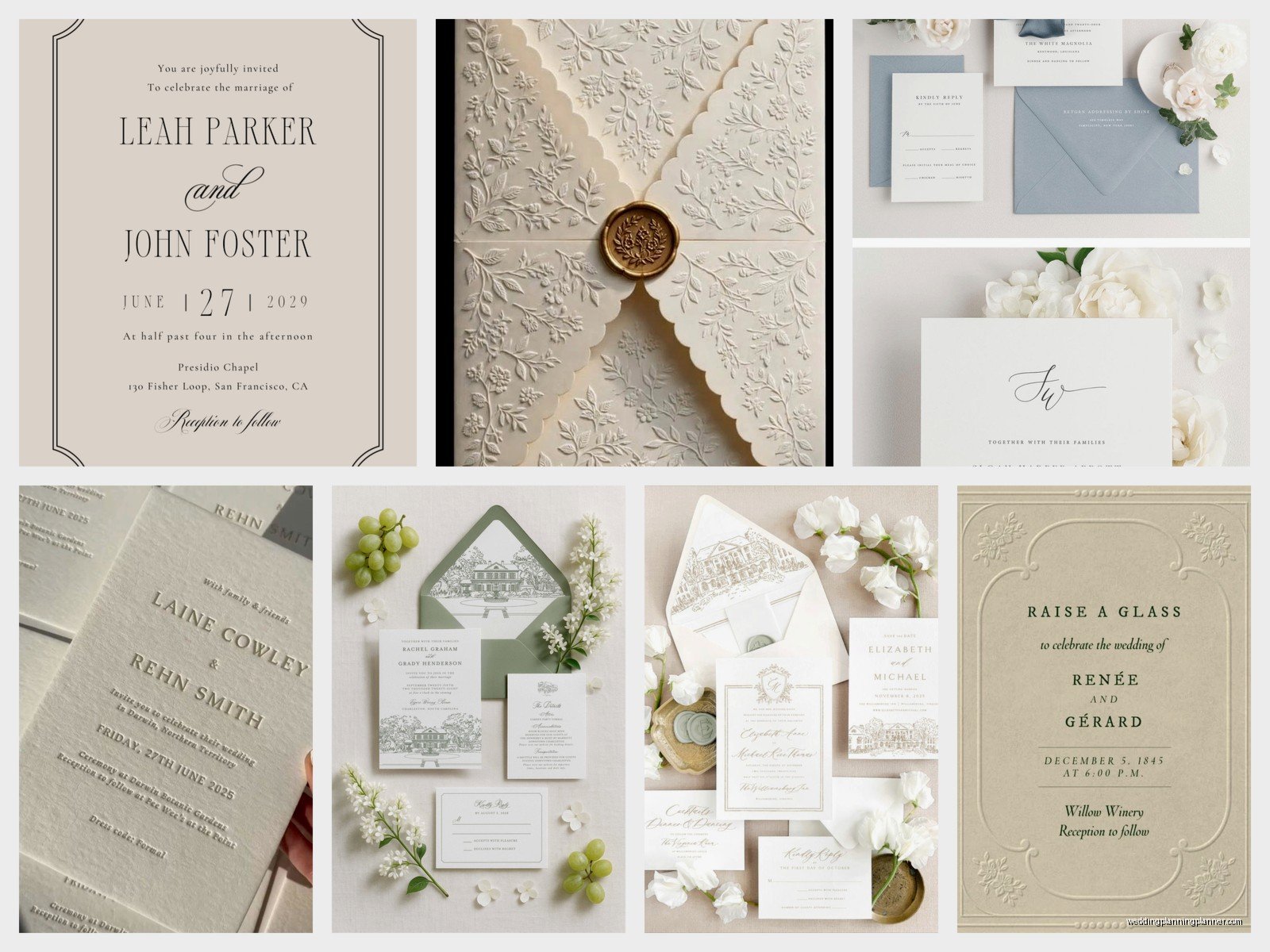
Digital calligraphy: Printed to look like hand calligraphy. Most guests honestly can’t tell the difference if it’s done well. Much more affordable at like $1-2 per envelope.
Your own handwriting: Free, personal, but only do this if you have genuinely nice handwriting. Messy handwriting on a formal invitation is… it’s a choice.
I had this situation in spring 2023 where a bride wanted to save money by addressing all 200 envelopes herself and her handwriting was just not great. We were two weeks from mailing and I had to gently suggest we find a calligrapher who could rush the job. She was annoyed with me but the invitations looked so much better and she admitted it later.
Postage Isn’t Just Postage
Okay so this seems minor but vintage stamps or custom stamps can really elevate the whole presentation. The USPS has those botanical stamps or the love stamps that look appropriate on classic invitations. Don’t just slap a flag stamp on there and call it done.
Also – and this is important – if your invitation suite weighs more than one ounce (and most classic suites do because of all that heavy paper), you need extra postage. Take a fully assembled invitation to the post office and have them weigh it. Hand-canceling is also worth requesting so your invitations don’t get chewed up by the sorting machines.
Timing and Etiquette Stuff
Classic invitations should go out 8-12 weeks before the wedding. Six months is too early (people forget), six weeks is too late (people can’t plan). This is like… the one timeline thing that hasn’t changed in forever.
Save the dates are more flexible but if you’re doing a destination wedding or holiday weekend, send those 6-8 months out. For classic save the dates, keep them simple – just names, date, location, and “invitation to follow.” You don’t need your whole wedding website URL plastered across it.
Common Mistakes I See All The Time
People mix fonts too much. Classic invitations should have maybe two fonts maximum – usually one script and one serif, or just one elegant serif for everything. When I see three or four different fonts on one invitation, it reads as confused, not classic.
Using too much information on the main invite. Keep the details for insert cards or your website. The invitation itself should be clean and uncluttered.
Forgetting about reply-by dates. Your RSVP date should be at least 2-3 weeks before your final catering count is due. I usually tell people to set it for 3-4 weeks before the wedding because you WILL have people who don’t respond and you’ll need time to track them down.
Not ordering enough extras. Order at least 15-20 extra invitations. You’ll mess some up during assembly, you’ll forget people, addresses will change. Just trust me on this.
Assembly Tips That Actually Help
Assembling invitation suites is tedious but there’s a proper order for classic invitations:
- Invitation goes down first (face up obviously)
- Tissue paper on top if you’re using it (this was originally to prevent smudging but now it’s just decorative)
- Reception card
- Other enclosure cards in size order, largest to smallest
- RSVP card tucked under the flap of its envelope, face up
- Everything goes into the inner envelope if you’re using one
- Then into the outer envelope with the text facing the back flap when you pull it out
Set up an assembly line if you’re doing this yourself. I usually recommend having a glass of wine and some friends over to help, but don’t let anyone get too tipsy because mistakes happen and these things are expensive to reprint.
When Classic Doesn’t Work
Look, classic invitations aren’t for every wedding and that’s totally fine. If you’re having a super casual backyard barbecue wedding, formal engraved invitations are gonna feel weird and mismatched. If your whole vibe is boho or modern minimalist or rustic barn, traditional doesn’t make sense.
But if you’re getting married in a ballroom, a historic mansion, a traditional church, a formal garden – classic invitations just work. They set the right tone and let guests know what to expect. When someone receives an engraved invitation on heavy cardstock with formal wording, they know they’re not showing up in jeans, you know?
Budget Reality Check
I’m gonna be real with you about costs because this is where people get sticker shock. For truly classic invitations with quality paper and printing:
- Budget option (thermography on nice paper): $500-800 for 100 suites
- Mid-range (letterpress or digital on premium paper): $1000-1500 for 100 suites
- High-end (engraving, hand calligraphy, all the extras): $2000-4000+ for 100 suites
These numbers include the full suite – invitation, enclosures, envelopes, and basic addressing. Add calligraphy, custom wax seals, silk ribbon, or other embellishments and the price goes up from there.
If that feels like a lot, remember that invitations are literally the first impression of your wedding. They’re what builds excitement and sets expectations. That said, there ARE ways to get the classic look for less – thermography instead of engraving, digital calligraphy instead of hand, skipping the inner envelope, doing a smaller suite with fewer insert cards.
Working With a Stationer vs. DIY
You can absolutely DIY classic invitations but it’s harder than it looks. The wording has to be perfect, the spacing has to be balanced, and if you’re ordering from an online template site, you’re limited in customization. I’ve seen so many brides spend hours trying to make a template work when a custom stationer could’ve nailed it in one draft.
A good stationer will also catch mistakes – wrong dates, misspelled names, formatting issues. They’ll know proper etiquette for divorced parents, deceased parents, couples hosting their own wedding, all that stuff. The cost is worth it if you can afford it, especially for traditional invitations where the rules are pretty specific.
But if you’re crafty and detail-oriented and have time, DIY can work. Just order samples first, proofread everything seventeen times, and have at least two other people proofread before you order the full quantity. Mistakes on 150 invitations are expensive to fix.
The best classic invitations I’ve worked with are the ones where the couple understood that classic doesn’t mean boring or outdated – it means elegant, timeless, and appropriate. You can still add your personality through paper color, envelope liners, a custom monogram, or subtle design elements. You just do it within the framework of traditional design principles, and when you get that balance right, the invitations are absolutely beautiful and they’ll still look good in photos 30 years from now, which is sorta the whole point of going classic in the first place.

Canva
Wedding Memories Hardcover Template Canva Editable For Notebook, Journal, Novel, Hard Covers, Canva template For KDP Cover 6×9″ 120 pages
Canva
The Ultimate Wedding Planning Bundle, Canva Editable.
Canva
Customizable Wedding Video Invitations templates, Canva Editable Digital Wedding invitation Minimalist, Animated Custom Invitation
Digital Planning Templates
Wine Wedding Planner Bundle – 200-Page Printable PDF + 10 Editable Wedding Invitations | Instant Digital Download
Canva
Orange Wedding Planner Bundle – 200-Page Editable Canva Templates + 10 Editable Wedding Invitations | Instant Digital Download
Digital Planning Templates
Champagne Wedding Planner Bundle – 200-Page Printable PDF + 10 Editable Wedding Invitations | Instant Digital Download
Canva
Wedding Memories Hardcover Template Canva Editable For Notebook, Journal, Novel, Hard Covers, Canva template For KDP Cover 6×9″ 120 pages
Digital Planning Templates
Yellow Wedding Planner Bundle – 200-Page Printable PDF + 10 Editable Wedding Invitations | Instant Digital Download
Canva
Dusty Blue Wedding Planner Bundle – 200-Page Editable Canva Templates + 10 Editable Wedding Invitations | Instant Digital Download