
Planning Guides, Style Guide
Royal Blue Wedding Invitations: Deep Blue Elegant Designs
Nov
Okay So Royal Blue Invitations Are Having a Moment
Royal blue wedding invitations are honestly one of the safest bets if you want something that looks expensive without going totally traditional. I had this bride back in spring 2023 who was adamant about navy at first, and I kept telling her royal blue would photograph better, and she finally agreed after I showed her some samples and wow, the difference was incredible. Royal blue has this depth that navy sometimes lacks, especially in printed materials.
The thing about royal blue is it reads as elegant automatically. You don’t have to work as hard to make it look formal compared to like, lighter blues or pastels. It just does the heavy lifting for you which is kinda great when you’re trying to set a tone before people even open the envelope.
Picking The Right Shade (Because They’re Not All The Same)
So here’s what annoys me – people think royal blue is just one color. It’s not. You’ve got Pantone 286, you’ve got what printers call “royal,” you’ve got variations that lean purple, variations that lean navy. When you’re ordering invitations, you gotta be specific about which royal blue you mean. I always tell clients to get a physical sample because what you see on your screen is gonna be different.
The classic royal blue (Pantone 286 C) is what most people think of – rich, saturated, bold. But some couples want something slightly softer, so you can go with a shade that’s maybe 10-15% lighter. Test it against your other wedding colors before committing to thousands of invitations though.
Paper Stock Makes or Breaks The Color
Matte cardstock will make royal blue look more sophisticated and modern. Glossy or shimmer finishes will make it look more… I don’t wanna say cheap, but less refined? The shimmer can work if you’re doing a very specific glamorous vibe, but generally I steer people toward matte or a subtle linen texture.
Cotton paper is your friend here. 100% cotton cardstock in 120lb weight or heavier will make that royal blue look so much richer. The color absorbs into cotton differently than regular cardstock, and you get this almost velvety appearance that screams quality.
Design Layouts That Actually Work With Royal Blue
You can go a few different directions and they all work, which is part of why this color is so versatile.
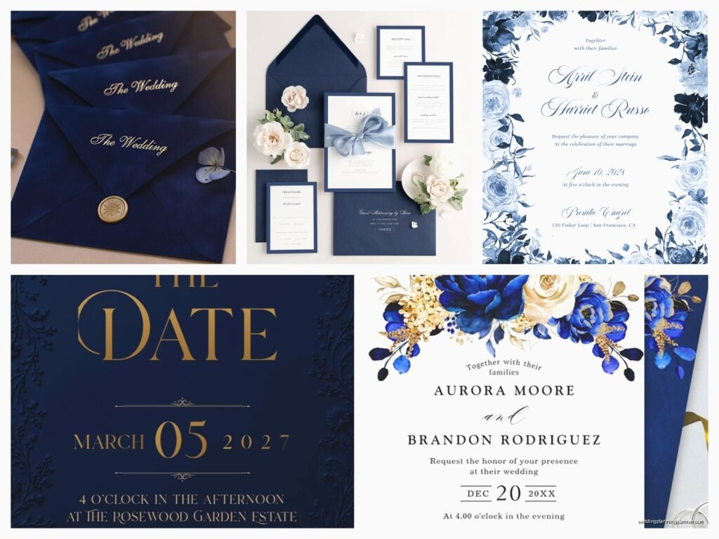
Full Bleed Royal Blue Background
This is where the entire invitation is royal blue with white or gold text on top. It’s dramatic, it’s bold, and it photographs incredibly well. The key here is making sure your text is large enough and the font is clean. You don’t want ornate script that’s hard to read on a dark background.
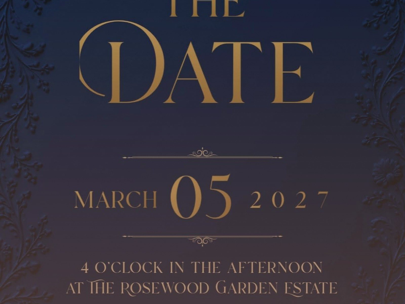
I usually recommend white ink for a crisp, formal look, or gold foil if the budget allows. Rose gold can work too but it’s not as classic. Silver feels too cool-toned against royal blue in my opinion.
Royal Blue Accents on White or Cream
This is the safer option and honestly what most of my clients end up choosing. White or cream cardstock with royal blue text, borders, or design elements. It’s easier to read, you can include more information without it feeling crowded, and it’s more traditional which some families really care about.
You can do royal blue letterpress, which looks absolutely stunning. Or digital printing with royal blue ink. Or – and this is where it gets fun – you can do navy text with royal blue accents so you get that depth and variation.
Layered Invitations With Royal Blue Elements
Okay so this is more complex but looks amazing. You have your main invitation on white or cream, then you layer it on top of a royal blue backer card. Maybe you add a royal blue belly band or ribbon. You’re creating dimension and that luxury feel without overwhelming people with color.
My cat knocked over an entire box of these once while I was assembling them for a client and I almost cried, but anyway – the layered look is worth the extra effort and cost if you want something really special.
Metallic Accents That Pair With Royal Blue
Gold is the obvious choice and yeah, it works beautifully. Gold foil stamping on royal blue looks expensive every single time. You can do gold borders, gold text, gold wax seals, gold envelope liners.
But here’s what I’ve been seeing more of lately – copper or bronze metallics with royal blue. It’s unexpected and it photographs with this warm richness that’s really gorgeous. Not for everyone, but if you’re doing a fall or winter wedding, consider it.
Silver and royal blue together can look a bit too “prom” if you’re not careful, but if you keep it minimal and modern, it works. Think thin silver lines, silver edge painting on thick cardstock, very geometric and clean.
Envelope Situations
Do you do royal blue envelopes or white envelopes? This is where couples get stuck and honestly there’s no wrong answer, it just depends on your overall aesthetic.
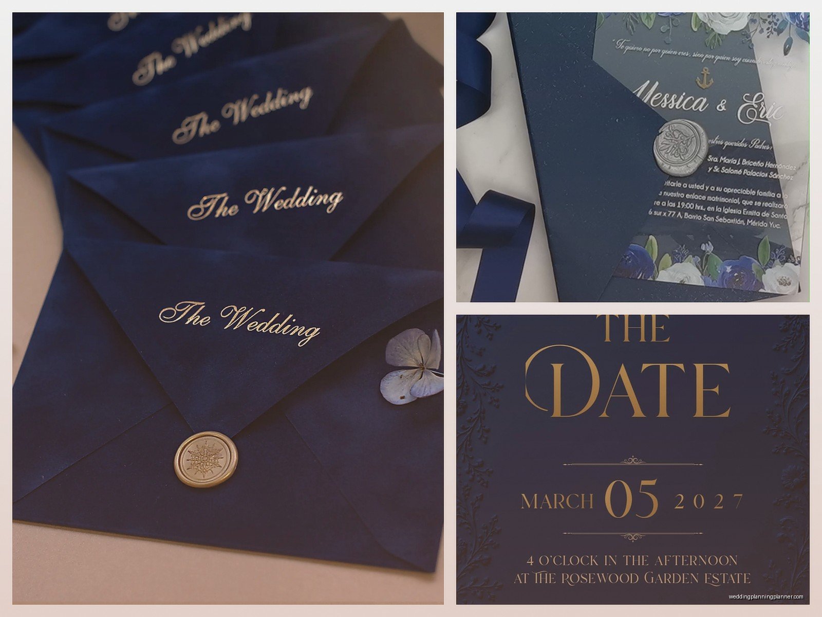
Royal blue envelopes are dramatic. When someone gets that in the mail, they know it’s something special before they even open it. But you need to think about addressing – white ink, gold ink, or printed labels all work. Handwritten calligraphy in white ink is stunning but pricey.
White or cream envelopes are classic and you can always add a royal blue envelope liner for that pop of color when people open it. This is actually my favorite approach because you get the best of both worlds. The envelope liner is the first thing people see when they open it, and it builds anticipation.
Envelope Liner Patterns
Solid royal blue is always good. But you can also do patterns – royal blue and white stripes, royal blue damask, royal blue watercolor effects, or even royal blue with gold geometric patterns. Just make sure whatever pattern you choose doesn’t compete with your actual invitation design.
I had a bride who wanted to use this really busy royal blue floral pattern for the liner and the invitation had florals too and it was just… too much? We ended up doing a solid royal blue liner and it looked so much better.
Typography Choices That Work
Serif fonts look elegant with royal blue. Think Garamond, Didot, Playfair Display – those classic, slightly formal typefaces that have been around forever. They give you that timeless sophisticated vibe.
Script fonts can work but be careful. You want something that’s still readable, not so swirly that people can’t figure out what time your ceremony starts. I like scripts for names only, then use a clean serif or sans-serif for the actual information.
Modern sans-serif fonts can look really striking with royal blue if you’re going for a contemporary feel. Thin, tall letters in royal blue on white cardstock with lots of white space – very editorial, very chic.
What To Pair Royal Blue With (Color Combos)
Royal blue and white is classic and you can’t go wrong. Clean, crisp, formal.
Royal blue and gold is probably the most popular combo I see. It’s regal (hence “royal” blue I guess), it photographs well, and it works for any season.
Royal blue and blush or dusty rose is really pretty for spring or summer weddings. The cool blue with the warm pink creates nice balance. You can do blush floral accents on royal blue invitations or alternate between the two colors.
Royal blue and burgundy or wine is gorgeous for fall and winter. Deep, rich, moody in the best way. Add some gold accents and you’ve got yourself a very luxe color palette.
Royal blue and emerald green – okay hear me out because this sounds weird but if you do it right it’s stunning. Very jewel-toned, very bold. Not for everyone but I’ve seen it work beautifully for evening weddings.
Printing Methods And What They Cost
Digital printing is your most affordable option and honestly for royal blue, it looks perfectly fine. The color saturation is good, it’s crisp, and most guests won’t know the difference between digital and letterpress.
Letterpress is beautiful if you want that tactile, impressed-into-the-paper look. It’s pricier but for royal blue text or borders on white cardstock, it’s really special. You can feel the impression with your fingers and it just feels expensive.
Foil stamping is where you’re gonna spend money but wow, the impact. Gold foil or silver foil on royal blue cardstock is breathtaking. The foil catches the light and creates this dimensional effect that digital printing can’t replicate. If you’re gonna splurge anywhere, this is where I’d do it.
Thermography is sort of a middle-ground option. It creates raised printing that looks similar to engraving but costs less. Royal blue thermography on cream cardstock looks really elegant and traditional.
Design Elements To Consider Adding
Wax seals in royal blue or gold on your envelopes add a really nice touch. They’re not as expensive as people think if you’re willing to do them yourself, and they make your invitations look custom and special.
Belly bands or ribbons in royal blue can tie your invitation suite together literally and figuratively. I prefer grosgrain ribbon over satin because it photographs better and feels more substantial.
Edge painting – this is where the edges of your cardstock are painted, usually in gold or a contrasting color. Royal blue invitations with gold edge painting look insanely expensive. Your stationer can do this or you can DIY it with a paint pen if you’re careful and patient.
Vellum overlays with royal blue text or designs add a romantic, ethereal quality. The vellum softens the royal blue slightly which can be nice if you’re worried about the color being too bold.
Things That Can Go Wrong (So You Can Avoid Them)
Color matching across different elements is tricky. Your invitation royal blue might not perfectly match your envelope royal blue might not match your reception stationery royal blue. Order everything from the same printer if possible, or at least get samples to make sure they’re close enough.
Royal blue can show fingerprints and smudges really easily, especially on matte cardstock. Handle your invitations with clean hands and maybe wear those white cotton gloves when you’re assembling them if you’re doing hundreds.
Printing white or light-colored text on royal blue requires good quality printing. Cheap digital printing will look washed out or the coverage won’t be solid. Make sure your printer has experience with dark cardstock.
Too many design elements can make royal blue feel overwhelming. Because it’s such a strong color, sometimes less is more. You don’t need florals AND borders AND patterns AND ribbons all on one invitation.
Seasonal Considerations
Royal blue works year-round but you can adjust your approach based on season. For spring and summer, pair it with lighter colors and maybe floral designs. Keep the overall feel a bit airier even though royal blue is a deep color.
For fall, lean into those burgundy, gold, and copper combinations. Maybe add some leaf motifs or geometric patterns that feel a bit more substantial.
Winter is where royal blue really shines – pun intended I guess. Pair it with silver, white, and ice blue accents. Snowflake designs, starry night themes, very elegant and formal vibes work perfectly.
I did a New Year’s Eve wedding in 2021 with royal blue and silver invitations that had this constellation map design and they were probably some of my favorite invitations I’ve ever worked on, even though the bride was incredibly indecisive and changed her mind seventeen times before we finalized…
DIY vs Professional Printing
You can DIY royal blue invitations if you’re crafty and have time. Order cardstock from a paper supplier, use a good home printer or take files to a print shop, and assemble everything yourself. This works best if you’re doing a simpler design without foil or letterpress.
But honestly? Royal blue invitations benefit from professional printing because getting that color saturation and quality right is hard at home. If your budget allows, hire a professional. If not, maybe DIY your day-of stationery but have your actual invitations professionally printed.
Timing And Quantities
Order samples first always. Never order your full quantity without seeing and touching actual printed samples. Royal blue looks different in person than on screen.
Order 15-20% more invitations than you think you need. You’ll mess some up during assembly, you’ll forget people, addresses will change, you’ll want extras for your wedding album. Just trust me on this.
Start the invitation process at least 4-5 months before your wedding. Design, proofing, printing, and assembly all take time, and you wanna mail invitations 8 weeks before your wedding date (6 weeks minimum).
