
Planning Guides, Style Guide
Forest Wedding Invitations: Woodland Nature Theme
Nov
Okay so forest wedding invitations
Right so you’re doing a woodland theme and honestly this is one of those topics where people get way too Pinterest-y and forget the actual functional parts of invitation design. I learned this the hard way back in spring 2023 when I had a bride who wanted “enchanted forest vibes” but then got mad when guests didn’t know what to wear because the invitation was literally just a watercolor painting of mushrooms with text overlaid that you could barely read.
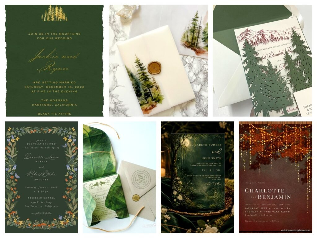
First thing – you gotta decide if you want rustic forest or elegant forest because these are NOT the same thing. Rustic is like birch bark textures, kraft paper, twine, maybe some burlap if you’re feeling brave (I’m not, burlap sheds everywhere and it’s annoying). Elegant forest is more like deep greens, gold foil, watercolor botanicals, those really detailed fern illustrations. Both work but mixing them looks confused.
Paper stock actually matters here
For woodland invites I usually push clients toward textured cardstock. The smooth stuff feels too corporate for a forest theme. You want something with a bit of tooth to it – like a nice cotton paper or even handmade paper if the budget allows. I’ve used paper embedded with wildflower seeds before and guests loved it, they could plant the invitation after the wedding which is cute but also means some people definitely lost theirs before the actual date so… trade-offs.
Kraft paper is the obvious choice and yeah it works great for rustic vibes. But here’s what bugs me – SO many couples default to kraft without thinking about readability. If you’re printing dark green or brown text on kraft paper, especially in a script font, your 70-year-old aunt Carol is NOT gonna be able to read it. I always do a print test and literally walk across the room to see if I can read it from 6 feet away. If not, we adjust.
Wood veneer invitations are a thing and they look incredible but they’re pricey and heavy which means postage gets expensive fast. Also you can’t really DIY these unless you have access to a laser cutter and even then it’s…
Color palettes that actually work
Forest green obviously. But not just one green – you want depth. I usually do a deep hunter green, a sage or eucalyptus green, and maybe a really pale celery green for accents. Then you need a neutral. Cream is safer than white for woodland themes. White can look too stark against all those earthy tones.
Accent colors: burgundy or wine red works beautifully, burnt orange for fall weddings, dusty blue if you want something less expected, or gold for that elegant forest look. I had a couple do forest green with blush pink and I was skeptical but it actually looked really soft and romantic, kinda surprised me.
One thing – if you’re doing a winter forest wedding, don’t forget you can add silver or icy blue. Evergreens in snow is still forest themed and it gives you more flexibility with metallics.
Design elements and imagery
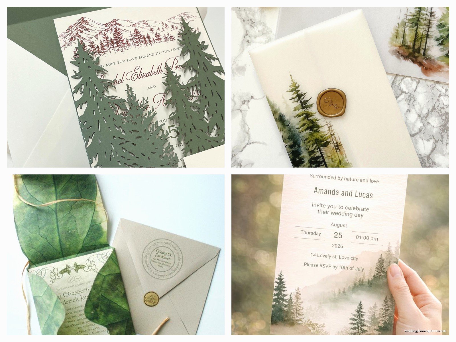
The illustration style makes a huge difference. You can go botanical and scientific-looking with those vintage fern prints, or watercolor and loose, or geometric line art, or actual photography of forest scenes. Just pick ONE style and stick with it across all your stationery suite. I see people mix a watercolor invite with a geometric line-art RSVP card and it looks like two different weddings.
Popular motifs: pine trees, ferns, oak leaves, acorns, mushrooms (very trendy right now), wildflowers, deer or other woodland creatures (use sparingly though because it can get cutesy fast), tree rings, branches, moss textures, pinecones.
Here’s a specific thing that happened – summer 2021 I had a client who wanted “whimsical forest” and she kept sending me inspiration pics of forest creatures. We’re talking foxes, rabbits, owls, hedgehogs, the whole deal. I gently tried to explain that unless you’re doing a storybook theme it might read as childish for a wedding invitation. She insisted. The invitations turned out gorgeous actually but then THREE different guests asked if it was a children’s birthday party when they first got them in the mail. We had to laugh about it but also… I was right and I’m still a little smug about that.
Typography choices
You need contrast. If everything is in a delicate script font it’s unreadable and looks busy against botanical illustrations. I typically recommend one script or serif font for names/main headers and a clean sans-serif for all the actual information people need to read.
Fonts that work well: anything with an organic feel but still legible. Some scripts look too formal (like traditional wedding scripts), you want something with a bit more movement. For rustic themes, slab serifs are great. For elegant forest, a thin serif or modern calligraphy works.
What doesn’t work: don’t use fonts that are trying too hard to look “woodsy” like ones made to look like twigs or carved wood. They’re gimmicky and hard to read. Just use a normal font and let your design elements carry the theme.
Actual invitation wording and layout
The wording can be traditional or casual depending on your vibe. For a woodland theme I think slightly casual wording feels more natural but that’s personal preference. You can absolutely do formal wording with a forest design.
Layout-wise, think about how your text interacts with your botanical elements. Are the ferns framing the text? Is there a wreath border? Are leaves scattered across the background? The text needs breathing room. Don’t crowd it with too many design elements or it gets cluttered.
One layout I love is putting a large botanical illustration on the back of the invitation and keeping the front relatively clean with just a simple branch or leaf detail. Then people get that wow factor when they flip it over but the important info is still easy to find.
The full stationery suite
Okay so you probably need: save the dates, actual invitations, RSVP cards, details card (or wedding website card), envelopes obviously, maybe reception cards if ceremony and reception are different locations, and then day-of stuff like programs, menus, place cards, table numbers.
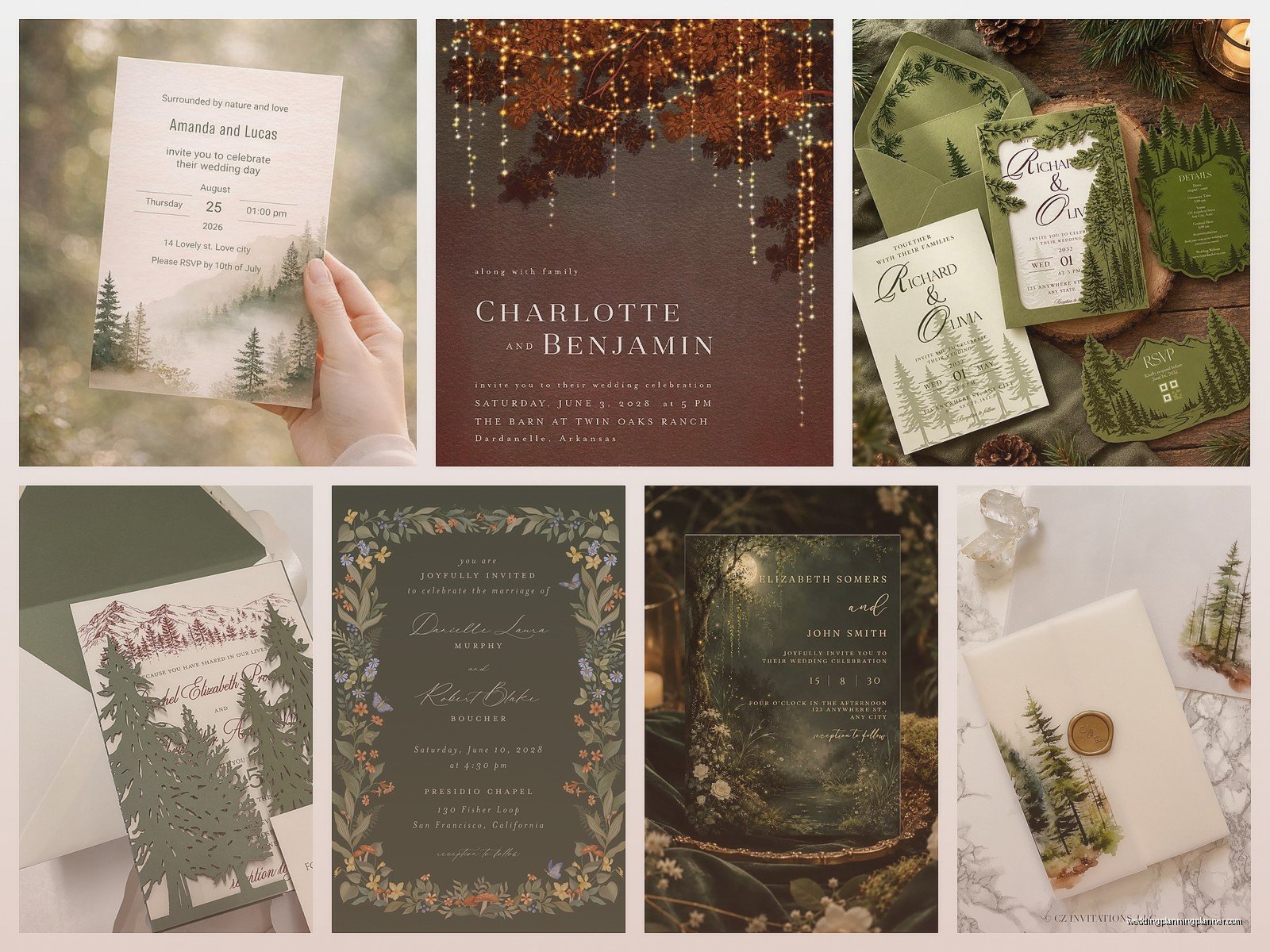
Everything should feel cohesive but doesn’t have to be identical. Like your save the dates can be more playful or simple, then the invitation is the fanciest piece, then day-of stuff can be more minimal. I usually do the invitation with the most detailed botanical illustration and then pull individual elements from that for other pieces. So if the invitation has a whole forest scene, maybe the menu just has a single fern from that scene.
My cat just knocked over my water bottle so now I’m typing with a towel on my lap but anyway –
Envelope situations
This is where you can get really creative. Kraft envelopes are the easy choice for rustic. For elegant forest, a deep green envelope is stunning, or even black with gold addressing looks incredible. Eucalyptus green envelopes are having a moment.
Liner options: floral pattern, woodgrain pattern, topographic map (if your venue is in actual woods this is a cool touch), or solid color that coordinates. You can DIY liners pretty easily if you’re on a budget.
Addressing: for rustic I like white ink on kraft or dark envelopes. For elegant, calligraphy in forest green or gold. You can also do printed labels with a botanical design if calligraphy isn’t in the budget. Digital calligraphy is a thing now and it looks pretty good honestly, most guests can’t tell the difference.
Wax seals are perfect for forest themes. Deep green, gold, or burgundy wax with a botanical seal design or your initials. They add like $2-3 per invitation though and you need to hand-cancel them at the post office which is annoying but they do look fancy.
DIY vs professional printing
You can totally DIY forest invitations if you’re crafty. Templates are available on Etsy and you can customize them pretty easily. Print at home if you have a good printer, or send the files to a print shop. Just make sure you do test prints because colors look different on screen vs paper.
For rustic themes, DIY is easier because imperfections kinda add to the charm. For elegant forest, you might want professional printing especially if you want foiling or letterpress.
Letterpress is gorgeous for woodland themes – that impression in the paper feels very organic and handcrafted. But it’s expensive, like starting at $800-1000 for 100 invitations usually. Foiling is slightly less expensive and you can do gold or copper foil on forest green paper and it looks so rich.
Digital printing is the most budget-friendly and honestly looks great if you use good paper stock. Most guests won’t know or care about the printing method, they just want a pretty invitation that tells them when and where to show up.
Extra details that elevate it
Deckled edges on the paper give it that handmade organic feel. You can buy a deckle edge ruler and DIY this or order paper pre-deckled.
Vellum overlays with botanical prints look ethereal and forest-y. You layer vellum over the invitation and tie it with ribbon or twine.
Real dried flowers or leaves attached to the invitation – I’ve seen this done beautifully but it’s time-consuming and makes the invites bulky for mailing. Better for hand-delivered invitations maybe.
Twine or ribbon belly bands to wrap around the invitation suite. Silk ribbon for elegant, jute twine for rustic. You can tuck a sprig of dried lavender or baby’s breath into the band.
Custom stamps or stickers for envelope seals with your initials or a small botanical design.
Practical stuff nobody thinks about
Weight and postage – all those extra details add weight. Weigh your finished invitation at the post office before you mail them all out. You might need extra postage and there’s nothing worse than having invitations returned because of insufficient postage.
Mail one to yourself first as a test. See how it arrives, if anything gets damaged, how long it takes.
Order extras. Like 10-15 extra invitations minimum. People lose them, you’ll want some for keepsakes, addresses change, plus-ones get added last minute.
Timeline: order invitations at least 4 months before the wedding, mail them 6-8 weeks before. Save the dates go out 6-8 months before (or earlier for destination weddings).
Proofreading: have like three different people proofread before you print. I cannot tell you how many times I’ve caught errors that the couple missed because they’d looked at it too many times. Date, time, location, website URL, RSVP deadline – check everything twice.
Budget breakdown kinda
This varies so much but roughly: DIY digital printing might be $200-400 for 100 invitations including envelopes and basic printing. Mid-range with some custom design and professional printing maybe $500-800. High-end with letterpress or foiling or really custom illustration work can easily be $1000-2000+. That’s just invitations, not the whole suite.
You can save money by: doing digital RSVP instead of printed cards (also easier for tracking responses), skipping envelope liners, using online templates instead of custom design, printing at a local shop instead of a specialty wedding printer, doing your own assembly.
Splurge items that make the biggest impact: really nice paper stock, professional calligraphy or hand-lettering for addressing, one special printing technique like foil on just the names.
Honestly the thing that annoyed me most about woodland invitations is when people want to use real wood slices as invitations. They’re heavy, expensive to mail, hard to write on, and like… where do guests keep them? They don’t fit in a card box. I always try to redirect people toward wood veneer which is thin enough to be practical but still has that wood element. But some people are really set on the full wood slice thing and then they complain about the cost and I’m just like, I told you.
Oh and make sure your design doesn’t make the invitation look like a camping trip announcement or a national park brochure. It’s gotta clearly read as a wedding invitation. I’ve seen some that were so heavy on the forest imagery that the wedding info felt like an afterthought
