
Planning Guides, Style Guide
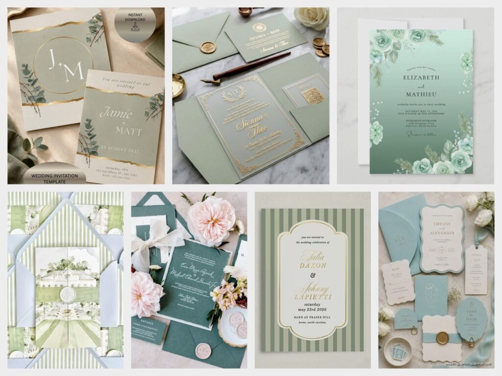
Mint Wedding Invitations: Soft Green Pastel Designs
Nov
Getting Started With Mint Wedding Invitations
Mint is having such a moment right now and honestly it’s been trending for like three years straight which is kinda unusual for wedding colors. I had this bride in spring 2023 who came in absolutely SET on mint invitations and she kept calling it “hospital green” which drove me absolutely insane because mint is SO much softer and more sophisticated than that, but anyway.
So the first thing you gotta know about mint invitations is that mint isn’t just one color. There’s like seafoam mint, true mint, mint green with more yellow undertones, dusty mint, and then there’s what I call “toothpaste mint” which you definitely want to avoid unless you’re going for a very specific retro vibe. When you’re looking at paper samples, always request them in natural light AND indoor light because mint can look completely different depending on the lighting situation.
Choosing Your Mint Shade
The shade you pick depends entirely on your wedding vibe. Softer, more pastel mints work amazing for spring and summer weddings, garden ceremonies, beach weddings, or really anything outdoorsy. The dustier mints with more gray undertones are perfect for fall weddings or if you’re doing an industrial venue situation. I personally love a true pastel mint with just a hint of blue in it—it photographs incredibly well and doesn’t wash out pale skin tones in photos.
Here’s what I tell clients: print out like five different mint shades from your printer at home (I know, I know, the colors won’t be exact) and tape them to your fridge or bathroom mirror. Live with them for a week. You’ll know which one feels right. The one that still makes you happy on day seven when you’re exhausted and haven’t had coffee yet? That’s your mint.
Paper Stock Makes a HUGE Difference
Alright so paper stock is where people either completely nail it or totally mess up their mint invitations. Mint on glossy cardstock looks cheap and sorta like a flyer for a car wash, no offense to anyone who’s done this but it’s just not the vibe you want. What you want is:
- Matte cardstock in 110lb or heavier—this gives you that luxury feel
- Cotton paper (like Crane’s Lettra) which has this beautiful texture and makes the mint color look so much richer
- Linen textured paper if you’re going for garden romance or rustic elegance
- Smooth premium cardstock if your design has lots of details or fine typography
I had this situation once where a bride ordered mint invitations online without seeing samples and they arrived on this weird shiny paper that looked like… I don’t even know, like mint-flavored aluminum foil? We had to rush order replacements three weeks before the wedding and I aged about five years during that process.
Design Elements That Work With Mint
Mint is super versatile which is why it’s so popular, but you can’t just slap mint on anything and call it a day. The design needs to complement the softness of the color.
Typography Choices
Script fonts look gorgeous with mint—think romantic, flowy, but still readable. You don’t want something so elaborate that your guests need a decoder ring to figure out what time the ceremony starts. I usually pair a romantic script for names with a clean serif or sans-serif for the details. Modern sans-serif fonts also work really well if you’re going for minimalist mint invitations.
One thing that annoys me SO much is when people use multiple script fonts on one invitation. Pick one script, maybe one serif, one sans-serif max. That’s it. I’ve seen invitations with like four different fonts and it looks like a ransom note, not a wedding invitation.
Color Combinations That Actually Work
Mint plays well with lots of colors but some combinations are definitely better than others:
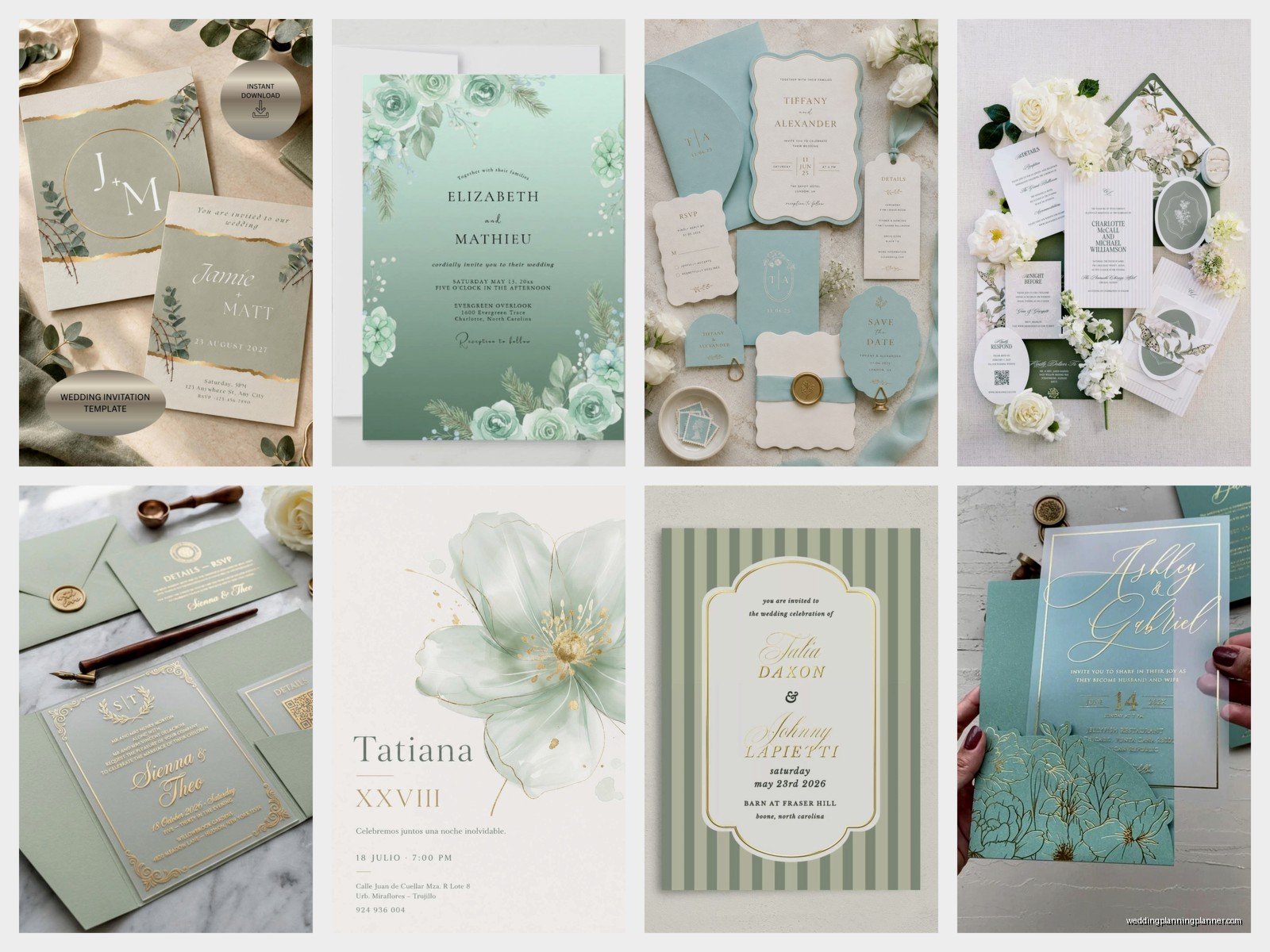
- Mint + gold foil = classic elegance, works for literally any season
- Mint + navy = nautical but make it sophisticated
- Mint + blush pink = romantic garden vibes, very spring
- Mint + white or cream = clean, modern, minimalist
- Mint + coral = fresh and fun, great for summer
- Mint + gray = modern and understated
- Mint + sage green = monochromatic green palette that’s really trendy right now
What DOESN’T work: mint + bright red (looks like Christmas), mint + orange (unless you really know what you’re doing), mint + purple (just… nah).
Printing Methods
The printing method you choose completely changes the look and obviously the price point. Digital printing is the most affordable and honestly looks great for mint invitations—the color reproduction is usually pretty accurate. Letterpress on mint paper is STUNNING but it’s pricey, like really pricey. You’re looking at $15-25 per invitation suite sometimes.
Foil stamping on mint is where things get interesting. Gold foil on mint is chef’s kiss perfect. Rose gold also looks beautiful. Silver can work but it sometimes reads a bit cold. I did these invitations with copper foil on a dusty mint background and the bride literally cried when she saw them, in a good way obviously.
Invitation Suite Components
Your invitation suite is more than just the main invitation card. You’ve got options and honestly it can get overwhelming really fast so let me break it down.
What You Actually Need
The main invitation is obviously required. Then you need response cards (RSVP cards) unless you’re doing online RSVPs which, can I just say, makes my life so much easier as a planner. Details cards are helpful for things like hotel information, website URLs, or weekend event schedules. Reception cards are only necessary if your ceremony and reception are at different locations or different times.
Envelopes—you need at least one layer but double envelopes look more formal. For mint invitations, I usually do a white or cream inner envelope and then either a mint outer envelope or a complementary color like navy or gray.
Envelope Addressing Options
This is where you can really make your mint invitations special or… where things can go wrong. Digital printing directly on mint envelopes works fine but make sure you do test prints because some printers don’t handle colored envelopes well. Hand calligraphy on mint envelopes is absolutely gorgeous but budget like $3-8 per envelope for that.
I’m gonna be honest, printed labels on mint invitations usually look cheap unless they’re clear labels with really beautiful typography. Better to just print directly on the envelope or go with calligraphy.
Embellishments and Extras
Okay so this is where you can go wild or keep it simple depending on budget and style:
- Belly bands (those paper strips that wrap around everything) in complementary colors
- Wax seals—maybe in gold, white, or a coordinating green shade
- Ribbon ties in silk or velvet
- Vellum overlays with printed details
- Envelope liners in patterns or complementary solid colors
- Custom stamps for the return address
My cat knocked over an entire box of wax seals once while I was working on a mint and gold invitation suite at home and I found little gold wax seal pieces under my couch for like six months afterward, but that’s beside the point.
Design Styles For Mint Invitations
Modern Minimalist
Clean lines, lots of white space, simple typography. Think mint cardstock with white or black text, maybe a subtle geometric border. This style works really well for contemporary venues or couples who like that sleek aesthetic. You don’t need tons of embellishments—the beauty is in the simplicity and the quality of the paper.
Garden Romance
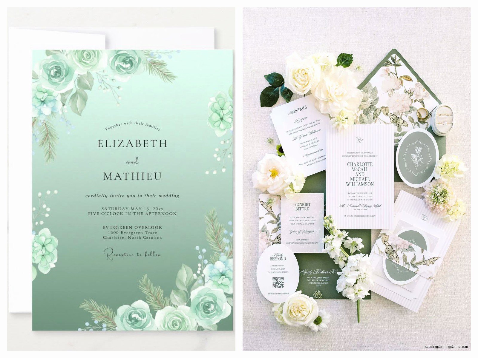
This is probably the most popular style for mint invitations. Floral illustrations, botanical elements, maybe some greenery motifs. Watercolor florals on mint backgrounds look especially pretty. You can do painted flowers in blush, white, and deeper greens. Script fonts work perfectly here.
Rustic Elegance
Mint with kraft paper accents, woodgrain textures, maybe some twine or burlap elements but like… elevated rustic, not barn wedding rustic unless that’s your thing. Linen textured mint paper works great for this style.
Beach or Coastal
Mint is perfect for beach weddings because it evokes ocean and sea glass. Pair it with navy, add some nautical elements like anchors or rope borders (used sparingly though), maybe some shell illustrations. Keep it light and breezy.
Vintage or Art Deco
Mint was actually pretty popular in vintage eras so you can lean into that. Art deco geometric patterns in gold on mint backgrounds look incredible. Vintage-style typography, maybe some ornate borders. This style works especially well with letterpress printing.
Practical Details You Can’t Forget
Timing and Ordering
Order your invitations at LEAST 4-5 months before your wedding date. You need time for design, proofs, printing, assembly, addressing, and mailing. Mail them 8 weeks before the wedding, or 12 weeks if it’s a destination wedding. Always order 15-20 extra invitations for keepsakes and inevitable addressing mistakes.
Postage Considerations
Here’s something people don’t think about—mint envelopes might need extra postage if they’re square or oversized or thick. Go to the post office and have them weigh your assembled invitation before you buy stamps. Nothing worse than having invitations returned for insufficient postage. Also, consider getting pretty stamps that coordinate with your mint color scheme rather than just flag stamps or whatever.
Proofreading Everything Multiple Times
I cannot stress this enough. Read every single word. Have someone else read it. Check dates, times, addresses, spellings of names. I once had a couple who didn’t catch a typo until after 150 invitations were printed and the venue name was spelled wrong. We fixed it with details cards but it was stressful and cost extra money.
DIY vs Professional Printing
Look, I’m all for DIY if you’re crafty and have time, but mint invitations can be tricky to print at home. Home printers often can’t handle thick cardstock, and getting the color consistent across 100+ invitations is actually really difficult. If you’re set on DIY, do it for like details cards or programs, but consider having the main invitation professionally printed.
There are great online services like Minted, Zazzle, or Etsy shops that do beautiful mint invitations at reasonable prices. You can also work with a local stationer (hi, that’s me) who can guide you through paper choices and design in person which honestly makes such a difference.
Assembly Tips
If you’re assembling invitation suites yourself, set up an assembly line system. Lay out all components in order, work on a clean surface, and don’t rush. Put on a good show (I worked through all of Schitt’s Creek during one particularly large invitation project) and just work steadily. Store assembled invitations flat in boxes, not standing up, so nothing gets bent or damaged.
Common Mistakes to Avoid
Don’t use too many design elements—mint is already a statement color so you don’t need ten different fonts and fifteen graphics and three types of embellishments. Less is usually more. Don’t forget to include your wedding website if you have one. Don’t make the text too small—remember some guests might need reading glasses. And please, please don’t use that weird papyrus-style font that some people think looks elegant but actually just looks like a menu from a mediocre Mediterranean restaurant.
Also gonna mention—make sure your mint invitation design is readable. I’ve seen designs where mint text on white backgrounds was so light you could barely read it, or mint backgrounds with gray text that just disappeared. Contrast is important even with soft pastel colors.
Working With Your Other Wedding Stationery
Your invitations should coordinate with your save-the-dates, programs, menus, place cards, and thank you cards, but they don’t have to match exactly. You can carry the mint color through all your stationery or just use it as an accent color in some pieces. Consistency in typography helps tie everything together even if colors vary slightly.
Save-the-dates can be more casual or playful than your formal invitations. Maybe your invitations are elegant mint and gold but your save-the-dates are mint with a fun illustration style. That’s totally fine and actually gives your stationery more personality throughout the wedding planning process.

Canva
Wedding Memories Hardcover Template Canva Editable For Notebook, Journal, Novel, Hard Covers, Canva template For KDP Cover 6×9″ 120 pages
Canva
The Ultimate Wedding Planning Bundle, Canva Editable.
Canva
Customizable Wedding Video Invitations templates, Canva Editable Digital Wedding invitation Minimalist, Animated Custom Invitation
Digital Planning Templates
Wine Wedding Planner Bundle – 200-Page Printable PDF + 10 Editable Wedding Invitations | Instant Digital Download
Canva
Orange Wedding Planner Bundle – 200-Page Editable Canva Templates + 10 Editable Wedding Invitations | Instant Digital Download
Digital Planning Templates
Champagne Wedding Planner Bundle – 200-Page Printable PDF + 10 Editable Wedding Invitations | Instant Digital Download
Canva
Wedding Memories Hardcover Template Canva Editable For Notebook, Journal, Novel, Hard Covers, Canva template For KDP Cover 6×9″ 120 pages
Digital Planning Templates
Yellow Wedding Planner Bundle – 200-Page Printable PDF + 10 Editable Wedding Invitations | Instant Digital Download
Canva
Dusty Blue Wedding Planner Bundle – 200-Page Editable Canva Templates + 10 Editable Wedding Invitations | Instant Digital Download