
Planning Guides, Style Guide
Beach Themed Wedding Invitations: Coastal Ocean Designs
Nov
Getting Your Beach Wedding Invitations Right
So beach themed invitations are honestly one of my favorite things to work on but they can go wrong SO fast. Like you think it’s gonna be easy because beach = pretty, but then you end up with invitations that look like they’re advertising a spring break party instead of your wedding.
First thing – you need to decide if you want literal beach vibes or just coastal elegance. There’s a huge difference. I had this client in summer 2021 who kept sending me inspiration photos that were all over the place. One minute she wanted starfish and sand dollars plastered everywhere, the next she wanted minimal navy stripes. We finally figured out she wanted “beach” but sophisticated, not themed like a Jimmy Buffett concert.
Color Palettes That Actually Work
The colors you pick are gonna set the entire tone. I see people defaulting to turquoise and coral all the time and like… it can work but it’s kinda overdone? Here’s what I typically recommend:
- Navy and white with gold accents – this is classic coastal without being too literal
- Seafoam green, cream, and soft gray – very calming and elegant
- Dusty blue with sand/taupe tones – my personal favorite honestly
- Coral and navy – if you must go traditional beach colors, this combo is less Spring Break
- All white with blue watercolor washes – ethereal and gorgeous
The thing that annoys me most is when couples pick bright tropical colors for a beach wedding that’s happening in like, Maine or Oregon. Your color palette should match the actual beach where you’re getting married. A Cape Cod wedding has different vibes than a Caribbean destination wedding, you know?
Design Elements and What to Include
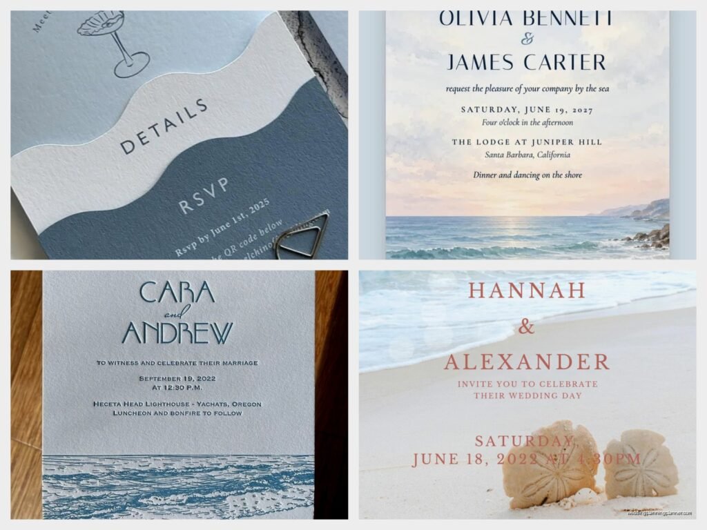
Okay so for actual design elements, you’ve got options. Watercolor is huge right now for beach invitations and I get why – it mimics the way water and sky blend together. But here’s what works:
Subtle over obvious: Instead of putting a giant seashell graphic on your invitation, consider a delicate border of tiny shells or a watercolor wash that suggests ocean waves. The best beach invitations I’ve designed hint at the theme rather than screaming it.
Typography matters so much: Script fonts can work but don’t go too swirly. You want people to actually read the thing. I like pairing a clean serif or sans-serif for the main information with maybe one elegant script for names or a quote. My cat knocked over my coffee on a proof once and honestly the water stain kinda looked like a wave so… there’s that.
Texture is your friend: This is where stationery gets fun. You can use:
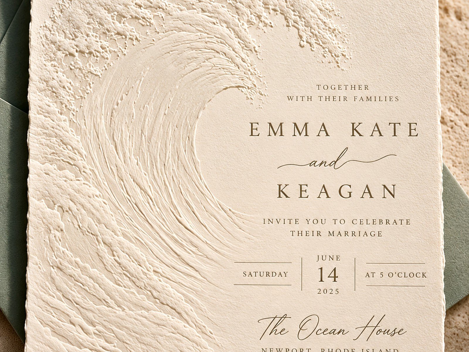
- Handmade paper with visible fibers that looks organic
- Vellum overlays that mimic sea glass
- Letterpress printing that creates dimensional waves or shells
- Deckled edges on the paper that feel beachy and relaxed
- Linen or cotton cardstock in natural tones
Wording and Information
Your wording can reinforce the beach theme without being cheesy. Instead of “join us as we tie the knot” you could say “join us where the ocean meets the shore” or something. Actually maybe that’s still cheesy, I don’t know, it depends on your style.
Make sure you include practical stuff that matters for beach weddings specifically:
- Parking information because beach parking is usually a nightmare
- What to wear – please tell people if they’ll be standing on sand
- Weather contingency plans
- Whether it’s adults-only (beach weddings and small children can be… a lot)
- Tide times if your ceremony timing matters
I learned this the hard way when a couple didn’t mention the wedding was literally on the sand and half their guests showed up in heels. The bride was stressed, I was stressed, and I had to help set up a shoe-changing station that wasn’t even in the original plan.
Envelope Choices and Assembly
Envelopes are where you can have more fun with the theme. Lined envelopes with a wave pattern or nautical map print look amazing when someone opens their mail. You can also:
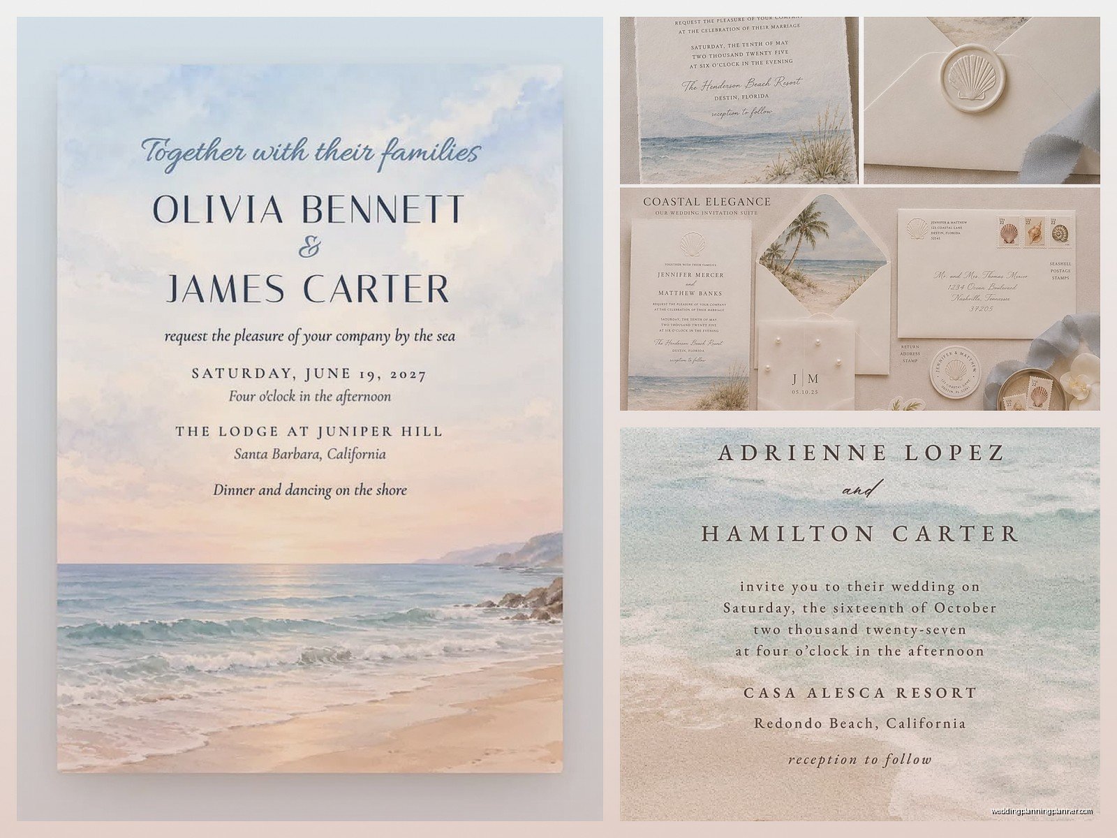
Use colored envelopes in your beach palette – seafoam, sand, navy, whatever. White is safe but kinda boring unless you’re doing something special with the liner or the seal. Wax seals in sea blue or gold are gorgeous and add that formal touch even though you’re having a beach wedding.
For return addresses, I always suggest getting a custom stamp made. It’s cheaper than printing in the long run and you can use it for thank you cards later. The stamp can include a small motif like an anchor, wave, or your wedding location coordinates.
Belly Bands, Ribbons, and Embellishments
Okay so this is where people either nail it or make their invitations look like a craft project exploded. Belly bands (those paper or ribbon strips that hold everything together) can be really elegant if you keep them simple. Maybe a vellum band with your monogram, or a silk ribbon in navy or cream.
What NOT to do: Don’t attach actual shells or sand to your invitations. I’ve seen it attempted and it never works. The shells break in transit, the sand gets everywhere, and postal workers hate you. If you want dimension, use a shell-shaped wax seal or a subtle embossed design instead.
Twine or jute rope can work for very casual beach weddings but be careful because it can read more “rustic barn” than “coastal elegant” depending on how you use it.
Paper Stock Recommendations
This gets technical but it matters. For beach themed invitations I usually recommend:
- Cotton or linen cardstock in weights between 100-130 lb – feels substantial and natural
- Textured paper that mimics linen or has a subtle grid pattern
- Smooth cardstock if you’re doing watercolor designs that need clean printing
- Recycled paper for eco-conscious couples, and it often has a nice organic look
Avoid super glossy or metallic papers unless you’re specifically going for a modern glam beach look. Usually matte or eggshell finishes work better for coastal themes because they feel more natural and… I don’t know, less trying-too-hard?
Printing Methods That Work Best
Digital printing is the most affordable and works great for watercolor designs or photos. The color reproduction is excellent and you’ve got lots of flexibility.
Letterpress is stunning for beach invitations, especially if you’re doing wave patterns, coral designs, or nautical motifs. The impression in the paper adds dimension and luxury. It’s pricier but worth it if your budget allows.
Foil stamping in gold, silver, or even blue foil can be gorgeous for beach themes. Imagine your names in gold foil over a watercolor ocean background. Chef’s kiss.
Thermography creates raised printing that feels nice to touch and looks formal without the letterpress price tag.
Suite Components Beyond the Main Invitation
A full invitation suite for a beach wedding might include:
- The main invitation card
- RSVP card and envelope (pre-addressed and stamped, please, for the love of god make it easy for your guests)
- Details card with hotel info, website, dress code
- Weekend itinerary if you’re doing a destination wedding
- Map or directions – especially important for beach locations that are hard to find
You don’t need all of these but think about what information your guests actually need. Destination beach weddings require more details than local ones.
Timing and Mailing Considerations
Beach weddings are often destination events so mail your invitations earlier than you would for a regular wedding. I recommend 12-16 weeks before the wedding instead of the standard 8-10 weeks. People need time to book flights and hotels.
Save the dates are pretty much mandatory for beach weddings. Send those 8-10 months out, or even earlier for peak summer dates or holiday weekends.
One thing about mailing – if you’re using vellum overlays, ribbons, or anything that makes the invitation thicker, take a finished sample to the post office and have them weigh it. You’ll probably need extra postage and there’s nothing worse than invitations getting returned or delivered postage-due.
DIY vs Professional Printing
Look, I’m gonna be honest with you. DIY can work for beach invitations if you’ve got design skills and patience. Watercolor designs are actually pretty forgiving for beginners. But there are things that are hard to DIY well:
- Letterpress (requires special equipment)
- Foil stamping (home foil systems rarely look professional)
- Deckled edges (you can do it by hand but it’s time-consuming and inconsistent)
- Color matching (home printers are unpredictable)
If you’re DIYing, I’d suggest using a template from a site like Minted or Etsy and customizing it rather than starting from scratch. And definitely order samples before you print 150 invitations.
Real Wedding Example That Worked
Spring 2023 I worked with a couple getting married in Outer Banks. They wanted beach vibes but elegant since it was a black-tie optional wedding. We did ivory cardstock with a dusty blue watercolor wash at the bottom that faded up to white. The text was in charcoal gray with their names in a delicate script. We used navy envelopes lined with a subtle wave pattern in cream and blue. The belly band was vellum with their monogram in navy. No shells, no starfish, no anchors – just the suggestion of ocean through color and movement. It was perfect and not overdone.
Budget Breakdown
Since I know everyone wants real numbers, here’s what you’re looking at for 100 invitations:
Budget-friendly: $200-400 for digital printing, simple design, standard paper
Mid-range: $500-800 for better paper, some customization, maybe one special printing technique
Luxury: $1000+ for letterpress, custom design, high-end paper, multiple embellishments
You can save money by skipping the full suite and doing a single card invitation with details on your wedding website. Or print the RSVP cards yourself but splurge on professional printing for the main invitation.
Common Mistakes to Avoid
Too many design elements competing for attention. Pick 2-3 max – like watercolor waves, gold foil, and a monogram. Not waves AND shells AND anchors AND rope AND… you get it.
Wrong paper weight – too thin looks cheap, too thick won’t fold properly if needed and costs a fortune in postage.
Forgetting about readability. That gorgeous script font might be hard for your grandmother to read. Make sure critical information is clear.
Not ordering enough. Always order 15-20 extra invitations for last-minute additions, mistakes, or keepsakes.
Ignoring your venue’s actual aesthetic. If your beach venue is modern and minimalist, your invitations should reflect that, not look like tropical tiki bar decor.
Working With a Stationery Designer
If you hire someone (hi, that could be me), bring inspiration photos but also be clear about what you DON’T like. I can’t tell you how many times clients show me 47 Pinterest pins and they’re all completely different styles. Tell me your budget upfront, your wedding colors, your venue vibe, and how formal or casual you want to be.
Good designers will show you mockups before printing anything. Review them carefully on a computer screen, not just your phone, because colors look different. Ask questions if something seems off.
Timeline-wise, custom stationery takes 6-8 weeks from design to delivery usually, so plan accordingly. Rush fees are expensive and stressful for everyone.
