
Planning Guides, Style Guide
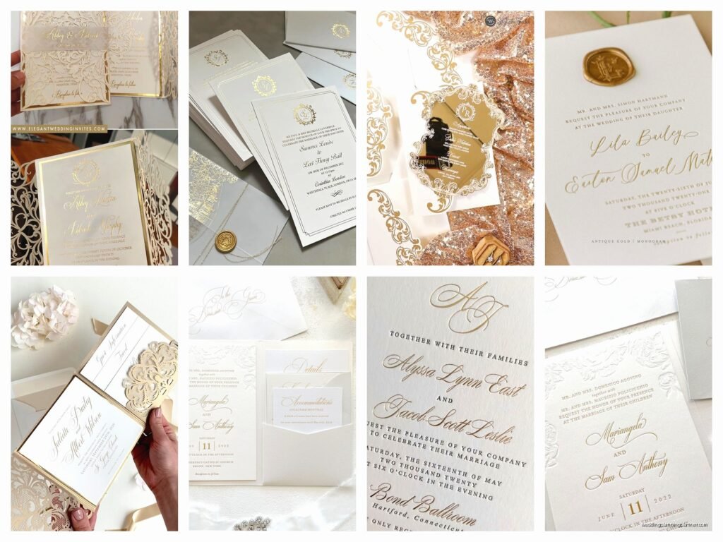
White and Gold Wedding Invitations: Elegant Metallic Classic
Nov
Picking the Right Shade of White (Yes There Are Like Fifty)
Okay so white and gold invitations sound straightforward but trust me, the white part alone will make you wanna pull your hair out. I had this bride in spring 2023 who kept saying “just white” and I showed her ivory, she hated it. Showed her bright white, too stark. Cream? Nope. We went through probably eight samples before she picked… wait for it… ivory. The exact first one I showed her.
Here’s what you’re actually choosing between: pure white (like printer paper, very modern and crisp), ivory (warmer, slightly yellow undertones), cream (even warmer, almost beige-ish), and ecru (kinda greyish-white). For gold metallic invites, I usually push people toward ivory or cream because the warmth matches the gold better. Pure white with gold can look kinda… Christmas-y? Which is fine if that’s your vibe but most couples don’t want their July wedding to scream December holidays.
The paper stock matters too – cotton paper in ivory looks completely different than regular cardstock in ivory. Cotton has this texture that catches light differently and makes the gold foil or ink look richer.
Gold Finishes and Why Foil Isn’t Your Only Option
Everyone thinks gold on invitations means foil stamping and yeah, foil is gorgeous but it’s expensive. Like really expensive. I’m talking sometimes $8-12 per invitation just for the printing, not including the actual card or envelopes or anything else. For a 150-person wedding that’s… okay I’m bad at math but it’s a lot.
Here are your actual options:
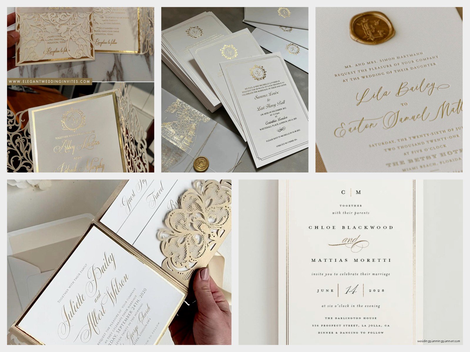
- Gold foil stamping – the fanciest, uses heat and metal dies to press shiny foil onto paper, looks incredible, costs the most
- Digital gold ink – printed gold (not actually metallic but looks gold), way cheaper, still pretty
- Thermography – raised gold ink that you can feel, middle price point, very traditional looking
- Gold letterpress – creates an impression in the paper with gold ink, super tactile and unique
- Gold edge painting – where the edges of the card are literally painted gold, this is stunning but adds another cost layer
I always tell clients to pick one splurge element. Maybe you do digital gold for most of the text but foil stamp just your names or monogram. Or you do all digital printing but add gold edge painting. Mixing techniques actually looks more custom and interesting anyway.
The Foil Color Variations Nobody Tells You About
Oh and “gold” foil comes in like ten different shades. Rose gold (pinkish), champagne gold (pale and subtle), antique gold (darker, more bronze), light gold, and regular shiny gold. I had a bride almost cry because her “gold” samples didn’t match and it turned out she’d been looking at three different gold tones across different vendors. Get physical samples of the actual foil color before you commit to anything because what looks like “classic gold” on a website might show up looking orange or brown or whatever.
Design Elements That Actually Work
The thing about white and gold is it can go really formal really fast or it can feel soft and romantic depending on your design choices. I’ve noticed some patterns over the years that tend to work better than others.
Geometric designs work great with this color combo – think gold hexagons, art deco lines, modern borders. Very Great Gatsby but in a good way not in a overdone 2015 way. Gold geometric frames around your text look clean and expensive without being too much.
Floral designs are trickier because you don’t want it looking like a funeral program (sorry but you know what I mean). If you’re doing florals, keep them delicate – gold line drawings of botanical elements, not big chunky flower graphics. Or do watercolor flowers in very pale gold and ivory tones.
Calligraphy fonts are like… everyone does this with gold invitations and it’s pretty but also kinda expected? I actually love when people mix a modern sans-serif font with one scripty font instead of going all calligraphy all the time. It feels more current.
What really annoys me is when people try to add too many other colors into a white and gold suite. Someone will be like “but what if we add blush pink and sage green and maybe some navy” and suddenly it’s not elegant anymore it’s just busy. If you absolutely need another color, stick to one – maybe a deep emerald green or a soft blush as an accent on like the envelope liner or belly band.
Paper Weights and Why It Matters More Than You Think
Gonna be honest, most people don’t think about paper weight until they hold a flimsy invitation and realize it feels cheap. For white and gold invitations specifically, you want substantial paper because the whole vibe is elegance and luxury and you can’t fake that with thin paper.
I recommend minimum 110lb cardstock, but 130lb feels way better. Some cotton papers come in 220lb and those feel like actual luxury items. You can also do layered invitations where you mount a printed piece onto a thicker backing board – this adds dimension and weight without the cost of printing on super expensive thick paper.
My cat just knocked over my coffee which is perfect timing because I need a break from thinking about paper weights anyway.
Envelope Situations
Your envelopes are honestly almost as important as the invitation itself because that’s what people see first. For white and gold invites, here’s what I usually suggest:
Get ivory or cream envelopes that match your invitation paper – don’t do white invites with bright white envelopes, the slight mismatch will drive you crazy. You can do gold addressing in a few ways: calligraphy in gold ink (expensive if you hire someone), print gold directly onto envelopes (many printers can do this now), or use gold labels/stickers (less formal but way easier).
Gold envelope liners are really pretty but they add cost and assembly time. You’re either buying pre-made gold liners or printing custom ones. The metallic paper for liners is weirdly hard to find in the right gold shade sometimes. I spent three hours once trying to source champagne gold liner paper for a client who had a very specific vision and it was… actually I’m still annoyed thinking about it.
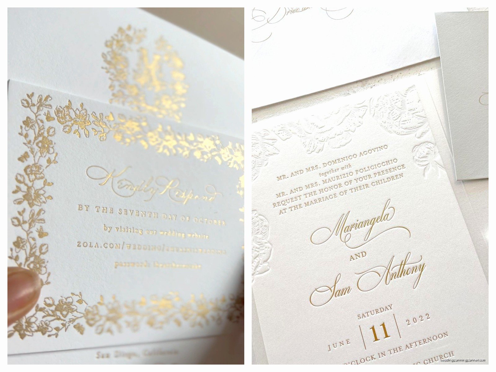
Gold wax seals are having a moment and they do look gorgeous on ivory envelopes. You can buy custom stamps with your initials or monogram. Just know that wax seals sometimes cause issues with post office machines, so you might need hand-canceling which costs extra postage.
The Whole Suite Components
An invitation suite isn’t just the main invitation card, and this is where costs add up fast. Here’s what might be included:
- Main invitation card
- RSVP card and envelope
- Details card (hotel info, website, whatever)
- Reception card (if ceremony and reception are different)
- Directions or map card
- Envelope liner
- Belly band or ribbon
- Wax seal
- Tissue paper (traditional but kinda outdated honestly)
You don’t need all of this. I promise. Most of my couples do invitation, RSVP with envelope, and one details card. Everything else can go on your wedding website. The bride in spring 2023 I mentioned earlier wanted literally every component and her invitations ended up costing more than her dress which is… a choice.
Belly Bands and Vellum Wraps
These are those decorative bands that hold all your cards together. Gold belly bands look really elegant, or you can do vellum (translucent paper) with gold printing. Vellum jackets that wrap around the whole suite are very trendy right now – you can print gold text or designs on the vellum and it creates this layered effect that’s really pretty.
Just know that adding bands or wraps means more assembly time, and if you’re DIYing this you’ll be sitting at your kitchen table for hours. Ask me how I know. Actually don’t, I’ve blocked out those memories.
Printing Methods Deep Dive
I mentioned the different gold finishes earlier but let me get into actual printing methods because this affects both cost and timeline.
Digital printing is the fastest and cheapest – most online invitation companies use this. It’s basically fancy computer printing. Gold won’t be actually metallic but it photographs fine and looks decent in person. Turnaround is usually 1-2 weeks.
Thermography is that raised printing that feels bumpy – it’s created by applying powder to wet ink and heating it. This was super popular in the 80s and 90s and it’s having a comeback because it’s more affordable than engraving but still has texture. Takes about 2-3 weeks usually.
Foil stamping requires custom metal dies to be made which is why it’s expensive and takes longer – usually 3-4 weeks minimum. But the result is actual shiny metallic gold that catches light beautifully. Worth it if you have the budget.
Letterpress creates an impression in thick cotton paper – text is debossed (pressed in) rather than raised. When you add gold ink to letterpress it’s stunning but also pricey and takes 3-4 weeks. The paper has to be thick enough to take the impression without tearing.
Engraving is the opposite of letterpress – the text is actually carved into the paper and you can feel it on the back. This is the most formal and traditional method, super expensive, takes forever. Mostly for like, royal weddings or people with unlimited budgets.
DIY vs Professional and Where to Save Money
Look, I’m a stationery consultant so obviously I’m biased toward hiring professionals, but I also get that invitations can cost a ridiculous amount of money. Here’s where you can DIY without it looking homemade:
You can design your own invitations using Canva or Adobe Illustrator if you’re comfortable with design programs, then have them professionally printed. This saves the design fee. Sites like Minted, Zola, and Artifact Uprising have good quality printing at reasonable prices. For gold foil specifically, check out Mixbook or Basic Invite – they do foil printing at lower costs than boutique printers.
What I don’t recommend DIYing: actual foil stamping (you need equipment), calligraphy addressing unless you’re actually good at it (bad calligraphy is worse than printed addresses), and anything involving complicated assembly. Your time is worth something and if you’re spending 20 hours assembling invitations that’s 20 hours you could spend on other wedding planning or like… relaxing.
Matching Your Invitations to Your Wedding Aesthetic
Your invitations should give guests a preview of your wedding vibe. White and gold works for so many different styles though, so you gotta make sure the design matches your actual wedding.
If you’re doing a ballroom wedding with chandeliers and formal everything, go for traditional calligraphy, maybe some ornate gold borders, classic formatting. If you’re doing a modern museum wedding or something sleek, geometric gold designs with sans-serif fonts work better. Garden wedding? Delicate gold botanical line drawings. Art deco venue? Gold gatsby-style frames and borders.
I see people all the time who pick invitations they think are pretty without considering if it matches their venue or style, and then everything feels disconnected. Your invitation is setting expectations, basically.
Timing and Ordering
Order your invitations at least 4-5 months before your wedding date. That gives you time for: design and revisions (2-3 weeks), printing (2-4 weeks depending on method), shipping to you (1 week), assembly if needed (however long it takes you), addressing (1-2 weeks), and mailing them out (8 weeks before wedding minimum).
Always always always order samples before you commit to your full order. Like I cannot stress this enough. What looks good on a screen looks completely different in person, especially with metallic gold colors. Most companies will send you sample packs or let you order individual samples of designs. Do this. Compare them in different lighting. Show them to your partner or your mom or whoever.
And order extras – like 10-15 more than you think you need. People lose them, you’ll want some for your wedding album or scrapbook, you might need to mail a few last-minute additions… it happens.
Postage Costs Nobody Thinks About
Here’s something that shocked one of my clients: her invitations were too heavy for regular stamps. Anything over 1 ounce costs more to mail, and if your suite has multiple cards, a wax seal, ribbon, or thick paper, you’re probably over 1 ounce. You’ll need to take a fully assembled invitation to the post office and have them weigh it to tell you exact postage.
Also if your invitation is square instead of rectangular, that’s non-machinable and costs extra. If it has a wax seal or anything bulky, hand-canceling is recommended so it doesn’t get destroyed in sorting machines – this costs extra per piece.
Gold stamps exist and they’re pretty with white and gold invitations, but you might need multiple stamps to reach the right postage amount. Plan for this in your budget because for 150 invitations, the postage difference between regular and overweight can be like $100-150.
Real Talk on Budgets
White and gold invitations can range from like $2 per suite (basic digital printing, simple design, DIY assembly) to $25+ per suite (foil stamping, cotton paper, professional calligraphy, all the extras). Most of my clients end up somewhere in the $5-10 per suite range which feels reasonable for the quality you get.
If you’re trying to stick to a tight budget, here’s where to splurge and where to save: Splurge on the main invitation looking good – nice paper, gold foil on your names or a small element. Save on RSVP cards by using online RSVPs through your website instead of physical cards. Save on extra detail cards by putting that info on your website. Save on fancy envelope liners and just do pretty addressing instead.
The gold edge painting I mentioned earlier? That’s usually $2-3 per card just for the edges. It’s beautiful but if you’re on a budget, skip it. Same with custom wax seals – you can find generic pretty ones for way cheaper than custom monogrammed ones.

Canva
Wedding Memories Hardcover Template Canva Editable For Notebook, Journal, Novel, Hard Covers, Canva template For KDP Cover 6×9″ 120 pages
Canva
The Ultimate Wedding Planning Bundle, Canva Editable.
Canva
Customizable Wedding Video Invitations templates, Canva Editable Digital Wedding invitation Minimalist, Animated Custom Invitation
Digital Planning Templates
Wine Wedding Planner Bundle – 200-Page Printable PDF + 10 Editable Wedding Invitations | Instant Digital Download
Canva
Orange Wedding Planner Bundle – 200-Page Editable Canva Templates + 10 Editable Wedding Invitations | Instant Digital Download
Digital Planning Templates
Champagne Wedding Planner Bundle – 200-Page Printable PDF + 10 Editable Wedding Invitations | Instant Digital Download
Canva
Wedding Memories Hardcover Template Canva Editable For Notebook, Journal, Novel, Hard Covers, Canva template For KDP Cover 6×9″ 120 pages
Digital Planning Templates
Yellow Wedding Planner Bundle – 200-Page Printable PDF + 10 Editable Wedding Invitations | Instant Digital Download
Canva
Dusty Blue Wedding Planner Bundle – 200-Page Editable Canva Templates + 10 Editable Wedding Invitations | Instant Digital Download