Planning Guides, Style Guide
Boho Wedding Invitations: Bohemian Rustic Designs
Nov
Okay so boho wedding invitations are having this massive moment right now
I’ve been doing wedding stationery consultations for like fifteen years and honestly the boho trend just keeps getting bigger. Had this bride in spring 2023 who came to me with a Pinterest board that had literally 847 pins of boho invites and she’s like “I want ALL of this” and I’m thinking okay we gotta narrow this down because boho can mean so many different things to different people.
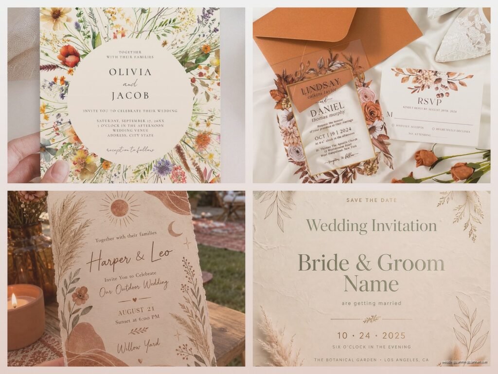
The whole bohemian rustic vibe is basically about creating something that feels organic, a little wild, not too precious or formal. Think earthy tones, natural textures, maybe some dried flowers or pampas grass illustrations, hand-lettered fonts that look like someone actually wrote them with a brush pen. You’re going for that effortless romantic feel even though—and this is what kinda annoys me—it actually takes MORE effort to make something look effortlessly beautiful than it does to just pick a traditional template.
Color palettes that actually work for boho invitations
So the colors are super important here. You’re not doing navy and gold or black and white. Nah. I usually steer clients toward terracotta, sage green, dusty rose, burnt orange, cream, taupe, and this really pretty muted mauve color that photographs amazingly. You can also throw in some rust tones or even a deep burgundy if you’re doing a fall wedding.
What I tell people is to pick 2-3 main colors max. The spring 2023 bride I mentioned? She wanted seven colors and I had to literally show her mockups to prove it would look chaotic rather than boho. Sometimes you gotta be firm about design principles even when clients think more is more.
Neutrals are your friend with boho designs. Like a kraft paper background with white or cream text looks instantly rustic without trying too hard. Or you can do the reverse—cream cardstock with terracotta lettering. I’ve also seen really pretty invites that use a watercolor wash background in soft earthy tones and then layer the text on top.
Typography choices that scream bohemian
The fonts you choose will make or break the boho vibe. You want a mix usually—a script font for names or main headers and then a simpler sans-serif or serif for the details. But not just ANY script font because some of them look too formal or too wedding-y in that traditional sense.
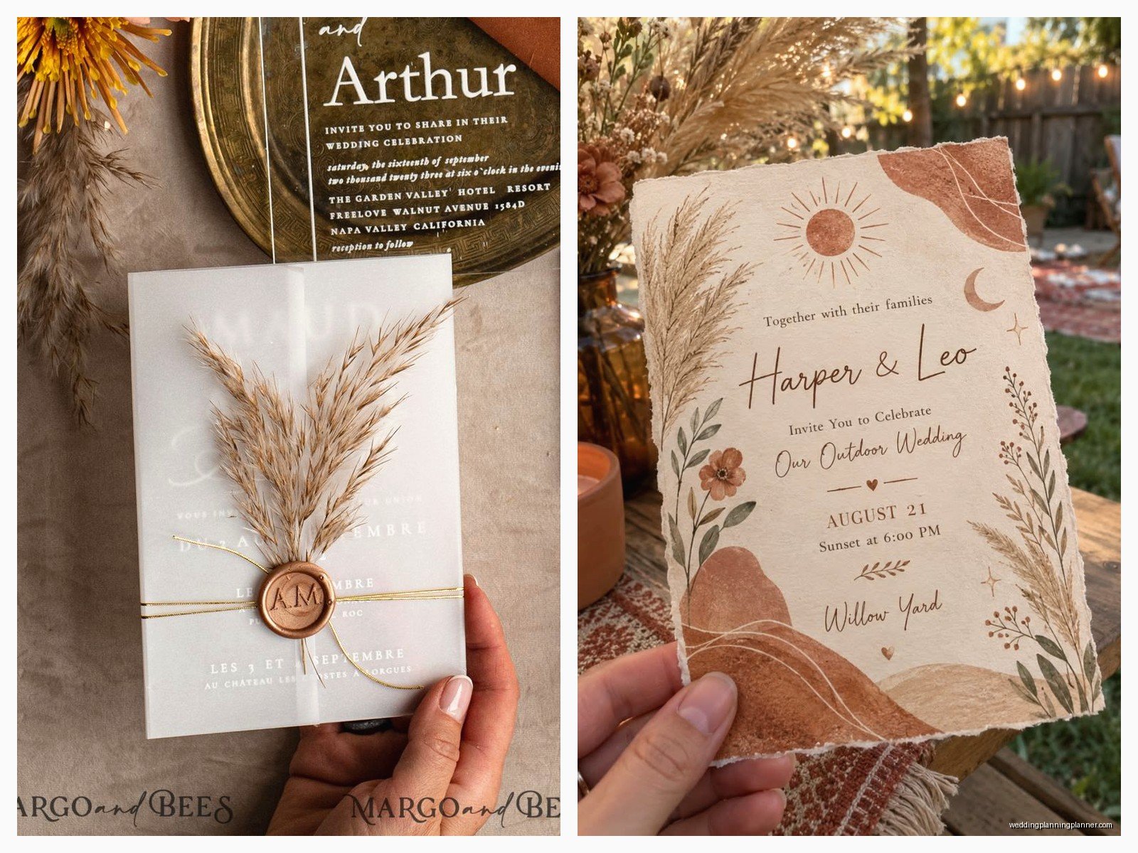
Look for fonts that have: irregular baselines, hand-drawn qualities, organic flowing lines, maybe some imperfections built in. I’m talking fonts like Selima, Philosophy, Wild Spirit, or Sacramento. For your secondary font go with something clean like Montserrat, Raleway, or even just a simple sans-serif that won’t compete.
One thing that drives me absolutely crazy is when people use too many fonts. I once had a client who wanted five different fonts on one invitation and I’m like… that’s not boho that’s just confusing to read. Stick to two, maybe three if you’re using a third one for like a small detail element.
Paper and texture options
This is where you can really lean into the rustic part of bohemian rustic. Standard smooth cardstock is fine but it doesn’t give you that organic tactile feel. I always recommend:
- Kraft paper or recycled paper for that natural look
- Cotton paper with a deckled edge (those rough torn-looking edges)
- Handmade paper with visible fibers or flower petals embedded
- Vellum overlays which add a dreamy ethereal quality
- Wood veneer for save-the-dates (yes actual thin wood sheets you can print on)
The texture matters SO much. When someone picks up your invitation it should feel substantial and interesting. I did invitations last summer that used this thick cotton paper with deckled edges and we tied them with raw silk ribbon and tucked in a sprig of dried lavender. The bride cried when she saw the final product which… okay I know that sounds cheesy but it was genuinely a beautiful moment and also my cat had just knocked over my coffee so I was having a DAY.
Design elements and embellishments
Here’s where boho invites get fun. You’re not limited to just text on paper. Think about adding:
Botanical illustrations: Pampas grass is huge right now. Also eucalyptus, olive branches, wildflowers, ferns, desert plants if you’re going southwestern boho. These can be watercolor style, line drawings, or even pressed real flowers.
Macramé or woven details: I’ve seen invites with tiny macramé corners or a woven pattern printed as a border. You can also actually tie invitations with macramé cord.
Natural fiber ribbons: Silk, cotton, linen, or even leather cord. Stay away from synthetic satin ribbon because it reads too formal.
Wax seals: These add a romantic vintage touch. Go for colors that match your palette—terracotta wax seals are gorgeous. You can get custom stamps with your initials or just use a simple design.
Geometric shapes: This might sound contradictory but geometric elements like triangles, hexagons, or arches can work really well in boho designs. They add structure to all the organic flowing elements.
Layout and composition tips
Boho doesn’t mean cluttered even though it can feel like there’s a lot going on. You still need white space—or in this case, neutral space. Don’t fill every inch of the invitation with design elements or text.
I usually do an asymmetrical layout because it feels more organic and less formal than centered text. Maybe the main text is aligned left with botanical illustrations flowing down the right side. Or you could do centered text but with illustrations that break out of a rigid border and kind of sprawl across the design.
Layering is also really effective. Like you might have a kraft paper backing, then a cream-colored main invitation on top, then a vellum overlay with your monogram or a botanical print, all tied together with ribbon. Each layer adds visual interest and that handcrafted feel.
Information to include and wording style
The actual words on your invitation can lean casual or stay traditional—that’s totally up to you and your partner’s style. Boho weddings are usually less formal so you might skip stuff like “request the honour of your presence” and just say “invite you to celebrate” or “join us for.”
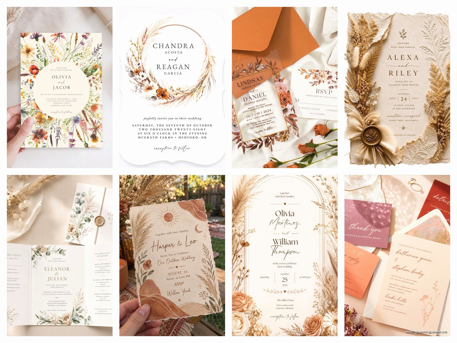
You gotta include the basics obviously: who’s getting married, date, time, location, RSVP details. But the way you present it can be more relaxed. I’ve done boho invitations that say things like “Let’s party under the stars” or “Come dance with us in the desert” instead of formal reception wording.
Keep your sentences short and readable. Boho script fonts can be hard to read in long paragraphs so break up text with spacing and don’t make your guests squint to figure out what time the ceremony starts.
Suite components beyond the main invite
A full boho invitation suite usually includes several pieces and they should all coordinate without being too matchy-matchy:
- Save the date (can be more casual, maybe a postcard style)
- Main invitation
- Details card with accommodations, website, dress code
- RSVP card and envelope
- Reception card if ceremony and reception are separate
- Weekend events card if you’re doing welcome drinks or day-after brunch
You can vary the design slightly across pieces. Maybe your save the date is on wood veneer but your main invite is cotton paper. Or your RSVP card has a different botanical illustration than your main invite but uses the same color palette and fonts.
DIY versus professional printing
Look I’m gonna be honest—I’m biased here because this is literally my job. But I’ve seen SO many DIY disasters. That said, if you’ve got design skills and access to good quality paper and a decent printer, you can absolutely DIY boho invitations. They’re actually more forgiving than formal invitations because slight imperfections add to the handmade charm.
If you’re DIYing: invest in good paper, test print everything multiple times, and don’t wait until the last minute because something will go wrong. Your printer will jam. You’ll run out of ink. The color won’t look right. Just trust me on this.
For professional printing you’ve got options like letterpress (gorgeous and tactile but expensive), digital printing (affordable and versatile), or thermography (raised printing that mimics letterpress). I usually recommend digital for boho designs because you can do full color illustrations and it’s cost-effective.
Timing and quantities
Order or make more invitations than you think you need. I always tell clients to add 25-30 extra. People lose them, addresses change, you’ll want to keep some as keepsakes, and if you’re doing something custom it’s cheaper to order extras upfront than to do a second print run.
Send save the dates 6-8 months before the wedding, earlier if it’s a destination wedding. Send actual invitations 8-12 weeks before. This gives people time to RSVP and you time to follow up with the people who definitely won’t RSVP on time because there are ALWAYS people who don’t RSVP on time and it’s… anyway.
Envelope addressing and finishing touches
Your envelopes are part of the design. For boho weddings I love seeing kraft envelopes, cream envelopes with a deckled flap, or even colored envelopes in sage or terracotta. Line them with printed paper that coordinates with your invitation design—maybe a small botanical pattern or a watercolor wash.
Addressing can be done with calligraphy (hand or digital), printed labels that match your design, or even rubber stamps for return addresses. There’s this whole debate about whether printed labels are tacky but honestly if they’re designed well they’re fine. Not everyone has calligraphy skills or the budget to hire a calligrapher.
Stamps matter too believe it or not. USPS has botanical stamps, vintage-looking stamps, and other designs that work way better than generic flag stamps for boho invitations. It’s a small detail but it adds to the overall aesthetic when your guest opens their mailbox.
Budget considerations
Boho invitations can range from super affordable to really expensive depending on your choices. Kraft paper with simple digital printing is budget-friendly. Cotton paper with letterpress, custom illustrations, hand-dyed silk ribbon, and wax seals gets pricey fast.
Here’s where you can save money: skip the multiple layers, DIY some elements like tying ribbons or adding dried flowers, use digital calligraphy instead of hand calligraphy, print digitally instead of letterpress, and order from online printers instead of boutique stationery designers.
Where you should maybe spend a bit more: paper quality (cheap paper looks cheap), design if you’re not doing it yourself, and printing quality. A beautiful design printed poorly defeats the purpose.
Common mistakes I see all the time
People go too literal with the boho theme and end up with invitations that look like a craft store exploded. You don’t need feathers AND dreamcatchers AND pampas grass AND macramé AND crystals all on one invitation. Pick a few key elements and let them shine.
Another mistake is illegible fonts or text that’s too small. Your 70-year-old grandma needs to be able to read the invitation without a magnifying glass. If your font is super decorative make it big enough or use it sparingly for headers only.
Not proofreading is obvious but I’ve had to reprint invitations because someone spelled their venue name wrong or put the wrong date. Have like three different people proofread everything before you print.
And please for the love of… make sure you have enough postage. Boho invitations with multiple layers, ribbons, and embellishments are often heavier than standard invitations. Take one to the post office and have them weigh it before you mail 150 invitations with insufficient postage.
Coordinating with your wedding aesthetic
Your invitations set expectations for your wedding style so they should coordinate with your overall vision. If your invitations are boho rustic with terracotta and pampas grass, guests are gonna expect a relaxed outdoor celebration, not a black-tie ballroom affair.
Think about how the invitation design elements can carry through to other wedding stationery: programs, menus, place cards, table numbers, signage, thank you cards. You don’t have to replicate the exact invitation design but using the same color palette, fonts, and general aesthetic creates a cohesive look that honestly just makes everything feel more pulled together and intentional