Planning Guides, Style Guide
Plain Invitation Card: Design & Ordering Guide
Jun
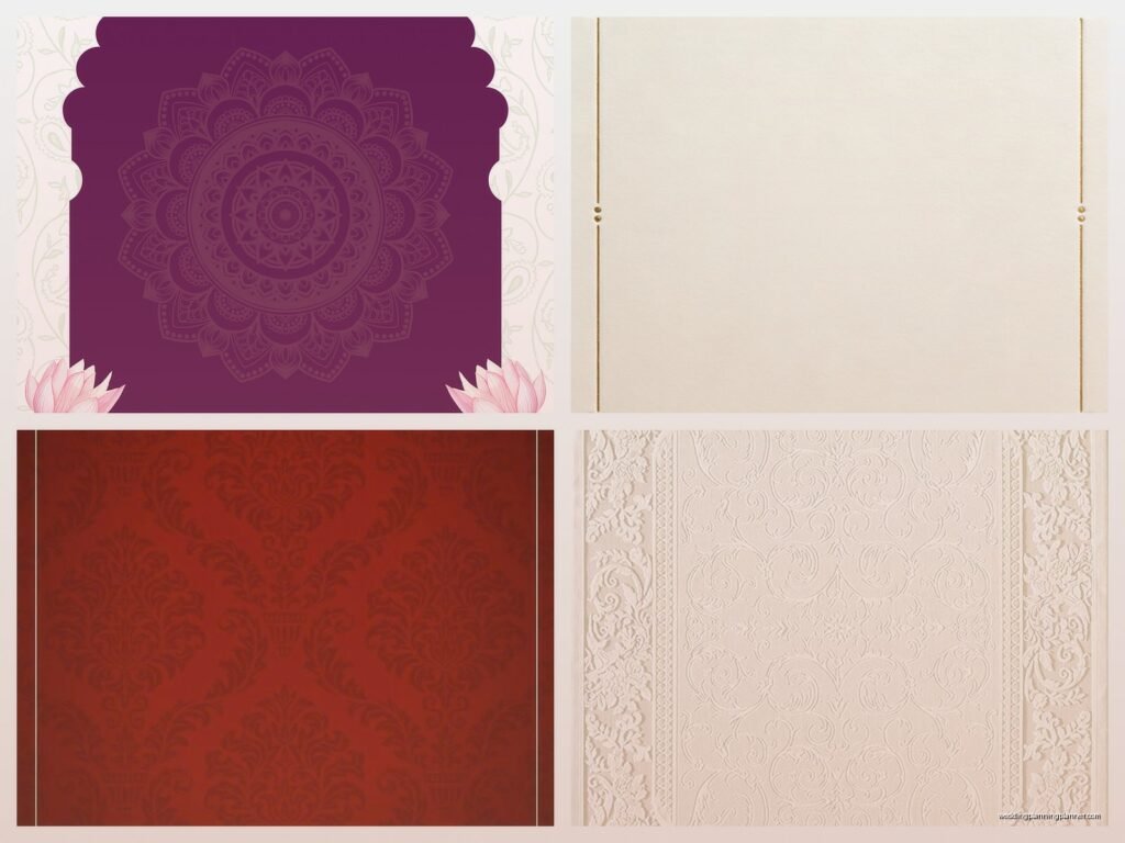
Okay So Plain Invitation Cards Aren’t Actually That Plain
Look, plain invitation cards get such a bad rap and honestly it drives me nuts because they’re some of the most elegant choices you can make. When I say plain, I don’t mean boring—I mean clean, minimalist, sophisticated. Think crisp white cardstock with simple black typography. Think cream-colored paper with your names in a classic serif font. No florals, no watercolors, no foil stamping everywhere.
The thing is, you gotta know what you’re actually ordering because “plain” means different things to different vendors and that’s where people mess up.
What Actually Makes an Invitation “Plain”
So a plain invitation card usually means:
- Solid color cardstock (white, cream, ivory, gray, black are most common)
- Simple typography—one or two fonts max
- Minimal or no decorative elements
- Clean layout with good use of white space
- Sometimes a simple border or line, but that’s it
Back in spring 2023 I had this bride who kept saying she wanted “just a plain card, nothing fancy” but then she’d send me inspo pics of invitations with letterpress, edge painting, and custom wax seals. We had to have like three conversations about what plain actually meant to her versus what it meant in printing terms. Turns out she meant plain design but wanted fancy production techniques. Totally different things.
Why Plain Cards Are Actually Harder Than You Think
Here’s what nobody tells you—plain invitations are unforgiving. When you have a busy design with florals and colors and patterns, small mistakes kinda disappear into the background. But with a plain card? Every tiny thing shows up. The paper quality matters SO much more. The font choice is everything. The spacing and alignment have to be perfect or it looks… I don’t know, it just looks off.
I remember this one order where the vendor had the text shifted like 2mm to the left and on a plain white card it was SO obvious. On a card with a watercolor background nobody would’ve noticed.
Choosing Your Paper Stock
This is where you need to pay attention because paper makes or breaks a plain invitation.
Weight matters: Don’t go below 100lb cardstock. Seriously. I’ve seen people order 80lb to save money and it feels like a flimsy piece of printer paper. For plain invitations, I usually recommend 110lb to 130lb cardstock. It feels substantial in your hand.
Texture options:
- Smooth/uncoated—modern, clean, takes ink beautifully
- Linen—has a subtle texture, feels more traditional
- Cotton—soft, luxurious, usually more expensive
- Laid—has fine lines running through it, classic look
For plain designs, I actually love a smooth matte cardstock. The lack of texture keeps everything minimal but the weight makes it feel expensive. Linen can work too but sometimes the texture competes with simple typography in a weird way.
Color choices: White isn’t just white, okay? There’s bright white (very modern, crisp), natural white (softer, warmer), cream, ivory, ecru… they’re all different. Request samples. Always request samples. What looks white on a screen might show up looking gray or yellow-ish in person.
Typography Is Literally Everything Here
Since you don’t have design elements to hide behind, your font choices are gonna do all the heavy lifting.
Serif fonts (the ones with the little feet on the letters) give you that classic, formal, timeless vibe. Think Garamond, Didot, Baskerville, Caslon. These work great for traditional weddings or when you want elegant and sophisticated.
Sans serif fonts (clean, no decorative bits) are modern and minimalist. Futura, Helvetica, Montserrat, Raleway. Perfect for contemporary weddings or if you’re going for that Scandinavian minimal aesthetic.
My cat just knocked over my coffee while I’m writing this so if this seems scattered that’s why… anyway, where was I?
Right, fonts. Here’s my rule: use ONE font family and play with weights (light, regular, bold) or use TWO fonts that complement each other. A serif for names and a sans serif for details, or vice versa. Three fonts looks messy. Zero creativity with fonts looks boring. Two is the sweet spot.
Size and hierarchy: Your names should be the biggest element. The date and venue info should be smaller but still readable. RSVP details can be smallest. Create visual hierarchy through size, not through adding design elements.
Layout and Spacing
White space is your friend. Like, your best friend. Don’t try to fill every inch of the card. A plain invitation with generous margins and breathing room looks intentional and expensive. A plain invitation crammed with text looks like you made it in Microsoft Word.
Center-aligned text is classic and safe. Left-aligned can look modern and editorial. Right-aligned is… nah, don’t do right-aligned, it’s hard to read.
Make sure your text isn’t too close to the edges. I usually recommend at least 0.5 inch margins, but 0.75 inches looks better on larger cards.
Size Options
Standard sizes are cheaper because they don’t require custom cutting:
- 5×7 inches—most common, fits in standard A7 envelopes
- 4×6 inches—smaller, more casual, less expensive
- 5.5×8.5 inches—taller, elegant, a bit different
- 6×8 inches—bigger, makes a statement
For plain designs, I actually like going slightly larger than standard. A 5.5×8.5 inch card with minimal text and lots of white space looks really striking. But you’ll pay more for custom envelope sizes.
Printing Methods
Okay so this is where it gets technical but you need to know this stuff before ordering.
Digital printing: Most affordable, great for plain designs with solid colors. The ink sits on top of the paper. Perfect for simple black text on white cardstock. Quick turnaround, can do small quantities.
Letterpress: Presses the text INTO the paper, creates an impression you can feel. Gorgeous for plain invitations because the texture adds interest without adding visual clutter. But it’s expensive and you need to order more because there’s more waste in the setup.
Thermography: Raises the text slightly off the paper, creates a shiny raised effect. Traditional and formal. Less expensive than letterpress but not as luxe. Honestly I find it sorta dated but some people love it.
Foil stamping: Uses metallic or colored foil. Can work for plain designs if you’re doing like simple gold text on black cardstock. Very dramatic. Also pricey.
For most plain invitations, digital printing is perfectly fine. The key is finding a good printer who uses quality inks and equipment. A well-done digital print on great paper beats a mediocre letterpress job any day.
Where to Order
You’ve got options and they’re all… different.
Online template sites (Minted, Paperless Post’s print options, Zola, etc.): Easy, affordable, you can customize templates. But you’re limited to their designs and paper options. For truly plain invitations, you might find their simplest templates work fine. Just make sure you can remove any decorative elements you don’t want.
Print-on-demand services (Vistaprint, Catprint, etc.): Cheapest option. You upload your own design. Quality can be hit or miss—definitely order samples first. Good if you’re on a tight budget and aren’t picky about premium paper.
Local print shops: Can work directly with someone, see paper samples in person, make adjustments. Usually mid-range pricing. Great for custom work and if you want to support local businesses.
Stationery designers: Most expensive but you get custom design work, premium papers, and expert guidance. Worth it if invitations are a priority for you or if you want something really specific.
Etsy designers: Middle ground between DIY and full-service designers. Many offer template customization or semi-custom work. Pricing varies wildly. Read reviews carefully.
What Really Annoys Me About Ordering Plain Invitations
The thing that drives me absolutely crazy is when vendors don’t show you actual printed samples before you order. They’ll show you digital mockups that look perfect on screen, and then the printed version shows up and the colors are off or the alignment is weird or the paper feels cheap. This is especially problematic with plain invitations because there’s nowhere to hide quality issues.
Always—ALWAYS—order a printed proof or sample before you commit to printing 150 invitations. Yes, it costs extra. Yes, it takes more time. But I’ve seen too many couples end up with invitations they hate because they skipped this step.
Quantities and Timing
Order about 20% more than your guest count. So if you’re inviting 100 guests, order at least 120 invitations. You’ll want extras for:
- Mistakes when addressing envelopes
- Last-minute additions to guest list
- Keepsakes for parents/yourselves
- Potential lost mail
Timeline-wise, start the design process like 4-5 months before you need to mail them. Figure 2-3 weeks for design and revisions, 2-4 weeks for printing (longer if you’re doing letterpress or foil), and then you need time to address and assemble everything. Mail invitations 6-8 weeks before your wedding.
Envelope Considerations
Your envelope matters almost as much as the invitation itself when you’re going plain and simple.
White envelopes are classic and safe. Cream or ivory if your cards are cream or ivory—don’t mix whites and creams, it looks weird. Colored envelopes (black, navy, gray, blush) can add visual interest without messing with your minimal card design.
For addressing, you’ve got options. Hand calligraphy looks gorgeous but costs $$$ unless you do it yourself. Digital calligraphy (printed directly on envelopes) is cheaper and still looks nice. Or just use a clean sans serif font in your printer—for modern plain invitations, this actually works perfectly fine.
Envelope liners add a pop of something without cluttering your actual invitation. A plain white card in a white envelope with a patterned or colored liner inside? That’s a nice surprise when someone opens it.
DIY vs Professional
Can you DIY plain invitations? Sure. They’re actually easier to design yourself than complex ones. You can use Canva, Adobe InDesign, or even Microsoft Word if you know what you’re doing (though I wouldn’t recommend Word for anything you’re printing professionally).
But here’s the thing—designing something that looks simple is actually kinda hard. Getting the spacing perfect, choosing fonts that work together, making sure everything’s aligned… it takes a good eye. I’ve seen plenty of DIY plain invitations that looked homemade in a bad way because the spacing was off or the fonts were weird.
If you’re gonna DIY, study professional examples first. Look at luxury brand typography. Notice how much white space they use. Pay attention to font pairings. And please, for the love of all that is good, don’t use Papyrus or Comic Sans or anything like that.
Extras and Add-Ons
Even with plain invitations, you might want some of these:
Edge painting: Where the edges of the cardstock are painted (usually gold, black, or a color). Adds a subtle luxe detail without affecting the clean design.
Belly bands: A strip of paper wrapped around the invitation suite. Can be plain or have a simple monogram.
Vellum overlays: A translucent sheet over your invitation. Adds texture and visual interest while keeping things minimal.
Wax seals: On the envelope, not the invitation itself. Classic and elegant.
But honestly? For truly minimal invitations, you don’t need any of this. A beautiful plain card on quality paper with perfect typography is enough.
Common Mistakes People Make
Using too many font weights or styles even within one font family—like mixing italic, bold, AND regular. Pick two max.
Choosing bright white paper for a formal evening wedding—it can look too stark or casual. Cream or ivory reads as more formal.
Forgetting about the envelope when planning the design—your invitation doesn’t exist in isolation, think about the whole package.
Not considering how the invitation photographs—plain invitations can look stunning in photos if done right, but they can also look boring if there’s no texture or contrast.
Skimping on paper quality to save money—this is the one place where you really should spend a bit more. The difference between 100lb and 120lb cardstock is like $20-30 for most orders but the feel is completely different.
Real Talk About Costs
Plain doesn’t automatically mean cheap. You can get plain invitations for $1 each from Vistaprint or you can pay $15 each for letterpress on cotton paper from a designer. It’s a huge range.
Budget-friendly (under $2 per invitation): DIY digital printing, online template sites with basic options, print-on-demand services.
Mid-range ($2-6 per invitation): Local print shops, Etsy designers, premium online services, better paper stocks.
Luxury ($6+ per invitation): Custom designers, letterpress or foil printing, premium papers like cotton, hand-done elements.
Remember to factor in envelopes, postage (especially if your invitations are thick or oversized), addressing costs, and any extras like liners or belly bands.
Testing Before You Commit
Seriously cannot stress this enough—get samples. Not just digital previews. Actual printed samples on the actual paper you’re planning to use.
When you get your sample, look at it in different lighting. Natural daylight, indoor lighting, evening light. Notice how the paper color and text look different depending on the light. Check the alignment carefully. Feel the weight and texture. Show it to someone else and get their honest opinion.
If something feels off, speak up. It’s way easier to make changes before you’ve printed 150 invitations than after.