Planning Guides, Style Guide
50th Marriage Anniversary Invitation Card: Design & Ordering Guide
Jun
Getting Started With The Design Part
Okay so 50th anniversary invitations are basically their own beast compared to like, regular party invites or even wedding invitations. You’re celebrating five decades together which is kinda wild when you think about it, and the card needs to feel special without being over-the-top cheesy.
First thing I always tell people is figure out your vibe. I had this client back in spring 2023 who wanted everything gold and formal, but then her husband was like “we’re having a backyard barbecue” and there was this whole… anyway, you need to decide if this is gonna be elegant dinner party or casual family gathering because that completely changes your design direction.
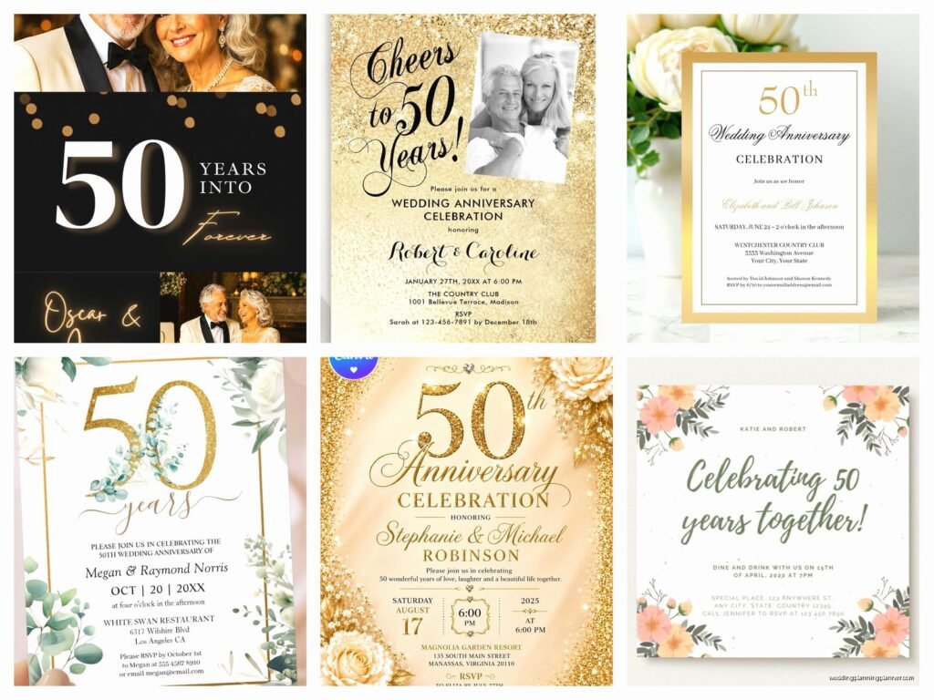
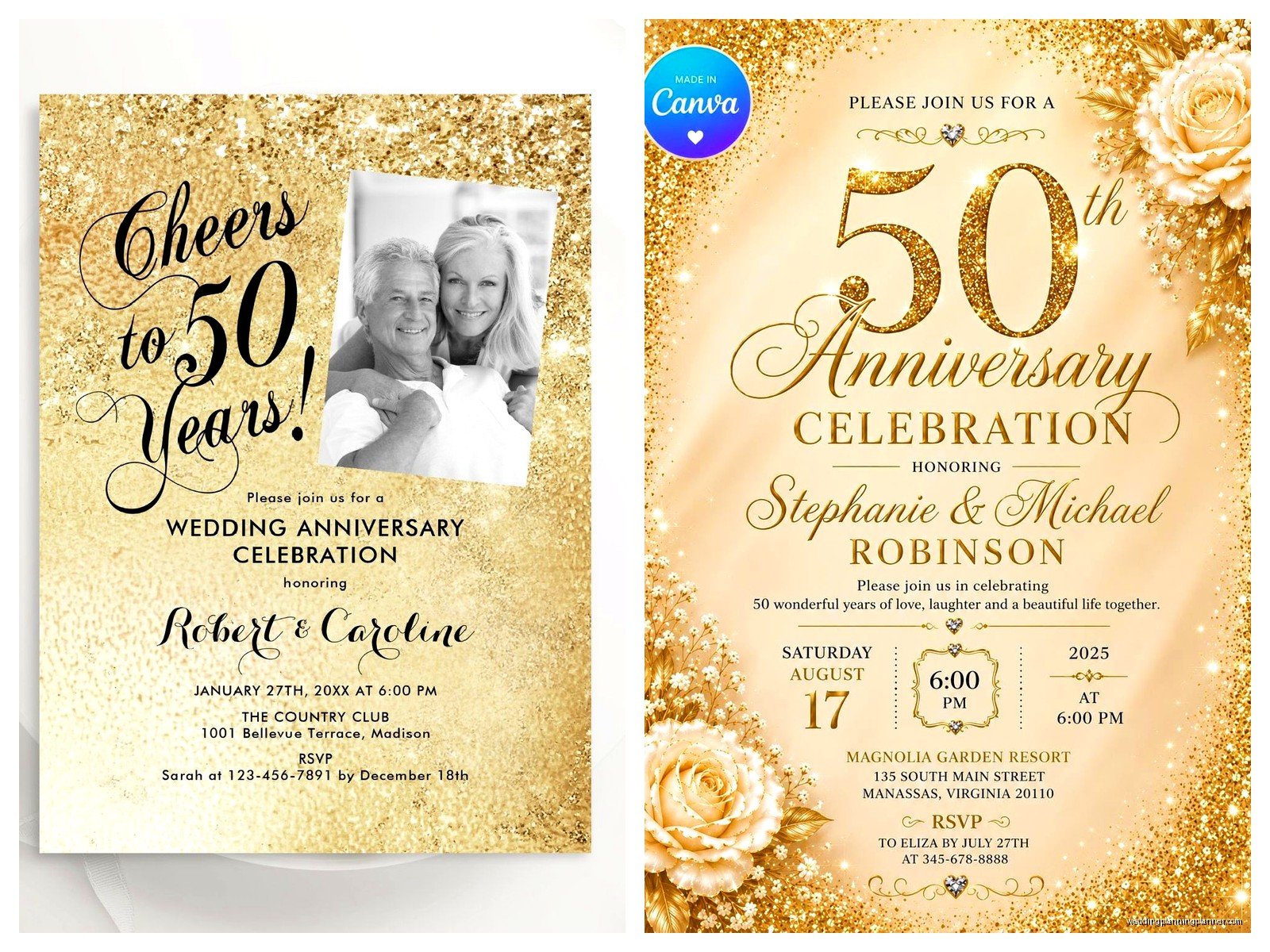
The traditional gift for 50 years is gold, so everyone and their mother wants gold foil on these invitations. Which is fine! Gold foil looks gorgeous. But it also adds like $3-5 per card to your printing costs, so just be aware. You can get a similar effect with metallic gold ink or even just a gold color scheme if budget’s tight.
Color Schemes That Actually Work
Gold and white is the obvious choice. Gold and cream looks more vintage and softer. I’m personally a fan of gold with deep navy or burgundy because it feels sophisticated without screaming “retirement party” vibes. Ivory and champagne tones work really well too if you want something subtle.
One thing that annoyed me SO much is when people try to cram every possible gold element onto one card. Gold border, gold text, gold flourishes, gold envelope liner… it’s too much. Pick like two gold elements max and let them shine.
What Information You Actually Need To Include
This is where people get confused because it’s not quite a wedding invitation but it’s not just a birthday party either. Here’s what I typically include:
- The couple’s names (obviously)
- What you’re celebrating – “50th Wedding Anniversary” or “Golden Anniversary”
- Date and time
- Venue with address
- RSVP details with a date
- Dress code if you have one
- Whether it’s adults only or family-friendly
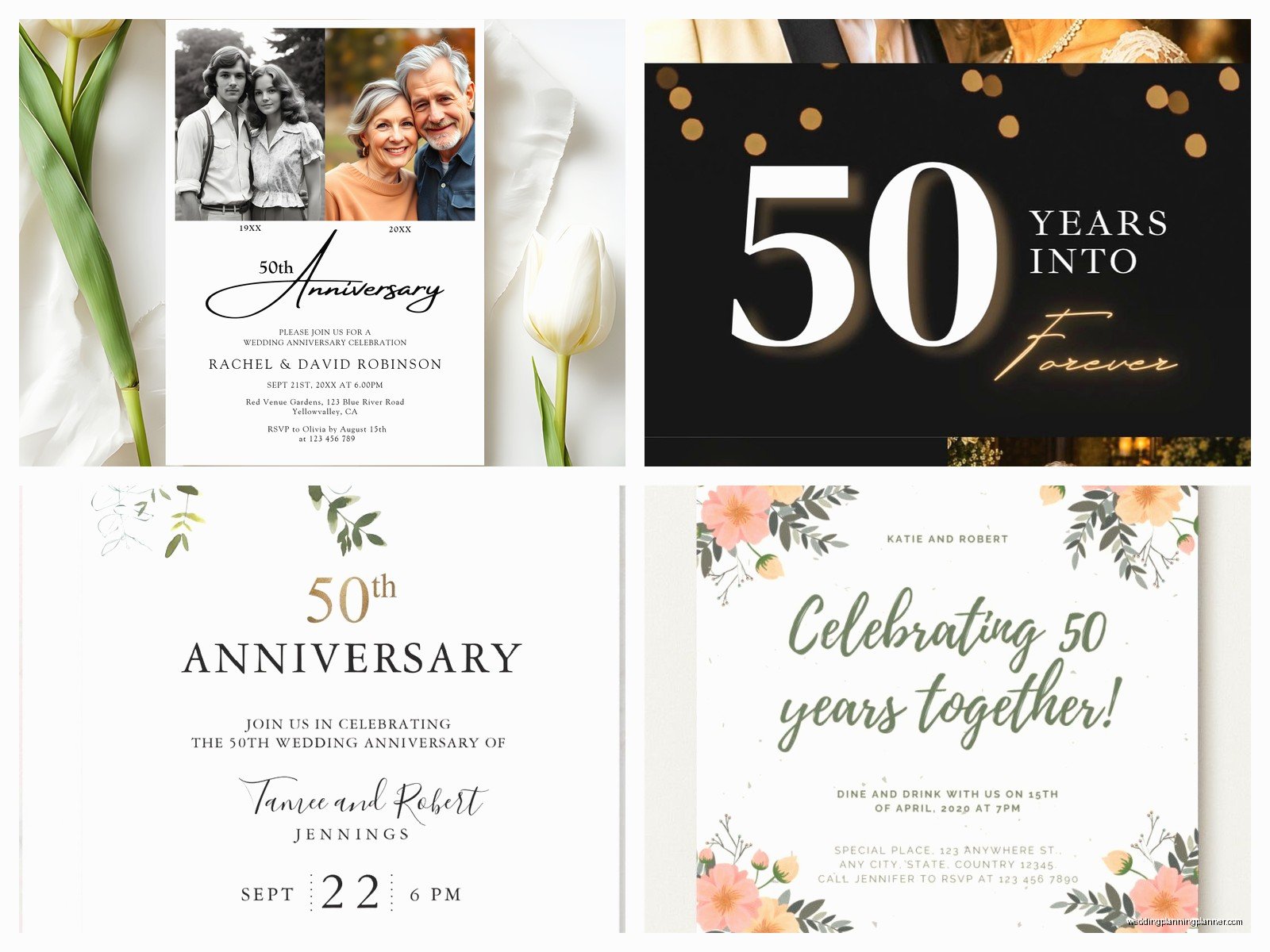
Some people want to include the original wedding date like “Married June 15, 1975” which adds a nice touch. You can also mention who’s hosting – usually it’s the couple themselves or their children.
For the wording, you’ve got options. Formal would be like “Mr. and Mrs. Robert Henderson request the pleasure of your company…” but honestly most 50th anniversary invites I design now are more relaxed. Something like “Please join us as we celebrate 50 years of love and laughter” feels more authentic to how people actually talk.
The Photo Question
Should you include a photo? I’m gonna say it depends. A then-and-now photo layout can be really sweet – like their wedding photo on one side and a recent photo on the other. But if the design is already busy or elegant, skip it. Not every invitation needs a photo.
If you do use photos, make sure they’re high resolution. I’m talking 300 DPI minimum. I once had a client send me a photo they’d screenshotted from Facebook and then wondered why it looked pixelated when printed. Like… that’s not how resolution works, but okay.
Design Elements And Layout Stuff
Standard invitation size is 5×7 inches, which fits nicely in an A7 envelope. You can also do 4×6 which is cheaper to mail, or go bigger with 5.5×8.5 if you want more space for photos or details.
For fonts, I usually pair a script font for names or the main headline with a clean serif or sans-serif for the details. Don’t use more than two fonts though, maybe three if you’re really careful about it. My cat just knocked over my coffee while I’m writing this, so if this gets rambly that’s why.
Border designs are huge for anniversary invitations. You can do:
- Classic gold frame borders
- Floral wreaths (very popular right now)
- Art deco geometric patterns if they got married in the 70s and want that vintage feel
- Simple elegant lines
- No border at all for a modern minimalist look
I’m personally kinda over the super ornate Victorian-style borders, but some people love them so whatever works for your style.
Digital Design Tools You Can Use
If you’re designing these yourself, Canva has a ton of anniversary templates you can customize. They’ve gotten way better in the last couple years. Templett is another option where you buy a template and edit it yourself, then download a print-ready PDF.
For more control, Adobe InDesign or Illustrator are professional options but there’s definitely a learning curve if you’ve never used them. I wouldn’t recommend starting from scratch in these programs two weeks before you need to order invitations.
Vistaprint and Minted both have online design tools built into their websites that are pretty user-friendly. You pick a template, change colors and text, done.
Printing Options And What They Actually Mean
Alright so printing methods matter more than people think. Here’s the breakdown:
Digital Printing: This is your most affordable option. Good quality, works for basically any design, fast turnaround. Colors are bright and consistent. This is what like 80% of people end up using.
Offset Printing: Better quality than digital, richer colors, but you usually need to order at least 100-250 cards to make it worthwhile. Takes longer too.
Letterpress: That pressed-into-the-paper texture that looks super fancy and vintage. Gorgeous but expensive – you’re looking at $8-15 per invitation easily. Better for smaller guest lists.
Foil Stamping: Adding metallic foil (usually gold for 50th anniversaries) to specific elements. Can be combined with digital or offset printing. Adds that luxury feel but yeah, costs more.
Thermography: Creates raised text that looks kinda like engraving but cheaper. It’s that slightly shiny raised lettering you see on a lot of formal invitations.
I usually recommend digital printing for most people unless you’ve got specific reasons to go fancier or you’re just really into paper goods and wanna splurge.
Paper Stock Matters More Than You’d Think
Standard cardstock is 80-100 lb weight. It’s fine, it works, nothing special. If you want something that feels more substantial go for 110-130 lb cardstock.
Paper finish options include matte (no shine, sophisticated), glossy (shiny, makes colors pop but can look cheap if you’re not careful), and linen (textured, classic feeling). I’m usually team matte or linen for anniversary invitations because they feel more elegant.
Recycled paper is an option if that’s important to the couple. Pearl or shimmer finishes add subtle sparkle without being over the top.
Where To Actually Order These Things
I’ve ordered from pretty much everywhere over the years, so here’s my honest take on different companies:
Minted: Beautiful designs, excellent quality, good customer service. More expensive but worth it if you want something really polished. They have independent artists designing templates which means more unique options.
Shutterfly: Super user-friendly, always running sales, decent quality. Good for photo invitations. Not as fancy-feeling as Minted but like half the price usually.
Vistaprint: Budget-friendly, fast shipping, tons of options. Quality is… fine. I’ve had some that looked great and some that felt kinda cheap. Hit or miss on color accuracy.
Zazzle: Massive selection, you can customize everything, good pricing. Interface can be overwhelming because there are SO many options.
Etsy: If you want to work with an independent designer or buy a template to print yourself. Quality varies by seller but you can find really unique stuff. Read reviews carefully.
Local Print Shop: Don’t sleep on this option! I worked with a local printer during that spring 2023 project I mentioned and they were so helpful with paper samples and fixing design issues. Sometimes costs more but the personal service is worth it, especially if you’re doing something custom.
Timing And Quantities
Order at least 4-6 weeks before you need to mail them. That gives you time for design, printing, shipping, and addressing. If you’re doing custom foiling or letterpress, add another 2-3 weeks.
For quantity, count your guest list and add about 10-15% extra. You’ll want extras for last-minute additions, keepsakes, mistakes while addressing, whatever. If you’re inviting 80 people, order 95-100 cards.
Most printing companies give you better per-card pricing at certain quantity breaks – like 25, 50, 100, 150. So sometimes ordering 100 instead of 85 only costs a few dollars more and gives you way more extras.
Envelope Situation
Your invitations come with basic envelopes usually, but you can upgrade. Colored envelopes (gold, ivory, navy) look more special than plain white. Envelope liners add a pop of pattern or color when people open them.
For addressing, you’ve got options. Handwrite them (time-consuming but personal), print labels (easy but can look informal), print directly on envelopes (clean look, many printers offer this), or hire a calligrapher (beautiful but expensive – usually $3-8 per envelope).
I’ve started using digital calligraphy where you send the printer your addresses and they print them in a calligraphy-style font directly on the envelopes. Looks hand-done but way more affordable. Companies like Minted offer this.
Postage And Mailing
Standard 5×7 invitation in a regular envelope needs one Forever stamp if it’s under 1 ounce. If you’ve got thick cardstock, multiple inserts, or fancy envelopes, weigh one complete invitation at the post office before you buy stamps. Nothing worse than having 100 invitations returned for insufficient postage.
You can get custom stamps with photos through USPS which is a cute touch. Or just pick pretty commemorative stamps – anything’s better than boring flag stamps for an anniversary invitation.
Common Mistakes I See People Make
Not ordering samples first. Most companies will send you paper samples or let you order one proof invitation. Do this! Colors look different on screen versus printed, and you wanna make sure the quality is what you expected.
Forgetting about RSVP logistics. Include a clear RSVP date (usually 3-4 weeks before the event) and make it easy – either include a response card with stamped envelope, or give a phone number/email, or set up an online RSVP through your own website or something like RSVPify.
Making the text too small. I get it, you wanna fit everything on there, but if your guests are mostly over 60, they need to be able to actually read the thing without a magnifying glass. Keep body text at 10-11 point minimum.
Choosing a design the couple doesn’t actually like because it’s “traditional” or whatever. This is their party, the invitation should reflect their personality even if that means doing something unexpected.
Extra Insert Cards
You might need additional cards for:
- Accommodation information if you have out-of-town guests
- Directions or parking details
- Registry information (though for 50th anniversaries, most couples request no gifts or donations to charity instead)
- Schedule of events if it’s a whole weekend thing
- Menu choices if you need meal selections
Keep these simple and in the same design style as your main invitation. You can usually order them as add-ons from the same company.
DIY Versus Professional Design
Look, I’m biased because this is literally what I do, but here’s my honest take. DIY works great if you’re comfortable with design software, have a good eye for layout, and have the time to fiddle with it. Templates from Canva or Etsy make this way easier than starting from scratch.
Hire a professional if you want something completely custom, you’re not confident in your design skills, or you just… don’t wanna deal with it. A designer can cost anywhere from $200-800+ depending on complexity and what’s included. Some will just design it, others handle the whole ordering and coordination process.
Middle ground option: buy a template, customize it yourself, then have a designer do a quick review and cleanup for like $50-100. Gets you most of the way there without the full custom design cost.
Proofreading Is Not Optional
I cannot stress this enough – proofread everything multiple times before you submit the order. Have someone else read it too. Check dates, times, addresses, spelling of names, phone numbers, everything. I once had a client who didn’t notice they’d put the wrong year on their invitations until after they’d mailed 150 of them and it was just… painful for everyone involved.
Print a test copy at home on regular paper to see how the layout looks physical versus on screen. Sometimes things that look fine digitally feel weird once they’re actually printed and in your hand.