Planning Guides, Style Guide
Sample Wedding Websites: Event Site Design Examples
Mar
Wedding Website Design Examples That Actually Work
So you’re building a wedding website and staring at a blank screen wondering what the hell to put on there right? I’ve looked at literally thousands of these things over the past fifteen years and honestly most couples overthink it but also somehow underthink the stuff that actually matters.
The homepage is where everyone lands first and you’ve got maybe three seconds before someone decides if they’re gonna explore or just bounce to find the venue address. I always tell couples to put a photo right at the top—not your engagement photos necessarily but something that feels like you. One couple I worked with in spring 2023 used a photo of them laughing at a taco truck and it was perfect because their whole vibe was casual and fun. Your names should be obvious, the date should be obvious, and there should be a clear menu or navigation.
Here’s what annoys me so much: couples who make their navigation menu some cutesy inside joke that guests don’t understand. Like instead of “Schedule” they write “The Big Day Breakdown” or something and people can’t find the ceremony time. Just… don’t do that. Be clear first, cute second.
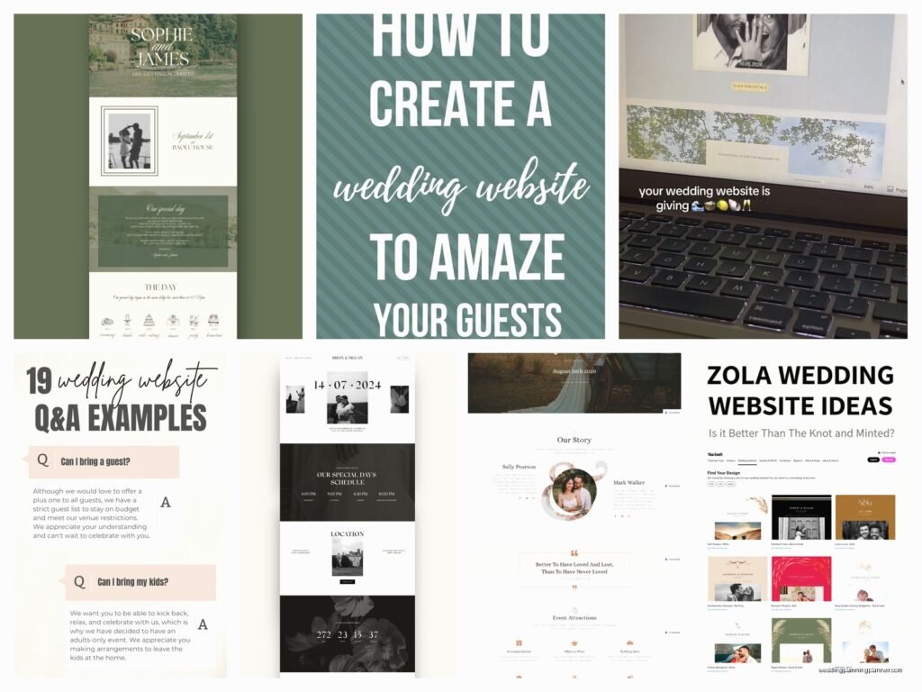
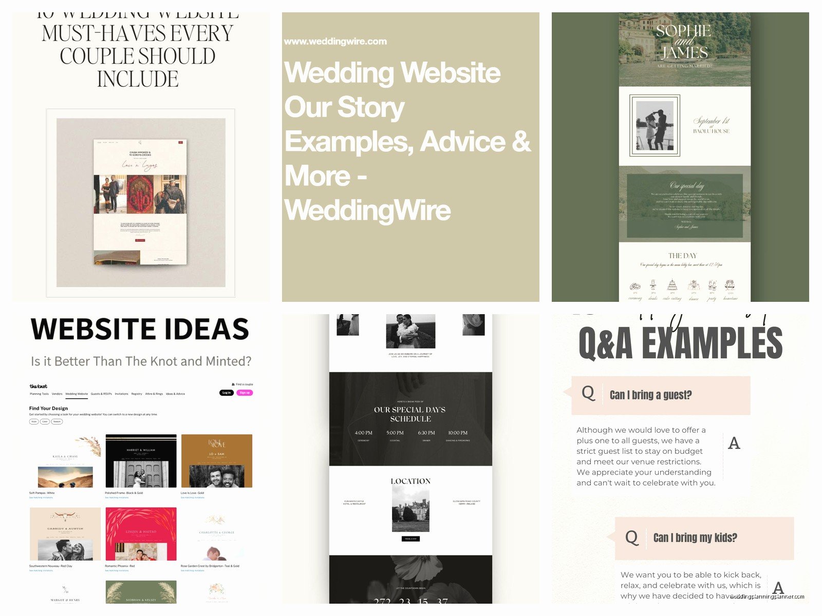
Our Story Page Examples
This is where you can get personal but keep it digestible. I’ve seen Our Story pages that are like reading a novel and nobody’s got time for that when they’re just trying to figure out what time to show up. Write maybe 3-4 paragraphs max. One couple did bullet points of their relationship timeline and honestly it was kinda genius because people could scan it quickly.
Good structure: How you met (brief), a couple key moments, how you got engaged. That’s it. You don’t need to document every vacation or inside joke. Save some mystery for the reception toasts.
Some couples split this into two sections—”How We Met” and “The Proposal”—which works if you’ve got good stories for both. I remember this one groom proposed during a total disaster of a camping trip where everything went wrong and the story was hilarious, so they gave it its own section with photos of him covered in mud. It showed personality.
Wedding Party Page Layout
You want photos of each person, their name, their role, and maybe one sentence about how you know them. That’s literally it. I see couples write entire paragraphs about each bridesmaid and it’s just too much scrolling.
Layout-wise, grid format works best. Either two columns or three columns depending on how many people you’ve got. Keep the photos consistent—same size, similar style. If you do outdoor photos for everyone, don’t randomly throw in one person’s bathroom selfie because you couldn’t coordinate.
Pro tip: include pronunciation guides if anyone’s name is tricky. Nobody wants to butcher the maid of honor’s name at the reception. Just put it in parentheses like “Siobhan (shi-VAWN)” and you’re good.
Schedule/Timeline Page
This is the page people visit most so make it scannable. I usually suggest a simple timeline format with times on the left and events on the right. Something like:
- 4:00 PM – Ceremony begins
- 4:30 PM – Cocktail hour
- 5:30 PM – Reception starts
- 6:00 PM – Dinner
- 7:30 PM – Dancing
Include the venue name and address for each event if they’re at different locations. Add a note about parking if it’s complicated or if there’s a specific lot guests should use. During this one wedding in summer 2021, half the guests parked in the wrong lot and had to walk like fifteen minutes in heels because the couple didn’t specify, and it was just… preventable chaos.
If you’re doing a multi-day event (welcome party, wedding day, brunch), break it into separate sections by day. Make it visually clear what’s happening when.
Travel and Accommodations
List your hotel blocks with direct booking links. Not just the hotel names—actual clickable links with your group code already in there if possible. Include the address, phone number, and deadline for the room block rate.
If you’re having a destination wedding, add info about the airport, transportation options, and maybe some local restaurant recommendations or things to do. You don’t need to write a travel guide but pointing people toward a good coffee shop near the hotel is helpful.
Some couples make maps or embed Google Maps which is smart if your venue is hard to find. Just make sure the pin is actually at the right location because I’ve seen maps that were off by like two streets and caused problems.
Registry Page Design
Keep this simple and don’t be weird about it. Link to wherever you’re registered—Amazon, Target, Zola, whatever. You can say something like “Your presence is the best present, but if you’d like to contribute…” or just be direct. People expect a registry link, it’s not tacky.
If you’re doing a honeymoon fund or cash fund, explain it briefly. Some older guests don’t understand those so a sentence like “We’re saving for a trip to Japan and would love contributions toward experiences” helps.
Don’t put your Venmo on there though, that’s just… nah. Go through an actual registry platform that’s set up for this.
FAQ Section That People Actually Read
This is where you answer all the questions you’re gonna get texted fifty times otherwise. Structure it as actual questions and answers, not paragraphs of info. Like:
What should I wear? Cocktail attire. The ceremony is outdoors so maybe skip stilettos.
Can I bring a date? If your invitation says “and guest,” yes! Otherwise we’re keeping it intimate.
Are kids welcome? We love your kids but this is an adults-only celebration.
Will there be food for dietary restrictions? Yes, please note any allergies or restrictions in your RSVP.
That last one is important because you need to know about dietary stuff early. Include questions about parking, whether the venue is accessible, what the weather might be like, and anything specific to your wedding. Having a sparkler send-off? Tell people. Want an unplugged ceremony? Say it here AND on the ceremony page.
RSVP Page Setup
Most couples use their website platform’s built-in RSVP system which is smart because it keeps everything organized. You need fields for name, number of guests attending, meal choice if applicable, and a spot for dietary restrictions or notes.
Set a clear RSVP deadline and stick to it. I usually recommend 3-4 weeks before the wedding so you have time to finalize numbers with vendors. Make the deadline obvious—put it at the top of the page in bold or whatever.
Some couples get creative with their RSVP wording like “Will you be joining our adventure?” instead of just “Will you attend?” which is fine if it fits your vibe, but make sure the actual buttons or form fields are crystal clear. “Accepts with pleasure” vs “Declines with regret” is classic and works.
Photo Gallery Ideas
You don’t need this page before the wedding honestly but if you want one, keep it to like 10-15 engagement photos max. Create a simple grid gallery that loads quickly. Nobody wants to wait thirty seconds for high-res images to load when they’re just browsing on their phone during lunch.
After the wedding, this becomes the spot where you can share professional photos or create a place for guests to upload their own photos. But pre-wedding, less is more. My cat walked across my keyboard while I was updating a client’s gallery once and somehow published like forty photos and the couple was annoyed because it made the page so slow.
Design Elements That Work
Color scheme should match your wedding colors but don’t go overboard. Pick 2-3 colors max and use them consistently. White or cream backgrounds are easiest to read. I see couples choose dark backgrounds with light text and it’s just harder on the eyes, especially for older guests.
Font choices matter more than you think. Use one font for headings and one for body text. Don’t use more than two fonts total or it looks chaotic. And please, please make the font size readable. I’d say 14-16pt minimum for body text. Your grandma shouldn’t need to zoom in to read your ceremony time.
Keep the design clean and not too busy. I know you’re excited and want to add all the flourishes but sometimes a simple layout with good photos and clear info beats an overly designed site that’s confusing to navigate or takes forever to load.
Mobile Optimization
Like 80% of your guests will look at your website on their phone so it better work well on mobile. Most website builders handle this automatically now but check it yourself. Open your site on your phone and actually click through every page. Do the buttons work? Can you read everything without squinting? Does the menu make sense?
I worked with a couple who had this gorgeous desktop design but on mobile the RSVP button was hidden behind their names and half their guests couldn’t figure out how to respond. They didn’t catch it until two weeks before the wedding when they realized they had way fewer RSVPs than expected. Test everything.
What Pages You Actually Need
Essential pages: Home, Schedule, Travel/Hotels, RSVP, Registry. That’s your core five. Everything else is optional honestly.
Nice to have but not required: Our Story, Wedding Party, Photos, FAQ, Things to Do (for destination weddings).
Don’t need: A page about your proposal unless it’s a really good story, individual pages for each wedding party member (just put them all on one page), a guestbook page before the wedding (nobody signs those anyway), or anything that requires guests to create an account or log in because people won’t do it.
Platform-Specific Tips
The Knot and Zola are probably the most popular and they’re free which is great. They have good templates and the RSVP systems integrate with your guest list. Downside is they look kinda templated because everyone uses them, but you can customize enough to make it yours.
Minted and Paperless Post have more design-forward options if aesthetics are really important to you. They cost money though. Withjoy is another good free option with clean designs.
Squarespace or Wix give you the most control if you want something totally custom, but you gotta be comfortable with website building or… it’s gonna be frustrating. And you’ll need to integrate a separate RSVP tool which adds complexity.
Whatever platform you choose, get your website up at least 4-6 months before the wedding. Earlier if you’re doing a destination wedding. People need time to book travel and hotels.
Keeping It Updated
This is something couples forget about—you gotta update your site as things change. If your ceremony time shifts or you add a welcome dinner or the hotel block fills up, update the website immediately. I’ve seen guests show up at the wrong time because the couple changed plans but didn’t update their site.
Also update it with real-time info if needed. Like “Due to weather, ceremony moved indoors” or whatever. Some platforms let you send notifications to guests who’ve RSVP’d which is super helpful for last-minute changes.
After the wedding, you can keep the site up and add photos or just take it down. Most platforms keep it live for a year or so. Some couples turn it into a kind of digital scrapbook which is sweet but not necessary. Just make sure you’ve downloaded your RSVP data and any info you need before the platform deletes it.
The biggest thing is just making sure your guests can find the information they need without digging through five pages or decoding your creative navigation. Clear info, good photos, mobile-friendly, done. You’re probably overthinking it honestly but that’s also kinda what wedding planning is so… gotcha, welcome to the club.