Planning Guides, Style Guide
Wedding Invitation Card Design: Creative Layout Ideas
Mar
Okay so layout ideas that actually work
The biggest mistake I see is people thinking they need to cram everything onto one card in the same font size. Like no. You’ve got hierarchy to work with and honestly that’s gonna save your entire design. I had this bride in spring 2023 who wanted EVERYTHING on the main invitation – the full schedule, dress code, registry info, her dog’s name (I’m not joking) – and I had to basically sit her down and explain that invitation suites exist for a reason.
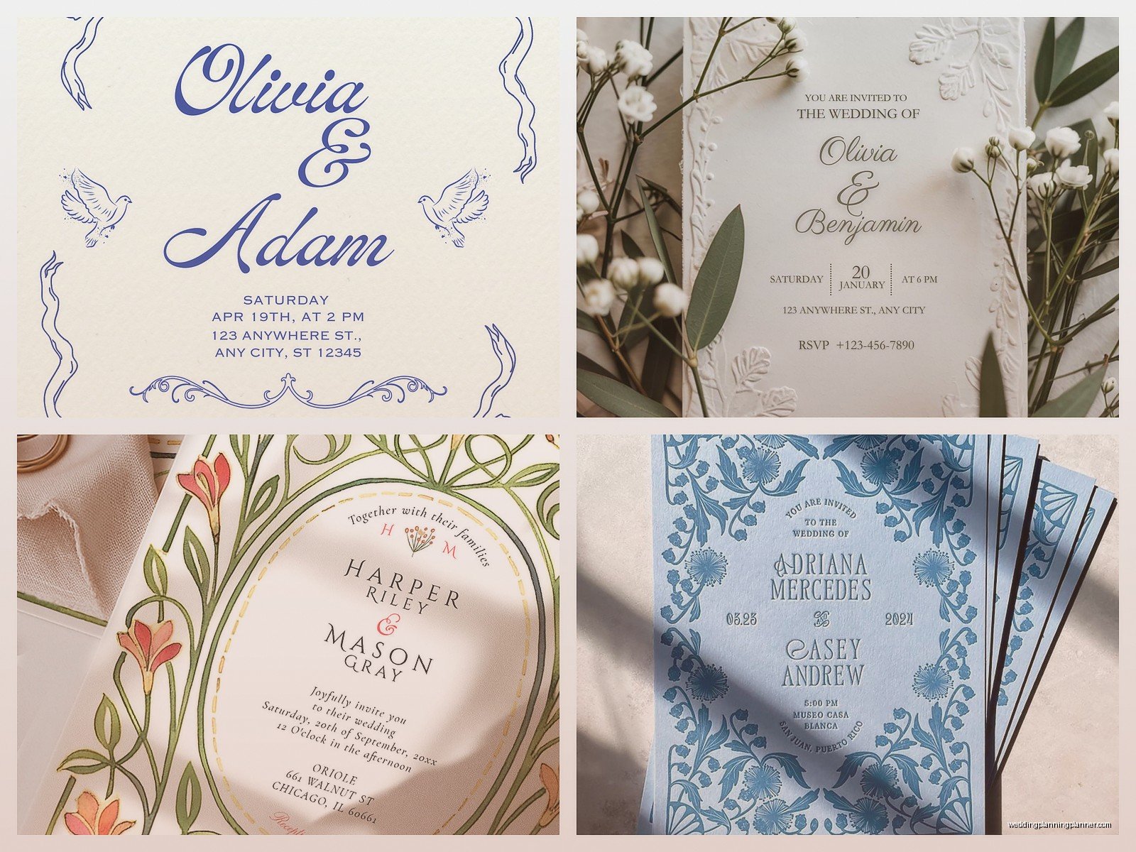
Start with your focal point. That’s usually the couple’s names. Make those bigger than everything else or at least give them breathing room. I typically do the names at about 150-200% the size of your body text. You can center them, you can offset them to one side, you can even split them with a graphic element in between. The point is they need to stand out immediately when someone opens that envelope.
The Classic Center-Aligned Stack
This is your traditional layout and honestly it works for like 70% of weddings. Everything’s centered, you’ve got your names at top or middle, then the invitation wording, then date and time, then venue. It’s clean, it’s readable, it reads top to bottom naturally. But here’s the thing – you gotta play with the spacing between elements or it’ll look like a grocery list.
I usually do bigger gaps before and after the names. Then a medium gap before the date. Venue information can be slightly smaller font size. If you’re doing a formal wedding this layout is your friend because it has that symmetrical, balanced, elegant feel that formal events need.
Asymmetrical Layouts That Don’t Look Messy
Okay this is where it gets fun but also where people mess up the most. Asymmetrical doesn’t mean random. You still need balance, just visual balance not literal centered balance. Think of it like… you know when you’re arranging furniture in a room? You wouldn’t put all the heavy stuff on one side. Same concept.
One layout I love is names on the left side, large and vertical-ish, with all the details aligned left on the right side of the card. Creates this cool L-shape with negative space in the bottom left corner where you can add a small graphic or just leave it empty. The empty space is actually doing work – it’s giving your eye a place to rest.
Another option is the diagonal flow. You start with element in top left, then each piece of info steps down and to the right, creating this descending staircase effect. Works really well with modern or contemporary weddings. Just make sure each “step” is clear and you’re not accidentally making people hunt for information.
Border Situations
Borders can either make or break your design and this is something that really annoys me because vendors will sell these templates with borders that are WAY too thick or busy. Your border should frame the content, not compete with it. I typically keep borders at like 1-3mm width max for a standard 5×7 card.
You can do a simple single line border about 10mm in from the edge. You can do a double line border with like 2mm between the lines. You can do corner elements instead of a full border – like little decorative bits in just the four corners. For garden weddings or outdoor venues, botanical corner elements work great.
Oh and if you’re doing a border with a pattern, make sure it’s not so detailed that it looks muddy when printed. I learned this the hard way with a lace pattern border that looked gorgeous on screen but printed as just… gray fuzz basically. That was summer 2021 and I still cringe thinking about the reprint costs.
Text Blocking and Panels
This is where you divide your card into sections visually. You might have a colored panel or shape behind certain text elements. Like the date and time could sit in a soft colored rectangle while everything else is on the white background. Creates visual interest and helps organize information.
You can also do text blocking with different text alignments – maybe your names are centered but your venue details are left-aligned in the bottom corner. Mixing alignments sounds chaotic but if you do it intentionally it actually creates a really dynamic look.
One thing I do a lot is put the ceremony and reception details in separate visual blocks if they’re at different locations or times. Makes it instantly clear that these are two different things happening. You’d be surprised how many guests get confused when everything runs together in one paragraph.
Playing With Orientation
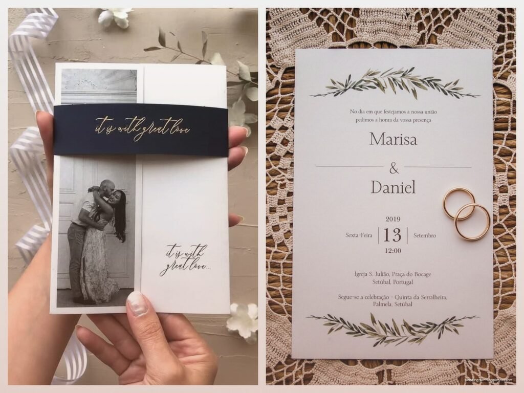
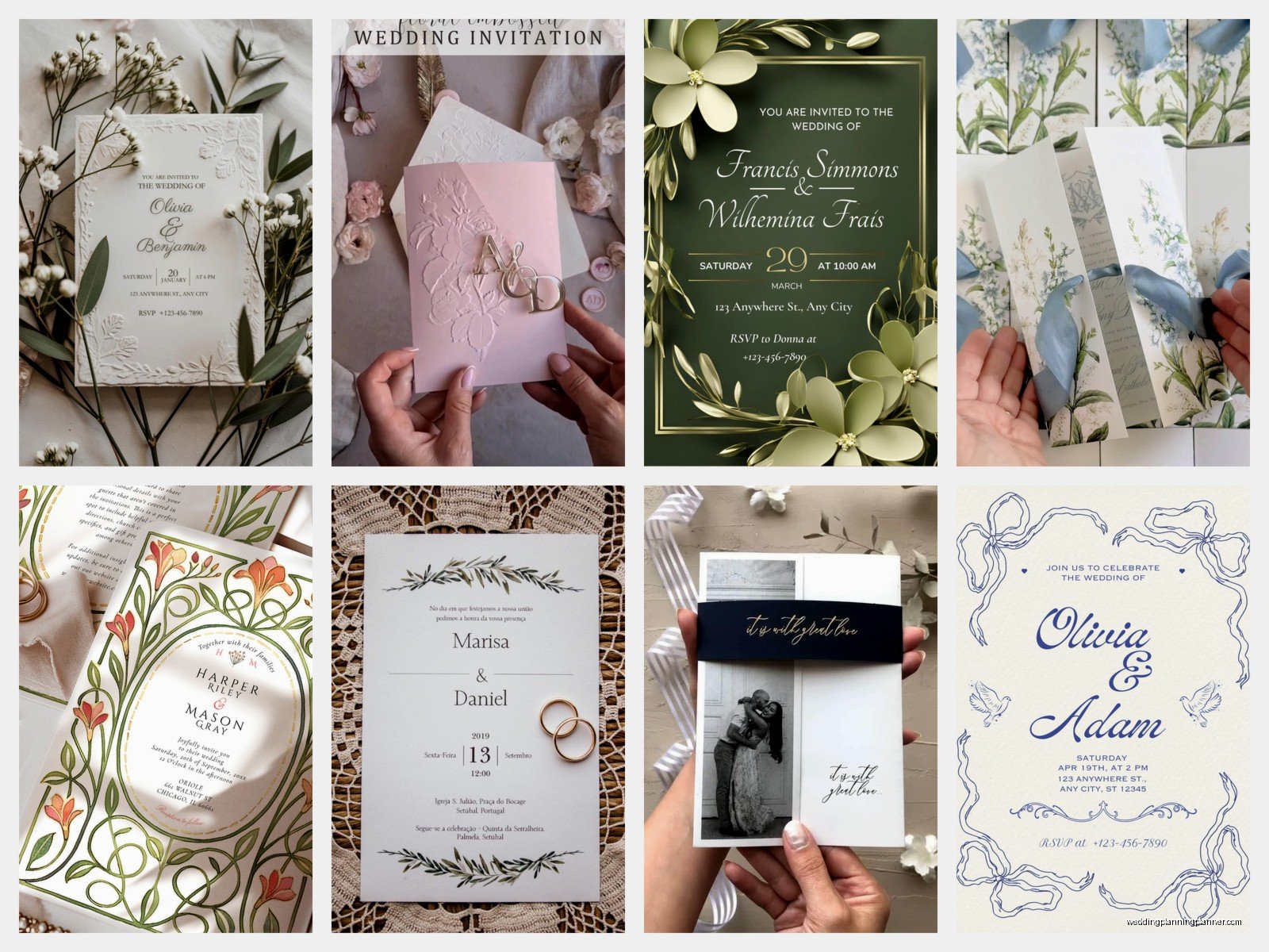
Most people default to vertical cards but horizontal can be really striking. It’s unexpected, it stands out in a stack of mail, and it gives you this wide canvas to work with. Horizontal layouts work especially well when you’ve got a landscape photo or illustration you want to incorporate, or when you’re doing that left-right split I mentioned earlier.
Square cards are another option though heads up they require extra postage usually. But they’re kinda trendy right now and they give you this perfectly balanced space that’s neither tall nor wide. I find square formats work really well for minimalist designs or when you’re featuring a monogram or crest as the central element.
Layering and Dimension
Okay so this isn’t strictly layout but it affects how your layout reads. You can layer different paper stocks – like a vellum overlay with just the names, placed over the main invitation with all the details. Or a belly band that wraps around the middle. Or a tag attached with ribbon that has the website or extra info.
These physical layers create depth and make people interact with your invitation, which means they’re more likely to actually read everything. Just don’t go overboard because if I need instructions to open your invitation, that’s a problem.
Grid-Based Designs
For modern or minimalist weddings, a grid layout is *chef’s kiss*. You’re basically dividing your card into equal sections – could be 2×2, could be 3×3, whatever works. Then you place different elements in different grid squares. Maybe names take up the top two squares, date and time are in the middle left, venue is middle right, and bottom squares have small details or stay empty.
The grid gives you structure but also flexibility. And it naturally creates that clean, organized, contemporary feel. I use this layout a lot for couples getting married at art galleries or modern venues where the aesthetic is very clean-lined and architectural.
Circular and Curved Layouts
Instead of everything being in straight lines, you can arrange text in curves or circles. Like text that curves around a circular monogram in the center. Or information that flows in an S-curve down the card. This works great for romantic, whimsical, or garden weddings.
The trick with curved text is making sure it’s still readable. Don’t curve it so dramatically that people have to turn the card sideways to read it. Gentle curves. Subtle arcs. And usually you wanna curve decorative text or short phrases, not your full venue address because that’s just gonna be frustrating to read.
Negative Space Is Your Friend
I cannot stress this enough and it’s something I literally have to tell clients every single week. White space (or negative space if your background isn’t white) is not wasted space. It’s breathing room. It’s elegance. It’s how you keep your design from looking like a cluttered mess.
A good rule is that at least 30-40% of your card should be empty space. That sounds like a lot but trust me it makes everything else more readable and more impactful. My cat literally walked across my keyboard while I was designing an invitation last month and accidentally deleted half the elements and honestly? It looked better with more empty space.
Typography Mixing
You can use different fonts for different elements but keep it to 2-3 fonts maximum. Usually I do one script or decorative font for names, one clean serif or sans-serif for body text, and maybe one more accent font if needed. More than that and it starts looking ransom-note-ish.
Make sure your fonts have enough contrast – like don’t pair two similar serif fonts together because they’ll just look like you couldn’t decide. Pair a romantic script with a clean modern sans-serif. Or a bold geometric font with a delicate thin serif. You want them to complement each other but be clearly different.
Information Hierarchy Tricks
Some info is more important than other info and your layout needs to show that. Names and date are top priority – those should be biggest and most prominent. Venue is next. Then time, then reception details if separate, then dress code or website at the smallest size.
You can also use color to create hierarchy. Maybe your names are in a darker or colored ink while everything else is in a lighter gray. Or vice versa. Just make sure there’s enough contrast that everything is still readable. I’ve seen invitations where they used light pink text on white paper and like… why would you do that to your guests’ eyes.
Illustration and Photo Integration
If you’re incorporating custom illustrations or photos, they need to be part of the layout from the start, not just slapped on top of text at the end. The illustration might form a border, or sit behind text as a watermark, or occupy one section of a divided layout.
For venue illustrations, I usually place them either at the top as a header image with text below, or at the bottom as a footer with text above. Sometimes in the background very light and faded with text overlaid. Depends on how detailed the illustration is – more detailed means it probably needs its own space, simpler line drawings can sit behind text okay.
Practical Considerations That Affect Layout
Your printer needs bleed area – that’s usually 3mm on all sides that gets trimmed off. So don’t put important text or design elements right at the edge or they’ll get cut. Keep everything at least 5mm in from where the card will be trimmed.
Think about your envelope size before you finalize dimensions. Standard sizes are cheaper to mail and easier to find envelopes for. If you’re doing a custom size, budget extra for custom envelopes and possible additional postage.
Also consider how the card sits in the envelope – when someone opens it, what do they see first? That should probably be your names or a striking graphic element, not like… the RSVP deadline in small text.
Special Situations and Variations
For bilingual invitations, you might need to adjust your layout to accommodate two languages. You can do side-by-side columns, or one language on front and one on back, or both languages in the same space with one slightly smaller. Just make sure both are readable and neither looks like an afterthought.
Destination weddings might need more info than local ones, so you might need a two-card suite where one card has the invitation and one has travel details. Or a folded card that opens to reveal more space inside.
If you’re including a lot of events over a weekend, consider a schedule card as a separate piece rather than trying to cram it all onto the invitation. Your invitation should have the ceremony details clearly, everything else can be on inserts or a website or whatever works but don’t sacrifice readability trying to fit everything on one card because your guests will just get confused and then you’ll get a million questions and honestly that’s way more annoying than just adding another card to the suite in the first place