Planning Guides, Style Guide
Invitation Samples: Design Examples & Inspiration
Mar
Okay so invitation design samples and where to actually find good inspiration
Look, I’ve been doing this for almost two decades and the number of times someone sends me a Pinterest board with like 47 different invitation styles saying “I want something like all of these” is… honestly it’s a lot. So let me just break down how to actually look at invitation samples in a way that’s gonna help you make decisions instead of just drowning in pretty pictures.
First thing – when you’re looking at invitation samples, you gotta separate the design elements from the vibe. I learned this the hard way back in spring 2023 when a bride showed me this gorgeous letterpress suite with botanical illustrations and said she wanted “exactly that” but then also wanted her invitations to be modern minimalist. Those are like, opposite things? So we had to sit down and figure out what she actually responded to in that sample – turned out it was just the sage green color, not the ornate florals at all.
Breaking down what you’re actually looking at
When I show clients invitation samples, I make them tell me specifically what they like because “it’s pretty” doesn’t help anyone. Here’s what actually matters:
- Typography – is it script, serif, sans-serif, or that trendy mixed font situation
- Layout – centered, asymmetrical, lots of white space, or text-heavy
- Color palette – and I mean the actual colors not just “romantic” or whatever
- Printing method – digital, letterpress, foil stamping, thermography
- Paper texture – smooth, cotton, linen weave, recycled
- Embellishments – ribbons, wax seals, vellum overlays, envelope liners
Once you know which of these elements you’re drawn to, finding samples that actually match your vision becomes way easier.
Where to find samples that aren’t just the same stuff recycled
Pinterest is fine I guess but it’s kinda become this echo chamber where everyone’s copying everyone else. I was looking for inspiration for a client last month and I swear I saw the exact same pampas grass invitation design like twelve times from different “designers.” What even is that.
Here’s where I actually look:
Minted and Paperless Post – yeah they’re mainstream but their filtering systems are actually good. You can search by color, style, printing method, and they show you the whole suite together which helps you understand how pieces work as a set. Plus they update their collections constantly so you’re seeing current design trends.
Independent stationery designers on Instagram – search hashtags like #weddinginvitation #custominvitations #weddingstationery but also look at the designers’ full portfolios. The thing that annoys me SO much is when people just save one pretty photo without understanding the designer’s whole aesthetic or if they even do custom work or just templates.
Etsy shops – but you gotta be careful here because quality varies wildly. Look at reviews, check if they show actual printed samples not just digital mockups, and read their production times carefully. I’ve had clients order from Etsy shops that looked amazing online and then receive… not great quality.
Real wedding features – sites like Style Me Pretty, Green Wedding Shoes, Junebug Weddings show invitations in context with the actual wedding. This helps you see how the invitation design connects to the overall event aesthetic which is honestly more important than people think.
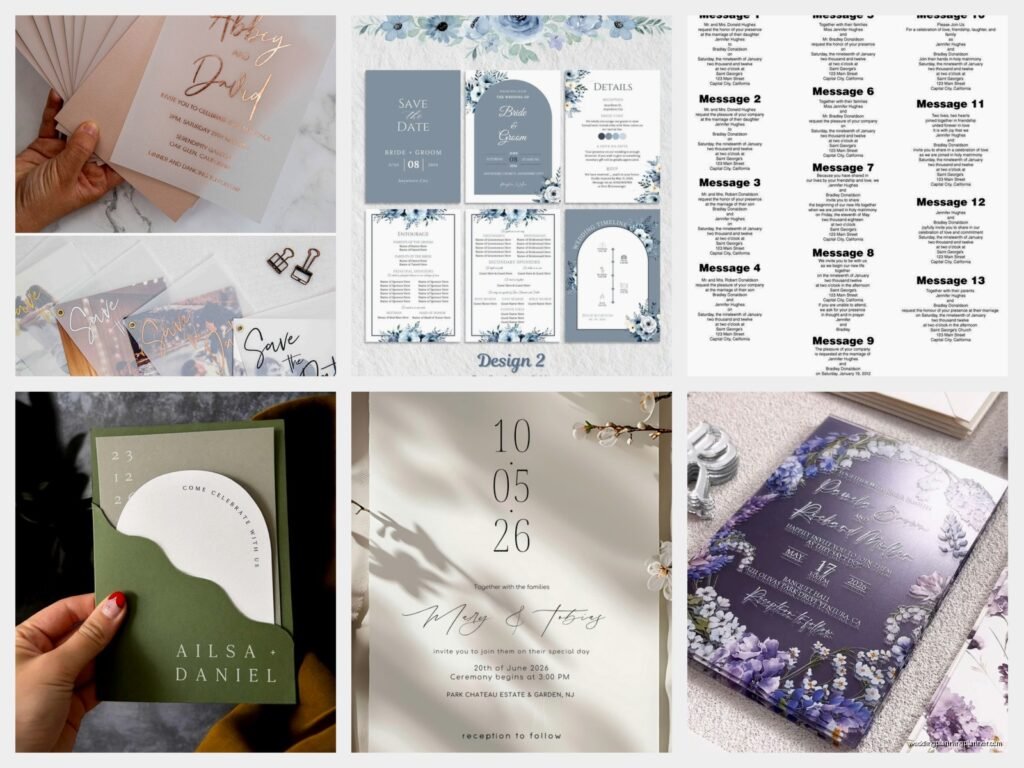
Design styles and what they actually look like
Alright so let me walk through the main invitation styles with actual descriptions because saying you want “elegant” invitations means absolutely nothing to a designer.
Classic formal
This is your traditional wedding invitation – think centered text, formal wording (the honour of your presence, that whole thing), usually black ink on white or ecru paper. Might have a simple border or monogram. The font is typically a serif like Garamond or a refined script like Edwardian. Printing method is often engraved or thermography to get that raised text effect.
These work for: church weddings, hotel ballrooms, country clubs, any venue where you’re wearing a full tuxedo not just a suit
Modern minimalist
Clean lines, lots of white space, sans-serif fonts or very simple serifs, usually one or two colors max. The layout might be asymmetrical or have unexpected spacing. Sometimes there’s a geometric element or a single line drawing. It’s all about restraint – what you leave out matters as much as what you include.
I did a suite in summer 2021 that was just black text on white paper with one thin gold line and the couple was worried it was too simple but it ended up being so striking. Sometimes less really is… okay I know that’s cliché but it’s true with invitations.
Botanical and garden
This is probably the most popular style right now – illustrated or watercolor florals, greenery, sometimes herbs or wildflowers. The florals can be realistic or more artistic and abstract. Usually paired with script fonts and earth tones or jewel tones. Can range from delicate and subtle to very bold and colorful.
The key with botanical designs is making sure the florals don’t overwhelm your text. Your guests need to actually read the invitation, not just admire the pretty flowers.
Romantic and whimsical
Soft colors like blush, lavender, sage green, lots of script fonts, often with ribbons or silk details, maybe some gold foil accents. The overall feeling is dreamy and feminine. Layouts tend to be flowing rather than rigid, with text that curves or follows organic shapes.
This style can go wrong really fast if you add too many elements – like if you’ve got a script font AND a floral border AND a ribbon AND a wax seal AND vellum overlay, it becomes too much. Pick like two or three special elements max.
Rustic and natural
Kraft paper, woodgrain textures, twine, burlap (though please, we can retire burlap now), handwritten-style fonts, earth tones. This style works for barn weddings, outdoor venues, casual celebrations. The vibe is organic and unpretentious.
Just… be careful this doesn’t look cheap. Quality kraft paper and good printing can look intentionally rustic, but low-quality materials just look like you didn’t wanna spend money on invitations.
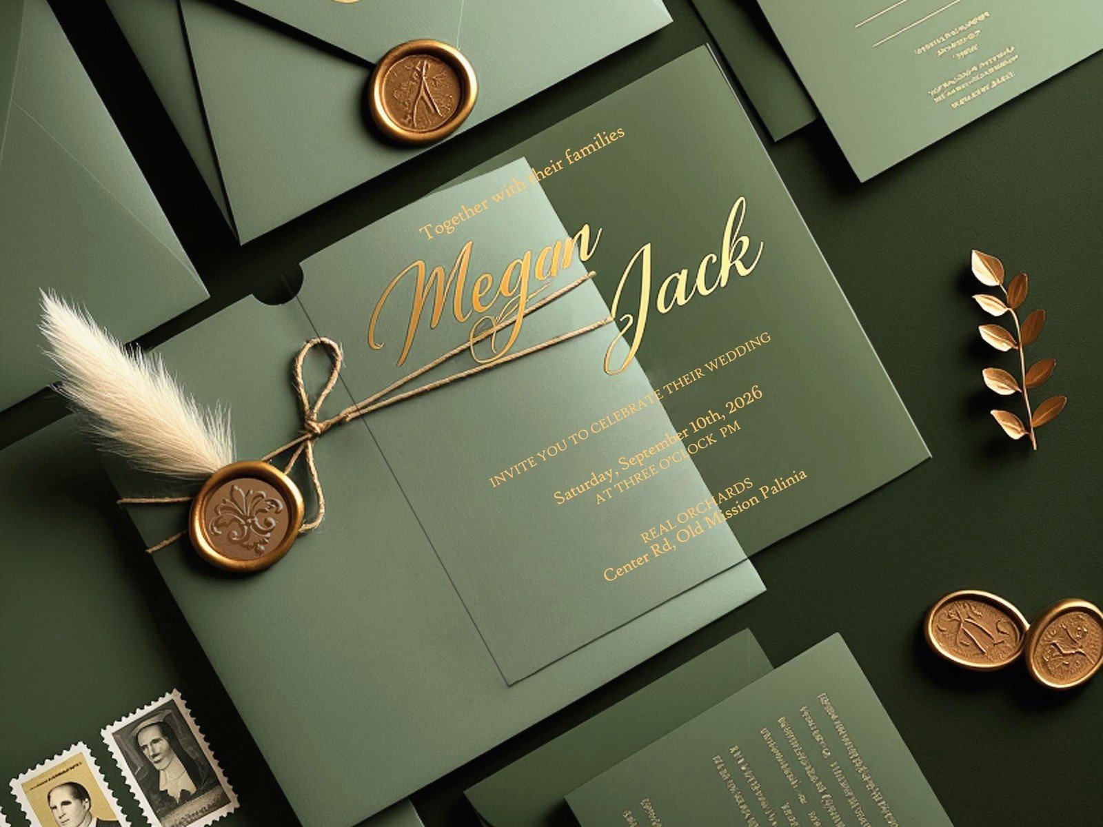
Art deco and vintage
Geometric patterns, gold and black color schemes, fan shapes, strong lines, fonts inspired by the 1920s-1940s. This works beautifully for historic venues, gatsby-themed weddings, or if you just love that era’s aesthetic. Foil stamping is pretty much essential for this style to really shine.
Bold and contemporary
Unexpected color combinations, mixed fonts, graphic elements, modern art influences, maybe some abstract shapes or color blocking. This is for couples who want their invitations to feel more like art prints than traditional stationery. You can play with size, orientation, unconventional materials.
Looking at full suite samples not just the main invitation
Okay this is important – when you’re browsing samples, try to find examples that show the complete suite, not just the main invitation card. A full suite typically includes:
- Main invitation card
- RSVP card and envelope
- Details card (accommodations, website, dress code)
- Envelope (with addressing)
- Envelope liner (optional but nice)
- Belly band or ribbon to hold it together
And honestly some couples also do save the dates, programs, menus, place cards, thank you cards in the same design. Seeing how a designer carries the visual theme across multiple pieces is really helpful.
My cat just knocked over my coffee while I’m writing this which is honestly perfect timing for a break but anyway –
How to use samples to communicate with your designer or stationer
When you meet with a stationer or designer, don’t just show up with a pile of screenshots. I’ve had consultations where people show me their phone and just keep scrolling and scrolling and I’m like okay but what specifically are we looking at here.
Instead, organize your samples into categories. I usually tell clients to create folders or boards like:
- “Fonts I love”
- “Color palettes”
- “Overall vibe”
- “Specific details” (like a wax seal example or an envelope liner pattern)
- “Definitely not this” (showing what you don’t like is actually super helpful)
And then be ready to articulate why you saved each sample. “I like this one because of the way the names are displayed” or “I want our invitations to feel as formal as this example” or “I love this color combination but not the fonts.”
Understanding printing methods through samples
This is something people don’t think about until they’re already committed to a design, but the printing method dramatically affects the final look and cost. When you’re looking at samples, try to identify what printing method was used:
Digital printing – most affordable, can do full color easily, good for photos or complex designs, but the ink sits on top of the paper so there’s no texture. This is what most online template companies use.
Letterpress – creates an impression in the paper, very tactile, traditionally done in one or two colors, has that luxury feel. It’s expensive and takes longer to produce but if you want that pressed-into-the-paper effect, there’s no substitute.
Foil stamping – shiny metallic foil pressed onto paper, comes in tons of colors (gold, rose gold, silver, copper, colored foils), adds instant elegance. Can be pricey depending on how much foil coverage you want.
Thermography – raised printing that mimics engraving but costs less, the text is actually raised up off the paper and has a shiny finish. It’s a good middle-ground option for formal invitations.
Engraving – the most traditional and expensive method, text is carved into a metal plate and pressed into paper, you can feel it on the back, creates a very crisp impression. This is what old-school formal invitations used.
When you’re saving sample images, try to find ones that specify the printing method or at least show close-up photos where you can see the texture and dimension.
Color and paper samples you need to see in person
Here’s the thing that trips everyone up – colors look completely different on screen versus printed. I cannot stress this enough. That blush pink you fell in love with on Pinterest might print as salmon or peach or dusty rose depending on the paper and printing method.
Most professional stationers will send you paper samples before you commit. If you’re ordering online, many sites offer sample packs for like $5-10. Get them. Touch the paper, see the colors in natural light and indoor light, check the weight and texture.
Paper weight matters more than people realize. Lightweight paper feels cheap even if the design is gorgeous. For wedding invitations, you want at least 100lb cover stock, but 120lb or heavier feels more substantial. Enclosure cards can be lighter.
Envelope addressing styles to consider
Something people forget about when looking at invitation samples is the envelope addressing, but it’s literally the first thing your guests see. Options include:
- Digital printing directly on envelopes – clean and modern, most affordable
- Calligraphy (hand or digital) – traditional and elegant, adds a personal touch
- Printed labels – practical but can look less formal
- Guest addressing printed on RSVP envelopes – saves you time and looks professional
When you’re browsing samples, pay attention to envelope styles. Are they pointed flap or square flap? Lined or unlined? What color? These details contribute to the overall impression.
Budget reality check with samples
Okay so this is the part where I have to be real with you – that gorgeous letterpress suite with custom illustrations, hand-torn edges, silk ribbon, wax seals, and calligraphy addressing? That’s probably $15-25 per invitation, maybe more. And you need to order for every household, plus extras.
When you’re collecting sample inspiration, keep track of which elements are splurges and which are standard. You can absolutely create a beautiful invitation on a budget, but you gotta prioritize. Maybe you do digital printing but add one special element like a colored envelope or simple belly band. Or you go with a template design but upgrade the paper quality.
I had a client once who spent months collecting samples of these incredibly elaborate invitations and then had a budget of $300 total for invitations for 150 guests and I was like… we need to have a conversation. We ended up doing a simple digital design on nice paper with DIY envelope liners and they looked great, but we had to let go of the letterpress dream.
Seasonal design considerations
When you’re looking at samples, think about your wedding date. A heavy velvet ribbon and deep jewel tones might look amazing for a winter wedding but feel wrong for a beach wedding in July. Similarly, bright florals and light colors are perfect for spring and summer but might not match a moody fall aesthetic.
Some design elements are seasonally flexible – modern minimalist, classic formal, and art deco styles can work year-round with the right color adjustments.
Template versus custom design samples
There’s a huge difference between customizable templates and fully custom designs, and you need to understand what you’re looking at in samples.
Templates allow you to change text, sometimes colors, maybe swap out some design elements, but the overall layout and structure is set. These are faster to produce, more affordable, and still look professional. Sites like Minted, Zola, and Paperless Post use this model.
Semi-custom means a designer has a portfolio of existing designs that they’ll adapt to your wedding – changing colors, adjusting layouts, maybe modifying illustrations. This is a middle ground.
Fully custom means starting from scratch based on your vision, creating original illustrations or designs specifically for you. This is the most expensive option and requires the longest lead time, but you get something completely unique.
When you’re saving inspiration samples, note whether you’d be okay with a template version of that style or if you really need something one-of-a-kind. That’ll help narrow down your vendor options and budget.
Red flags in invitation samples
Alright, some things to watch out for when you’re browsing samples:
- Text that’s too small to read comfortably – your 80-year-old grandmother needs to read this without a magnifying glass
- Too many different fonts – three max, and that’s pushing it
- Color combinations that clash or make text hard to read – light yellow on white, anyone?
- Overcrowded layouts with no breathing room
- Inconsistent alignment or spacing that looks accidental rather than intentional
- Low-resolution images or pixelated graphics
- Spelling or grammar errors in the sample (if a designer can’t proofread their own samples…)
Also, if you see a sample and your immediate reaction is “that’s fine I guess” rather than genuine excitement, keep looking. Your invitations set the tone for your whole wedding, so they should feel right, not just acceptable.
Coordinating with your wedding aesthetic
Your invitation doesn’t need to match your wedding decor exactly, but they should feel like they belong to the same event. If you’re having a black-tie ballroom wedding, your invitations shouldn’t look like they’re for a backyard BBQ, you know?
When collecting samples, also gather inspiration images from your venue, your color palette, your dress style, your overall wedding vibe. See how the invitation styles you like would fit into that bigger picture. Sometimes an invitation that’s gorgeous on its own doesn’t make sense for your specific celebration.
I’m gonna be honest, this is where a lot of couples get stuck because they fall in love with a design that doesn’t actually match their wedding plans, and then they either force it to work or end up starting over. Save yourself that headache by thinking holistically from the start.