Planning Guides, Style Guide
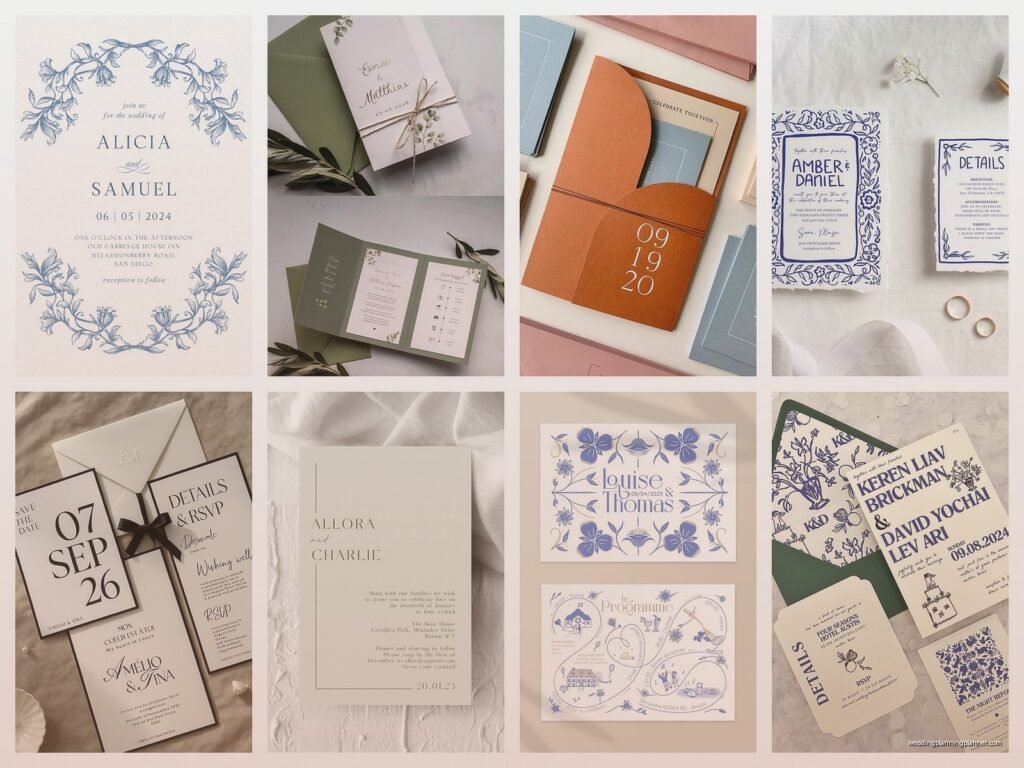
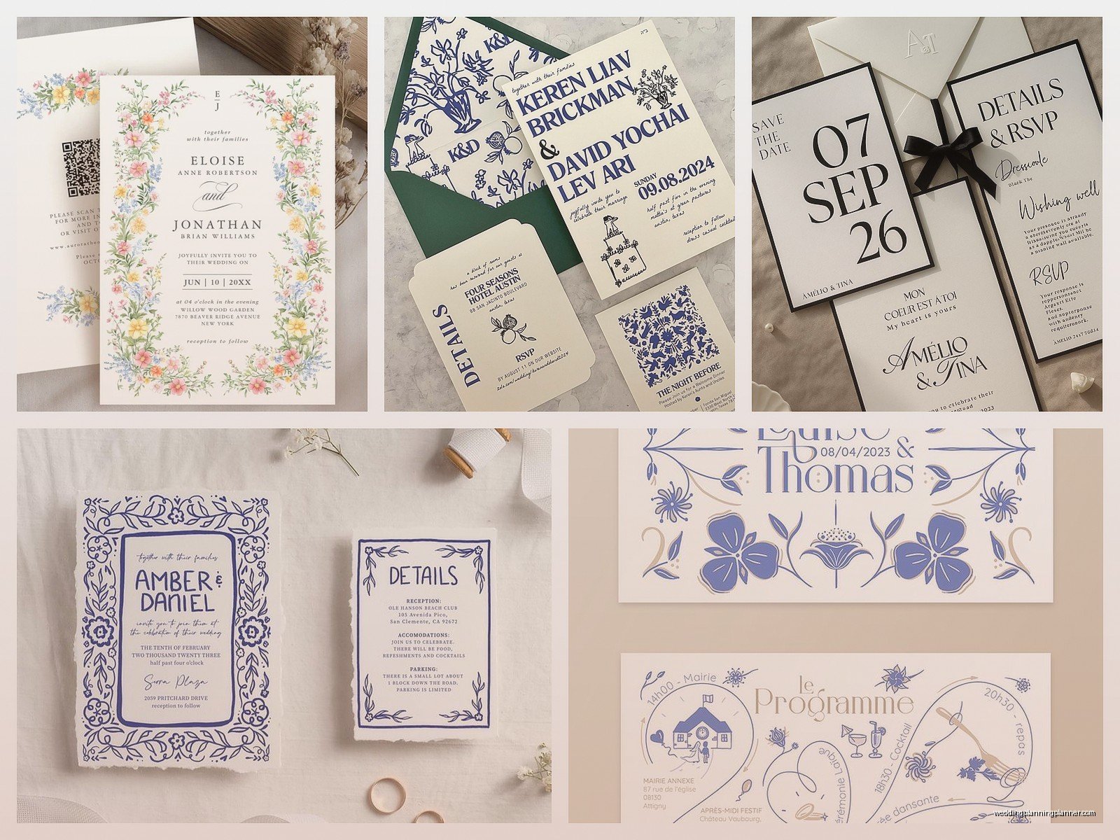
Wedding Invitation Layout: Design Composition Guide
Mar
okay so wedding invitation layout basics
The biggest mistake I see is people trying to cram everything onto one card because they think it looks “cleaner” or they’re worried about printing costs. Had this bride in spring 2023 who literally wanted her ceremony details, reception info, registry links, hotel blocks, AND a full weekend itinerary on a single 5×7 card and I was like… we need to talk about hierarchy here because your guests‘ eyeballs are gonna give up halfway through.
So here’s the thing about composition – you gotta think about it like layers of importance. The ceremony invitation is the star. Everything else is supporting cast. When I’m laying out an invitation suite, I start with what HAS to be on the main invitation card and what can live on insert cards.
what goes on the main invitation card
Your main invitation should include:
- Host line (who’s hosting – parents, couple, both families, whatever)
- Request line (the “request the honour of your presence” part)
- Couple’s names
- Date and time
- Venue name and city/state
- Reception to follow (if it’s at the same location)
That’s IT. Seriously. You don’t need directions, you don’t need dress code, you don’t need your wedding website URL taking up prime real estate. This annoyed me SO much last year when a groom’s mother insisted we put “Cocktail Attire Requested” in huge letters right under the couple’s names because she was worried people would show up in jeans. Like… we have insert cards for this exact reason, Margaret.
the visual hierarchy thing
When you’re looking at your invitation, your eye should travel in a specific path. Usually it goes: couple’s names (biggest), then date, then venue, then everything else gets smaller as it gets less critical. I use what I call the squint test – if you squint at your invitation from like two feet away, you should still be able to see the couple’s names and maybe the date. If you’re seeing the RSVP deadline or the hotel block info more prominently than the actual wedding date, something’s wrong with your hierarchy.
The couple’s names should typically be the largest text element. I usually set them at least 2-3 point sizes larger than the body text. For a standard invitation, if your body text is 11pt, names should be around 16-20pt depending on the font. But also it depends on whether you’re using a script font or serif or whatever because scripts take up more visual space.
spacing and breathing room
This is where people mess up constantly. You need WHITE SPACE. Or whatever color space if you’re doing a colored background. Your invitation shouldn’t look like a text document or a flyer for a yard sale. I generally leave at least a half inch margin on all sides, sometimes more if the design allows it.
Between different elements (like between the host line and the request line), you want around 0.15-0.25 inches of space. Between major sections (like between the couple’s names and the date/time info), go for 0.3-0.5 inches. These measurements sound super specific but they make a huge difference in readability.
My cat just knocked over my coffee which is perfect timing because I need a break from talking about margins anyway but also this is exactly why I don’t keep paper samples near my desk anymore.
the actual layout formats
There’s basically four standard layouts and you can mix them but here’s what I use:
Centered layout: Everything stacked in the middle. This is the most traditional and honestly the easiest to execute. All your text is center-aligned, you’re creating a vertical column of information. It’s clean, it’s classic, it works for like 90% of weddings.
Left-aligned modern: Everything aligned to the left side, usually with more breathing room on the right. This looks contemporary and works really well if you’re doing a minimalist vibe. The trick here is you can’t just left-align everything and call it done – you need to be really intentional about your line breaks and make sure nothing looks awkward or choppy.
Asymmetrical artistic: This is where you’re playing with different alignments and maybe putting some elements at angles or in unexpected places. Honestly this one’s harder to pull off and I only recommend it if you’re working with a professional designer because it’s really easy to make it look messy instead of artsy.
Formal crest or monogram top: You’ve got a monogram or family crest at the top, then everything else flows below it in a centered format. Very traditional, very formal, very “we’re getting married at a country club.”
fonts and how many is too many
Two fonts. Maybe three if you’re really pushing it and one of them is just for a small accent element. But generally, two fonts is the sweet spot. You want one font for the decorative stuff (names, maybe the request line) and one font for the information (date, time, venue, all that practical stuff).
Your decorative font can be a script, a serif with personality, whatever fits your vibe. Your information font should be READABLE. This isn’t the time to use that super trendy condensed font that looks cool but makes your venue address impossible to read. I usually go with a clean serif or sans serif for body text.
Also please don’t use more than two or three font sizes total. You’re not making a ransom note. You’re creating a cohesive design where some things are emphasized more than others but everything still feels like it belongs together.
the insert cards situation
Okay so insert cards are basically smaller cards that go in the same envelope as your main invitation and handle all the extra info. Here’s what typically goes on insert cards:
- Reception card (if reception is at a different location)
- Directions or map card
- Accommodations card with hotel blocks
- Weekend events card (for rehearsal dinner, day-after brunch, etc.)
- RSVP card with envelope
- Details card (dress code, website, registry info)
These should all match your main invitation in terms of design style but they don’t have to be identical. I usually keep the same color palette and fonts but maybe the layout is simpler or I’m using the accent color more prominently.
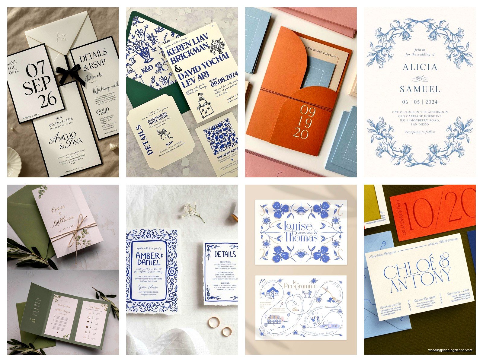
Insert cards are typically smaller than your main invitation. If your invitation is 5×7, inserts might be 4.5×6 or 4×6 or even smaller depending on how much info they need to convey. The RSVP card is usually the smallest because it just needs names and checkboxes basically.
the envelope addressing thing
This kinda ties into layout even though it’s not technically the invitation itself. Your envelope addressing should match the formality and style of your invitation suite. If you’ve got this super formal black tie invitation with calligraphy fonts, you probably shouldn’t be printing addresses in Helvetica on the envelopes.
Options for envelope addressing:
- Professional calligraphy (gorgeous but expensive)
- Digital calligraphy printing (looks hand-done but costs less)
- Printed addresses in a nice font that matches your suite
- Labels if you’re going casual or modern
The return address goes on the back flap usually, and it should be smaller and less prominent than the recipient address on the front. Sometimes I put a little monogram or design element on the back flap too if there’s room and budget.
borders and frames and decorative elements
You don’t NEED a border. Like genuinely you don’t. A lot of invitations look cleaner without them. But if you’re gonna use one, make sure it’s not competing with your text for attention. The border should frame the information, not overwhelm it.
I usually keep borders pretty simple – maybe a thin line, or a subtle pattern, or a delicate botanical illustration. What drives me crazy is when someone wants this thick ornate border that takes up like an inch on all sides and then they’re surprised when there’s no room for the actual invitation wording. Physics, people.
Decorative elements like florals, geometric shapes, watercolor washes – these should enhance the composition but not distract from it. I usually place them strategically in corners or along edges where they fill empty space without covering up text. Sometimes I’ll put a small motif between sections as a divider but it needs to be subtle.
color and contrast basics
Your text needs to be readable which sounds obvious but you’d be surprised. I had a bride in summer 2021 who wanted pale yellow text on a white background because “it’s so soft and romantic” and I had to be like… your 80-year-old grandmother is not gonna be able to read this, neither is anyone over 40 or anyone in slightly dim lighting or…
General rule: you want high contrast between your text and background. Dark text on light background or light text on dark background. If you’re doing colored text, make sure it’s dark enough to read. Navy blue, deep burgundy, forest green – these work. Pale pink, light gray, soft lavender – these make your invitation look pretty in photos but impossible to read in person.
If you’re doing a colored or patterned background, you might need to add a semi-transparent overlay behind your text to make it pop. Like a white box with 80% opacity behind your black text if you’re printing over a floral pattern.
printing methods and how they affect layout
This actually matters more than people think. Digital printing gives you the most flexibility – you can do full color, gradients, photos, whatever. It’s the most affordable and works great for most weddings.
Letterpress creates this gorgeous debossed impression but you’re limited in colors (usually 1-2) and you need to keep your design fairly simple. You can’t do tiny delicate details because they won’t press properly. Your layout needs to account for the fact that really thin lines might not show up well.
Foil stamping is similar – you’re adding metallic foil to specific elements. This works best as an accent, like foiling just the couple’s names or a border. You wouldn’t foil your entire invitation because it would be expensive and also kinda hard to read depending on the foil color.
Engraving is super formal and traditional, creates raised text, and like letterpress you’re usually working with fewer colors. It’s expensive so most people only do this for very formal or high-budget weddings.
common layout mistakes I see constantly
Putting too much information on one card – we covered this but seriously it’s the biggest issue. Your invitation is not a wedding website printed on cardstock.
Using too many different fonts or font sizes. It looks chaotic and unprofessional. Stick to your two fonts and three sizes max.
Not leaving enough margin space. Everything feels cramped and crowded. Give your design room to breathe.
Making the date or time too small. People need to know WHEN to show up. This should be prominent.
Using fonts that are hard to read. That super swirly script might look pretty but if your guests can’t figure out what it says, what’s the point.
Forgetting about the envelope size. You designed a beautiful 5×7 invitation but forgot that it needs to fit in an envelope with insert cards and now everything’s too tight.
the practical timeline stuff
Start working on your invitation layout at least 4-5 months before your wedding date. You need time for design, proofing, printing, addressing, and mailing. Invitations should go out 6-8 weeks before the wedding, so work backwards from there.
Get your wording finalized before you start worrying about layout. Knowing exactly what text you need helps determine how much space you’re working with. I’ve had clients change their wording three times during the design process and it’s frustrating because we keep having to rebalance the whole composition.
Order a printed proof before you do your full print run. What looks good on a computer screen might look different on actual paper. Colors can shift, fonts can appear larger or smaller, spacing might feel off. A physical proof is worth the extra cost and time.
working with different invitation sizes
Standard sizes are easier and cheaper to print and mail. The most common is 5×7 but you’ll also see 4×6, 5.5×8.5, and square formats like 5.5×5.5 or 6×6.
Larger invitations (like 7×9 or bigger) make a statement but they cost more to print and require extra postage. They give you more room for design elements but honestly unless you’re doing something really elaborate, you probably don’t need that much space.
Smaller invitations (4×6 or smaller) work for casual weddings or save-the-dates but they’re harder to layout because you’re really limited on space. You gotta be more minimal with your design and really prioritize what information is essential.
Square invitations look modern and cool but they require extra postage because they’re non-standard. Just factor that into your budget. Also some of them need to be hand-cancelled at the post office which is annoying but whatever.
digital vs physical layout considerations
If you’re doing digital invitations (which honestly more people are doing now), your layout rules are bit different. You’re designing for screens instead of paper so you need to think about how it looks on a phone vs a computer.
Digital invitations can be longer – you can scroll – so you’re not as constrained by physical card dimensions. But you still need good hierarchy and clear information. People skim even more on screens than they do with paper.
You can include interactive elements like buttons to RSVP or links to your website or registry. These should be clearly designed and easy to tap on a phone screen.
Colors look different on screens than in print. Screens are backlit so colors appear brighter and more vibrant. If you’re designing something that might be both digital and printed, test it in both formats because what looks good on your laptop might look washed out when printed.
Anyway I think that covers most of the important layout stuff. There’s obviously gonna be variations depending on your specific wedding style and cultural traditions and all that, but these principles apply pretty universally. The key is just making sure your invitation is readable, looks intentional rather than cluttered, and gives your guests the information they actually need without overwhelming them. Also proofread everything like seventeen times because typos on printed invitations are permanent and expensive to fix, trust me I’ve been there and it’s not fun explaining to a couple that we misspelled the venue name.