Planning Guides, Style Guide
Wedding Brochure Ideas: Complete Guide
Apr
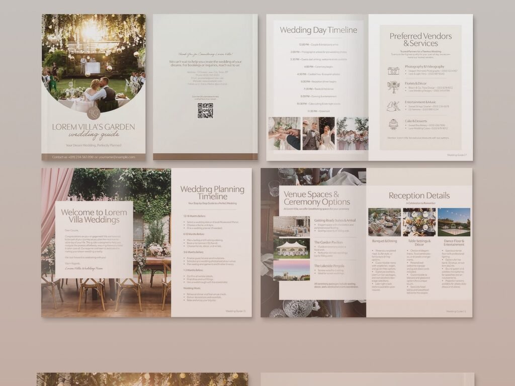
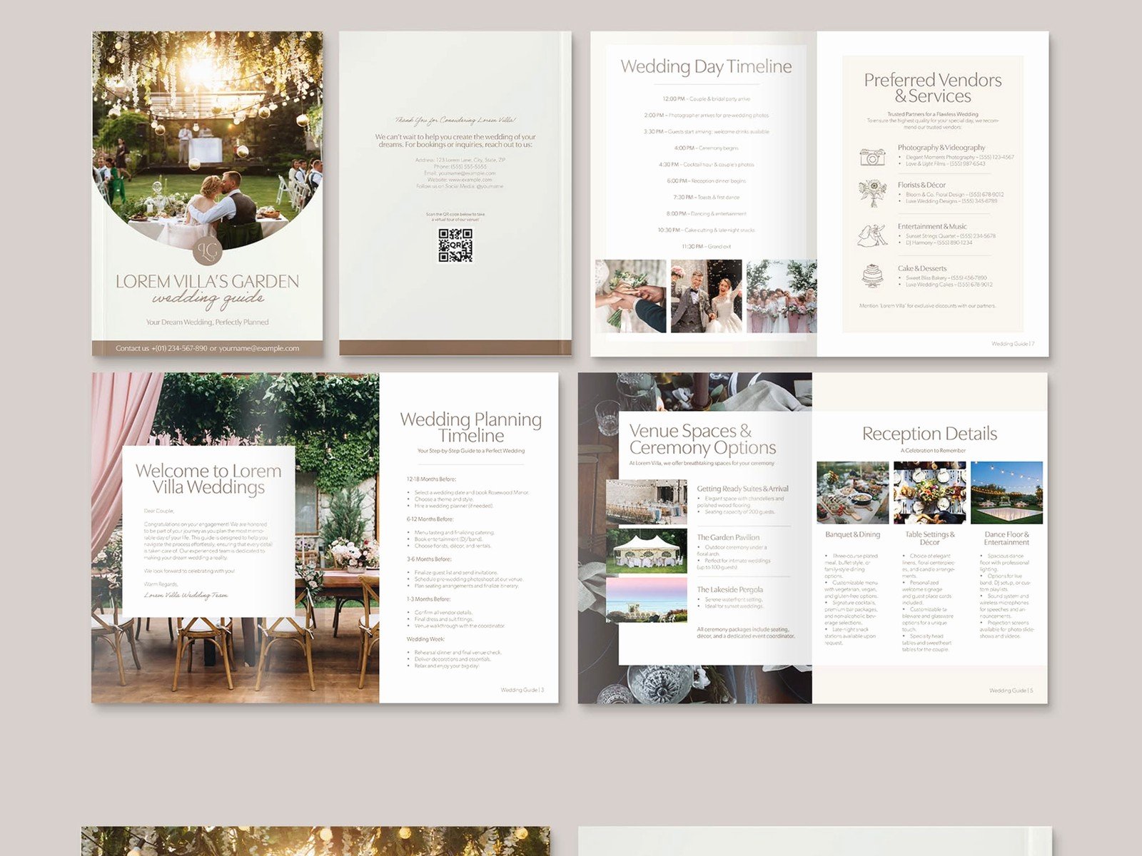
Basic Brochure Structure That Actually Works
Okay so wedding brochures are kinda like your first impression in paper form and honestly most people get them completely wrong. I’ve seen so many couples (and even some vendors, which drives me nuts) create these massive information dumps that nobody actually reads. Your brochure needs to answer the immediate questions someone has when they pick it up—where is this happening, when, what’s the vibe, and what do I need to know right now.
Start with the essential info on the front panel. Names, date, location. That’s it. You don’t need a love story on the cover. I had this couple back in spring 2023 who insisted on putting their entire “how we met” story on the front panel in 8-point font and I’m pretty sure half their guests needed reading glasses they didn’t bring. The brochure is not your memoir.
Front Panel Essentials
Your cover should have:
- Couple’s names (first names are fine, you don’t need the full legal situation)
- Wedding date
- City or venue name
- Maybe a simple graphic or your monogram
That’s literally all you need. Clean, readable, done. I use a lot of neutral cardstock with simple letterpress details because it feels expensive without actually being insane price-wise, but you can go with whatever matches your wedding aesthetic.
Interior Panels and What Goes Where
This is where people get scattered and start throwing information everywhere like they’re making a scrapbook. A tri-fold brochure gives you six panels total (front, back, and four interior). Use them strategically.
Panel 1 (inside left): Timeline of the day. Ceremony time, cocktail hour, reception start time, dinner service, dancing. Keep it simple. “5:00 PM – Ceremony begins” not “5:00 PM – We joyfully invite you to witness our sacred union as the sun sets over the mountains” like… we get it, it’s a wedding.
Panel 2 (inside center): This is prime real estate. Put your most important information here—usually venue details with the actual address, parking information, and maybe a tiny map if the location is tricky to find. I cannot tell you how many weddings I’ve worked where guests showed up an hour late because the brochure just said “The Barn at Willow Creek” without mentioning there are literally three different barns with similar names in that county.
Panel 3 (inside right): Dress code, hotel information, wedding website URL. This is also where you can mention if it’s an unplugged ceremony (though honestly that ship has kinda sailed for most weddings now). Registry info if you must, but I usually recommend just putting “Registry information available on our website” because listing stores feels a bit… transactional for a ceremony brochure.
Back Panel Strategy
The back panel is weird because some people see it immediately and others never flip the brochure over. I usually put thank you notes here—acknowledging parents, the wedding party, or anyone who helped make the day happen. You can also use this space for a meaningful quote if you’re into that, but please nothing from Pinterest that’s been used 47,000 times. Or just leave it simple with a decorative element that matches your theme.
Design Elements That Don’t Make People Cringe
I’m gonna be real with you—I’ve seen some truly terrible wedding brochure designs. Like Comic Sans level bad. In summer 2021, right when weddings were coming back after COVID, I had a client who wanted to use six different fonts because she “liked variety” and I had to gently explain that variety in this context just means chaos.
Stick to two fonts maximum. One for headers, one for body text. Make sure they’re readable. This isn’t the time to use that super swirly script font that looks like cursive from 1852. Your grandmother needs to be able to read this without squinting.
Color Choices
Match your wedding colors but don’t go overboard. If your wedding colors are navy and blush, you don’t need to make the entire brochure navy with blush text (which would be completely unreadable anyway). Use your colors as accents. Navy text on cream paper with blush borders or decorative elements. Simple.
White or cream cardstock is your friend. It’s classic, it’s readable, and it doesn’t look cheap if you use decent paper weight. I typically recommend 80lb cover stock minimum—anything lighter feels flimsy and kinda defeats the purpose of having a nice brochure.
Information Architecture (Fancy Term for Organization)
Think about what questions guests actually have when they’re attending a wedding. They need to know:
- Where am I going
- What time do I need to be there
- What should I wear
- Where do I park
- Where should I stay
- What’s the schedule
Everything else is secondary. Your love story, your favorite memories, the meaning behind your venue choice—that’s all nice but it’s not essential information. Save it for the wedding website or don’t include it at all. People are there to celebrate with you, they don’t need a full backstory to do that.
One thing that really annoys me is when couples try to cram their entire wedding website into the brochure. You have a website. Use it. The brochure should direct people to the website for additional details, not try to duplicate everything. I saw someone try to include a full vendor list with contact information in their brochure once and it was like reading a phone book.
Practical Details People Forget
Transportation info is huge and almost everyone forgets it. If you’re providing shuttle service from hotels, say so. Include pickup times and locations. If there’s no shuttle and people need to drive, mention parking. Is it free? Is it valet? Is there a dirt lot where everyone’s gonna ruin their fancy shoes? These details matter.
Weather contingencies—if your ceremony is outdoors, mention the backup plan. “In case of inclement weather, ceremony will move to the indoor pavilion” or whatever. Don’t make people wonder if they should bring umbrellas or… actually yes, if there’s any chance of weather issues, tell people to bring umbrellas. My cat knocked over my coffee while I was working on a brochure last week and it made me think about how paper and liquid don’t mix, which is relevant for outdoor weddings I guess.
Dietary and Accessibility Information
You don’t need to list the full menu in the brochure, but if you’re doing a plated dinner, mention how guests can indicate dietary restrictions. Usually this is handled with RSVP cards, but a quick note like “Please indicate any dietary restrictions when you RSVP” is helpful.
Accessibility details are important. Is the venue wheelchair accessible? Are there stairs? Is there accessible parking? You don’t need to write an essay, just a simple statement: “The venue is fully wheelchair accessible with ramps and accessible restrooms” or whatever applies to your situation.
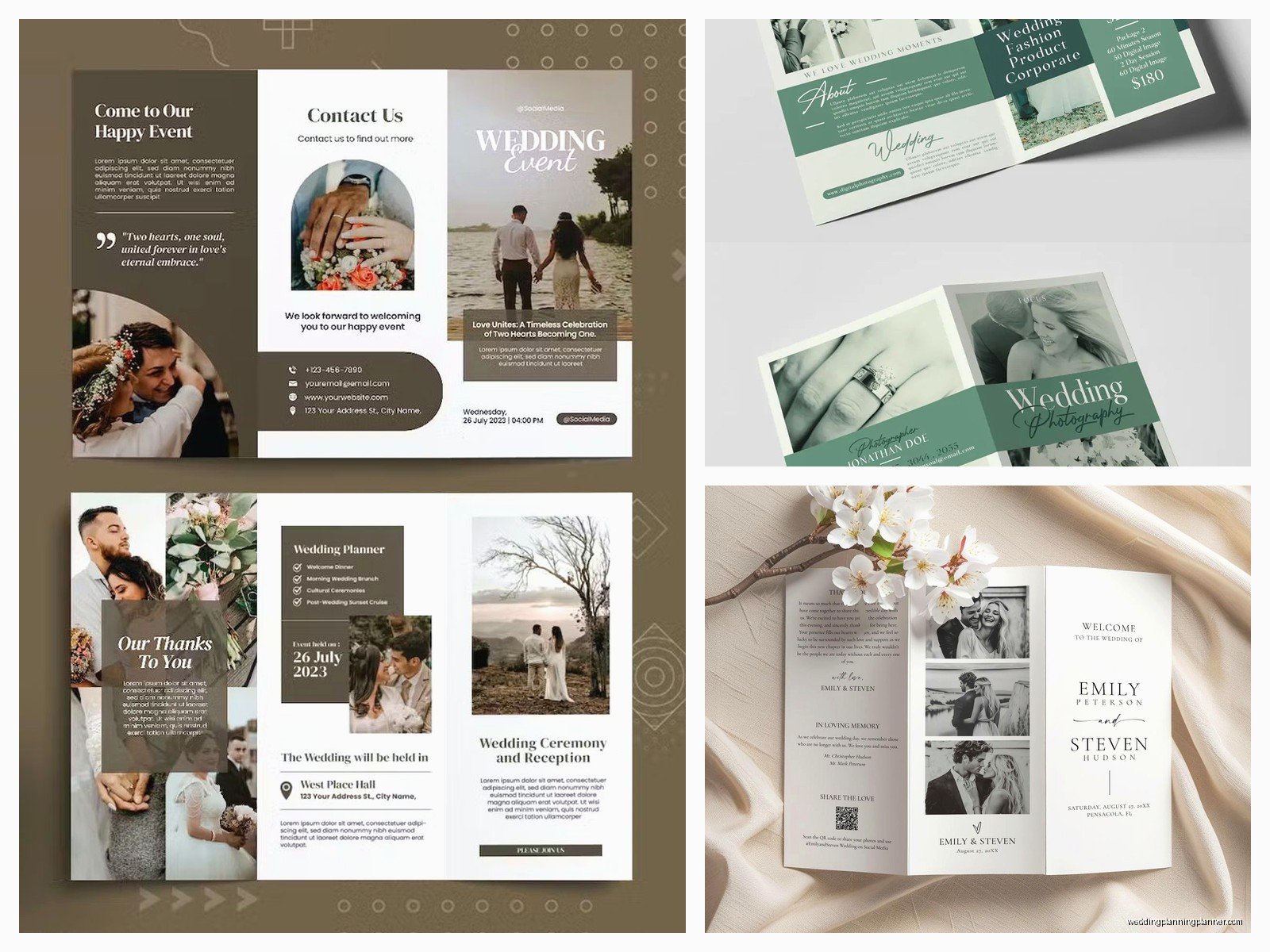
Size and Format Options
Tri-fold brochures are standard (8.5″ x 11″ paper folded in thirds) but they’re not your only option. You can do:
- Bi-fold (8.5″ x 11″ folded in half, gives you four panels)
- Z-fold (similar to tri-fold but folds like an accordion)
- Gate-fold (the two ends fold inward to meet in the middle, very fancy looking)
- Booklet style (multiple pages stapled or sewn together, good for destination weddings with lots of info)
I usually recommend tri-fold for traditional weddings and booklet style for destination weddings where you need to include travel information, local activities, and multiple venue details. Gate-fold looks expensive and impressive but it’s harder to fit in standard envelopes, so keep that in mind if you’re mailing these.
Printing Considerations
Do not print these at home unless you have a really good printer and you’re only making like 20 copies. Home printing always looks… home printed. The paper quality is different, the colors are off, and you can usually see where the fold lines are gonna crack the ink.
Professional printing is worth it. You can use online services (Minted, Vistaprint, Zazzle) or local print shops. Local shops are great because you can see paper samples in person and they can help with design if you’re stuck. Online services are usually cheaper for larger quantities.
Get samples before you order 200 copies. This is crucial. The colors look different on screen versus in print, and that gorgeous navy might turn out to be more of a… weird purple situation. Been there, fixed that.
Quantity Math
Order one brochure per family unit, not per guest. So if you’re inviting the Smith family of four, that’s one brochure. Add about 10% extra for mistakes, last-minute additions, and keepsakes. If you need 100, order 110.
What to Include vs. What to Skip
Include:
- Basic timeline
- Venue name and address
- Dress code
- Hotel blocks
- Website URL
- Transportation details
- Weather plan
- Contact person for day-of questions
Skip:
- Your entire dating history
- Detailed vendor credits (save that for social media)
- Explanation of every design choice
- Overly personal inside jokes
- Registry details beyond “see website”
- Complicated maps that nobody can read
Timing and Distribution
Brochures typically go out with your invitations, about 6-8 weeks before the wedding. You can also have extras at the welcome table for people who forgot theirs or didn’t receive one.
Some couples do a save-the-date brochure for destination weddings, which goes out way earlier (6-9 months before) and includes more travel planning information. That’s different from a ceremony brochure though—it’s more of an information packet.
For destination weddings, I actually recommend a welcome packet at the hotel that includes the brochure plus other local information. Restaurant recommendations, activity ideas, emergency contacts. But that’s getting into welcome bag territory which is a whole other thing…
Digital Alternatives
Not everyone needs a physical brochure honestly. If you have a detailed wedding website, you might skip printed brochures entirely and just include a card with your website URL in the invitation suite. This is especially practical for eco-conscious couples or if you’re trying to keep costs down.
You can create a digital brochure PDF that guests can download from your website. Make it mobile-friendly though—most people will pull it up on their phones the day of the wedding when they’re trying to remember what time cocktail hour starts. Design it vertically (portrait orientation) so it’s easy to read on a phone screen without zooming.
Common Mistakes I See All the Time
Too much text. Way too much text. Your brochure is not a novel. Use bullet points, short sentences, clear headers. White space is not your enemy—it makes information easier to process.
Unreadable fonts in unreadable colors. Light gray text on white paper. Yellow text on cream paper. That super ornate script font for everything including the address. Just… no.
Missing the actual important information while including lots of fluff. I’ve seen brochures with three paragraphs about how the couple loves autumn but no mention of where to park. Priorities, people.
Inconsistent information between the brochure, website, and invitations. If your invitation says ceremony starts at 5:00 and your brochure says 5:30, you’re gonna have confused guests. Double-check everything matches.
Not proofreading. Typos happen (clearly I’m not immune) but you really gotta catch them before you print 150 copies. Have someone else read it. Have multiple people read it. Check the venue address three times because GPS will take your guests to the wrong location if you transpose two numbers.