Planning Guides, Style Guide
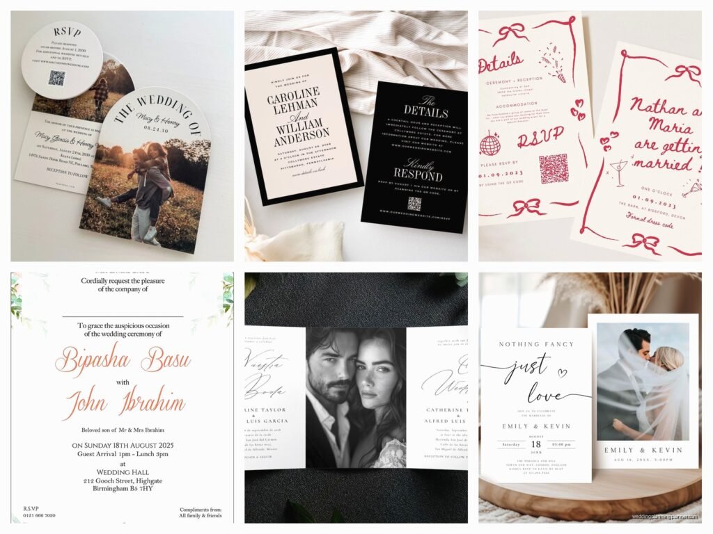
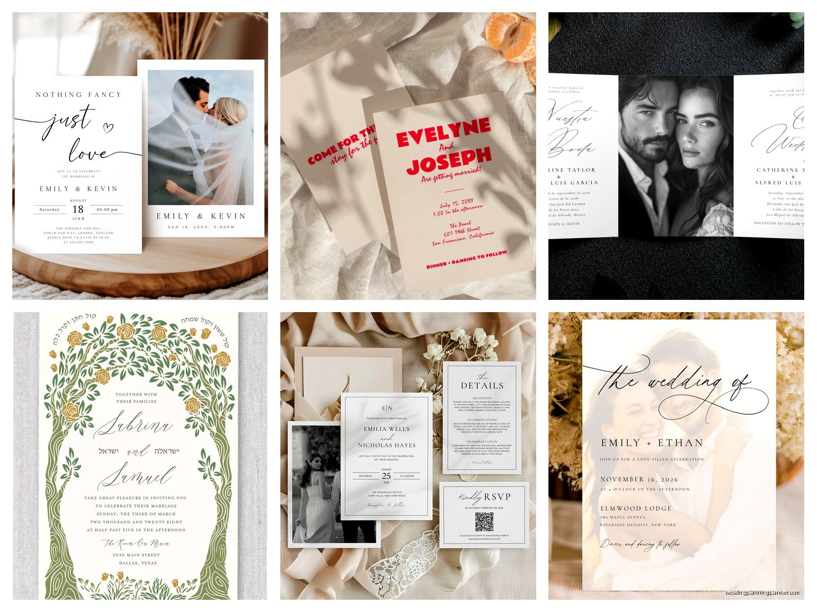
Double Sided Wedding Invitations: Two-Sided Print Designs
May
Why Double-Sided Invitations Are Actually Worth Considering
Okay so double-sided wedding invitations used to be kinda rare honestly, but now they’re everywhere and for good reason. You get twice the space without adding more pieces to your envelope suite, which means less weight (lower postage sometimes!) and fewer insert cards flying around. I had this bride back in spring 2023 who was adamant she needed like seven different insert cards and I was like… or we could just print on both sides of two cards and save you literally hundreds of dollars? She wasn’t convinced at first but once she saw the mock-up she got it.
The main thing with double-sided printing is understanding what actually works on each side. You can’t just slap random info on the back and call it done. There’s a strategy here that’ll make your invitations look intentional instead of like you ran out of room and panicked.
What Goes On Which Side (The Actual Layout Strategy)
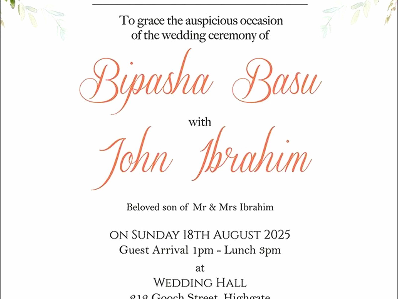
Front side is your main event obviously. This is where you put:
- Names of whoever’s getting married
- Date and time
- Venue name and city/state
- Reception to follow or whatever your situation is
The back side is where it gets interesting and where people mess up constantly. You’ve got options here and I’m gonna walk you through what actually makes sense.
Option One: All Your Details
This is probably the most common approach I see working well. Put your accommodations, wedding website, registry info (if you’re doing that), dress code, and maybe transportation details all on the back. It reads like a mini info sheet. The key is formatting it so it doesn’t look like a wall of text that nobody’s gonna read.
Use headers for each section. “Accommodations” as a little header, then the hotel block info underneath. “Join us online” or whatever cute phrase you want for your website. Keep paragraphs short—like two or three lines max per section.
Option Two: Ceremony Details on Back
If you’re having a Catholic mass or a longer ceremony with specific instructions (unplugged ceremony, anyone?), the back is perfect for this. I worked with a couple who had a full Hindu ceremony and needed to explain the timeline and what guests should expect. We put the basic invite info on front, then a sweet little “Our Ceremony” section on back that walked through the key moments. Guests actually loved this because they felt more prepared and less awkward about not knowing what was happening.
Option Three: The Illustrated Map or Venue Drawing
This one’s more design-heavy but looks absolutely gorgeous when done right. Custom illustration of your venue on the back, maybe with little labels for where parking is, where the ceremony vs reception spaces are, stuff like that. It’s decorative AND functional. Just make sure the illustration style matches your front design or it’ll look weird and disjointed.
Design Considerations That Actually Matter
Here’s what annoys me SO much about double-sided invitations: people forget that you’re gonna see both sides when you pull it out of the envelope, and if they don’t coordinate, it looks cheap. I don’t care how expensive your paper stock is.
Your back design needs to relate to the front somehow. Could be:
- Same color palette carried through
- A lighter version of the front pattern as a background
- Matching fonts (don’t introduce a totally new typeface on the back unless you really know what you’re doing)
- Complementary border or frame style
But also—and this is important—the back shouldn’t compete with the front. The front is the star. The back is the supporting actor who makes everything better but doesn’t steal the scene. So if your front is really ornate and detailed, keep the back simpler. If your front is minimal and clean, you can get away with more detail on the back.
Text Density Issues
Nobody wants to read a novel on the back of your invitation. I see this all the time where couples try to cram their entire love story, directions, three hotel options, the full wedding weekend schedule, and their dog’s name onto the back and it’s just… it’s too much. If you need that much information, you actually do need a separate details card or you should really be directing people to your website.
A good rule is that the back should have maybe 60-70% less text than the front maximum. Any more and you’re asking guests to work too hard.
Paper Stock Decisions For Two-Sided Printing
This is where you gotta think practically. Not all paper works well for double-sided printing.
Weight matters: You want at least 100 lb cover stock, preferably 110-130 lb. Anything lighter and you’ll get show-through where you can see the text from the other side bleeding through. It looks bad and unprofessional. I had a bride in summer 2021 who ordered from some online discount printer and didn’t check the paper weight—her invitations arrived and you could literally read the back side text through the front. We had to rush reorder everything three weeks before her wedding and she was a mess.
Finish options: Matte or eggshell finishes tend to work better for double-sided printing than glossy. Glossy can sometimes make the back side feel less important or make it harder to read depending on lighting. Plus matte feels more sophisticated for wedding invitations anyway in my opinion, but that’s a whole other conversation.
Texture considerations: If you’re going with a heavily textured paper like linen or felt, just know that really solid color blocks might not print as evenly on both sides. Lighter designs with more white space tend to work better on textured stocks. My cat literally just knocked over my coffee while I’m writing this, great timing.
Printing Methods And What Works Best
You’ve got three main printing options for double-sided invitations and they each have pros and cons that’ll affect how your design looks.
Digital Printing
Most affordable, works great for designs with lots of colors or photo elements. The quality has gotten really good in recent years. The main thing is making sure your printer can handle the paper weight you want—some digital presses max out at lighter weights. Turnaround is usually fastest with digital too.
Letterpress
Okay so letterpress on both sides is possible but it’s pricey because it’s literally two separate press runs. You print one side, let it dry, then run it through again for the other side. The registration (lining everything up) has to be perfect or it looks off. Beautiful results though if you’ve got the budget. That tactile impression on both sides feels really luxurious.
One thing though—you probably don’t want the same level of impression depth on both sides because the paper can only take so much before it starts to warp or the impressions interfere with each other. Usually people do a deeper impression on front and lighter on back.
Thermography
That raised printing technique that’s sort of between flat digital and letterpress in terms of cost. Works fine for double-sided but similar to letterpress, you’re doing two passes. The raised texture is only on the printed areas so your back side will feel different from blank spaces, which some people love and some people find distracting.
Formatting Text For The Back Side
The back of your invitation usually needs different formatting than the front because you’re conveying different types of information. The front is formal announcement style, the back is more like… practical details style.
You can break some of the formality rules on the back. It’s okay to use more casual language like “Join us for cocktails immediately following the ceremony” instead of the super formal wording. You can use bullet points or icons to organize information. You can even use slightly smaller font sizes—I usually go 1-2 points smaller than the body text on front.
Alignment-wise, you don’t have to center everything on the back just because the front is centered. Left-aligned text for a list of hotels? Totally fine. It actually reads easier that way.
Common Mistakes I See People Make
Putting critical information ONLY on the back with nothing pointing to it on the front. I’ve seen people put their RSVP deadline only on the back and then wonder why nobody responded on time. If something is important, either put it on the front or add a little note on the front like “Additional details on reverse” or something.
Using white text on a dark background for large blocks of text on the back. It’s hard to read and it feels like you’re trying too hard to be trendy. Small amounts of reverse text for headers? Fine. A whole paragraph? Nah.
Forgetting about the orientation. If your front is vertical, your back should also read vertically. Don’t make people rotate the card to read the back—it’s annoying and feels poorly planned.
Not leaving enough margin space. The back needs margins just like the front does, maybe even slightly larger margins since there’s usually more text. Nothing should be closer than half an inch from any edge, and three-quarters of an inch is even better.
Working With Your Printer On Double-Sided Jobs
You need to ask your printer some specific questions before you finalize your design:
- What’s your maximum paper weight for double-sided printing?
- How do you handle registration/alignment between sides?
- Is there a color shift between front and back? (Sometimes there is with digital printing)
- Do you require any specific file setup for two-sided jobs?
- What’s the turnaround time compared to single-sided?
Most printers want you to submit two separate files—one for front, one for back—clearly labeled. Don’t send them a two-page PDF and assume they’ll figure it out. Be explicit about which is which and if there’s a specific orientation they need to maintain.
Get a printed proof if at all possible, not just a PDF proof. You need to see how the paper handles the ink on both sides, whether there’s any show-through, and how the colors look in real life. This is especially important if you’re using darker colors or solid backgrounds.
When Double-Sided Doesn’t Make Sense
Real talk: sometimes you shouldn’t do double-sided printing. If your design is super minimal and you only have like three lines of text total, adding info on the back might actually make it feel cluttered when you don’t need to. Sometimes a single-sided invitation with separate detail cards is actually cleaner.
Also if you’re doing something really specialty like acrylic invitations or wood veneer or whatever trendy material, double-sided printing might not even be possible or might look weird with the material.
And if your budget is super tight, sometimes single-sided with all info on front (just formatted really well) is gonna be cheaper than paying for two-sided printing, depending on your printer’s pricing structure.
DIY Double-Sided Printing At Home
Look, I’m gonna be honest with you—printing double-sided invitations at home is possible but it’s annoying and the results are usually pretty obviously DIY. Home printers aren’t designed for heavy cardstock, so you’re limited to lighter weights which means more show-through potential. The color matching between your front and back is probably gonna be slightly off. And if you’re doing more than like 50 invitations, you’re gonna be there forever.
If you do go this route, get a printer that has a straight paper path (usually means a rear feed tray) so thick paper doesn’t have to bend through rollers. Test print on regular paper first to make sure your margins and alignment are right before you waste expensive cardstock. And buy extra paper because you WILL mess some up, that’s just how it goes.
Actually umm my friend did her own double-sided invitations for her micro-wedding last year and they looked pretty good because she kept the design really simple—just text, no complicated graphics—and used 80 lb paper instead of trying to force her printer to handle heavier stock. So it’s doable if you’re realistic about what you can achieve.
Envelope Coordination
One thing people don’t always think about is how the double-sided invite looks when someone first pulls it out of the envelope. Which side are they seeing first? Usually it’s the front obviously, but depending on how you insert it, they might catch a glimpse of the back immediately.
I like to insert double-sided invitations so the back is facing the envelope flap. That way when they open it and pull it out, they see the front first, then naturally flip it over to see there’s more information. It’s a better reveal than having the details side show first.
Also consider whether your envelope liner or envelope color complements both sides of your invitation. If the back has a different color scheme than the front, make sure your envelope choices work with both.
Cost Breakdown Reality Check
Double-sided printing usually costs more per piece than single-sided, but you’re saving money by not having additional insert cards. So you gotta do the actual math for your situation. Get quotes both ways—double-sided invitation vs single-sided invitation plus separate details card—and see which actually comes out cheaper.
In my experience, double-sided becomes more cost-effective once you’re printing more than about 75 invitations. Below that quantity, the setup fees for double-sided printing might make it more expensive than just adding an insert card. But every printer is different so definitely compare.
Don’t forget to factor in assembly time too. Fewer pieces means less time stuffing envelopes, which if you’re paying someone to do assembly or if your time is valuable, that matters. I’ve spent way too many evenings helping brides assemble invitation suites with like six different pieces and honestly one or two double-sided cards would’ve cut that time in half.