Planning Guides, Style Guide
Newspaper Wedding Program: Vintage News-Style Designs
May
Okay so newspaper wedding programs are having this huge moment right now
Like seriously, I’ve been doing this for almost two decades and the vintage newspaper-style program thing has exploded in the last couple years. Had this bride in spring 2023 who showed me a Pinterest board with literally 87 pins of newspaper programs and I was like okay we’re doing this but we’re gonna do it RIGHT because half of what you see online looks amazing in photos but is completely unreadable in actual church lighting.
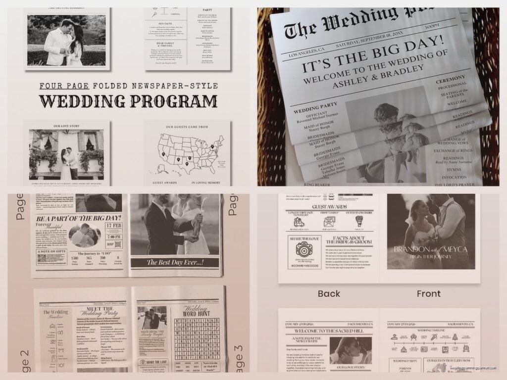
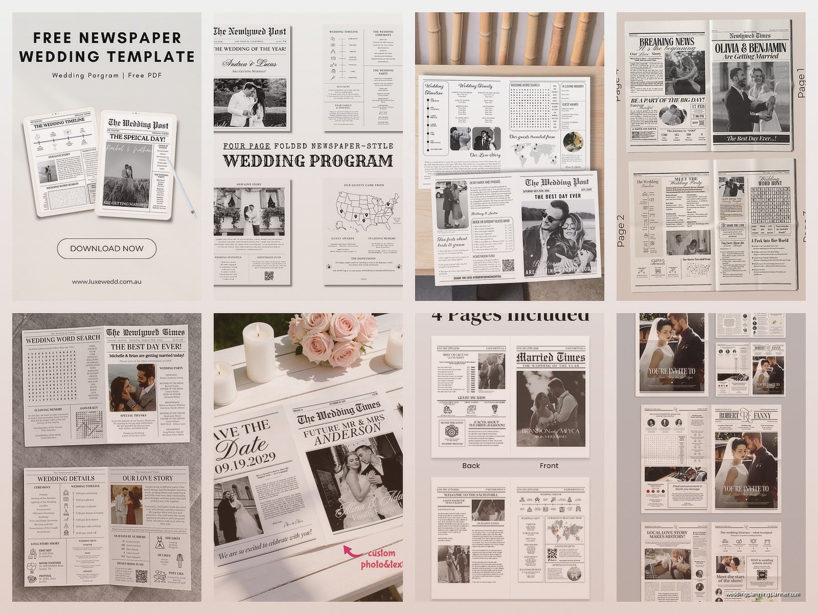
The whole concept is you’re making your wedding program look like an old-timey newspaper. Think 1920s-1940s vibes, that newsprint aesthetic, big bold headlines, multiple columns, maybe some vintage ads thrown in. It’s kinda perfect if you’re doing an art deco wedding, a Great Gatsby theme, or honestly just want something different from the typical folded cardstock program that everyone does.
What you actually need to get started
First thing – you gotta decide if you’re going full newsprint paper or just doing the design style on regular paper. Real newsprint is that thin, slightly gray paper that actual newspapers use. You can order it online from paper suppliers or sometimes print shops have it. But here’s what annoys me about newsprint: it smudges SO easily and if anyone has even slightly sweaty hands (which hello, it’s a wedding, everyone’s emotional and nervous), you’re gonna have ink all over their fingers and potentially their nice clothes.
I usually steer people toward a cream or ivory cardstock that’s maybe 80-100 lb weight, printed with that newspaper design. You get the look without the mess. But if you’re really committed to authenticity, go for the newsprint – just warn your guests and maybe have some napkins around.
Design elements that actually matter
The masthead is your headline area at the top. This is where you put something like “The Wedding Gazette” or “Hart & Miller Times” or whatever your names are. I had a couple do “Finally Married Weekly” which made everyone laugh. You want that old newspaper font – look for fonts like Blackletter, Old English, or Playfair Display for the masthead. Then the body text should be in something like Times New Roman, Garamond, or Courier because that’s what actual newspapers used.
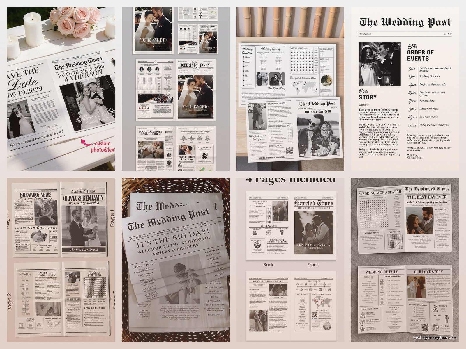
Column layout is everything. Real newspapers have 3-5 columns usually. For a wedding program, I recommend 2-3 columns max because you need it to be readable from where people are sitting. If you go too narrow with your columns, older guests are gonna struggle. My cat knocked over my coffee onto a program proof once and honestly it looked better with the coffee stain because it added to that vintage authentic vibe but anyway…
You want to include these classic newspaper elements:
- A dateline at the top (the city and date of your wedding)
- Volume and issue number (like “Vol. 1, No. 1” or make it meaningful – “Vol. 28, No. 14” if you’ve been together 28 years… wait that doesn’t work, you know what I mean)
- Fake little ads scattered throughout
- Headlines for each section instead of just boring labels
- Maybe a weather report or horoscope section if you have space
- Photo layouts with captions like newspaper photos
Content sections that work really well
Instead of just listing “Wedding Party” you make it a headline like “BREAKING: Local Woman Convinces Five Friends to Wear Same Dress” and then list your bridesmaids underneath. See what I’m doing here? Every section becomes a news story.
The ceremony order becomes “TODAY’S EVENTS: A Timeline of Matrimonial Happenings” or something. I mean you can be more or less cheesy depending on your personality. Some couples go full comedy with it, others keep it more elegant and just use the format without being too jokey.
Front page layout
Your front page should have the masthead, then a big headline that’s basically announcing your marriage. “Smith and Johnson Unite in Matrimony” or “Local Couple Finally Makes It Official After 10 Years” – whatever fits your vibe. Then you can do a fake article that tells your love story in newspaper article format. This is where you write about how you met, got engaged, whatever you want guests to know.
Put a photo of you two in there with a caption underneath like “The happy couple photographed at their engagement session in Central Park” just like newspapers do. Black and white photos work better for this aesthetic obviously.
Inside pages content
This is where you put all the actual program information but styled as different “articles” or sections:
- The ceremony order (“Today’s Schedule of Events”)
- Wedding party bios (“Meet the Supporting Cast” or “The Lineup”)
- Thank you to parents (“Gratitude Column” or “Acknowledgments Section”)
- Explanation of ceremony traditions if you’re doing anything cultural or religious that guests might not know
- Fun facts about the couple (do this as a “Did You Know?” sidebar)
The fake ads are honestly my favorite part to design. You can do vintage-style ads for fake products related to your relationship. Like if you’re both coffee addicts, make a retro coffee ad. If you have a dog, do a fake ad for “Premium Dog Walking Services: Provided by Rex Since 2019” with a little photo. One couple did a fake ad for “Anxiety Relief Services” provided by the bride’s therapist because they were very open about mental health and it was actually really sweet and funny.
Size and folding options
Most people do either tabloid size (11×17) folded in half, or broadsheet size if you really wanna commit. Tabloid folded gives you four pages total which is usually enough. You’ve got front cover, two inside pages, and back cover.
Some couples do a single sheet that’s not folded at all – just front and back, printed on 8.5×11 or 11×17. This works if your ceremony is short and you don’t need tons of content. The advantage is it’s cheaper to print and easier for guests to hold, but you lose that authentic newspaper feel of having to unfold it.
During that stressful situation in spring 2023 I mentioned earlier, the bride wanted EIGHT pages of content and I had to be like… bestie… no one is gonna read eight pages during your ceremony, they’re here to watch you get married. We compromised on four pages with really tight content editing.
Printing options and costs
If you’re doing like under 50 programs, you can honestly just use a good home printer or go to FedEx/Staples. For larger quantities, you’re gonna want to find a local print shop or use an online service. Ask specifically if they can do newsprint if that’s what you want.
Cost-wise, regular paper programs run maybe $1-3 per program depending on quantity and where you print. Newsprint is usually cheaper actually, sometimes under $1 per program. The expensive part is the design if you’re hiring someone. I charge $300-500 for custom newspaper program design depending on complexity, but you can also find Etsy templates for like $15-40 that you customize yourself.
DIY design tips if you’re doing this yourself
Use Canva or Adobe InDesign. Canva has newspaper templates already which makes it easier. Set up your columns first, then drop in text. Don’t try to make the columns perfectly justified like real newspapers – it’s gonna create weird spacing and you’ll waste hours on it.
Print a test copy before you order 150 of them. I cannot stress this enough. Check it in different lighting. Have someone who doesn’t know your wedding details read it and see if they can understand everything. I’ve had to reprint programs because the font was too small or the contrast wasn’t enough between text and background.
For images, use black and white and make sure they’re high resolution – at least 300 dpi. Blurry photos look intentionally vintage, truly blurry photos just look bad and unprofessional.
Things that look cool but don’t actually work
Okay so some design choices seem amazing but create problems. Like printing the entire program in that brownish sepia tone – sounds vintage and cool but makes text hard to read. Or using all caps for body text because old newspapers did that sometimes… nah, it’s too hard to read in long sections.
Also those really elaborate Victorian-style borders and flourishes? They look gorgeous in the design file but when printed, especially on newsprint, they often come out muddy or the fine details get lost. Keep decorative elements somewhat bold and simple.
And don’t make every single word a different font trying to look like those ransom note style newspapers. I see this mistake all the time where someone thinks they’re being creative but it just looks chaotic and again, hard to read. Stick to 2-3 fonts max: one for headlines, one for body text, maybe one for accents.
Adding interactive or unique elements
Some couples add a crossword puzzle on the back page with clues about their relationship. This is cute if your ceremony is gonna be long or if there’s waiting time before it starts. You can also do a word search, sudoku, or even a “wedding bingo” card.
Another thing that works is a tear-off section at the bottom – like those old newspaper ads with the little tabs you rip off. You could do this for song requests, marriage advice cards, or drink tickets for the reception.
QR codes can be incorporated as part of a fake ad or article, linking to your wedding website, a playlist, or photo gallery. Just make sure you test the QR code before printing because I’ve seen them placed on dark backgrounds where phones can’t read them properly.
Matching your wedding theme
If you’re doing art deco, lean into that 1920s newspaper aesthetic with geometric borders and that specific font style. For a more rustic or vintage wedding, you might want the newsprint to look aged or weathered – you can achieve this with a cream/tan background color and some subtle texture overlays.
The newspaper style actually works for modern weddings too if you do it with a contemporary twist – clean lines, minimalist design, modern fonts but in that column layout. It doesn’t have to be specifically vintage to work.
Wording and tone considerations
You can go full formal with traditional wording just formatted like news articles, or you can get playful with it. Most couples mix both – formal ceremony information but fun headlines and sidebars. Just make sure the important info (like when to sit, stand, what’s happening) is crystal clear even if you’re being creative with presentation.
For the “articles” about your relationship or wedding party, keep them short. Like actual newspaper article length – a few paragraphs max. People are skimming this, not settling in with their morning coffee to read a novel.
I always include a note somewhere thanking guests for coming. You can style it as a “Letter from the Editor” or just a simple acknowledgment section. Doesn’t have to be elaborate but it’s a nice touch.
Timeline for getting these done
Start designing at least 2-3 months before the wedding. You need time for revisions, proofing, test prints, and then actual printing. If you’re ordering online, factor in shipping time plus a buffer in case something goes wrong.
Final guest count affects how many you print, so don’t send files to print until you have solid numbers. Order about 10-15% extra though because some will get messed up, people will want extras as keepsakes, or you’ll have last-minute additions.
The absolute latest you should have programs in hand is one week before the wedding. That gives you time to fix any disasters without having a complete meltdown. I’ve had programs delivered the day before and it’s just… it’s too stressful, don’t do that to yourself.
Working with your other wedding stationery
If you’re doing newspaper programs, you might consider carrying that theme through to other pieces – maybe your save the dates or table numbers or even your menu cards. It doesn’t all have to match exactly but having some visual consistency is nice.
That said, you don’t have to make EVERYTHING newspaper themed. I had a couple do newspaper programs but elegant calligraphy invitations and it worked fine because… who says everything has to match perfectly anyway? Your wedding, your rules or whatever.
The programs can honestly stand alone as a unique element even if nothing else matches that style. Sometimes having one unexpected vintage piece makes it more special than if everything is matchy-matchy.
Just make sure whoever’s designing your other materials knows about the newspaper programs so there’s some cohesion in color palette at least. Like if your programs are black and cream, maybe don’t do navy and blush for everything else because that’s gonna look disjointed.