Planning Guides, Style Guide
Wedding Flyer Template: Promotional Poster Downloads
Jul
Getting Your Wedding Flyer Templates Sorted Out
Okay so wedding flyers are one of those things that couples don’t think about until like three weeks before they need them and then it’s panic mode. I learned this the hard way in spring 2023 when a bride called me absolutely losing it because she’d designed these gorgeous custom invitations but had nothing to promote her wedding website or bridal shower at local venues where her family was gathering. We scrambled to create something cohesive and I honestly thought my laptop was gonna crash from how many template sites I had open at once.
First thing you need to know is what you’re actually using the flyer for because that changes everything. Are you promoting a wedding expo booth? Advertising your save-the-date website? Creating handouts for a destination wedding welcome party? The size, format, and design approach shifts based on purpose and honestly most template sites don’t make this clear which drives me absolutely nuts.
Where to Actually Download Templates That Don’t Suck
Canva is obviously the go-to and yeah it’s kinda basic but their wedding flyer templates are actually decent. The free version gives you enough options that you won’t feel limited unless you’re super picky about fonts. I use the paid version because I need the brand kit feature for my business but for a one-off wedding project you can totally work with free. They’ve got sizes pre-set for standard flyer dimensions which is helpful because you don’t have to guess.
Creative Market has beautiful templates but you’re paying anywhere from $8 to $30 per template. The advantage is you get way more customization options and the designs feel less cookie-cutter. I bought a bundle there once that had like fifteen different wedding promotional materials and I’ve reused elements from it for probably six different clients. Worth it if you’re planning multiple events or if you’re a planner like me who needs variety.
Etsy is weirdly good for this stuff. You can find instant download templates that come as editable PDFs or PowerPoint files. Some sellers give you Canva links too. The quality is all over the place though so read reviews carefully. I’ve downloaded templates that looked gorgeous in the preview but were impossible to edit without Adobe InDesign which like… most regular people don’t have.
Template.net has free options but they’re very corporate looking? I don’t recommend them unless you’re doing something super minimalist and modern. Their interface is also annoying because they make you sign up before downloading anything.
What Actually Needs to Be on Your Wedding Flyer
This is where people get confused because wedding flyers aren’t the same as invitations. You’ve got way less space and a different purpose so you gotta prioritize info differently.
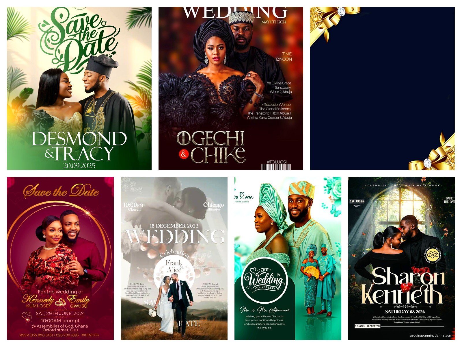
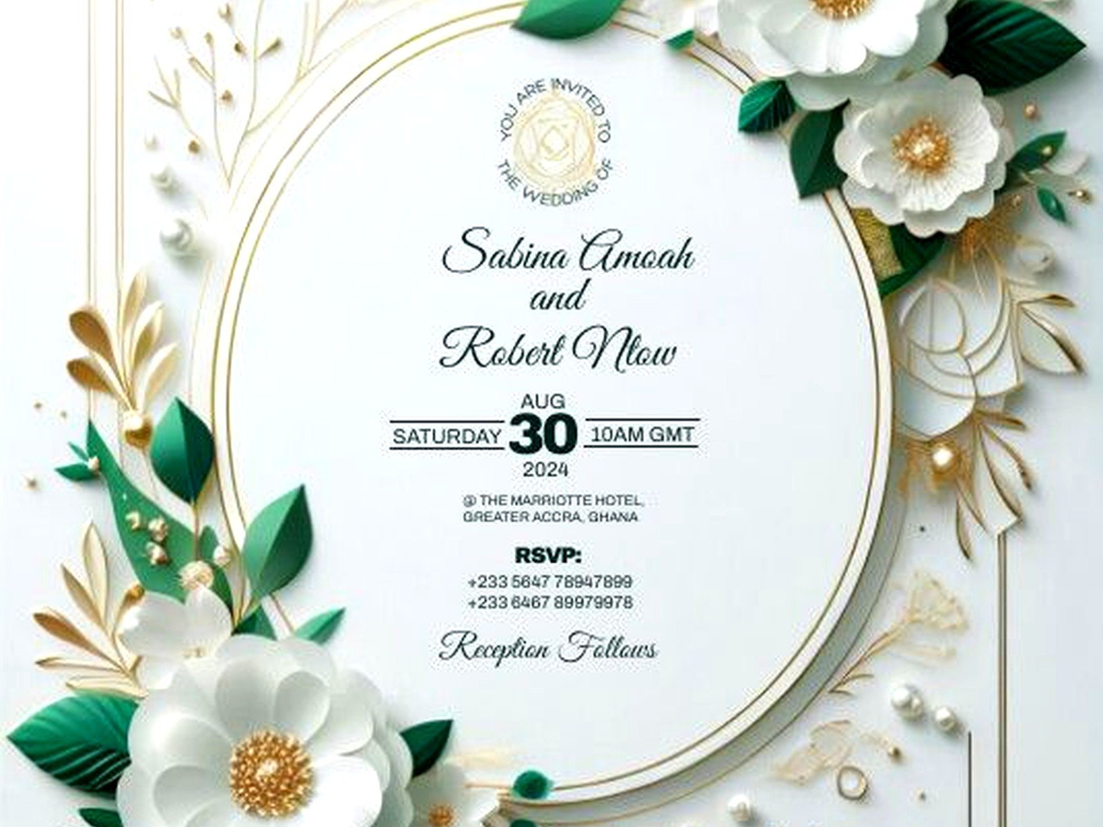
Your names obviously go at the top but you don’t need all the formal “Mr. and Mrs.” stuff unless that’s your vibe. A lot of couples just do first names in a big pretty font. The date is critical and it should be prominent—I’ve seen flyers where the date was in tiny text at the bottom and that’s just backwards thinking.
If you’re promoting a wedding website include that URL clearly. QR codes are actually super useful here and most template sites now have spots for them built in. I was skeptical about QR codes until I saw how many older guests actually used them at a wedding I planned in 2022. My cat walked across my keyboard while I was generating one once and it created this weird broken code that I almost sent to print, so uh, always test those before finalizing.
Location info depends on what the flyer is for. If it’s a save-the-date style flyer you might just put the city. If it’s for a specific event like a welcome party you need the full address. I usually recommend keeping it to one or two lines max because cluttered flyers get ignored.
The thing that annoyed me most recently was a template that had this huge decorative border that looked amazing but left almost no room for actual text. Like the design was eating up 40% of the usable space. When you’re choosing templates look at the actual text areas not just the pretty graphics.
Customizing Without Making It Look Homemade
You want your flyer to match your wedding aesthetic but not be so over-designed that it’s unreadable. Stick to two fonts maximum—one for headers and one for body text. I know it’s tempting to use that gorgeous script font for everything but trust me your guests need to actually read this thing.
Colors should pull from your wedding palette but consider printing costs. If you’re doing full-color flyers with dark backgrounds you’re gonna spend way more on ink or professional printing. A white or cream background with colored text and accents is way more budget-friendly. Unless you’re only doing digital distribution then go wild I guess.
Photos are tricky on flyers because the dimensions are usually portrait orientation and most engagement photos are landscape. You’ll need to crop strategically or choose a template that has a photo spot that works with your image orientation. I’ve spent probably cumulative hours of my life trying to make landscape photos fit into vertical spaces and it’s… not fun.
Keep your text concise. Flyers are meant to be scanned quickly not read like a letter. Bullet points work great for listing multiple events or important details. If you find yourself writing paragraphs you’re doing it wrong—that info should probably be on your wedding website instead.
File Formats and Technical Stuff You Need to Know
Most templates come as PDFs, JPEGs, or editable files in specific programs. PDFs are great for printing but harder to edit unless you have Adobe Acrobat Pro. JPEGs are universal and easy to share digitally but lower quality for professional printing. If you’re getting them printed at a print shop ask what format they prefer—usually it’s PDF at 300 DPI minimum.
Speaking of DPI that’s dots per inch and it matters for print quality. Anything under 300 DPI will look pixelated when printed. Digital flyers for social media or email can be lower resolution like 72 DPI because screens don’t need as much detail. I cannot tell you how many times I’ve had to explain this to couples who designed something for Instagram and then wanted to print it poster-size.
Bleed is another printing term you’ll encounter. It means your design extends slightly beyond the cut line so there’s no white border if the cutting is slightly off. Templates designed for printing usually have bleed built in but if you’re creating from scratch you need about 0.125 inches extra on all sides.
Printing vs Digital Distribution
Honestly for most weddings now you don’t even need to print flyers unless you’re doing a specific event where physical handouts make sense. Digital versions can go on social media, in email announcements, or on your wedding website. You can create Instagram story versions and Facebook event headers from the same template usually.
But if you are printing, don’t just hit print on your home printer unless you’re okay with mediocre quality. Staples and FedEx Office do decent flyer printing and it’s not that expensive—usually under $1 per flyer for basic color printing. If you need like 100+ flyers look into online print services like VistaPrint or Moo which have better bulk rates.
Paper weight matters more than you’d think. Standard copy paper is 20lb and feels cheap. Go for at least 80lb cardstock if you want it to feel substantial. Glossy vs matte is personal preference—glossy looks more vibrant but shows fingerprints, matte is more elegant but colors appear slightly muted.
Common Mistakes I See All the Time
Using too many design elements is probably the biggest one. Just because a template has spots for ribbons, flowers, hearts, and swirls doesn’t mean you should use all of them. Pick one or two decorative elements and let the rest be clean space.
Forgetting to proofread is wild but it happens constantly. I had a client who printed 200 flyers with the wrong date and didn’t notice until they were already distributed to half their guest list. Proofread multiple times and have someone else look at it too because you’ll miss your own mistakes.
Ignoring readability from a distance—if you’re posting these flyers on bulletin boards or handing them out at events people need to read the key info from like three feet away. Test this by literally stepping back from your screen or holding a printed version at arm’s length.
Not saving your work in multiple formats is something I learned the hard way when… actually this wasn’t wedding-related but I was watching The Great British Baking Show and got so distracted I closed a design without saving and lost two hours of work. Now I compulsively save everything as both the editable version and a final PDF.
Making Templates Work for Different Wedding Events
You can usually adapt one good template for multiple purposes by just swapping out text and maybe adjusting colors slightly. Your engagement party flyer can become your rehearsal dinner flyer with different details. This is way easier than starting from scratch each time.
For destination weddings I actually recommend creating a small series of flyers—one for the main wedding info, one for travel details, one for the weekend schedule. You can use the same design framework so they look cohesive but serve different informational purposes. Hand these out at the welcome bags or email them in the weeks leading up.
Bridal shower and bachelor/bachelorette party flyers can be more playful than the main wedding flyer. You have more freedom to use bright colors, funny photos, or themed graphics. Just make sure they still feel connected to your overall wedding brand if you care about that sorta thing.
Budget Considerations
Free templates are totally fine for most situations honestly. Unless you’re having a super high-end formal wedding where every detail is curated, a well-customized free template looks professional enough. Spend your money on printing quality rather than buying expensive templates.
If you’re hiring a designer for your invitations ask if they’ll throw in a flyer template as part of the package. Sometimes they will for a small additional fee and then everything matches perfectly without you having to figure out font matching and color codes.
Digital-only distribution costs nothing except your time so if budget is tight just skip printing entirely. Create a beautiful digital version, share it on social media, and include it in your email communications. Most guests are gonna look at their phones for info anyway.
Accessibility Stuff People Forget
Make sure there’s enough contrast between your text and background. Light gray text on white might look sophisticated but it’s hard to read especially for older guests or people with vision issues. There are free online contrast checkers you can use.
Font size matters—nothing important should be smaller than 12pt and honestly I’d go bigger for key details like date and location. Decorative text can be smaller but the stuff people actually need to read should be easily visible.
If you’re including a QR code make sure it’s large enough to scan easily. I’d say at least 1 inch square minimum. And always test it with multiple phones before finalizing because sometimes they don’t work properly depending on how they’re generated.
Alternative text for digital flyers is something almost nobody thinks about but if you’re posting on social media include the text info in the caption too so screen readers can access it. Takes like 30 seconds and makes your content accessible to everyone.
Organizing Your Template Files
Create a folder system on your computer because you’re gonna have multiple versions and edits and it gets messy fast. I do something like “Wedding Flyers > Drafts” and “Wedding Flyers > Final” and then within those I date the files. Sounds neurotic but you’ll thank yourself when you need to go back and make changes.
Keep the original template file separate from your edited versions. If you mess something up you can always go back to the clean template and start over rather than trying to undo a bunch of changes. This has saved me more times than I can count.
If you’re working with a designer or planner share files through Google Drive or Dropbox rather than email attachments. Email compresses images and can mess up formatting plus then you’ve got versions scattered across different email threads which is just asking for confusion.