
Planning Guides, Style Guide
Dusty Blue Wedding Invitations: Muted Blue Gray Designs
Nov
Okay So Dusty Blue Invitations Are Having A Moment
Dusty blue is literally everywhere right now and honestly it’s been that way since like 2019. It’s that perfect muted blue-gray shade that doesn’t scream “baby boy shower” but also isn’t trying too hard to be navy. I had this bride in spring 2023 who was absolutely obsessed with dusty blue and we spent THREE WEEKS just finding the right paper stock because she kept saying things looked “too purple” or “too gray” and I was like… girl, this is literally the same swatch you approved last Tuesday.
But here’s the thing—dusty blue wedding invitations are actually super versatile once you figure out what you’re doing with them. They work for formal weddings, casual barn weddings, beach weddings, garden weddings. The shade itself is kinda like the Switzerland of wedding colors.
What Actually IS Dusty Blue Though
So dusty blue sits somewhere between slate gray and a desaturated blue. It’s got gray undertones which is what makes it “dusty” instead of just… blue. When you’re looking at paper samples or digital proofs, you want something that reads as blue-ish but feels soft and muted. Not bright, not bold, definitely not cobalt.
The Pantone people would probably give you some official number but honestly when I’m working with printers I just say “think storm cloud meets faded denim” and they usually get it. Some companies call it “french blue” or “dusty periwinkle” or “slate blue” which—okay sure, but we all know what we mean.
Pairing Colors That Actually Work
This is where people get it wrong all the time and it drives me nuts. They think dusty blue goes with everything because it’s neutral-ish, but nah. Here’s what actually looks good:
- White or cream – Obviously. This is your safe bet. Cream is better than stark white though because it keeps that muted vibe going.
- Blush pink or mauve – Super popular combo. The warmth of the pink balances the cool blue.
- Sage green – Very 2022-2024 energy. Looks expensive somehow.
- Terracotta or rust – If you want something unexpected. Works better for fall weddings.
- Gold or copper metallics – Rose gold especially. Silver can look too cold.
- Charcoal gray or navy – For the text usually, gives you contrast.
What doesn’t work? Bright colors. Anything neon. Hot pink. Royal blue. You’re gonna lose that sophisticated muted thing you’re going for.
Paper Stock Choices Because This Actually Matters
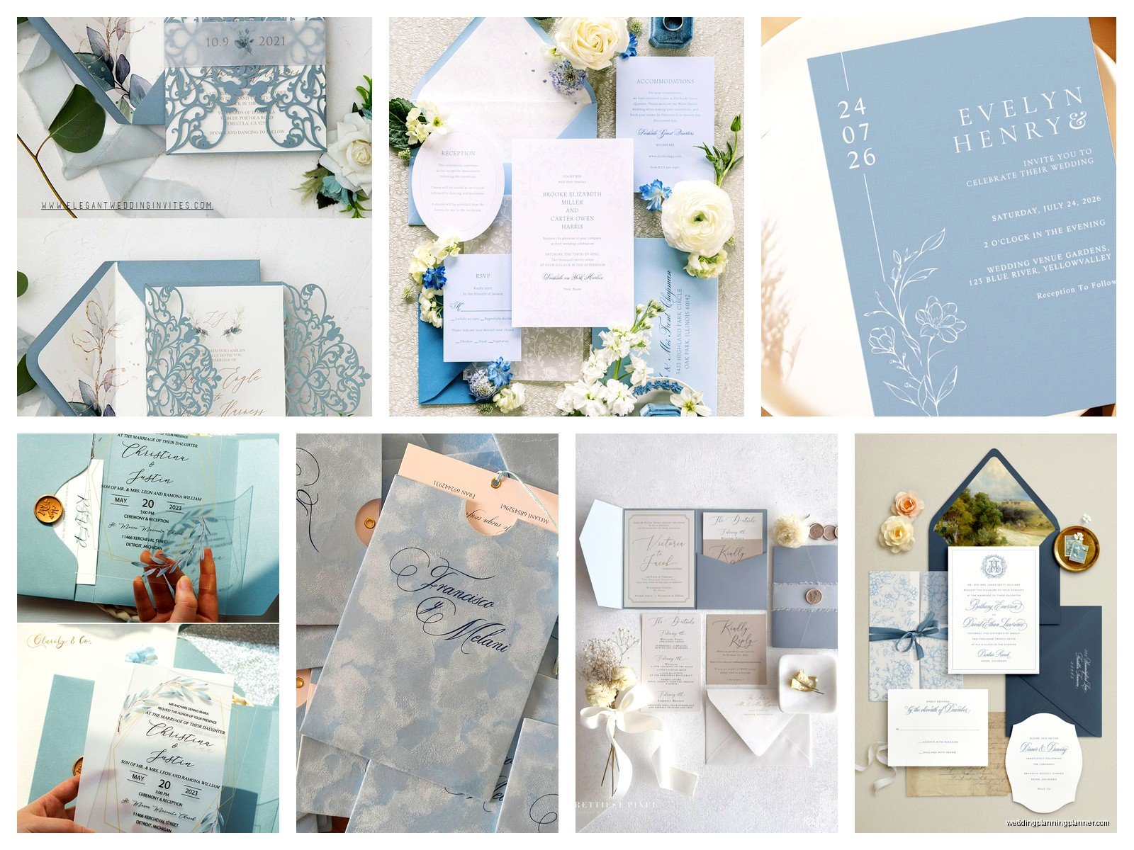
Alright so paper stock is where you can really elevate dusty blue invitations or completely ruin them. I learned this the hard way with a client back in summer 2021 who ordered invitations online without asking me first and they arrived on this weird glossy cardstock that made the dusty blue look like… a corporate PowerPoint slide? It was bad.
Matte cardstock
This is your standard and honestly it works great for dusty blue. The matte finish keeps everything soft and elegant. You want at least 100lb cardstock, preferably 110lb or heavier so it feels substantial. Flimsy invitations are a crime regardless of color.
Cotton paper
This is my favorite for dusty blue specifically. Cotton paper has this subtle texture that makes the color look richer somehow. It’s more expensive but if you’ve got the budget, do it. Brands like Crane or Legion Paper have gorgeous cotton options.
Linen textured paper
Also really nice. The texture adds dimension which is good because dusty blue can sometimes read as flat if you’re not careful with the design.
Vellum overlays
Okay so this is where it gets fun—you can do a white or cream invitation with a dusty blue vellum overlay. Or vice versa. The translucent quality of vellum makes the dusty blue look even more ethereal. Just make sure you’re using a belly band or wax seal to hold it in place because loose vellum sheets in an envelope are annoying for your guests.
What I don’t recommend: glossy or shimmer finishes. They cheapen the look. Dusty blue should feel soft and organic, not sparkly.
Design Styles That Work With This Color
The design style you pick matters just as much as the color itself. Dusty blue isn’t automatically elegant just because it exists on paper.
Minimalist modern
Clean lines, lots of white space, simple sans-serif fonts. Maybe a thin dusty blue border or a geometric shape. This works really well if your wedding is modern or industrial-chic. I’m talking like… simple black text on cream paper with just a dusty blue envelope liner. Done.
Romantic floral
Watercolor flowers in dusty blue, blush, and sage. This is super popular and honestly it’s pretty but I’m kinda over it? Only because I’ve designed like forty variations of this exact thing. But brides love it so. Usually you’ll see eucalyptus leaves, roses, maybe some pampas grass if we’re feeling trendy.
Classic formal
Think traditional invitation layout with formal calligraphy fonts. Dusty blue works here as an accent color—maybe for the couple’s names or in a subtle border. The envelope addressing would be in dusty blue ink. Very timeless.
Rustic or bohemian
Kraft paper backgrounds with dusty blue text or illustrations. Maybe some hand-drawn elements. This works for barn weddings or outdoor celebrations. You can add twine or a wax seal in dusty blue.
Vintage or Art Deco
Dusty blue actually looks amazing with gold geometric patterns in an Art Deco style. Think Great Gatsby but… muted. Or you can go vintage with ornate frames and script fonts.
Typography Stuff You Should Know
Font choices can make or break your invitation and this is something that drives me absolutely insane when I see DIY invitations gone wrong. Dusty blue text needs enough contrast to be readable but you also don’t want it competing with your design.
For main text (names, date, venue info), use a darker color like charcoal or navy. Save the dusty blue for accents, headers, or decorative elements. If you insist on using dusty blue for body text, make sure it’s on a white or cream background and test the readability. Send yourself a printed proof because what looks fine on a screen can disappear on paper.
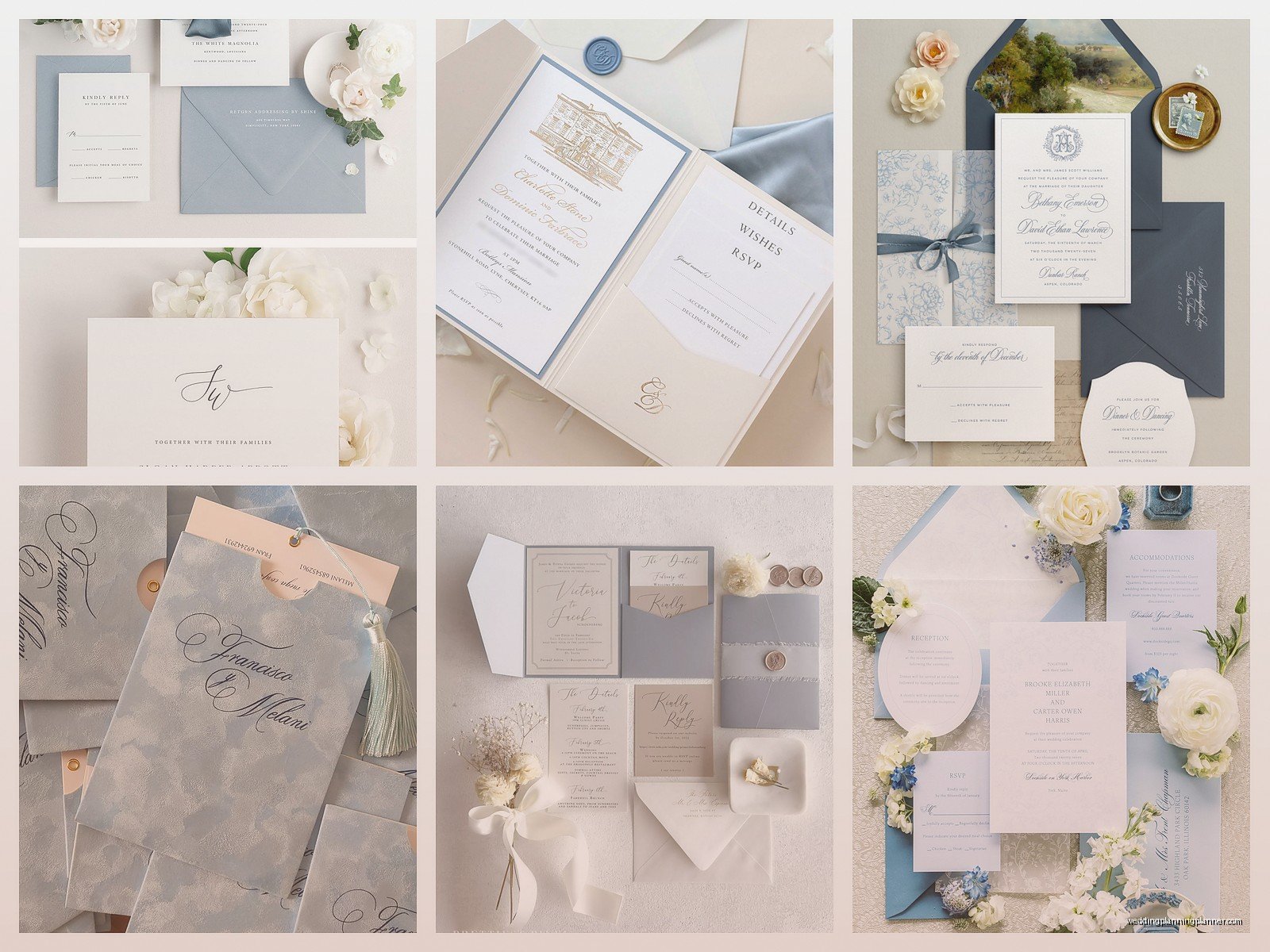
Font pairings I use a lot: a romantic script font (like Allura or Beloved Script) paired with a clean serif (like Garamond or Cormorant). Or a modern sans-serif (Montserrat, Raleway) with a delicate script. Don’t use more than two fonts. Three maximum if you’re including a monogram.
Printing Methods And Why You Should Care
The printing method you choose affects how your dusty blue actually looks on paper, and this is something most people don’t think about until it’s too late.
Digital printing
Most affordable option. Good for print-at-home or online printing services. The dusty blue will be consistent but sometimes can look a little flat. Make sure you’re using a quality printer—I’ve seen some online services where the colors come out way different than the proof.
Letterpress
Gorgeous and tactile. The impression in the paper adds so much dimension. Dusty blue letterpress on cream cotton paper? *Chef’s kiss.* It’s expensive though. Like, significantly more expensive. Budget probably $800-$1500 for 100 invitations depending on complexity.
Foil stamping
You can get dusty blue foil which looks really elevated. I did a set with matte dusty blue foil on white paper and it was stunning. Foil catches the light differently than regular ink so it adds interest.
Thermography
This is raised printing that mimics engraving but costs less. The texture is nice and it makes dusty blue look richer. Good middle-ground option if letterpress is out of budget.
Oh and speaking of printing—always always always order samples before you commit to 150 invitations. Colors look different in real life and you need to see the actual paper quality. My cat knocked over my coffee onto a sample stack last week and honestly the ones that survived the spill were the higher quality stocks so… there’s your durability test I guess.
Envelope Situations
Your envelopes are part of the whole invitation experience so don’t just throw your beautiful dusty blue invitation into a basic white envelope from Office Depot.
Options that work well:
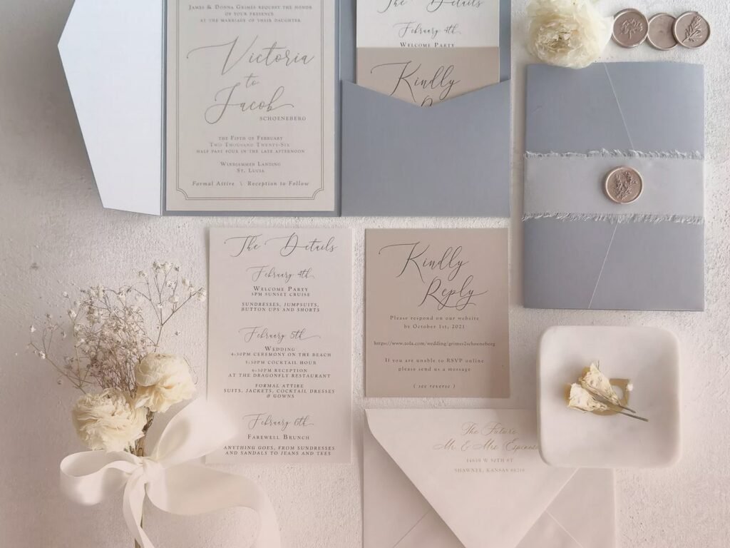
- Dusty blue envelopes with white or cream invitations inside
- White or cream envelopes with dusty blue envelope liners
- Gray envelopes as a neutral that complements dusty blue
- Kraft envelopes for rustic weddings
For addressing, you can do dusty blue ink which looks sophisticated, or use a darker color for better readability. If you’re doing calligraphy (or hiring someone to do it), make sure they have experience with colored inks because the consistency can be different than black ink.
Envelope liners are an easy way to add that dusty blue if your main invitation suite doesn’t have much color. You can do solid dusty blue, a pattern, or even a watercolor design. Just make sure the liner paper isn’t so thick that your envelopes won’t seal properly—I’ve had this happen and it’s a nightmare when you’re trying to mail 200 invitations.
Additional Pieces In Your Suite
Most couples need more than just the main invitation. Here’s how to carry the dusty blue through the other pieces:
RSVP cards
Keep it simple. Usually I do cream or white with dusty blue text or a dusty blue accent. Include a pre-addressed return envelope in dusty blue if you want to be fancy about it.
Details cards
Info about hotels, website, dress code. Same design aesthetic as your main invitation but simplified. You can use dusty blue as a header color or border.
Belly bands or ribbons
If you’re wrapping your invitation suite together, dusty blue silk ribbon looks expensive. Or a paper belly band with the couple’s names or monogram in dusty blue.
Wax seals
Dusty blue wax seals are having a moment. They look really pretty on cream or white envelopes. You can get custom stamps with your initials or wedding date. Fair warning though—wax seals sometimes get damaged in mail sorting machines, so hand-cancel your invitations at the post office if you’re using them.
Envelope liners we already covered but seriously they’re important
Yeah I know I mentioned this already but people forget about liners and then they’re like “oh the invitation looks boring” and I’m like WELL YOU DIDN’T WANT TO PAY FOR LINERS SO.
DIY vs Professional Printing
Look, I’m gonna be honest with you—DIY can work for dusty blue invitations if you’re crafty and have a good printer. But it’s more work than people think.
If you’re going DIY, use a template from Etsy or Canva that’s specifically designed for printing. Don’t just wing it in Microsoft Word. Make sure your home printer can handle cardstock (most can’t handle anything over 80lb). Do test prints. Buy extra paper because you will mess some up.
The color matching is the tricky part. Your screen shows colors in RGB but printing is CMYK, so that dusty blue you see on your monitor might print differently. Professional printers calibrate for this. Your home printer… probably doesn’t.
For envelope addressing, you can hand-write them in a nice pen (get one that doesn’t smudge), use a Cricut or Silhouette machine, print labels, or hire a calligrapher. The calligrapher option is pricey but looks amazing.
Honestly if your budget allows, I’d say DIY the details cards or programs but have the main invitation professionally printed. That’s where you want the quality to show.
What Annoys Me About This Trend
Since we’re being real here—the thing that drives me absolutely crazy about dusty blue invitations is when people don’t commit to the color palette. They’ll want dusty blue invitations but then their wedding colors are completely different, like burgundy and gold, and it’s just… confusing for guests? Your invitation should give people a sense of your wedding aesthetic.
Also, the number of times I’ve had to explain that “dusty blue” and “light blue” are NOT the same thing… I can’t. Light blue is what you’d see at a baby shower. Dusty blue has those gray undertones that make it sophisticated. There’s a difference and it matters.
Timing And Ordering Quantities
Order your invitations at least 4 months before your wedding date, earlier if you’re doing letterpress or foil because those take longer to produce. Add a couple weeks if you’re ordering during wedding season (May through October) because printers are slammed.
For quantities, order 10-15 extra invitations beyond what you need. You’ll want extras for keepsakes, last-minute additions to the guest list, or replacements if some get damaged. Envelopes though—order like 25-30 extra because you WILL mess up addressing some of them. Trust me on this.
And postage—don’t forget to take a fully assembled invitation to the post office to weigh it before you buy stamps. Thick invitations, multiple inserts, wax seals… all that adds weight and you might need extra postage. Nothing worse than having invitations returned for insufficient postage.
Real Talk About Budget
Dusty blue invitations can range from like $2 per suite to $15+ per suite depending on what you’re doing. Digital printing on standard cardstock with basic envelopes? You’re looking at $2-4 per invitation. Add letterpress, cotton paper, custom envelope liners, and calligraphy? Yeah, you’re easily at $10-15 each.
For 100 invitations, budget anywhere from $200 to $1500+. I know that’s a huge range but it really depends on your choices. Most of my couples spend around $400-600 for a nice quality suite with a few upgrades.
You can save money by: limiting your color palette (fewer ink colors = less expensive), doing digital printing instead of letterpress, skipping envelope liners, DIYing the assembly, and using online printing services instead of boutique stationers.
Where you should splurge if you can: paper quality and printing method for the main invitation. That’s what people see first and what they’ll remember.

Canva
Wedding Memories Hardcover Template Canva Editable For Notebook, Journal, Novel, Hard Covers, Canva template For KDP Cover 6×9″ 120 pages
Canva
The Ultimate Wedding Planning Bundle, Canva Editable.
Canva
Customizable Wedding Video Invitations templates, Canva Editable Digital Wedding invitation Minimalist, Animated Custom Invitation
Digital Planning Templates
Wine Wedding Planner Bundle – 200-Page Printable PDF + 10 Editable Wedding Invitations | Instant Digital Download
Canva
Orange Wedding Planner Bundle – 200-Page Editable Canva Templates + 10 Editable Wedding Invitations | Instant Digital Download
Digital Planning Templates
Champagne Wedding Planner Bundle – 200-Page Printable PDF + 10 Editable Wedding Invitations | Instant Digital Download
Canva
Wedding Memories Hardcover Template Canva Editable For Notebook, Journal, Novel, Hard Covers, Canva template For KDP Cover 6×9″ 120 pages
Digital Planning Templates
Yellow Wedding Planner Bundle – 200-Page Printable PDF + 10 Editable Wedding Invitations | Instant Digital Download
Canva
Dusty Blue Wedding Planner Bundle – 200-Page Editable Canva Templates + 10 Editable Wedding Invitations | Instant Digital Download