
Planning Guides, Style Guide
Mountain Wedding Invitations: Alpine Peak Theme Designs
Nov
Getting Started with Mountain Wedding Invitations
So the alpine peak theme is having a MOMENT right now and honestly it’s been steady for like three years. I had this couple back in spring 2023 who wanted their invitations to look like vintage national park posters and we went through seven rounds of revisions because they kept changing which mountain range they wanted featured, but anyway — mountain wedding invitations are way more specific than people think when they first come to me.
First thing you gotta figure out is whether you want literal mountain imagery or more of a vibe. Because there’s a huge difference between having an illustrated Rockies peak on your invite versus just using forest green colors with some pine tree accents. Both are mountain themes technically, but they read completely different. The literal approach works better if you’re actually getting married at a specific mountain venue or ski resort. The vibe approach is more flexible if you just like the aesthetic but you’re getting married in like… a barn that happens to be near some hills.
Color Palettes That Actually Work
You’d think mountain colors are obvious but I’ve seen people get this wrong SO many times. The instinct is to go with browns and greens, which yeah, makes sense, but it can look muddy really fast if you don’t balance it right. Here’s what I usually recommend:
- Slate blue or dusty blue as your primary — it reads as mountain sky and looks elegant
- Cream or ivory instead of bright white (bright white looks too stark against mountain imagery)
- Deep forest green as an accent, not the main color
- Metallic copper or rose gold if you want some shine — gold can look too formal
- Charcoal gray for text, never pure black
The thing that annoyed me for YEARS was when couples would send me inspiration photos of invitations that were basically just brown cardstock with darker brown text and they’d be like “we want it natural and organic” and I’d have to explain that nobody can actually read brown on brown. Natural doesn’t mean illegible, you know?
Typography Choices for Alpine Themes
This is where people either nail it or make their invitations look like a summer camp flyer. You want fonts that feel substantial but not overly rustic. I usually combine two or three fonts maximum:
A strong sans-serif for names works really well — something like Montserrat or Raleway. Then you can do a delicate serif for the details if you want some contrast. What you DON’T want is those fake-woodsy fonts that look like they’re made of logs or whatever. Those read as cheesy unless you’re doing a very specific vintage national park poster style, and even then, use them sparingly.
Script fonts are tricky with mountain themes because they can make the whole thing feel too romantic-garden-wedding instead of alpine-adventure-wedding. If you’re gonna use a script, make it a more casual hand-lettered style rather than super swirly calligraphy.
Design Elements and Imagery
Illustrated vs Photographic Mountains
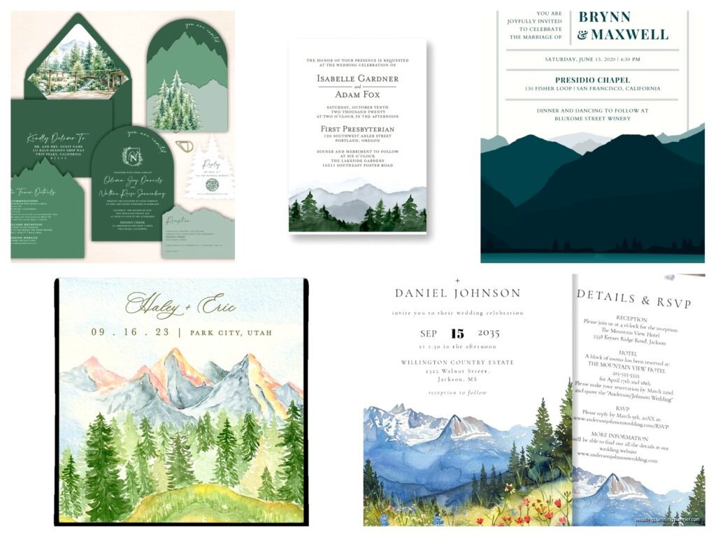
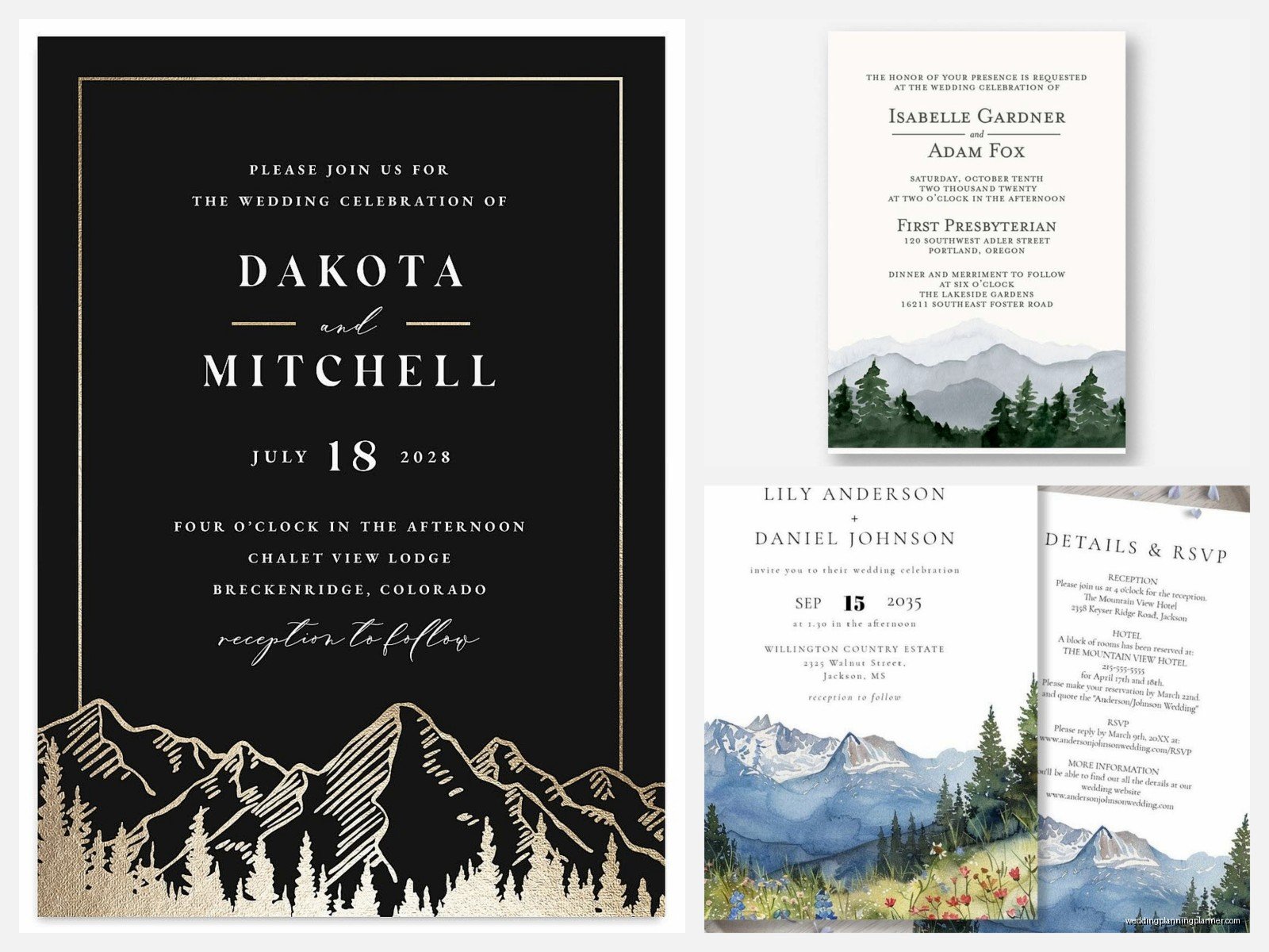
Okay so this is a big decision point. Illustrated mountains give you way more flexibility because you can stylize them to match your exact vibe. You can do watercolor peaks, line drawing ranges, geometric triangular mountains, vintage engraving style, whatever. Photography of actual mountains can be stunning but it’s harder to make it work as a background element without overwhelming your text.
If you’re using photos, you usually need to fade them way back or use them as a small accent element rather than a full background. I learned this the hard way with a couple in summer 2021 who insisted on using this gorgeous photo of the Tetons as their full invitation background and we could barely read any of the text even after lightening it like 60%. We ended up putting a translucent white overlay box behind all the text which worked but it wasn’t as clean as the illustrated version would’ve been.
Additional Design Elements to Consider
Mountains shouldn’t be your only visual element or it’ll look kinda flat. Layer in some of these:
- Pine trees or evergreen forests (these work especially well along the bottom edge)
- Topographic map lines — super popular right now and they add texture without being too literal
- Compass designs (small, as an accent)
- Wildlife silhouettes if it fits your vibe — deer, bears, elk, but don’t go overboard
- Stars or constellations for evening mountain weddings
- Vintage postage stamps or postmarks if you’re doing the national park poster angle
- Wood grain textures, but subtle ones
My cat knocked over my coffee on a set of mountain invitations once and honestly the water stain kinda looked like it could’ve been an intentional watercolor wash, but anyway…
Paper and Material Choices
The paper stock you choose makes a HUGE difference in how mountain-y your invitations feel. You can have the most beautiful mountain design but if it’s printed on glossy cardstock it’s gonna feel wrong. Here’s what works:
Matte cardstock is your safest bet — it has that natural feel without being too textured. I usually recommend 110lb or heavier so it feels substantial. Recycled paper can be great for mountain themes because it has that slightly organic texture, but make sure it’s not so textured that it makes your printing look fuzzy.
Kraft paper is popular for mountain weddings but honestly it’s getting overdone and it limits your color options since you’re working with that brown base. If you do use kraft, you’ll need to design with that brown tone in mind from the start — white ink can look amazing on kraft but it’s more expensive to print.
Special Printing Techniques
This is where you can get fancy if your budget allows. Letterpress printing looks gorgeous for mountain themes because it adds that tactile dimension — the pressed impression of mountain peaks actually makes them feel more dimensional. Foil stamping in copper or silver can make mountain line art really pop. I had a couple do blind debossing of topographic lines as a background texture and then printed their text over it and it was stunning, super subtle.
Digital printing is obviously the most budget-friendly and honestly the quality is really good now. You can get great color reproduction for watercolor mountain designs with digital. Just make sure whoever’s printing them understands color calibration because blues and greens can shift really easily.
Invitation Suite Components
What to Include Beyond the Main Invite
So you’ve got your main invitation designed but mountain weddings usually need some additional pieces because there’s often travel involved or specific location details. Here’s what I typically include in an alpine theme suite:
The main invitation obviously. Then you need details cards because mountain venues often have parking situations or shuttle info or “wear sensible shoes” warnings. I always recommend a separate accommodations card if you have room blocks, especially because mountain town hotels fill up fast and you want people to book early.
RSVP cards should match the aesthetic but they don’t need to be as elaborate — you can do a simpler version of your mountain design. Website cards are becoming more common than full details cards for some couples, which works fine, just make sure the URL is easy to read and not too long.
Envelopes and Addressing
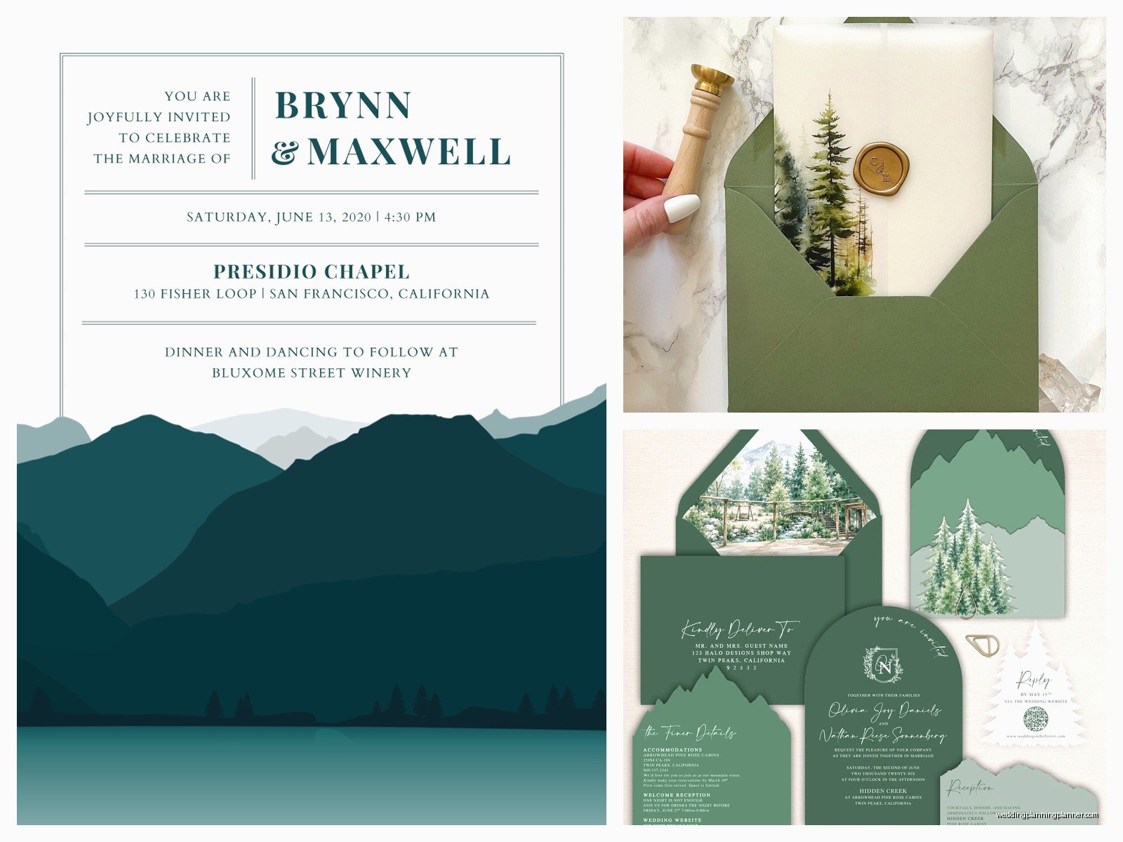
Envelope color matters more than you’d think. A lot of people default to white envelopes but for mountain themes I usually push them toward natural colors — kraft, gray, slate blue, or even forest green if the design supports it. The envelope is the first thing people see so it should set the tone.
For addressing, you can go digital printing, hand calligraphy, or use a nice font and print directly on the envelopes. Hand calligraphy is beautiful but expensive — budget like $3-5 per envelope for a good calligrapher. Digital printing on envelopes has gotten really reliable and you can match your invitation fonts exactly.
Envelope liners are where you can have some fun — topographic map patterns, watercolor mountain scenes, starry night skies, forest scenes. They’re that little surprise when someone opens the envelope that makes the whole suite feel more special.
Working with Designers and Printers
If you’re hiring someone to design these, you need to be specific about what kind of mountain vibe you want because “mountain wedding invitations” means different things to different designers. Bring reference images — like specific examples of illustration styles you like, color palettes, even photos of the actual venue if that’s relevant.
Timeline-wise, custom invitation design usually takes 2-4 weeks depending on how many revision rounds you need, then printing is another 2-3 weeks, and you should mail them 8 weeks before the wedding. So you’re looking at starting the invitation process like 4-5 months before your wedding date minimum. I know that sounds early but mountain weddings often involve travel and people need time to plan.
DIY vs Professional Design
You can definitely DIY mountain invitations if you’ve got design skills and time. Templates from places like Etsy or Creative Market can give you a starting point — just make sure you’re buying templates that are actually customizable and not just pre-made designs where you fill in text boxes. The quality varies wildly.
If you’re doing it yourself, invest in good paper and do test prints. I cannot stress this enough — what looks good on your screen will look different printed, especially colors. Blues and greens shift the most. Order samples before you print 150 invitations.
Professional design obviously costs more but you’re paying for expertise in layout, typography, color theory, and someone who knows how to set up files properly for printing. A good stationery designer can also help you avoid rookie mistakes like text that’s too small or colors that won’t reproduce well.
Wording and Details Specific to Mountain Weddings
The actual wording on your invitations might need some tweaks for a mountain venue. You definitely want to include more specific location details than you would for like a church in town. Include the full venue name and address obviously, but also consider adding a line about weather preparedness or attire.
Something like “Mountain weather can be unpredictable — please dress in layers” or “The ceremony will be outdoors at 9,000 feet elevation” gives people important info without being too bossy. If there’s a significant hike or walk involved, mention that too so people can plan appropriate footwear.
Some couples include a small map on their details card showing the venue location relative to major roads or towns, which is actually really helpful for mountain locations that might not have great GPS reception or might be hard to find.
Seasonal Considerations
Mountain weddings happen year-round and your invitation design should probably reflect the season. Summer mountain weddings can go brighter and more vibrant — think wildflowers, sunny peaks, bright blues. Fall mountain weddings are perfect for those copper and rust tones with golden aspens. Winter mountain weddings obviously lean into snow-capped peaks, deeper blues, maybe some silver or white accents, skiing themes if that’s your thing.
Spring mountain weddings are tricky because mountain spring is like… still kinda winter depending on elevation? But you can do fresh greens and lighter colors if you’re going for that renewal vibe.
Budget Considerations
Alright so let’s talk money because mountain wedding invitations can range from pretty affordable to absolutely ridiculous. A basic digital printed suite with standard paper might run you $3-5 per invitation including envelopes. Mid-range with better paper, custom design, and nice envelopes is more like $8-12 per invitation. High-end with letterpress or foil stamping and all the fancy extras can easily hit $15-25+ per invite.
Remember you need to budget for the full quantity plus extras — order at least 15-20 more than your guest count for keepsakes and last-minute additions. Also factor in postage, which for a heavier suite with multiple inserts can be more than a regular stamp.
You can save money by doing a postcard RSVP instead of a traditional card with return envelope, or by putting more information on your wedding website instead of printing multiple insert cards. Some couples do a simpler design for the save-the-dates and then go fancier for the actual invitations, which spreads out the cost.

Canva
Wedding Memories Hardcover Template Canva Editable For Notebook, Journal, Novel, Hard Covers, Canva template For KDP Cover 6×9″ 120 pages
Canva
The Ultimate Wedding Planning Bundle, Canva Editable.
Canva
Customizable Wedding Video Invitations templates, Canva Editable Digital Wedding invitation Minimalist, Animated Custom Invitation
Digital Planning Templates
Wine Wedding Planner Bundle – 200-Page Printable PDF + 10 Editable Wedding Invitations | Instant Digital Download
Canva
Orange Wedding Planner Bundle – 200-Page Editable Canva Templates + 10 Editable Wedding Invitations | Instant Digital Download
Digital Planning Templates
Champagne Wedding Planner Bundle – 200-Page Printable PDF + 10 Editable Wedding Invitations | Instant Digital Download
Canva
Wedding Memories Hardcover Template Canva Editable For Notebook, Journal, Novel, Hard Covers, Canva template For KDP Cover 6×9″ 120 pages
Digital Planning Templates
Yellow Wedding Planner Bundle – 200-Page Printable PDF + 10 Editable Wedding Invitations | Instant Digital Download
Canva
Dusty Blue Wedding Planner Bundle – 200-Page Editable Canva Templates + 10 Editable Wedding Invitations | Instant Digital Download