
Planning Guides, Style Guide
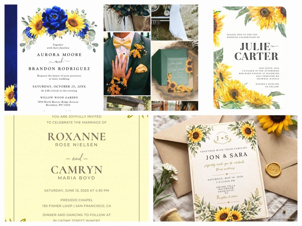
Sunflower Wedding Invitations: Yellow Floral Theme Designs
Nov
Getting Started With Sunflower Invitations
Okay so sunflower wedding invitations are having this massive moment right now and honestly they’re not going anywhere. I had this bride back in summer 2021 who was absolutely obsessed with sunflowers—like she wanted them everywhere, the cake, the centerpieces, her bouquet, and obviously the invitations. The thing is, sunflower designs can go really tacky really fast if you’re not careful about it.
First thing you gotta know is that sunflowers work best for certain wedding vibes. We’re talking rustic barn weddings, outdoor garden ceremonies, late summer or early fall events, country-themed receptions. If you’re planning a black-tie ballroom situation, maybe reconsider? Or at least go with a really subtle, elegant sunflower motif instead of full-on giant blooms everywhere.
Paper Stock Makes a Huge Difference
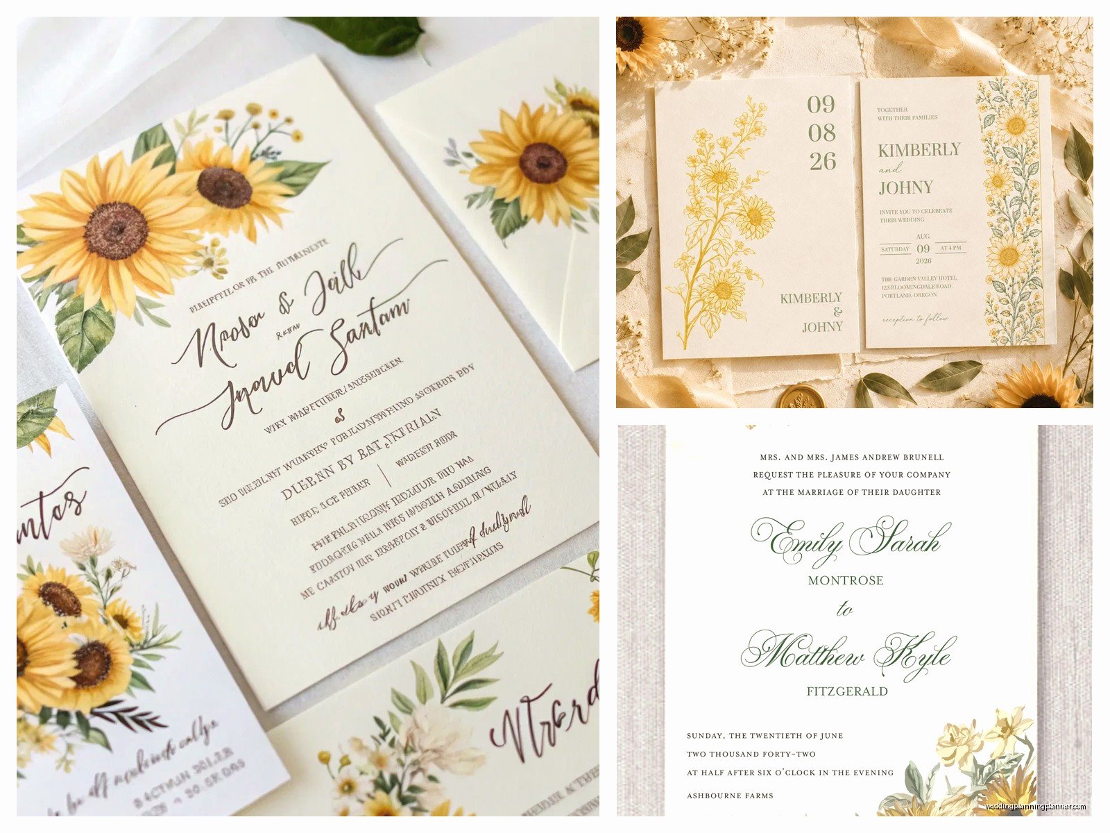
The paper you choose is gonna set the whole tone. I always recommend a textured cardstock for sunflower invites because it adds that organic, natural feel. Kraft paper is super popular and honestly looks amazing with yellow florals—the brown background makes the yellows pop without being overwhelming. You can also do a cream or ivory base which feels more formal but still warm.
Linen texture is another good option. It’s got that subtle woven look that pairs well with botanical themes. One thing that really annoyed me though? When couples insist on glossy cardstock for sunflower invites. It just looks cheap and kinda like a grocery store flyer, I don’t care what anyone says. Matte or textured finishes always look more sophisticated.
Weight matters too—aim for at least 110lb cardstock, preferably 130lb. You want the invite to feel substantial in someone’s hand. Thin flimsy paper doesn’t match the bold, sturdy nature of sunflowers.
Design Styles That Actually Work
There’s like a million different ways you can incorporate sunflowers into your invitation design. Let me break down what I’ve seen work well and what… doesn’t.
Watercolor Sunflowers
Watercolor designs are super popular right now and they work beautifully with sunflowers. The soft, painted look keeps things from getting too cartoonish. You can do a single large sunflower as a focal point, or scatter smaller blooms around the text. I usually suggest keeping the watercolor elements to the edges or corners so your text remains readable.
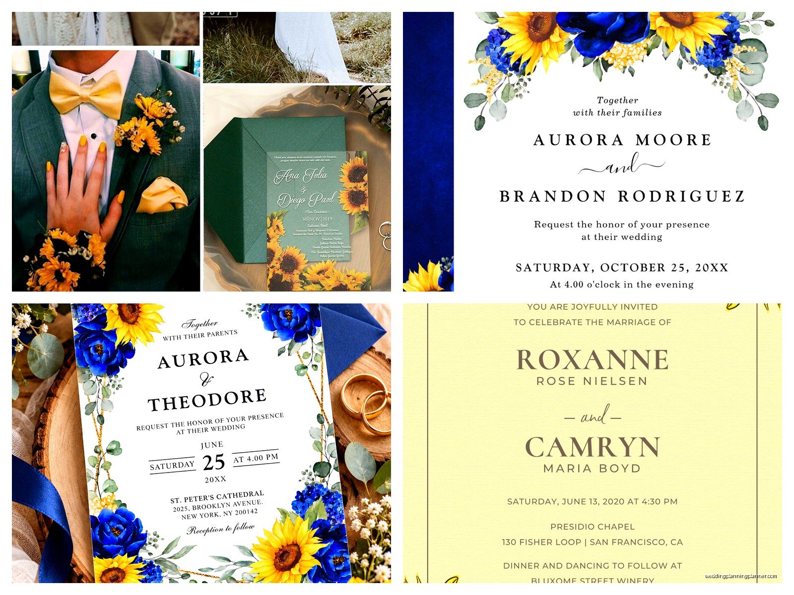
The key with watercolor is making sure the colors aren’t too saturated. You want those gentle yellow and gold tones with hints of green for the leaves and stems. Some designs throw in touches of burnt orange or terracotta which can look really nice for fall weddings.
Illustrated Line Drawings
If you want something more minimalist, line-drawn sunflowers can be gorgeous. Simple black ink illustrations on white or cream paper, maybe with one or two flowers and some greenery. This style works well if you’re doing a modern rustic wedding or if your venue is more upscale but you still want that sunflower element.
You can combine line drawings with a pop of actual yellow—like a yellow envelope liner or a yellow ribbon tied around the invitation suite. That way you get the sunflower theme without it being too in-your-face.
Realistic Photography or Prints
Some designs use actual photographs of sunflowers, either as a background or as accent elements. This can work but you have to be careful about image quality and placement. Blurry sunflower photos look terrible when printed, trust me. I learned this the hard way with a rush order in spring 2023 where the couple sent me low-resolution images they’d pulled from Google and insisted we use them… the printer called me directly to say it was gonna look pixelated and awful.
If you go this route, use high-resolution professional photos and consider fading them into the background so they don’t compete with your text.
Border Designs
Sunflower borders are classic—you frame your invitation text with sunflowers running along the top and bottom, or all four sides. This style works great for more traditional invitation layouts. You can mix sunflowers with other elements like eucalyptus, baby’s breath, wheat stalks, or even cotton for a real farmhouse feel.
Just watch the balance. Too many elements and it starts looking cluttered. I usually stick to sunflowers plus one or two complementary botanicals max.
Color Palette Considerations
Obviously yellow is your main color here, but which yellow? There’s a big difference between bright lemon yellow, golden yellow, mustard, and pale butter yellow. For sunflowers specifically, you’re usually working with golden and warm yellows.
Your accent colors matter a ton. Here’s what I’ve seen work well:
- Navy blue—creates a really sophisticated contrast and tones down the brightness
- Burgundy or wine—perfect for fall weddings, adds richness
- Sage green or eucalyptus green—natural pairing, keeps things fresh
- Terracotta or rust—warm and earthy, very on-trend right now
- Chocolate brown—especially with kraft paper, very rustic
- White or cream—clean and simple, lets the sunflowers shine
You can also do different shades of yellow and gold together for a tonal look. Honestly the worst combination I’ve seen is sunflower yellow with hot pink… nah, just nah. Unless you’re specifically going for a bright summer fiesta vibe, but even then it’s a lot.
Typography Choices
Your font selection needs to match the overall vibe you’re creating. For rustic sunflower weddings, I usually recommend pairing a script font for names with a clean sans-serif or simple serif for the details.
Some good script options: anything with a handwritten feel but still readable. Avoid super swirly fonts that are hard to decipher—your guests shouldn’t need a decoder ring to figure out where and when to show up. For rustic themes, brush lettering fonts work really well.
For the body text, keep it simple. A classic serif like Garamond or a clean sans-serif like Montserrat. The sunflowers are already providing visual interest, so your typography can be more restrained.
Oh and my cat just knocked over my coffee while I’m writing this, so if this section seems a bit… anyway, moving on.
Invitation Suite Components
A full invitation suite typically includes several pieces, and you’ll want to carry your sunflower theme throughout but not identically on every piece. That gets boring and repetitive.
Main Invitation
This is where you can go bigger with your sunflower design. Whether that’s a large watercolor bloom, a border, or an illustrated corner accent, the main invite should clearly establish your theme.
RSVP Card
Scale down the design here. Maybe just a small sunflower icon or a simple border element. You don’t need the full design repeated—actually it’s better if you don’t because it looks more intentional and designed rather than just copy-pasted.
Details Card
Information about accommodations, reception details, dress code, etc. Keep the sunflower elements minimal here—maybe just in a header or footer. The focus should be on readability since there’s usually a lot of text.
Envelope Liners
This is where you can have some fun. A full sunflower pattern envelope liner makes a great first impression when someone opens their invitation. You can do an all-over pattern, a watercolor wash, or even a simple yellow liner with small sunflower accents.
Belly Bands or Ribbons
If you’re wrapping your invitation suite together, consider a natural jute twine, burlap ribbon, or yellow satin ribbon. You can tuck a small dried flower or greenery sprig into the ribbon for extra detail, though this does increase postage costs because it adds thickness.
Printing Methods
How you print matters almost as much as the design itself. Digital printing is the most affordable option and works fine for most sunflower designs, especially watercolor styles. The colors come out vibrant and it’s cost-effective.
Letterpress can look stunning with sunflower line drawings or simpler designs. You get that beautiful debossed texture that feels so luxurious. It’s pricier though—like significantly pricier. We’re talking $8-15 per invitation versus $2-4 for digital.
Foil stamping is having a moment and gold foil on sunflower elements looks incredible. You can foil just the sunflower petals or centers for a metallic pop. Combine foil with digital printing for a more budget-friendly option than full letterpress.
Screen printing works well for more artistic, hand-crafted looks. If you’re DIY-ing or working with a small artisan printer, this could be a good option.
DIY vs. Professional Design
Look, I’m gonna be honest here. DIY sunflower invitations can look great if you have design skills and the right tools. Sites like Canva have decent templates, and you can customize colors and text pretty easily. But—and this is a big but—I’ve seen so many couples underestimate how time-consuming this is.
You’re not just designing one invitation. You need the RSVP, details card, envelope addressing, possibly programs and menus if you’re keeping the theme throughout. That bride I mentioned from 2021? She started out wanting to DIY everything and after two weeks of struggling with Canva templates, she came back and hired me because she was so stressed.
If you do go DIY, order samples first. What looks good on screen doesn’t always translate to print. Colors can shift, especially yellows. And pay attention to bleed areas and safe zones for text—you don’t want important information getting cut off.
Professional designers know how to balance elements, choose appropriate fonts, and set up files correctly for printing. We also have access to better quality graphics and illustrations. But yeah, it costs more. Weigh your time, stress level, and budget.
Printing at Home vs. Professional Printing
If you’re doing DIY design, you might be tempted to print at home. For like… maybe RSVP cards or details cards, okay. But for the main invitation? I really don’t recommend it unless you have a high-quality printer and know what you’re doing.
Home printers usually can’t handle heavy cardstock well. The colors often look washed out or inconsistent from one print to the next. And if you’re printing 100+ invitations, you’re gonna go through so much ink that it’s not even cost-effective anymore.
Professional printing services (Catprint, Minted, even local print shops) will give you way better results. The colors are consistent, the paper feeds properly, and you’re not spending your weekends hunched over a printer that keeps jamming. Trust me on this.
Envelope Addressing Options
Your envelopes are part of the overall presentation, so don’t overlook them. For sunflower invitations, I usually suggest:
Kraft envelopes: Natural brown that pairs perfectly with the rustic sunflower theme. You can use white or cream ink for addressing, or go with black for better contrast.
Yellow envelopes: Commit to the theme fully. Pale yellow or golden envelopes look cheerful and immediately signal what kind of wedding this is. Use darker ink colors for readability.
Cream or ivory: Classic and elegant, works with any sunflower design style from rustic to refined.
For addressing, you’ve got options. Hand calligraphy looks gorgeous but is expensive—usually $3-5 per envelope. Digital calligraphy or printed addresses are more budget-friendly and still look nice. You can also do cute sunflower-themed address labels or stamps, though some people find those less formal.
Seasonal Timing Considerations
Sunflowers are obviously associated with summer and early fall since that’s when they’re actually in season. If you’re having a June wedding or a September wedding, sunflower invitations make perfect sense. For a winter or spring wedding, you might get some confused looks… or you might not care because you just love sunflowers and that’s totally valid too.
The thing is, sunflowers have such strong seasonal associations that using them for off-season weddings can feel a bit disconnected. But I’ve definitely had couples do it successfully by framing it as just their favorite flower rather than trying to match the season.
Budget Breakdown
Let’s talk real numbers because this is what everyone actually wants to know. For 100 invitations with a sunflower theme:
Budget option: $150-300 total. DIY design using Canva templates, digital printing through an online service, basic envelopes, printed addressing. You’re doing most of the assembly yourself.
Mid-range option: $500-800 total. Semi-custom design from Etsy or Minted, professional digital printing on nice cardstock, envelope liners, some special elements like ribbon or a tag, maybe digital calligraphy for addressing.
Splurge option: $1200-2000+ total. Fully custom design from a professional stationer (hi, that’s me), letterpress or foil printing, hand calligraphy, custom envelope liners, wax seals, the whole nine yards.
Remember you also need to factor in postage. If your invitation suite is thick with multiple inserts, a liner, and a ribbon, you’re probably looking at extra postage—sometimes 70 cents or more per invite instead of the standard stamp.
Common Mistakes to Avoid
After years of doing this, I’ve seen the same mistakes over and over. Don’t make these:
Too many design elements: Sunflowers, plus mason jars, plus burlap texture, plus wood grain, plus lace, plus… stop. Pick two or three elements max. More is not better.
Unreadable fonts: If your grandma can’t read it without her glasses, choose a different font. Seriously.
Wrong color yellow: Neon yellow or lemon yellow can look harsh. Stick with warmer, golden yellows for sunflowers.
Forgetting about accessibility: Low contrast between text and background makes invitations hard to read. Yellow text on white? Bad idea. Dark text on light background always.
Not ordering samples: Never, ever place a full print order without seeing a physical sample first. Colors and paper quality can surprise you.
Leaving out important information: I once had to reprint an entire order because the couple forgot to include the actual ceremony time. Check, double-check, then have someone else check your wording.
Matching Your Wedding Theme
Your invitations should give guests a preview of what to expect at your wedding. If your invites are rustic kraft paper with watercolor sunflowers, people will expect a casual outdoor vibe. If you’re doing elegant line-drawn sunflowers on heavy cream cardstock, they’ll anticipate something more refined.
Make sure your invitation style matches your actual wedding plans or you’ll have guests showing up in the wrong attire or with wrong expectations. I had a couple once do super casual sunflower invites for what turned out to be a fairly formal country club wedding and… yeah, there were some awkward moments with guest attire.
Think about carrying the sunflower theme through to your other paper goods too—programs, menus, place cards, thank you cards. You don’t have to use the exact same design, but keeping a consistent style and color palette makes everything feel cohesive and intentional rather than random.

Canva
Wedding Memories Hardcover Template Canva Editable For Notebook, Journal, Novel, Hard Covers, Canva template For KDP Cover 6×9″ 120 pages
Canva
The Ultimate Wedding Planning Bundle, Canva Editable.
Canva
Customizable Wedding Video Invitations templates, Canva Editable Digital Wedding invitation Minimalist, Animated Custom Invitation
Digital Planning Templates
Wine Wedding Planner Bundle – 200-Page Printable PDF + 10 Editable Wedding Invitations | Instant Digital Download
Canva
Orange Wedding Planner Bundle – 200-Page Editable Canva Templates + 10 Editable Wedding Invitations | Instant Digital Download
Digital Planning Templates
Champagne Wedding Planner Bundle – 200-Page Printable PDF + 10 Editable Wedding Invitations | Instant Digital Download
Canva
Wedding Memories Hardcover Template Canva Editable For Notebook, Journal, Novel, Hard Covers, Canva template For KDP Cover 6×9″ 120 pages
Digital Planning Templates
Yellow Wedding Planner Bundle – 200-Page Printable PDF + 10 Editable Wedding Invitations | Instant Digital Download
Canva
Dusty Blue Wedding Planner Bundle – 200-Page Editable Canva Templates + 10 Editable Wedding Invitations | Instant Digital Download