
Planning Guides, Style Guide
Minimalist Wedding Invitations: Simple Clean Modern Designs
Nov
okay so minimalist wedding invitations
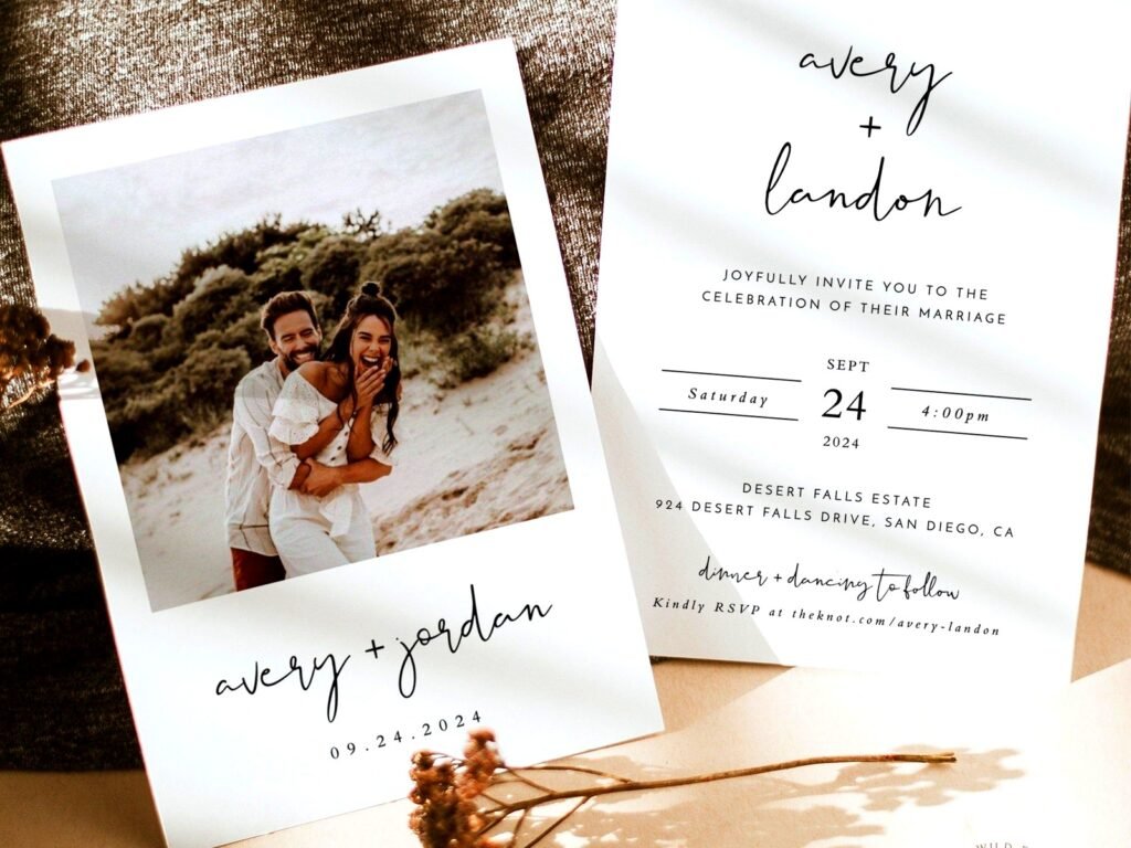
Look, minimalist wedding invitations are having this massive moment right now and honestly it’s about time because I’ve seen way too many invitations that look like a scrapbooking project exploded all over cardstock. The whole minimalist approach is basically about stripping everything down to what actually matters – your names, the date, the location, maybe one beautiful element that ties it together.
The thing that drives me absolutely nuts about minimalist design is when people confuse it with being boring or cheap-looking. Like no Sharon, just because there aren’t seventeen fonts and a watercolor floral border doesn’t mean it’s not sophisticated. I had this bride back in spring 2023 who kept saying her minimalist suite looked “too plain” and wanted to add more and more elements until I literally had to show her examples of luxury brands and their packaging to prove that negative space is actually a design choice, not a mistake.
what makes an invitation actually minimalist
So the foundation of minimalist design is really about intentionality. Every single element on that invitation needs to earn its place. You’re typically working with:
- One or two fonts maximum (and honestly one is usually enough)
- Lots of white space or negative space
- A limited color palette – usually one to three colors total
- Clean lines and geometric shapes if you use any decorative elements
- High-quality paper because when you strip away all the extras, paper quality really shows
The typography is gonna do most of the heavy lifting here. I usually go with a really clean sans-serif for modern vibes or a refined serif if you want something that feels a bit more classic. Mixing a sans-serif with a serif can work but you gotta be careful it doesn’t start looking too busy.
paper stock matters SO much
When you’re doing minimalist invitations, the paper quality becomes like ten times more important than it would be with a heavily decorated suite. I always tell clients to budget more for paper if they’re going minimal because there’s nowhere to hide. A flimsy cardstock with minimal design just looks… cheap. But a thick, luxurious paper with minimal design looks expensive and intentional.
Some options I love:
- Cotton paper (at least 110lb) – it has this beautiful texture
- Smooth premium cardstock in the 130-140lb range
- Handmade paper if you want texture but still clean lines
- Even acrylic or vellum for overlays if you want something really modern
I worked with this couple in summer 2021 who did their invitations on this gorgeous thick cotton paper in the palest blush color with just black letterpress text. That’s it. No graphics, no borders, nothing else. And people are STILL talking about how elegant those invitations were. The paper did all the work.
color palettes that work
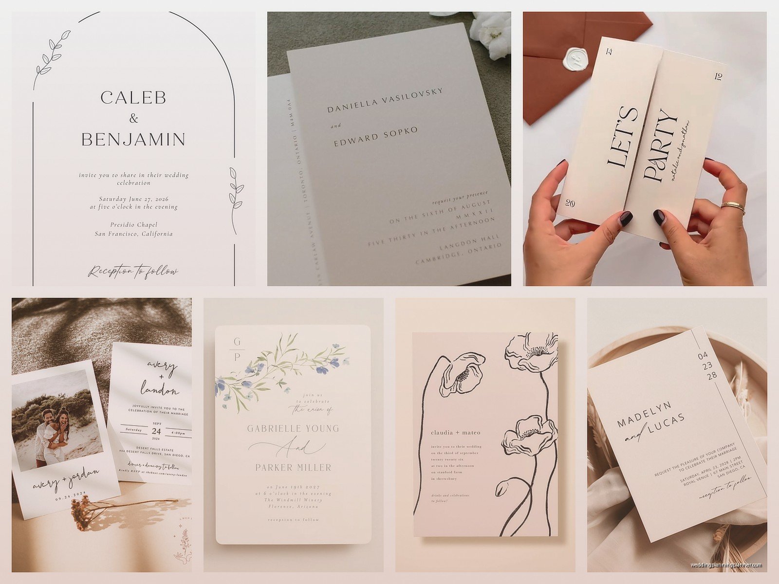
Minimalist doesn’t mean colorless, but it does mean restrained. Black and white is obviously the classic choice and honestly it never looks bad. But you can absolutely bring in color if you do it thoughtfully.
Some combinations I’ve used that work really well:
- Black text on cream or ivory paper
- Navy on white
- Terracotta or rust on cream
- Sage green on white
- Charcoal gray on pale gray
- One pop of metallic (usually gold or copper) with black and white
The key is you’re not trying to include your whole wedding color palette on the invitation. Pick one or maybe two colors and commit. I’ve seen couples try to sneak in all five of their wedding colors in “minimal” ways and it just… doesn’t work. It looks confused.
typography choices and layout
This is where people either nail it or completely miss the mark. Your font choice is basically carrying the entire design, so it needs to be good. I’m talking about fonts that are clean, readable, and have some personality without being gimmicky.
Some font styles that work well:
- Modern sans-serifs like Futura, Montserrat, or Proxima Nova
- Elegant serifs like Garamond, Didot, or Bodoni
- Refined slab serifs if you want something a bit different
What you’re avoiding: anything too decorative, script fonts (usually – there are exceptions but they’re rare), novelty fonts, anything that was trendy in 2010.
For layout, you’re typically working with centered text or a really clean left-aligned layout. The spacing between lines matters more than you’d think – too tight and it feels cramped, too loose and it feels disconnected. I usually play with line spacing until it just feels… right? Which I know isn’t helpful but that’s kinda how design works sometimes.
when to add a single design element
Sometimes pure text feels too stark even for minimalist design. That’s when you add ONE element. Not three, not five – one.
Options that work:
- A single horizontal line above or below the text
- A simple monogram or initials
- A small geometric shape (circle, square, arch)
- A minimal line drawing – like a single branch or arch outline
- A thin border around the entire invitation
I had this bride who was absolutely set on including illustrations of her venue because it was this gorgeous modern building. We ended up doing a super simple line drawing of just the building’s outline in the corner – like barely there – and it was perfect. Any more detail would’ve ruined the whole vibe.
printing methods that elevate minimalist design
Okay so this is where you can really make your invitations stand out. The printing method adds dimension and interest without adding visual clutter.
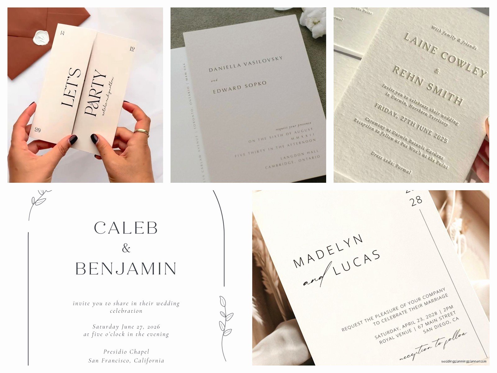
Letterpress is probably my favorite for minimalist invitations. You get that beautiful impression in the paper, and it just feels so tactile and luxurious. It works especially well with simple text-based designs.
Foil stamping in gold, silver, or copper can add just enough shimmer without being over the top. I usually do this for names or key details.
Blind debossing is when you create an impression without any ink – it’s super subtle and really sophisticated. Great for monograms or borders.
Digital printing is totally fine too if budget is a concern. The key is using a high-quality printer and premium paper. A well-done digital print on great paper beats a cheap letterpress job any day.
the suite coordination thing
Your invitation doesn’t exist alone – you’ve got the envelope, maybe an RSVP card, details card, whatever else you need. Keeping the minimalist vibe consistent across all pieces is important.
I usually do:
- Main invitation with most of the design weight
- RSVP card that’s even simpler – sometimes just the essential info
- Details card that matches the layout style
- Envelope addressing in the same font or a complementary one
The envelope is actually a great place to add interest. A colored envelope with white text, or a liner in a subtle pattern, or even just really beautiful calligraphy on a plain white envelope. My cat knocked over my coffee on a whole stack of envelopes once and I had to… anyway that’s not relevant here.
what information you actually need
Minimalist design forces you to be really clear about what’s essential. You obviously need the names, date, time, location. The ceremony and reception details. How to RSVP.
What you might skip or move to a separate card:
- Long venue addresses (put on details card or website)
- Accommodation info
- Dress code (unless it’s really important)
- Registry information (this should be on your website anyway)
- Your entire love story
The main invitation should have just enough info that someone knows where to show up and when. Everything else can go on additional cards or your wedding website. I see couples trying to cram everything onto one card and it defeats the purpose of going minimal in the first place.
common mistakes people make
Using too many fonts because they can’t commit to one – this is probably the biggest issue I see. Someone will pick a beautiful minimalist template and then start swapping fonts for different text elements and suddenly you’ve got four fonts happening.
Not leaving enough white space. The empty space is part of the design! It’s not wasted space that you need to fill up. I literally had to stop a groom from adding a small floral graphic “because there’s room” when the whole point was the clean look.
Choosing a font that’s too thin or light. Minimalist doesn’t mean barely visible. Your text still needs to be easily readable. I’ve seen invitations where the font weight was so light that older guests couldn’t read it without squinting.
Going TOO minimal where it starts looking like a corporate memo or… I don’t know, a dentist appointment card? There’s a balance between clean and cold.
DIY vs professional design
Look, you can absolutely DIY minimalist invitations. In some ways they’re easier to design yourself because you’re not trying to create complex illustrations or manage multiple decorative elements. But – and this is important – the simplicity means every tiny detail matters.
If you’re gonna DIY:
- Invest time in learning basic design principles
- Use a platform like Canva but customize the templates heavily
- Print samples before ordering the full quantity
- Get honest feedback from people with good taste
- Pay for premium fonts if the free ones aren’t cutting it
If you’re hiring a designer, make sure they actually understand minimalist design. Show them examples of what you like. Some designers are really uncomfortable with negative space and will try to add elements you don’t need.
budget considerations
People assume minimalist is cheaper. Sometimes yes, sometimes no. You’re saving money on complex design work and potentially on printing if you’re doing fewer colors. But you should be spending more on paper quality and possibly on premium printing methods.
Where you can save:
- Simple layouts are faster to design
- Fewer colors can mean lower printing costs
- Digital printing is cheaper than letterpress
- You might need fewer insert cards if you use a wedding website
Where you should spend:
- Paper quality – seriously don’t cheap out here
- Printing method if you want letterpress or foil
- Professional design if you’re not confident DIYing
real examples that work
Just to give you concrete ideas, here are some actual minimalist invitation concepts I’ve done or seen that really worked:
All black text on thick cream cotton paper, centered layout, one thin horizontal line separating the names from the details. That’s it. Looked incredibly expensive.
White ink on black paper – sounds simple but the contrast is so striking. Used a modern sans-serif font, all caps for the names, sentence case for everything else.
Acrylic invitation with just black text printed directly on the clear acrylic. Super modern, definitely not for everyone, but the couple loved it and it matched their ultra-modern venue perfectly.
Letterpress in navy on soft white paper with the couple’s monogram blind debossed at the top. Classic but still minimal.
Honestly the acrylic ones were almost too modern for some of their older relatives who were kinda confused about why the invitation was see-through, but whatever, it looked amazing.
envelope and addressing details
Your envelope is the first thing people see, so it needs to match the vibe. For minimalist invitations, I usually suggest:
- Clean addressing – either printed in your invitation font or really nice calligraphy
- No return address labels – print directly on the envelope or use a stamp
- Consider a colored envelope with white or cream text
- Skip the envelope liner or use a super simple one
- Single color postage stamps if possible
The addressing style matters more than you’d think. Messy handwriting or a generic label can undermine the whole sophisticated minimal vibe you’re creating.
timing and practical stuff
You’ll want to order samples way before you commit to a full print run. Colors look different on screen versus in person, paper weight is hard to judge online, and you need to see how everything actually feels in your hands.
Order extras. Always. I usually tell people to add 15-20% to their guest count for mistakes, last-minute additions, and keepsakes. With minimalist designs where every detail shows, you really don’t want to be addressing a smudged envelope or dealing with a printing error on your last invitation.
Send them out 8-10 weeks before the wedding, maybe 12 weeks if you’ve got a lot of out-of-town guests. Same timeline as any other invitation really.
The assembly is usually pretty straightforward with minimal designs since you typically have fewer insert cards and less fussy elements. But still budget time for it because addressing and assembling invitations always takes longer than you think it will, even when they’re simple. Trust me on this one, I’ve stayed up until 2am helping clients finish assembly more times than I can count and it’s never because the invitations were complicated, it’s just that there are SO MANY of them.

Canva
Wedding Memories Hardcover Template Canva Editable For Notebook, Journal, Novel, Hard Covers, Canva template For KDP Cover 6×9″ 120 pages
Canva
The Ultimate Wedding Planning Bundle, Canva Editable.
Canva
Customizable Wedding Video Invitations templates, Canva Editable Digital Wedding invitation Minimalist, Animated Custom Invitation
Digital Planning Templates
Wine Wedding Planner Bundle – 200-Page Printable PDF + 10 Editable Wedding Invitations | Instant Digital Download
Canva
Orange Wedding Planner Bundle – 200-Page Editable Canva Templates + 10 Editable Wedding Invitations | Instant Digital Download
Digital Planning Templates
Champagne Wedding Planner Bundle – 200-Page Printable PDF + 10 Editable Wedding Invitations | Instant Digital Download
Canva
Wedding Memories Hardcover Template Canva Editable For Notebook, Journal, Novel, Hard Covers, Canva template For KDP Cover 6×9″ 120 pages
Digital Planning Templates
Yellow Wedding Planner Bundle – 200-Page Printable PDF + 10 Editable Wedding Invitations | Instant Digital Download
Canva
Dusty Blue Wedding Planner Bundle – 200-Page Editable Canva Templates + 10 Editable Wedding Invitations | Instant Digital Download