
Planning Guides, Style Guide
Watercolor Wedding Invitations: Painted Artistic Designs
Nov
Okay so watercolor invitations are having a MOMENT
And honestly they’ve been having a moment for like five years now but they’re not going anywhere because brides keep asking for them. I had this client back in spring 2023 who brought me a Pinterest board with literally 87 watercolor invitation examples and she was like “I want something unique” and I’m thinking… girl, if 87 other people did it, but anyway I helped her figure it out.
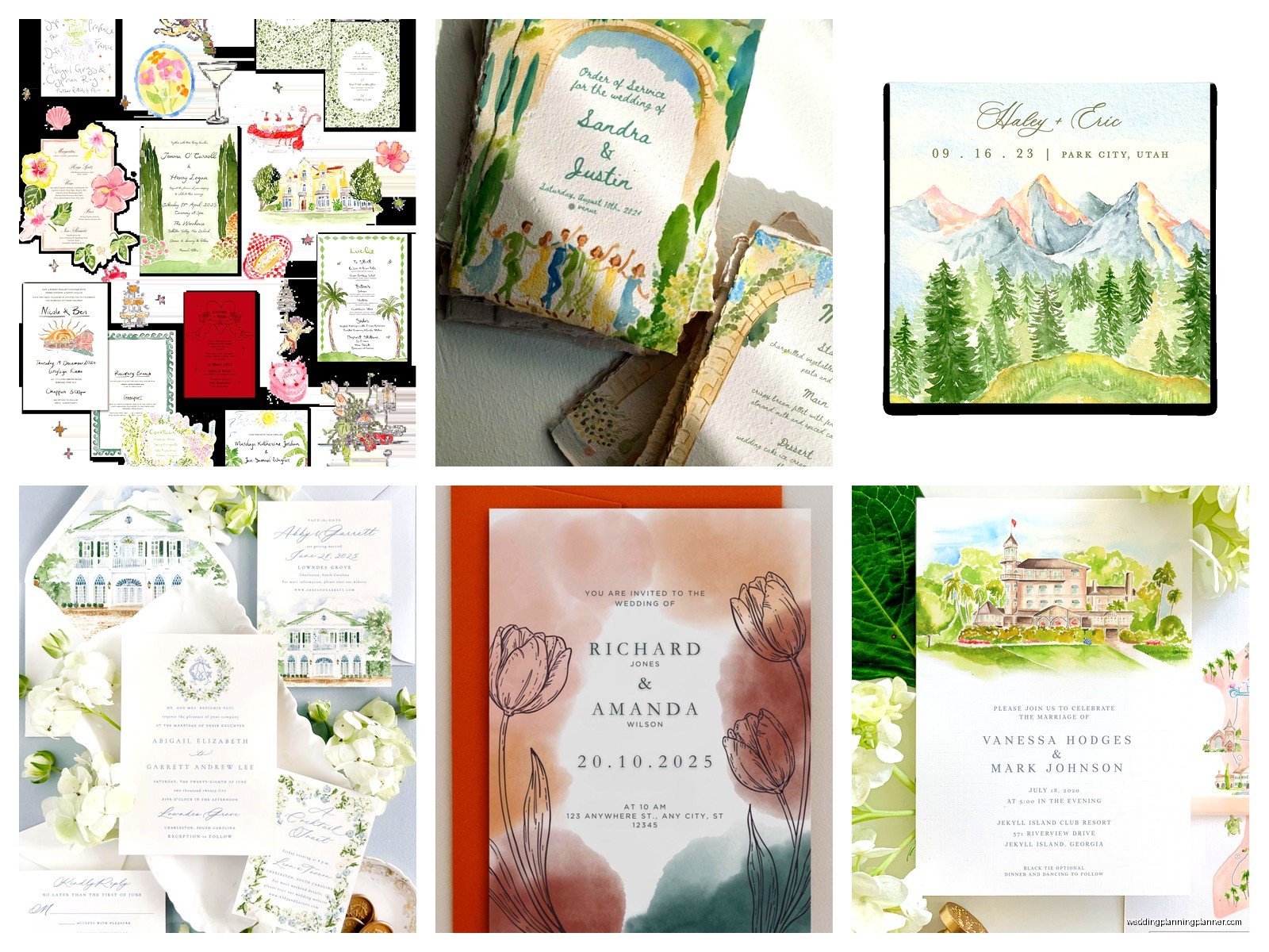
The thing about watercolor wedding invitations is they can go two ways: you can get actual hand-painted designs or you can go with digitally printed watercolor-style graphics. Both are valid. Both look gorgeous when done right. The hand-painted ones are gonna cost you more obviously because someone actually has to paint each one or paint a master copy that gets scanned and printed.
Real Watercolor vs Digital Watercolor Prints
So here’s what you need to know about the difference. Real hand-painted watercolor invitations mean an artist literally paints either your actual invitations or paints original artwork that gets professionally photographed or scanned, then printed onto your invitation stock. Digital watercolor is when a designer creates watercolor-style graphics using Photoshop or Procreate or whatever, and it looks like watercolor but no actual paint touched any paper.
I’m not gonna lie, most people can’t tell the difference once they’re printed, especially if the digital artist is good. But there’s something about knowing yours was actually painted that some brides really love. It’s like… the difference between a recording of a concert and being there live, kinda? You know what I mean.
Real watercolor invitations usually run between $15-$40 per invitation suite depending on how custom you go. Digital watercolor prints are more like $5-$15 per suite. So there’s your budget consideration right there.
Popular Watercolor Styles For Wedding Invites
The most common styles I see are:
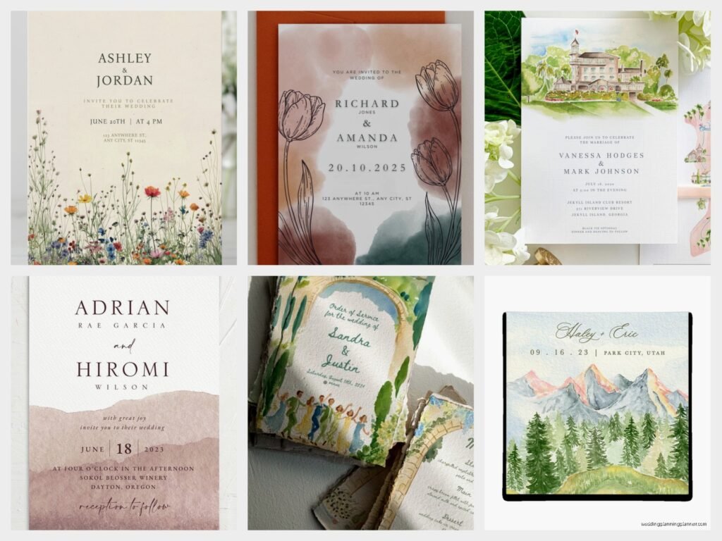
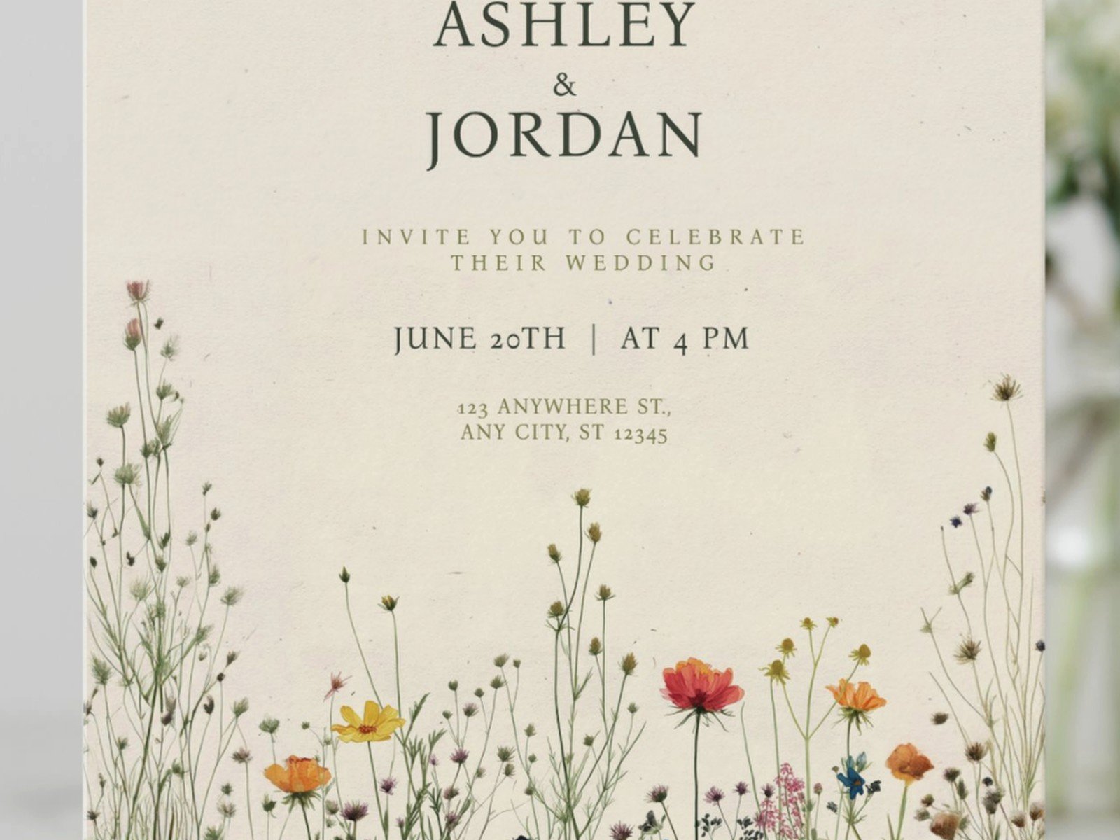
- Floral watercolor backgrounds with text overlay
- Watercolor washes as borders or accents
- Geometric shapes filled with watercolor textures
- Landscape scenes (like your venue or a beach or mountains)
- Abstract color bleeds and gradients
- Botanical illustrations in watercolor style
The floral ones are BY FAR the most popular. Like probably 70% of the watercolor invites I work with have some kind of loose, romantic flowers painted in soft colors. Lots of blush pink, sage green, dusty blue, lavender. Occasionally someone goes bold with jewel tones and those turn out stunning actually.
How To Find The Right Designer or Artist
If you want actual hand-painted invitations, you’re looking for either a watercolor artist who specializes in wedding stationery or a stationer who partners with artists. Etsy is honestly a goldmine for this – I’ve connected so many clients with amazing artists there. You can also search Instagram using hashtags like #watercolorwedding #weddinginvitationartist #handpaintedwedding.
What annoyed me recently was this one artist who had GORGEOUS portfolio photos but when my client ordered samples, the actual printed quality was terrible because she didn’t understand print resolution and DPI. The original paintings were beautiful but she was scanning them at like 72 DPI which is only good for screens, not printing. So make sure you ask about their printing process and see actual printed samples, not just digital mockups on their website.
For digital watercolor designers, places like Minted, Artifact Uprising, and Papier have really good options. You can customize colors and text but you’re working within their existing templates. If you want something totally custom, hire an independent designer – expect to pay $500-2000 just for the design work before printing costs.
Questions To Ask Your Designer
When you’re interviewing designers or artists, ask them:
- Do you paint actual watercolors or create digital designs?
- What’s included in your pricing? (design only, printing, envelopes, etc)
- How many revision rounds do I get?
- What’s the turnaround time?
- What paper stocks do you recommend for watercolor designs?
- Can I see printed samples not just digital files?
- Do you handle the printing or do I need to find a printer?
- What file formats will I receive?
That last one matters because if you want to print additional items later like programs or menus in the same design, you’ll need the source files.
Paper Selection Actually Matters A Lot
Okay this is where it gets technical but stay with me. The paper you print watercolor designs on makes a HUGE difference in how the colors look. Watercolor art has subtle gradients and color variations that can get lost on the wrong paper or look muddy.
Best paper options for watercolor invitations:
- Cotton paper – This is the premium choice. It’s thick, has a nice texture, and colors look rich and dimensional. Usually 110-130 lb weight.
- Matte cardstock – Good middle ground option. Colors absorb nicely without too much shine. Go for at least 100 lb weight.
- Textured linen or felt paper – Adds extra visual interest and the texture plays well with watercolor aesthetics.
Avoid glossy or super smooth papers because watercolor designs are meant to look soft and organic, and glossy finish fights against that vibe. Also the colors can look too saturated and lose that hand-painted quality.
I usually recommend cream or white paper over colored stock for watercolor invites because you want the painted colors to show true. Although I did have one couple do watercolor florals on a pale gray paper and it was actually really sophisticated looking.
Printing Methods
You’ve got a few options here and they each give different results:
Digital printing is the most affordable and what most people use. It’s fine for watercolor designs especially if you’re using a good quality printer. The colors are pretty accurate and it’s cost-effective for any quantity. Just make sure they’re using a high-quality digital press, not like an office printer situation.
Letterpress can be combined with watercolor backgrounds and it looks AMAZING. Like the watercolor is printed first, then the text is letterpressed on top. Super tactile and beautiful but expensive – usually $20-35 per invitation minimum. Worth it if you’ve got the budget though.
Offset printing is what you’d use for large quantities (200+) and it gives really consistent color quality. The setup costs are higher but the per-unit price drops significantly.
DIY Watercolor Invitations – Is It Doable?
Look, I’m gonna be straight with you. If you’re artistic and have time, yes you can DIY watercolor invitations. But it’s way more work than people think. I watched my sister try this for her wedding and she ended up scrapping the whole thing after painting 20 invitations because they all looked slightly different and it was driving her crazy.
If you still wanna try it, here’s the reality:
You’ll need good quality watercolor paper, actual watercolor paints (not the kid stuff), brushes, and a lot of patience. Paint your design, let it dry completely, scan it at 300 DPI minimum, clean up the scan in Photoshop if needed, then either print at home on cardstock or send the files to a print shop.
The hard part is consistency. Getting the same colors and style across multiple paintings is tough even for experienced artists. That’s why most people who go the hand-painted route do one master painting and then print copies of it.
Actually easier DIY option: buy watercolor digital designs from Creative Market or Etsy (like $15-40 for a whole collection of graphics), then customize them yourself in Canva or Photoshop. Add your text, arrange the elements how you want, and send to a printer. This is what I usually recommend for craft-loving brides who want some creative control without the actual painting part.
My sister’s cat knocked over her paint water onto like 15 finished invitations back when she was attempting this and I’ve never seen someone so defeated
But anyway moving on.
Color Palettes That Work Best
Watercolor invitations look best with 2-4 main colors that blend into each other. Too many colors and it starts looking chaotic. Here are combinations I see work really well:
- Blush pink + sage green + touches of gold
- Dusty blue + terracotta + cream
- Lavender + gray + soft yellow
- Coral + navy + mint
- Burgundy + dusty rose + forest green
- Peach + sage + ivory
Monochromatic watercolor can be really elegant too – like different shades of blue bleeding into each other, or various greens for a botanical vibe.
One thing about watercolor is the colors will look slightly different on screen versus printed. Always always ALWAYS get a printed proof before you approve a full print run. I learned this the hard way with a client in summer 2021 who approved everything digitally and then the printed invites came out way more purple than the blue she thought she was getting. We had to reprint everything and it was a whole mess that could’ve been avoided with a $15 proof.
Incorporating Watercolor Into Your Full Suite
So you’ve got your invitation design figured out, but what about all the other pieces? Most couples want some consistency across their stationery suite.
Your suite might include:
- Main invitation
- RSVP card
- Details card (accommodation, website, etc)
- Envelope liner
- Belly band or vellum wrap
- Return address printing
You don’t have to put the full watercolor design on every single piece – that can actually be overwhelming. What works well is using the full watercolor art on the main invitation, then pulling accent elements for the other pieces. Like maybe just a small floral corner on the RSVP card, or a watercolor wash on the envelope liner.
Vellum overlays with watercolor designs are having a moment too. The translucent quality of vellum makes watercolor look even more delicate and ethereal. You can print a watercolor design on vellum and wrap it around your invitation suite, or use it as a jacket.
Envelope Addressing Options
This is where people get stuck because they’ve invested in these beautiful watercolor invitations and then they’re like… now what do I do with the envelopes?
Options that complement watercolor invites:
- Professional calligraphy (hand-done or digital)
- Printed addresses in a nice font
- Watercolor envelope liners that coordinate with your design
- Custom stamps or wax seals in your wedding colors
I usually tell couples to pick one or two special touches for the envelopes rather than doing everything. Like either do the fancy calligraphy OR the watercolor liner OR the wax seal. All three together starts getting too busy and also crazy expensive.
Timing and Logistics
Watercolor invitations, especially custom ones, take longer than you think. Here’s a realistic timeline:
If you’re going custom hand-painted: start looking for artists 8-10 months before your wedding. The design process usually takes 4-6 weeks with revisions, then you need to factor in printing time (2-4 weeks depending on method), and you should mail invitations 8 weeks before the wedding (12 weeks if it’s a destination wedding).
If you’re using templates or digital watercolor: you can compress this timeline to 4-6 months out from the wedding, but don’t cut it too close because there’s always something that comes up… a typo you didn’t catch, the wrong shade of blue, whatever.
Also factor in time for addressing envelopes. If you’re doing calligraphy that’s another 2-4 weeks usually. Or if you’re gonna handwrite them yourself, that takes longer than you think when you’re doing like 150 envelopes.
Seasonal Considerations
Watercolor designs can be adapted for any season but certain styles lean certain directions. Spring weddings obviously do well with pastel florals and soft colors. Summer weddings can go brighter and more saturated with the colors. Fall weddings look gorgeous with burgundy, orange, and deep green watercolors – I’m thinking eucalyptus and fall foliage vibes. Winter weddings can do watercolor too but maybe with deeper jewel tones or even incorporate metallic watercolor effects with gold or silver.
You can also incorporate seasonal elements into the actual paintings – like cherry blossoms for spring, sunflowers for summer, autumn leaves for fall, or pine branches and berries for winter.
Common Mistakes People Make
After working with watercolor invitations for years, here are the mistakes I see over and over:
Choosing designs that are too busy. Watercolor is inherently detailed and textured, so if you add too many elements – like watercolor flowers PLUS geometric shapes PLUS a photo PLUS multiple fonts – it becomes visual chaos. Less is more with this style.
Not considering readability. Sometimes the watercolor background is so saturated or busy that the text gets lost. Make sure there’s enough contrast between your text and the background. White or cream text on dark watercolor can work, or dark text on light watercolor, but avoid putting medium-tone text on medium-tone watercolor.
Forgetting about the back side. This sounds dumb but people focus so much on the front design that the back of the invitation is blank white and it looks unfinished. Even just a small watercolor accent or a light wash of color on the back makes it feel more complete.
Not ordering enough extras. Always order at least 15-20 extra invitations beyond your guest count. You’ll want some for keepsakes, some get damaged in mailing, you’ll forget people, addresses will be wrong… just trust me on this.
Skipping the proof. I mentioned this before but it’s worth repeating because it’s such an easy mistake that costs so much money to fix.
Budget Breakdown
Since budget is always a thing, here’s what you’re realistically looking at for watercolor invitations for 100 guests (so about 100-120 invitations depending on your plus-one situation):
Budget option ($300-600 total): Template-based digital watercolor from Minted or similar, digital printing, basic envelopes, printed addressing. You’re probably looking at $3-6 per suite.
Mid-range option ($800-1500 total): Semi-custom digital watercolor design, better paper stock, maybe letterpress or foil for names, envelope liners, digital calligraphy for addressing. Like $8-15 per suite.
Luxury option ($2000-4000+ total): Custom hand-painted watercolor art, letterpress printing, cotton paper, hand calligraphy, custom envelope liners, wax seals, the works. You’re at $20-40+ per suite easily.
And these numbers don’t include save-the-dates or day-of stationery like programs and menus if you want those to match.
Coordinating Day-Of Stationery
If you love your watercolor invitation design, you’ll probably want to carry it through to your wedding day paper goods. This creates a cohesive look that designers (like me) get really excited about but that also adds to your budget so think about what’s actually important.
Things you might want in matching watercolor design:
- Ceremony programs
- Menu cards
- Place cards and escort cards
- Table numbers
- Welcome sign
- Bar menu
- Thank you cards
You don’t need all of these. Really think about what your guests will actually interact with or what photos you want. Like if you’re not doing a sit-down dinner with courses, maybe you don’t need menu cards? If your venue is small and simple to navigate, maybe you don’t need a ton of signage?
I usually recommend choosing 3-4 items maximum to carry the design through to. The invitation obviously, then maybe programs, place cards, and one large sign. That gives you cohesion without going broke on printing costs.
Working With Your Other Wedding Vendors
Share your invitation design with your florist, your decorator, and your planner (if you have one). The watercolor palette you chose can inform the actual wedding flowers and decor. I’ve seen weddings where the florist literally pulled colors from the watercolor invitation and it all looked so intentional and beautiful.
Also share them with your photographer because they’ll want to do detail shots of your invitations and it’s good for them to know what style to expect. Watercolor invites photograph really well actually because they’re already so visual and artistic.
Some couples even display a large version of their watercolor invitation design at the wedding – like printed as a poster for the welcome table or entrance. That’s kinda extra

Canva
Wedding Memories Hardcover Template Canva Editable For Notebook, Journal, Novel, Hard Covers, Canva template For KDP Cover 6×9″ 120 pages
Canva
The Ultimate Wedding Planning Bundle, Canva Editable.
Canva
Customizable Wedding Video Invitations templates, Canva Editable Digital Wedding invitation Minimalist, Animated Custom Invitation
Digital Planning Templates
Wine Wedding Planner Bundle – 200-Page Printable PDF + 10 Editable Wedding Invitations | Instant Digital Download
Canva
Orange Wedding Planner Bundle – 200-Page Editable Canva Templates + 10 Editable Wedding Invitations | Instant Digital Download
Digital Planning Templates
Champagne Wedding Planner Bundle – 200-Page Printable PDF + 10 Editable Wedding Invitations | Instant Digital Download
Canva
Wedding Memories Hardcover Template Canva Editable For Notebook, Journal, Novel, Hard Covers, Canva template For KDP Cover 6×9″ 120 pages
Digital Planning Templates
Yellow Wedding Planner Bundle – 200-Page Printable PDF + 10 Editable Wedding Invitations | Instant Digital Download
Canva
Dusty Blue Wedding Planner Bundle – 200-Page Editable Canva Templates + 10 Editable Wedding Invitations | Instant Digital Download