
Planning Guides, Style Guide
Terracotta Wedding Invitations: Rust Orange Earth Tone
Nov
Getting Started with Terracotta Invitations
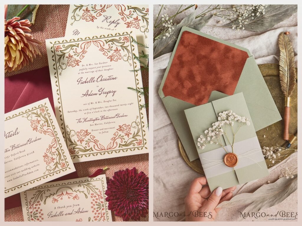
So terracotta wedding invitations are having this huge moment right now and honestly I’ve been working with rust orange earth tones since like spring 2023 when I had this bride who was OBSESSED with desert vibes. The thing about terracotta is that it’s not actually orange-orange, it’s more of that burnt clay color that sits somewhere between rust and dusty rose depending on the lighting, which is kinda perfect because it photographs differently in natural light versus indoor lighting.
You’re gonna want to start by figuring out what shade of terracotta you actually want because here’s what annoyed me SO much – printers and paper companies all call different colors “terracotta” and they’re wildly different. I had a situation where a client approved a digital proof that looked like a soft peachy-rust color and when the printed invitations arrived they were basically burnt orange pumpkin spice territory. Not cute. So always, ALWAYS order physical swatches before committing to anything.
Paper Stock Options That Actually Work
The paper you choose makes a massive difference with earth tones. I usually recommend starting with either a textured cotton paper or a smooth matte finish – the textured stuff gives you that organic pottery feel which reinforces the whole terracotta concept. Brands like Neenah, Crane, and Legion Paper have solid options in this color family.
For the actual terracotta color, you can go a few routes:
- Pre-colored cardstock in rust/terracotta shades (easiest option)
- Cream or ivory base with terracotta ink
- White cardstock with terracotta watercolor or painted details
- Kraft paper with rust accents (more budget-friendly)
The pre-colored stock is what I recommend for most couples because it’s consistent and you don’t have to worry about ink coverage issues. But if you want white or cream paper with terracotta elements, just know that rust-orange inks can sometimes look muddy if the printer doesn’t calibrate correctly.
Design Elements and Typography
This is where you can really play around. Terracotta pairs beautifully with so many styles – you can go modern minimalist, bohemian desert, Mediterranean villa, or even Art Deco if you pair it with the right metallics.
Typography-wise, I’ve noticed serif fonts work particularly well with terracotta because they add that classic elegance that keeps the color from feeling too casual or… I don’t know, too pottery barn? You want elegant but earthy. Fonts like Garamond, Baskerville, or even some of the modern serifs like Freight or Canela look gorgeous. Sans serifs can work too but they need to be substantial – thin sans serifs kinda disappear against terracotta.
For accent colors and design elements, here’s what I’ve seen work really well:
- Sage green or olive green (that desert plant vibe)
- Dusty rose or mauve
- Cream and ivory
- Gold foil or copper foil
- Deep brown or chocolate
- Burnt sienna or deeper rust tones for contrast
My cat literally walked across a terracotta invitation suite once while I was photographing it and honestly the paw prints kinda added to the aesthetic but the client didn’t need to know that happened.
Printing Methods
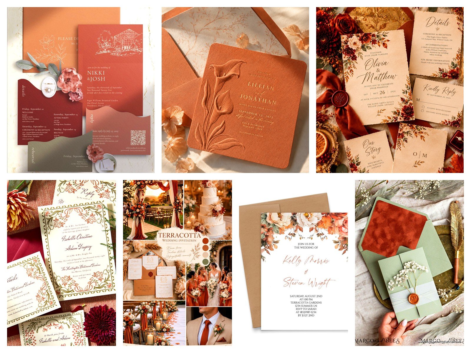
Alright so printing methods matter A LOT with earth tones. Digital printing is the most affordable and works fine for most designs, but if you’re printing terracotta ink on lighter paper, you might need to do a double pass to get good color saturation. I learned this the hard way when the first run came out looking like sad peachy-beige instead of that rich clay color.
Letterpress is absolutely stunning with terracotta because you get that tactile impression and the ink sits differently on the paper. It’s pricier but if your budget allows, the combination of terracotta ink with a deep impression on thick cotton paper is just *chef’s kiss*. The thing is letterpress can be tricky with large solid areas of color, so it works better for text-focused designs or designs with terracotta accents rather than full terracotta backgrounds.
Foil stamping in copper or rose gold over terracotta cardstock is another gorgeous option. The warmth of the metallics against the rust tones creates this really luxe desert sunset kind of feeling without being too matchy-matchy.
What About DIY Printing?
If you’re thinking about printing these yourself at home – you can, but manage your expectations. Home printers struggle with color accuracy on pre-colored cardstock, and they really struggle with rust/orange tones specifically. I’ve had clients try this and the colors shift weirdly, plus most home printers can’t handle the thick textured cardstock that makes these invitations feel special.
If you’re set on DIY, print on cream or white cardstock with terracotta ink, or print in black/dark brown on terracotta cardstock. Those approaches are more forgiving.
Envelope Situations
Okay so envelopes – you’ve got options. The most obvious is terracotta envelopes to match your invitations, which creates a really cohesive look. But honestly sometimes that’s too much terracotta and it can read as very monochromatic when someone pulls it out of their mailbox.
I usually suggest one of these combinations:
- Cream or ivory envelopes with terracotta invitation inside (classic and fresh)
- Terracotta envelopes with cream belly band or wrap
- Kraft envelopes with terracotta liner (budget-friendly but still elevated)
- Sage green envelopes with terracotta invitations (unexpected but beautiful)
For envelope liners, you can do a terracotta pattern, a watercolor wash in rust tones, or even a geometric pattern that incorporates your wedding colors. I had this couple in summer 2021 who did a hand-painted terracotta and gold abstract pattern for their liners and it was SO labor-intensive but looked incredible. They painted like 150 liners themselves over several weekends which is dedication I simply do not possess.
Wax Seals and Finishing Touches
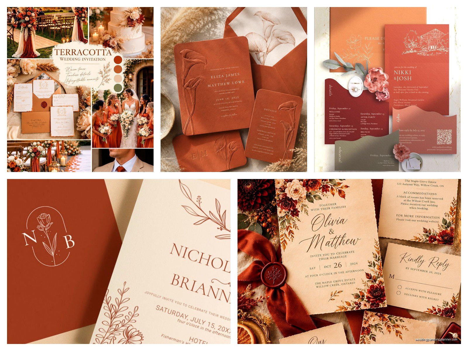
Wax seals in terracotta, rust, or copper are the perfect finishing touch if you want to go a bit extra. You can get custom stamps with your initials or wedding date. Just know that wax seals sometimes get damaged in the mail or they add extra postage costs because they make the envelope non-machinable, so you gotta hand-cancel them at the post office or they’ll get destroyed by the sorting machines.
Other finishing touches that work well:
- Silk ribbon in rust, copper, or sage
- Dried flowers or pampas grass tucked into the suite
- Vellum overlay with terracotta text
- Deckled edges on the invitation card
- Copper envelope clasps
The deckled edges thing is having a moment and it works particularly well with the organic earth-tone aesthetic because it reinforces that handmade, natural feeling.
Suite Components Beyond the Invitation
Don’t forget about all the other pieces you might need. If you’re doing terracotta invitations, you’ll probably want your other stationery to coordinate. This includes:
- Save the dates
- Details cards
- RSVP cards and envelopes
- Wedding programs
- Menu cards
- Place cards
- Thank you cards
You don’t need to make everything terracotta – that would actually be overwhelming. I usually suggest carrying the color through as an accent. Like maybe your save the dates are terracotta but your menus are cream with terracotta text, or your place cards are white with a terracotta painted edge.
Seasonal Considerations
Terracotta works year-round but it definitely hits different depending on the season. Fall weddings are obvious – the rust tones match the autumn leaves and that cozy harvest feeling. But I’ve done spring terracotta weddings that felt fresh and modern, summer desert weddings where it was perfect, and even winter weddings where terracotta paired with deep greens and gold created this unexpected warmth.
For spring, pair it with lighter colors like blush and cream. Summer calls for brighter accents like coral or yellow. Fall is when you can go deep with burgundy, chocolate, and burnt orange. Winter terracotta looks gorgeous with emerald green, navy, or even icy blue for contrast.
Budget Breakdown
Let’s talk money because that matters. Terracotta invitations can range wildly in price depending on what you choose:
Budget-friendly approach ($2-4 per invite): Digital printing on kraft or pre-colored cardstock, simple design, standard envelopes. You can definitely make this work and still have it look elevated.
Mid-range ($5-8 per invite): Better paper stock, maybe some foil accents, custom envelope liner, nice typography. This is where most of my clients land and you get a lot of bang for your buck here.
Luxury ($10-20+ per invite): Letterpress, multiple printing techniques, thick cotton paper, custom illustrations, hand-painted elements, wax seals, silk ribbon. This is when you want your invitations to be a real statement piece.
Remember these prices don’t include postage which can add up, especially if you have heavy or oversized invitations.
Working With a Designer vs Templates
You can absolutely find terracotta invitation templates on sites like Etsy, Minted, or Zola. Templates are great if you have a clear vision and just need someone else to have done the design work. The downside is you’re limited to what’s already created and you might see someone else with the same invitations.
Custom design gives you complete control and something unique to you, but it’s gonna cost more and take longer. I work with designers all the time and the process usually takes 4-6 weeks from initial concept to final files, with multiple revision rounds.
If you’re doing templates, just make sure the terracotta color in the template matches what you can actually print. Sometimes templates show colors that look gorgeous on screen but are impossible to reproduce accurately in print.
Timeline Stuff You Need to Know
Order your invitations at least 3-4 months before your wedding date. That gives you time for design, proofing, printing, and addressing. Then mail them 6-8 weeks before the wedding date. For destination weddings, bump that up to 8-10 weeks.
If you’re doing anything custom like letterpress or hand-painting, add extra time. Those processes can’t be rushed and you don’t want to be stressed about invitations arriving late when you’ve got a million other things to worry about.
Common Mistakes I See All the Time
People forget to account for how terracotta photographs. It can look very different in photos than in person, so if you’re planning to share photos of your invitations on social media or in your wedding album, do some test shots with different lighting.
Another thing – not all terracotta tones work well with all skin tones in photos. If you’re planning invitation flat-lay photos with your hands in them showing off your ring or whatever, consider whether the color complements or clashes with your skin tone. Sounds picky but it matters for photos.
Also people underestimate how many invitations they actually need. Order extras. You’ll want some for your own keepsake, some will get damaged, addresses will change, plus-ones will be added last minute. I always tell clients to order at least 15-20 extra invitations beyond their guest count.
Coordinating With Your Overall Wedding Design
Your invitations set the tone for your whole wedding, so make sure your terracotta theme carries through to other elements if that’s the vibe you want. Think about your florals, table linens, bridesmaid dresses, signage, and even your cake design.
That said, you don’t need to go crazy with it. Terracotta can be the star of your invitations and then just show up as an accent color elsewhere. Like maybe your invitations are fully terracotta but your wedding has sage green linens with terracotta napkins and some rust-colored florals. That kind of thing.
